
Many organisations collect large volumes of data but struggle to turn it into insights that support real decision-making. Spreadsheets, static reports, and disconnected systems often hide important patterns rather than reveal them. Data visualization consulting services bridge this gap by transforming complex data into visuals that are easy to interpret and use.
At Vidi Corp we have helped 600+ clients with their data visualization projects including Google, Heineken and Teleperformance. We are specialized in creating data visualization dashboards that analyse internal company data help clients optimize their operations.
This article explores the quantifiable benefits of data visualisation, real-world industry applications, and the structured consulting approach that we use to deliver measurable business value from data.
Data visualization obviously help companies with more professional presentations but it is much more than that. Businesses invest into it because they expect a return on their investment which usually comes from increased revenue or decreased costs.
Well-designed visuals help people “get it” faster. In fact, some researchers found that visualizations were 25.5% quicker to understand than text and 46.5% quicker than tables.
In business terms, that speed turns into sharper insight: patterns stand out, anomalies become obvious, and decisions get grounded in what’s really happening. That’s why operational BI dashboards are so often aimed at optimizing revenue-critical workflows and eliminating avoidable cost.
Data visualization really shines when paired with real-time analytics. When live performance is visualized clearly, managers can spot gaps, trends, and risks at a glance—then act before small issues turn into big ones.
One client we supported reported a 40% faster turnaround time for key strategic decisions after implementing the dashboards.
A good dashboard is a shared language—especially for non-technical stakeholders. Clear visuals reduce misunderstandings, align teams quickly, and make discussions more productive, whether it’s an executive meeting, a client presentation, or a planning session.
In one engagement, a client told us our improved dashboard design helped drive adoption by 10 additional stakeholders.
When you can see your data, you start noticing what raw reports hide: bottlenecks, weak handoffs, duplicated effort, and spending leaks. Dashboards bring these issues to the surface earlier, so teams can fix them faster, reduce manual work, and focus resources where they matter most.
For example, when we worked with Neterra Telecommunications, they reported that our visualizations helped uncover a one-off cost-saving opportunity worth €50k.
Organizations that interpret data faster tend to move faster. Visualization makes it easier to catch market shifts, customer behavior changes, and emerging risks before competitors do. Over time, that responsiveness becomes more than “better reporting”—it becomes a strategic edge.
One client, Enabling Technologies, reported a 20% increase in service revenue driven by insights surfaced through our dashboards.
Data visualisation consulting is applied across many industries to solve real business challenges. The examples below show how tailored dashboards and reports help organisations gain clearer visibility, improve performance, and turn data into practical insights in different sectors.
Data visualization helps finance teams track revenue, expenses, and profitability in one place, making financial performance easier to monitor. Clear visuals support more accurate forecasting, better budget planning, and ongoing oversight of financial risks.
Our client needed a reliable way to monitor their financial performance across the year. Revenue, expenses and profit margins were being reviewed through disconnected reports, making it difficult to understand overall performance, track progress against targets, or anticipate future cash flow.
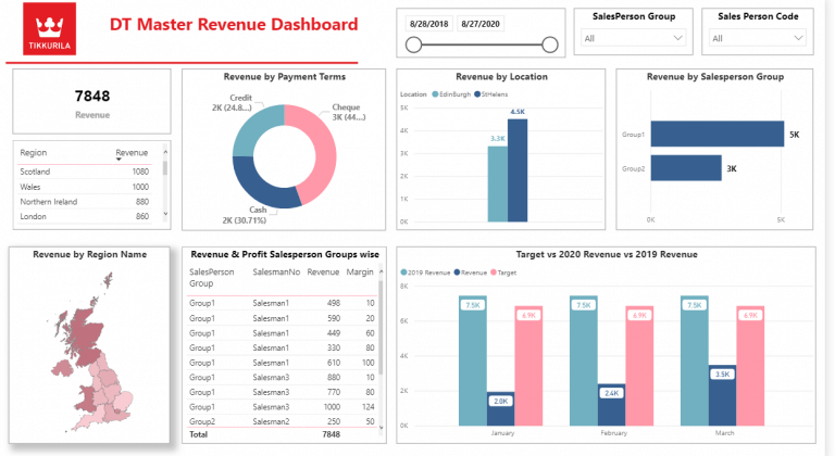
We built an interactive financial dashboard that provided a year-to-date global overview of income, expenses, and profit margin. Monthly breakdowns showed real income and expenses, while projection charts helped estimate future performance. The dashboard also included bank account balance analysis, giving the finance team a complete view of both profitability and liquidity in one place.
With all key financial metrics visualized in a single dashboard, the team gained clearer visibility into their financial position. It helped to improve budget planning, identify financial risks, and review performance at a glance.
Data visualization consulting can be a game-changer in retail because it turns fragmented sales data into clear, actionable insight. Retail teams can instantly see performance by store, product line, and margin—making it easier to optimize inventory, pricing, and merchandising decisions.
In one project, we built a Power BI dashboard for a jewelry brand that primarily sold through physical retail outlets. Sales data was extracted automatically from Shopify POS via our Shopify connector (with the dashboard anonymized for privacy).
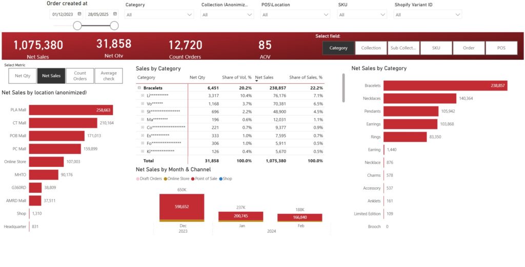
The core challenge was that the client couldn’t easily compare how newly launched collections performed against their core product line across different stores. They needed a fast way to analyze sales and profitability by outlet, collection, and sub-collection—without manual reporting or time-consuming drilldowns.
As a result, management could identify top-performing stores and collections in minutes rather than days, cutting recurring reporting time by an estimated 50–70% and speeding up weekly trading decisions. The team also used store-level filtering to fine-tune assortment by location, which typically reduces slow-moving stock and improves sell-through—helping protect margin by focusing attention on the highest-profit products and outlets.
Data visualization helps education leaders track performance against strategic goals, monitor equity outcomes, and understand how different student groups are progressing over time. Clear, accessible dashboards support evidence-based decisions and make it easier to identify where additional support is needed.
We worked with Buffalo Public Schools when they developed a five-year strategic plan with clear objectives such as narrowing achievement gaps for ethnic minority students, increasing student participation in after-school activities and improving the percentage of families receiving offers from their top-choice schools. Tracking progress across these goals using static reports made it difficult to measure impact consistently over time.
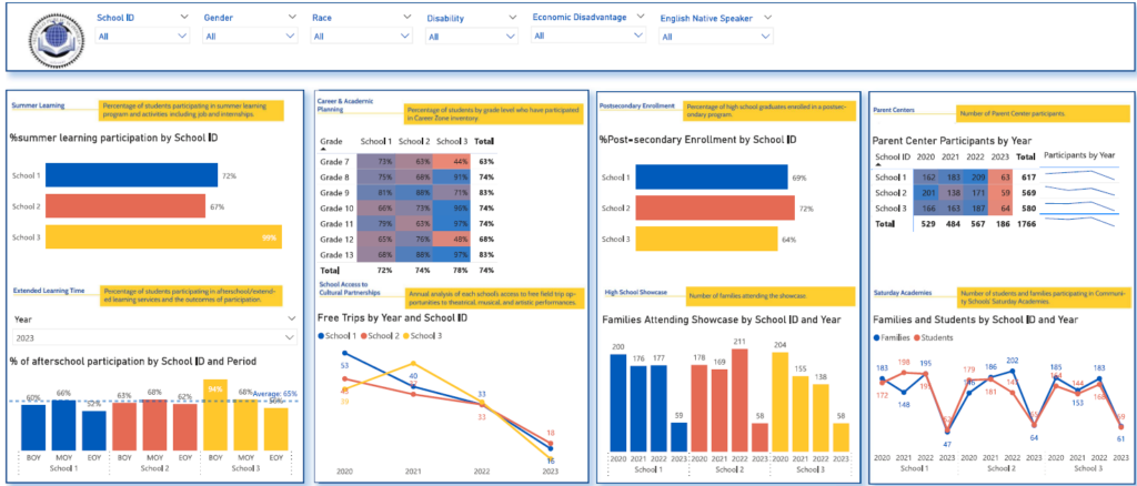
We designed a school dashboard that measured performance across all metrics defined in the strategic plan. The dashboard connected directly to the ERP system and refreshed automatically each day, ensuring progress was always up to date. Key performance indicators were shown for the beginning, middle, and end of the school year, making changes over time easy to track.
With a single view of performance, education leaders were able to monitor progress more effectively and identify student groups that required additional support. The dashboard improved transparency, supported data-driven planning, and helped stakeholders clearly see how initiatives were performing throughout the year.
Data visualization helps logistics teams monitor delivery performance, identify bottlenecks, and ensure goods move efficiently through warehouses and distribution networks. Clear dashboards make it easier to track order status, meet shipping targets, and prioritise operational issues before they escalate.
The client needed better visibility into how effectively items were moving through their warehouse and out for delivery. While delivery data was available, it was difficult to understand shipment readiness, track progress across delivery stages, and identify late orders in time to take action.
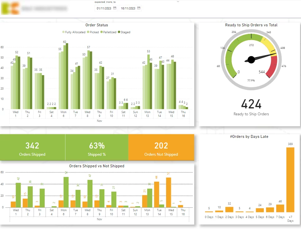
We designed a warehouse dashboard focused on customer delivery metrics. It showed shipment readiness, delivery status across key warehouse stages, shipped versus unshipped orders by expected date, and late orders by days overdue, with drill-down to individual orders.
With a real-time view of warehouse and delivery performance, the team was able to spot delays earlier, prioritise late orders, and improve overall shipment flow. The dashboard helped maintain high shipping readiness levels and supported more efficient day-to-day logistics operations.
Data visualization helps real estate teams understand portfolio performance, track profitability, and identify cost drivers across properties. Well-structured dashboards provide a clear overview of revenue, expenses, and profit, while allowing users to drill down into individual properties and expense categories when needed.
The client needed a clear, consistent way to monitor the performance of their real estate portfolio and understand what was driving changes in revenue and profit. Financial data was available, but without a clear structure it was difficult to see trends over time, compare properties, or identify irregularities in expenses.
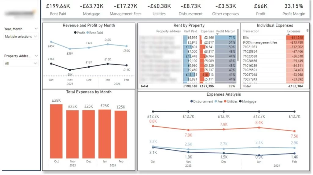
We built a Power BI real estate dashboard with a clear storytelling structure. High-level KPI cards provided an instant overview of portfolio performance, followed by trend charts showing changes in revenue, expenses, and profit over time. Users could drill down into individual properties and expense groups using filters, making it easy to understand performance drivers and spot irregularities.
This dashboard helped our client to monitor investments more effectively, identify cost issues early, and compare actual results against budget. The dashboards supported better investment oversight and more informed decision-making across the real estate portfolio.
A structured process helps data visualization consultants deliver solutions that align with business objectives and generate long-term value.
1. Data Visualization Consultation
Data visualization consultants work closely with stakeholders to understand decision-making workflows, key metrics, and user needs. They define success criteria, identify priorities, and set project milestones to ensure the solution supports real business decisions.
2. Data Assessment
Data visualization experts review data sources to evaluate quality, reliability, and accessibility. They identify data gaps, integration requirements, and technical constraints, ensuring the solution is built on a strong and scalable data foundation.
3. Solution Development And Integration
The consulting team designs and develops custom dashboards using an agile approach, sharing progress regularly and incorporating feedback throughout the build. They automate data connections where possible and test solutions to ensure accuracy, performance, and security.
4. Deployment And Optimization
Consultants manage deployment with minimal disruption to daily operations. After launch, they monitor performance and refine dashboards based on user feedback and changing business needs.
5. Training
To drive adoption, data visualization experts deliver role-specific training and clear documentation. They support teams in building confidence with the solution and enable ongoing maintenance and improvement.
Well-designed dashboards help users understand the message quickly, without unnecessary effort or distraction. The following principles guide how data visualization consulting experts design visuals that share insights clearly and efficiently.
Reducing clutter is one of the most important principles in data visualization. Clutter distracts users from the core message and makes dashboards harder to read. When too many visual elements compete for attention, users struggle to understand what matters most.
Common sources of clutter include:
Using a wide range of colours forces users to constantly check legends and remember what each colour represents. This increases cognitive load and slows down interpretation.
Crowded visuals with excessive labels, axis titles, gridlines, and repeated values overwhelm users. In many cases, a clear title can replace multiple labels, and values only need to appear once to communicate effectively.
Decorative gridlines, sliders, borders, or repeated annotations often add noise without adding meaning. Every element on a chart should support the insight being communicated.
Clear visuals use space intentionally and remove anything that does not directly contribute to understanding the data.
Colour plays a powerful role in how users interpret data, but poor colour choices can quickly reduce readability.
What to avoid:
Best practices to follow:
Colours should carry meaning. For example, green often signals positive outcomes, while red highlights issues or risks. This helps users interpret results instinctively.
Consistency builds familiarity. If a metric or category appears in blue in one chart, it should remain blue across the entire dashboard. This reduces confusion and improves comprehension.
When used thoughtfully, colour guides attention and reinforces insights rather than distracting from them.
We have a detailed guide on selecting the right data visualization tool but in short your decision depends on data complexity, user needs, governance requirements, and scalability. Data visualization consultants evaluate these factors to ensure the chosen platform supports reliable insights and long-term adoption.
Power BI is a business intelligence and data visualization platform developed by Microsoft and widely used for interactive reporting and dashboarding.
Power BI supports interactive dashboards and reports, integrates tightly with Excel, Azure, and Microsoft 365, and enables advanced data modelling using DAX. It also provides automated data refresh, row-level security, and enterprise-grade access control.
Advantages
Disadvantages
Tableau is a visual analytics platform designed for fast data exploration and data storytelling.
Tableau offers a drag-and-drop interface that allows users to build interactive visuals quickly, supports a wide range of chart types, and enables deep filtering and drill-down for exploratory analysis across large datasets.
Advantages
Disadvantages
Looker Studio is a data visualization and analytics platform built around a centralised semantic data model.
Looker Studio defines metrics through a modelling layer that ensures consistency across reports, connects directly to cloud data warehouses, and supports embedded analytics for external applications.
Advantages
Disadvantages
Domo is a cloud-based analytics platform that combines data integration, visualization, and collaboration.
Domo provides built-in data connectors, supports near real-time dashboards and alerts, offers a mobile-first user experience, and enables easy sharing and collaboration across teams.
Advantages
Disadvantages
Data visualisation consulting helps organisations turn complex data into clear insights that support better decisions. With the right approach, tools, and design principles, dashboards become a foundation for improved performance, efficiency, and growth.
At Vidi Corp, our data visualisation consulting team has supported more than 600 organisations across every stage of their analytics implementation. We’d be delighted to bring that experience and expertise to your project.
Contact us today to explore how tailored dashboards can deliver real business value!
![]()
![]()
![]()