The difference between a fancy-looking dashboard and a system that actually drives decision making is knowing which data analytics best practices to follow. Lots of organisations throw money at analytics, but struggle to turn data into action because they missed the fundamentals. Get the principles right, and your analytics will deliver clear, tangible business value.
As a Business Intelligence consultancy, we’ve delivered 1,000+ data analytics projects for 600+ clients, including Google, Heineken and Dermalogica. Some of the executive dashboards that we have built have generated $100K+ in value, so we know what actually works in real business environments.
In this article, we’ll walk you through the most important data analytics best practices – from working out what business questions you need to answer and what KPIs to track, to making sure your data is of good quality, choosing the right tools and designing dashboards that really drive decisions. We’ll also cover some common pitfalls and show you how to implement these best practices using a practical 90-day action plan
In 2026, organisations are no longer just collecting data for the sake of it; they’re expected to make it useful in real time, power some pretty smart systems, and adapt to changing conditions on the fly. This is exactly what made adopting data analytics best practices a must, not a nice-to-have. Without a structured approach, even the most advanced tools and big datasets just won’t deliver any meaningful results.
In our experience, when organisations struggle to get a return on their data analytics investments, in 90% of cases, it’s because they’re not following the core best practices. By establishing and sticking to some proven best practices, you can turn data initiatives from expensive experiments into reliable drivers of growth, efficiency and competitive advantage.
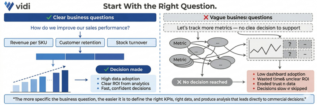
Every data analytics project starts with clearly defined business questions that are nailed to the wall of commercial objectives. That means identifying exactly what decision you want to help make and which process it’s related to – e.g., improving marketing ROI, reducing operational costs or increasing customer retention. The more specific the question, the easier it is to define which KPIs to track, how to structure the data and produce an analysis that leads to real action.
When business questions are vague, your analytics quickly becomes disconnected from decision-making. Teams might build dashboards and reports, but they don’t answer anything meaningful, so you end up wasting time, with low adoption and an unclear ROI. Without a clear starting point, organisations often track loads of irrelevant metrics or misinterpret results, which slows down decision-making and reduces trust in the data.
A real-life example of this principle is where our Power BI consultants worked with a medical device company that came to us with a clear question: how to monitor machine utilisation and predict failures before they impact performance. We built Power BI reports focused on specific metrics like component cycles, utilisation trends and maintenance triggers. This allowed their teams to spot early signs of declining usage, take proactive action and engage customers at the right time. As a result, the client boosted service revenue by 20% and reduced operational costs.
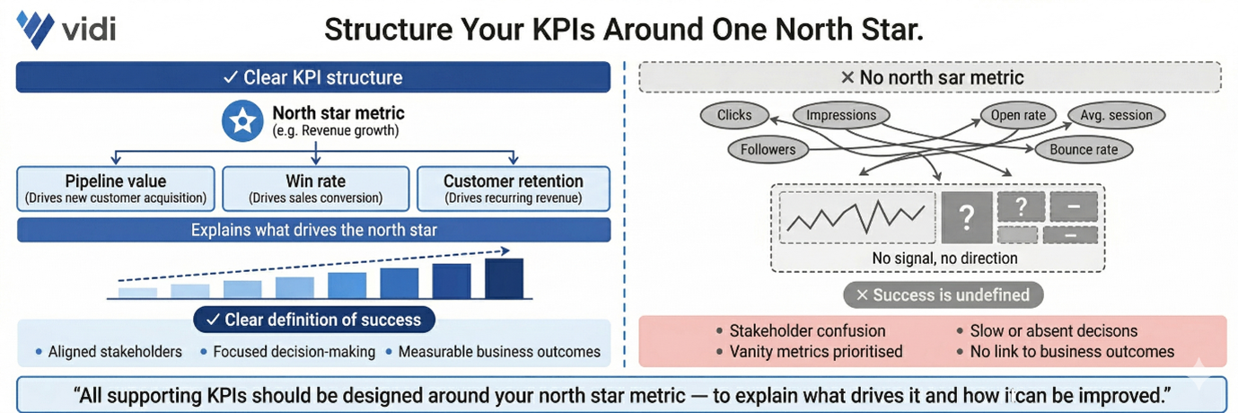
Once you’ve got your business questions sorted, the next step is to translate them into clear, measurable objectives supported by well-structured KPIs. That starts with identifying a single north star metric that reflects the primary goal – e.g., revenue growth, pipeline value or customer retention. All the supporting KPIs should then be designed around this metric to explain what drives it and how it can be improved.
Without a clear KPI structure, analytics becomes a mess and hard to act on. Teams often track loads of disconnected metrics, which creates confusion and slows down decision-making. When there is no north star metric, it becomes unclear what success looks like, and stakeholders may focus on vanity metrics that don’t contribute to real business outcomes.
Our data visualization consultants worked with the Global Head of Marketing at Teleperformance to build a Power BI sales pipeline dashboard that measured the impact of marketing on revenue generation. We defined expected revenue from marketing as the north star metric and structured all the supporting KPIs around it, including leads by source, conversion rates by funnel stage and opportunities by region. This KPI framework allowed stakeholders to clearly understand which channels were driving pipeline growth and where performance was dropping. As a result, the company ditched 6 hours of manual reporting, introduced automated daily insights and used the dashboard to optimise marketing efforts across regions by spotting underperforming lead sources.
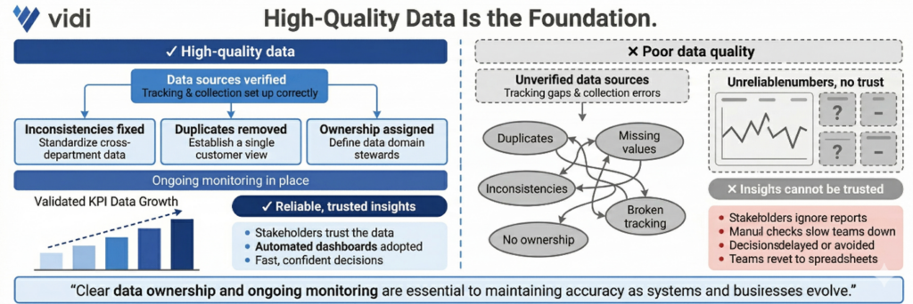
High-quality data is the foundation of any successful analytics initiative. That involves checking data sources, fixing inconsistencies, removing duplicates and making sure tracking and data collection processes are set up to work properly. It also means having clear ownership of data and ongoing monitoring to keep accuracy up as systems evolve.
Poor data quality leads to unreliable insights and erodes trust in analytics. When stakeholders see inconsistent or incorrect numbers, they stop relying on reports altogether. That often results in delayed decisions, extra manual checks and teams reverting to spreadsheets instead of using automated dashboards.
In one of our projects, a major automotive marketing agency was wrestling with inconsistent GA4 tracking across 70+ client websites, thanks to a bunch of different developers and no clear game plan. Our Google Analytics consultants dug in, audited their tracking, and identified a bunch of inaccuracies. To get everyone on the same page, we standardised data collection using structured GTM templates and consistent tracking logic. This ensured that all the key events and metrics were getting picked up accurately across all the platforms. As a result, reporting accuracy shot up by 40% and the amount of time it took to set up tracking on each site plummeted from 8-10 hours to just 2-5 hours.

Choosing the right tools is super important if you want to build a scalable and efficient analytics setup. This means picking the right tools for data integration, data warehouse storage, and BI reporting – and making sure they align with your data sources, reporting audience, and level of analysis needed.
Using the wrong tools is a major pain point – it creates friction across the whole analytics process. For example, some BI tools like Power BI or Tableau require paid licenses for every user, which can make sharing data with external folks tough and add a bunch of extra admin overhead. Others, like Looker Studio, make it super easy to share data with external people without licenses, but might have limitations in advanced visualisation. If the tool doesn’t integrate well with your data sources or is just too complicated for your team, adoption drops and the value of analytics is reduced.
We saw this play out in one of our projects, where a client migrated 40+ dashboards from Tableau to Power BI to better fit their Microsoft ecosystem and save money. We redesigned the dashboards, made them much more intuitive, and ensured they integrated seamlessly with their existing data sources. As a result, the client cut their licensing costs by a whopping $2,500 per month while making their reporting environment way more user-friendly and scalable.
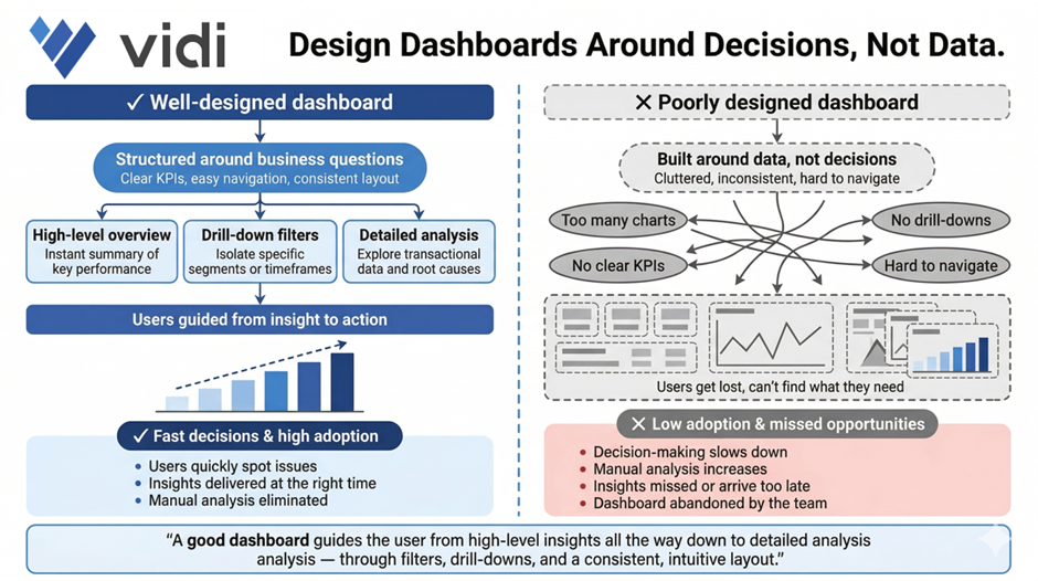
Dashboards need to be designed around helping people make decisions, not just spewing out data. That means structuring reports around key business questions, using clear KPIs, and making sure your visuals are super easy to navigate so users can quickly spot issues and take action. A good dashboard will guide the user from high-level insights all the way down to detailed analysis through filters, drill-downs, and consistent layouts.
When dashboards are all over the place, cluttered, inconsistent, or just plain complicated, users get lost. They struggle to find the info they need, and it ends up slowing down decision-making. This often means low adoption, tons of manual analysis, and missed opportunities because insights aren’t presented clearly enough or at the right time.
We had a similar story in one of our projects, where we built automated Power BI reports on top of a massive ERP database with tens of millions of rows – and used them across sales, marketing, procurement, operations, and finance teams. We structured the dashboards to cover key areas like revenue, cash flow, and cost analysis, with super-optimised performance and clear navigation for different stakeholders. This helped users quickly zero in on cost-saving opportunities and revenue drivers. As a result, the client saved €50,000 right off the bat, added an extra €10-20K in monthly recurring revenue, and eliminated the need for a full-time analyst maintaining manual Excel reports.
Good data visualisation is all about clarity, not complexity. Dashboards need to present info in a way that’s super easy to understand at a glance – using the right chart types, consistent layouts, and clear hierarchy. One of the most useful frameworks for this is outlined in Storytelling with Data, which says to get rid of clutter, focus on what matters, and guide the viewer through the insight.
When visualisation principles get ignored, dashboards become super tricky to use and interpret. Users may misread trends, overlook important insights, or waste way too much time trying to figure out what they’re looking at. This eats away at trust in the data and limits the impact of analytics – even if the underlying data is spot on.
Our dashboard consultants developed a dashboard for a children’s care home in the UK for one of our projects. We designed it to clearly visualise key metrics and link supporting evidence through SharePoint, making it super easy for users to understand each case and present info to regulators. By structuring the visuals around clarity and usability, the team improved decision-making and operational efficiency. The solution became the heart of their workflow, helping them ensure high standards of care and expand analytics into other areas of the organisation.
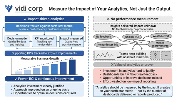
Analytics shouldn’t just be about delivering insights – it should be about the impact it creates. This means tracking how decisions influenced by analytics affect the north star metric – be it revenue, cost efficiency, customer retention, or some other key objective. You should also be monitoring supporting KPIs to understand which changes are driving improvements.
Without being able to measure performance its basically impossible to prove that your analytics efforts are actually worth the investment – or improve your approach on an ongoing basis. Teams end up ploughing on with dashboards and reports without ever getting any real feedback on whether they’re actually having any impact on the bottom line. This can lead to a whole heap of wasted effort, unclear ROI, and lots of opportunities to improve decisions over time being missed.
In one of our projects, a client was using analytics to try to get a handle on their customer acquisition cost, and that became their north star metric. So our marketing analytics consultants built a dashboard that tracked CAC, alongside a bunch of supporting metrics like conversion rates, channel performance, and lead quality. Over time, the client was able to use those insights to start shifting budget around, moving it away from channels that weren’t performing and into those that were. By continuously measuring the impact of those decisions, they were able to knock their CAC down by over 25% while still growing revenue, which was a pretty clear demonstration of just how valuable their analytics investment had been.
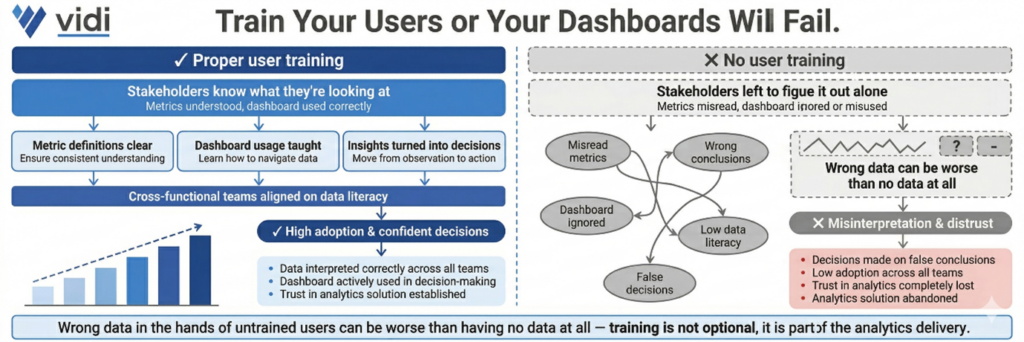
Even the best dashboards in the world are going to fail if the people using them don’t have a clue what they’re looking at. That’s where training comes in – it’s about making sure stakeholders know what each metric means, how to actually use the dashboard, and how to turn those insights into real decisions. This is especially important when you’re talking about cross-functional teams with different levels of data literacy.
If you don’t train the users properly, you’re looking at a whole bunch of problems – people misinterpreting the data, not using the BI dashboard at all, or in some cases even making decisions based on entirely false conclusions. And that in turn leads to poor decision making, low adoption rates and a general lack of trust in the analytics solution. We’ve seen cases where the data people get wrong can be worse than having no data at all.
In our experience, the best analytics projects always include proper, hands-on training sessions geared towards the specific needs of the various user groups. We often run workshops where we walk stakeholders through real business scenarios on their dashboards, showing exactly how to interpret the metrics and what to do with them. This approach builds confidence, boosts adoption, and makes sure that analytics becomes an everyday part of the decision-making process.
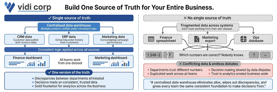
Having a single source of truth is all about ensuring that all teams are working from the same, consistent data. And the way to achieve that is by creating a centralised BI data warehouse that can pull data from multiple systems, apply some consistent logic and feed the dashboards and reports. This wipes out discrepancies between departments and gives you a solid foundation for making decisions.
Without a single source of truth, organisations are stuck with conflicting numbers and data silos. Different teams may be relying on their own separate datasets, which leads to all sorts of problems – inconsistencies, duplicated work, and endless debates about which numbers are correct. All of which slows down decision-making and erodes trust in analytics across the business.
In one of our projects, our data warehouse consultants helped a platform company build a centralised cloud database by integrating multiple systems through APIs into a single Azure-based database. This got rid of the data silos and gave them a unified data model they could use across all reporting. As a result, they were able to knock manual data consolidation down to almost zero, cut report generation time from 48 hours to under 5 minutes, and speed up decision-making by 40%. The centralised data foundation also helped them get up to 99.7% data accuracy, which meant they could confidently rely on real-time insights.
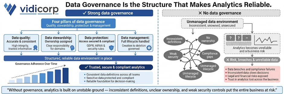
Data governance is all about making sure your data is accurate, secure and consistently managed across the organisation. It’s about building on four key pillars: data quality (so the data is accurate and consistent), data stewardship (assigning ownership and responsibility), data protection (securing access and making sure you’re compliant), and data management (handling the whole data lifecycle from collection to storage). Together, these pillars create a structured data environment you can rely on.
If you don’t have proper governance in place, analytics just becomes unreliable and a risk. Inconsistent definitions, unclear ownership, and weak security controls are just a few of the problems you’ll run into – and they can even lead to data breaches and compliance issues. This, in turn, slows down decision-making and exposes the business to all sorts of legal and financial risks, especially when you’re dealing with sensitive data.
In one of our projects, our Tableau consultants worked with a company that was struggling with inconsistent reporting across departments due to unclear data ownership and multiple versions of the same metrics. We put in a governance framework by defining KPI ownership, standardising metric definitions and implementing role-based access controls in their BI environment. We also set up data quality checks and audit logs to monitor usage and changes. As a result, reporting inconsistencies were eliminated, stakeholder trust in the data went way up and the leadership team was able to rely on a single, governed set of metrics for their strategic decisions.
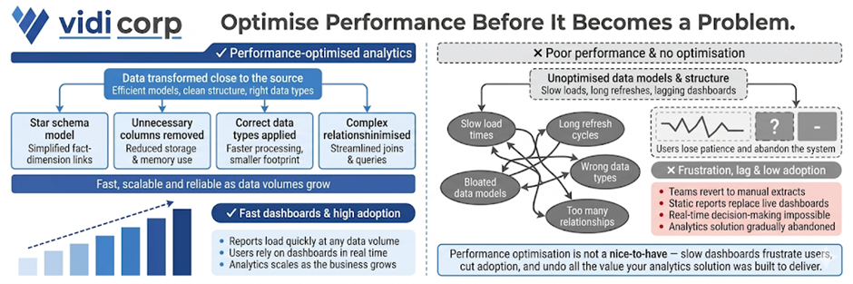
Optimising for performance using data modelling best practices is all about making sure your analytics solution stays fast, scalable, and reliable as data volumes grow. And the way to do that is by transforming data as close to the source as possible, using efficient data models like star schemas, and removing any unnecessary columns or tables. Choosing the right data types and minimising complex relationships also plays a big role in keeping dashboards from getting too slow.
If the performance of your analytics solution starts to suffer, that can be a real problem. Slow loading reports, long refresh times, and lagging dashboards will just frustrate the users and cut adoption. We’ve seen teams just revert back to manual extracts or static reports because the system is too slow to rely on in real time. In our years of experience, a performance optimisation can make all the difference to how analytics is used.
We’ve seen it time and time again, in various projects, where our data modelling consultants redesigned inefficient data models to chop out unnecessary columns, restructure relationships and push transformations forward. As a result, we’ve been able to knock a huge chunk off data model size – as much as 10 times in fact – and in some cases slash refresh times from more than an hour to a relatively snappy 2 minutes. And that’s had a big impact on stakeholders, who now get to access up-to-date insights quickly and easily, and start using dashboards as part of their daily decision-making.
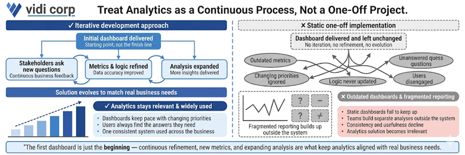
Data analytics implementation shouldn’t be a one-off project. It needs to be developed iteratively. As soon as that initial dashboard is delivered, stakeholders are bound to start asking new questions as they start getting to grips with the data. And that’s when the iterative development comes in – continuously refining the solution by adding new metrics, improving logic, and expanding the analysis to keep up with real business needs.
If you don’t approach it this way, analytics quickly becomes outdated. Those static dashboards can’t keep up with changing priorities, and users will stop using them if they can’t get the answers they need. And before you know it, you’ve got fragmented reporting – teams building separate analyses outside the main system – which cuts down on consistency and usefulness.
In our experience, the best analytics solutions evolve alongside the business. We usually start off with a core dashboard that focuses on key KPIs, and then build on it with extra views, filters and deeper analysis as stakeholders start interacting with the data. That continuous feedback loop means that the analytics solution stays relevant, gets widely adopted, and lines up with real decision-making processes.
Most failed analytics projects in 2026 are down to predictable mistakes in planning, data handling, and adoption – not complex technology. And the good news is that these are avoidable if you spot them early and put the right practices in place.
Loads of teams start by picking a BI tool before figuring out what they actually need to solve. That means they end up with some shiny dashboards that don’t actually answer any real business questions.
How to avoid it: Require a one-page problem statement that clearly states business questions and objectives before you choose any tools.
Collecting too much data without a plan creates complexity without any value. It slows down performance and makes analysis harder to interpret.
How to avoid it: Define a clear north star metric and only collect data that directly supports it and its key drivers.
Messy tracking, inconsistent definitions and missing data will all undermine trust in analytics. Once stakeholders lose confidence, adoption drops.
How to avoid it: Implement data validation checks and standardised tracking early, before building your dashboards.
Dashboards often fail because they are not aligned with how stakeholders make decisions or are too complicated to navigate.
How to avoid it: Design dashboards around specific decisions and train users on how to interpret and act on the data.
Even well-built analytics solutions fail if users are not properly onboarded. Teams may resist the change or continue using old processes.
How to avoid it: Include training, clear ownership and ongoing support in your implementation plan.
When these traps are ignored, the consequences are pretty serious. Companies end up wasting months of development time, overspending on tools and infrastructure, and still end up with low adoption and unclear ROI.
Avoiding these mistakes is just as important as following best practices. Together, they’ll ensure that your analytics investment delivers real business value rather than becoming yet another unused system.
The best way to put these best practices into action is by having a structured 90-day plan. This is exactly the way we deliver data analytics implementations for our clients, and it’s the same approach we would take if we worked together. The goal is to move fast from assessment to measurable impact, while building a solid foundation for long-term success.
The first 30 days are all about getting a handle on your current state. This includes auditing your existing tools, checking data quality and reviewing current dashboards and reporting processes.
The key activities here include running a data health check, cataloguing your critical metrics and identifying gaps in data quality, governance and usability. By the end of this phase, you should have a clear idea of what’s working, what’s not and where the biggest opportunities lie.
The next 30 days are all about delivering visible improvements. This is where we standardise 3-5 core KPI definitions, fix critical data quality issues and redesign key dashboards around real business questions.
A typical milestone in this phase is piloting a redesigned dashboard for a single team by a fixed deadline (say by the end of Q2 2026). These quick wins demonstrate value early and help build trust in the analytics solution.
The final 30 days are all about making sure the good stuff sticks – getting best practices wired into the very fabric of what we do every day. That means setting up some solid governance frameworks, deciding who’s in charge of what and when, and making sure we’ve got processes in place for ongoing development and maintenance that don’t fall off the radar.
Every single action needs to have a clear owner and deadline tied to something real in the business, like getting department leads to own KPIs by the end of this quarter or defining governance policies before the quarter ends.
The key to making it all work is keeping the momentum going. If we can deliver some tangible results within 90 days, that makes all the difference in the world with our stakeholders – it builds credibility and gets people on board for deeper investments in data. Rather than trying to do it all at once and dragging our feet, this way we get analytics delivering value from the get-go and only getting better from there.
We all know that tools alone don’t get you data analytics success. It’s about asking the right questions, getting your data in order, and building systems that people actually use to make decent decisions. This guide gives you a solid foundation to build on, but let’s be honest – there’s a whole lot that only comes from getting your hands dirty and trying it out in different industries, with various tools, and against all sorts of data challenges.
That’s where experienced consultants come in – we’ve done hundreds of analytics projects and know how to spot the stuff that’ll trip you up, get things delivered faster, and design solutions that make a real difference right from day 1.
If you want to make these best practices a reality in your organisation, get in touch with us. We can help you take stock of where you are now, map out a crystal clear roadmap, and build a data analytics solution that actually drives the business forward.
![]()
![]()
![]()