
Business intelligence best practices are the principles that guide how you plan, build, and manage a BI project. They cover everything from choosing the right tool and structuring your data correctly, to designing dashboards your team will actually use and keeping sensitive data secure.
At Vidi Corp, we have delivered business intelligence consultancy projects for 600+ clients including Google, Heineken and Teleperformance. That experience has shaped a clear set of practices that determine whether a BI project succeeds or gets abandoned.
This guide covers business intelligence best practices that apply regardless of the tool you use, whether that is Power BI, Tableau, Looker Studio, or any other platform. You will find both strategic best practices, such as how to plan for ROI and choose the right BI tool, and technical ones, such as data modelling, automation, dashboard design, and security.
Business intelligence is the practice of collecting, transforming, and visualising data to support business decisions. It covers everything from the databases that store your data to the dashboards that display it.
BI systems pull data from sources like ERP platforms, CRM tools, accounting software, and marketing channels. That data is cleaned, structured, and loaded into reports that give managers and executives visibility into what is happening across the business.
The goal is not just to show data, it is to surface the right data, to the right people, at the right time. That is what separates a useful BI project from one that collects dust.
The value of a BI project does not come from the dashboards themselves. It comes from what those dashboards help you do differently.
There are 3 ways a BI project delivers a return:
Ask yourself: what decisions would I make differently if I had better data? Which processes could be automated? How many people would benefit? Your answers will shape the scope and direction of your entire project.
No single BI tool is right for every organisation. The choice depends on who will use the reports, where your data lives, and how technical your team is. Based on our experience, most clients go for either Power BI, Looker Studio or Tableau.
Consider your data ecosystem before choosing. You can also refer to our guide about choosing your ad hoc analytics tools.
Also weigh learning curve, scalability, compliance requirements (such as GDPR or HIPAA), and total cost of ownership, including training, storage, and advanced feature fees. The best tool is the one your team will actually use.
Not everyone in your organisation needs the same dashboard. Building one report for your CEO and your operations manager is a common mistake, and it usually serves neither well.
C-level executives typically need strategic BI: historical trends, quarterly comparisons, and forecasts that support strategic decisions. Line managers need operational business intelligence, real-time KPI tracking, and automated alerts that let them act before a problem escalates.
Design separate dashboards for each audience. Identify specific job titles, their decisions, and the metrics that inform those decisions. That focus makes dashboards significantly more useful — and more likely to be adopted.
This approach drives measurable results. A senior director at a medical device company worked with our Microsoft Power BI consultants to build reports for tracking machinery and service data. Early identification of device utilisation decline contributed to a 20% increase in service revenue.
Manual reporting is one of the most common and expensive inefficiencies in data-driven organisations. Every hour spent copying data into spreadsheets or building reports by hand is an hour not spent acting on insights.
A fully automated BI report starts with automated data extraction. Most BI tools connect natively to common data sources, Power BI to Microsoft products, Looker Studio to Google products. Where native connectors are not available, third-party data connectors or direct API integrations fill the gap. For more complex environments, extracting data into a Business Intelligence data warehouse first gives you better performance and reliability, as the warehouse handles the heavy data processing while your BI tool focuses on visualisation.
From there, configure automated refresh schedules so your dashboards always reflect current data. Set daily or hourly refreshes depending on how frequently your data changes. Beyond refresh schedules, set up data alerts that notify the right people the moment a KPI crosses a critical threshold — so issues are flagged before anyone has to open a dashboard to find them.
Mercy Corps, a global non-profit, worked with Vidi Corp to automate their Power BI reporting from SAP Ariba using Python and Azure SQL. The solution saves approximately 5 hours per month in manual data extraction and enables more frequent report refreshes.
A well-structured data model is the foundation of any high-performing BI project. Poor modelling leads to slow dashboards, inaccurate calculations, and reports that break as data grows. Here are the business intelligence best practices recommended by our data modelling experts:
Data should be transformed as far upstream as possible. If you are working with a SQL database, apply filtering and aggregation in your SQL query before loading data into your BI tool. Avoid doing heavy transformation inside your BI tool’s calculation layer, it is slower and harder to maintain.
Most BI tools include a data preparation module (Power Query in Power BI, Tableau Prep in Tableau) for defining repeatable transformation steps. Use these for any transformations that cannot be handled at the database level.
Structure your data model with a star schema: a central fact table connected to dimension tables through one-to-many relationships. Avoid many-to-many relationships wherever possible, they cause unpredictable filter behaviour and slow down report loading.
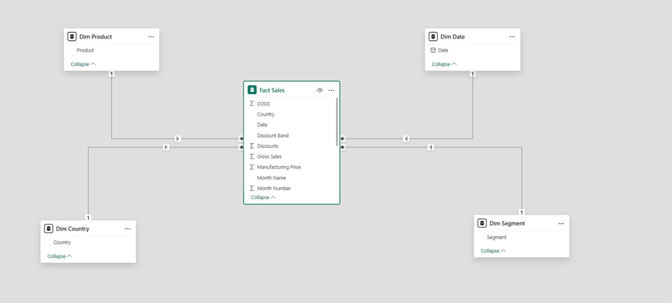
Bi-directional relationships between tables should also be avoided unless absolutely necessary. They can create circular filter paths and reduce performance, particularly as your data model grows in complexity.
Only load the columns and tables your reports actually need. Every additional column increases the size of your data model and slows down refresh times. Pay particular attention to long text columns — these consume more memory than numeric columns and should be trimmed or removed if not used in reports.
Disable the load of intermediate tables used only for merging or appending. These are needed during transformation but should not be visible in the final data model.
Review your column data types after loading data. BI tools often auto-detect types correctly, but errors are common, especially with date and time fields. Where possible, use a Date type instead of Date/Time to avoid the creation of unnecessary background calendar tables. Use numeric types instead of text where values are codes or IDs.
Data visualisation is where BI becomes visible to end users. Poor design makes accurate data hard to understand. Good design makes insights obvious at a glance. Here are the business intelligence best practices we recommend based on our experience in the data visualization consulting space:
Apply the Gestalt principles of visual design, proximity, similarity, continuity, and enclosure — to group related information and guide the eye across your dashboard. These principles are not decorative rules; they reflect how the human brain processes visual information.
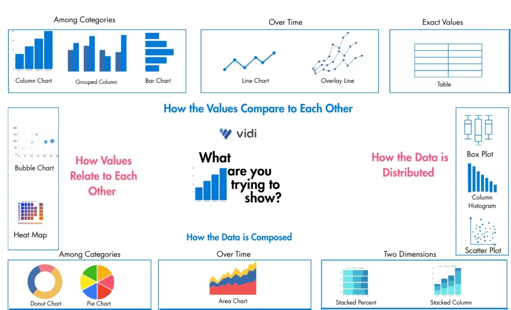
The wrong chart type obscures insight rather than communicating it. Use bar charts for comparisons, line charts for trends over time, and scatter plots for correlations. Avoid pie charts with more than four segments, they become difficult to read. Match your chart type to the question the data is answering.
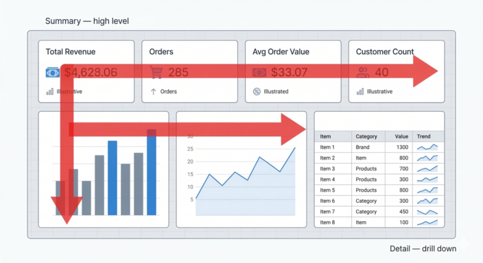
People read dashboards the same way they read a page: left to right, top to bottom. Place your most important summary metrics in the top-left of the dashboard. Move toward more detailed, drill-down data as you go right and down the page.
The top row is ideal for KPI cards that give an immediate summary. The bottom-right of the page is the right place for a detailed data table that allows users to explore individual records.
Remove any formatting element that does not serve the reader. Delete axis labels when the chart title conveys the same information. Avoid diagonal or vertical text, horizontal text is always faster to read. Turn off default gridlines and background fills unless they genuinely aid comprehension.
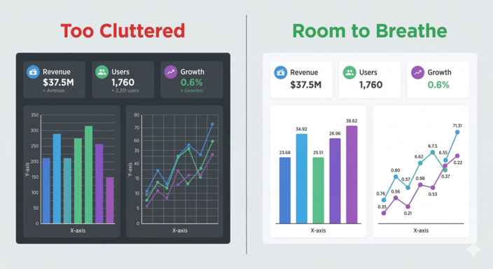
Crowded dashboards are hard to read. Leave deliberate gaps between visuals, white space gives the eye a place to rest and helps users process one piece of information before moving to the next. Avoid background colours and visual borders that reduce the sense of openness.
Use colour to communicate meaning, not just style. Green signals good performance; red signals a problem. Apply these conventions consistently through conditional formatting so users can scan for status without reading every number.
Assign a specific colour to each key metric and use it consistently across all pages of a report. This allows users to identify metrics by colour rather than by reading titles, speeding up the way they navigate and interpret the dashboard.
Security is not an optional add-on to a BI project. As dashboards become central to business operations, controlling who sees what and auditing access, becomes essential.
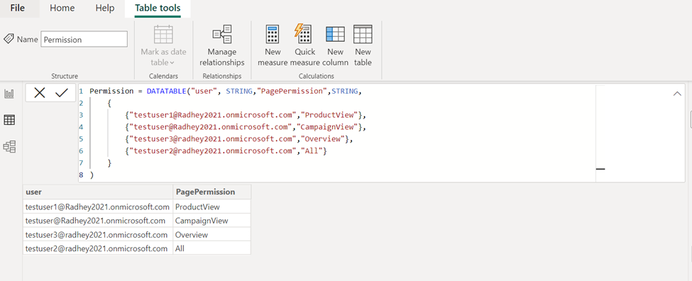
Row-level security (RLS) lets you control which data a user sees based on their role or identity. A regional sales manager sees only their region’s data. A finance director sees the full picture. RLS is available in Power BI, Tableau, and most enterprise BI platforms, and should be configured from the start of any project where data is shared across teams.
Give users only the level of access they need to do their job. In Power BI workspaces, admin and member access allows users to reshare content and modify permissions — restrict these roles carefully. Viewer access is sufficient for most report consumers and prevents accidental or intentional redistribution of sensitive assets.
In Tableau and Looker Studio, equivalent permission structures exist at the project, dashboard, and data source level. Review these settings regularly, especially when team members change roles or leave the organisation.
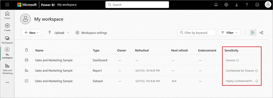
Label dashboards and datasets according to their sensitivity level — confidential, internal, or public. Sensitivity labels remind users of handling requirements before they share or download content. In Power BI, these labels can be enforced through Microsoft Purview Information Protection policies.
If your organisation handles data that cannot leave your infrastructure — due to regulatory requirements or contractual obligations, consider on-premises BI deployment options. Power BI Report Server is one such option, allowing a full BI environment to run inside your own infrastructure without data passing through the cloud. The cost is significant, so this is most appropriate for large organisations with strict data residency requirements.
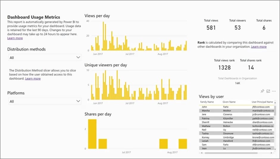
BI administrators should review access logs regularly. Most enterprise BI platforms provide system-generated reports showing which users accessed which dashboards, when, and from where. Irregular access patterns, such as a user viewing dashboards they do not normally use, can indicate a security issue worth investigating.
Business intelligence best practices are not tool-specific. Whether you are working in Power BI, Tableau, or Looker Studio, the principles that determine success are the same: define clear ROI, choose the right tool, design for your audience, automate your data pipeline, and secure your reports from the start.
If you would like to discuss how these practices apply to your organisation, our BI consultants are happy to help. Contact us to start the conversation.
![]()
![]()
![]()