
Accurate Profit and Loss dashboards are the foundation of sound financial decision-making. Yet many businesses still rely on manual exports, spreadsheets, and disconnected systems to track income, costs, and profitability.
At Vidi Corp, we provide dedicated data connectors that automatically extract data from Xero, QuickBooks Online, and Zoho Books into a secure Azure SQL Server database. This centralised database becomes the foundation for building powerful Tableau or Power BI Profit and Loss dashboards. To help you get started quickly, we also offer free P&L dashboard templates in both Tableau and Power BI.
Our dashboards are developed by ACCA-certified professionals and experienced Power BI consultants with backgrounds in financial analysis. They have been tried and tested by more than 100 CPAs worldwide, ensuring both technical reliability and accounting accuracy.
In this article, we will walk you through the Profit and Loss dashboards we offer, explain how they are built, and provide direct links so you can download and implement them in your own business.
Track some of the most common profit and loss metrics and KPI with just a few clicks.
A profit and loss dashboard is a financial analytics tool that visualises a company’s P&L statement in a clear, interactive format. It brings together core metrics such as revenue, cost of goods sold (COGS), gross profit, operating expenses, and net profit into a single central view. Instead of reviewing static spreadsheets, leadership teams can monitor financial performance in real time.
In Power BI, this type of dashboard typically displays monthly income trends, overhead breakdowns by category, and profit margins over time. Users can filter results by department, product line, location, or accounting method (cash vs accrual) to understand what is driving profitability. The goal is not just to report numbers, but to identify patterns, risks, and opportunities early.
A profit and loss dashboard automates monthly financial reporting for accountants, finance teams, and fractional CFOs. Instead of exporting data from accounting systems, cleaning it in Excel, and rebuilding the same charts every month, the dashboard refreshes automatically from the source system.
This is especially valuable for firms managing multiple clients. One of our clients reduced report preparation time by over 50% after implementing automated Power BI dashboards, freeing up their team to focus on advisory work instead of manual reporting
Automation also increases consistency. The same logic, KPIs, and calculations are applied each month, reducing the risk of formula errors and version-control issues.
Many organisations operate across multiple entities, accounts, or locations. Real estate investors often maintain one account per property. Retailers frequently manage separate accounts for each outlet. Without automation, consolidating these accounts into a single P&L view requires manual exports and reconciliations.
A P&L dashboard connects all entities into one data model and consolidates results automatically. This makes it possible to view performance by entity or as a group, with filters that switch between properties, outlets, or subsidiaries instantly.
For example, Modern Cannabis integrated Power BI with QuickBooks Online to connect multiple companies into a single dashboard. They reduced the time spent compiling financial reports across entities by over 75%, eliminated manual entry errors through automated syncing, and cut their month-end close process by several days.
A P&L dashboard should not operate in isolation. While accounting systems show financial outcomes, they rarely explain why those outcomes changed. To understand performance properly, businesses need to connect financial data with operational data.
By building dashboards in Power BI or Tableau, companies can combine accounting data with CRM, marketing, inventory, payroll, or ERP systems in a single data model. This enables analysis such as revenue by lead source, profit by customer segment, or margin by sales rep.
For example, one of our clients reduced data silos from six systems to one centralised database and cut manual data consolidation by 95% after implementing an automated reporting solution
Our P&L dashboards are designed for businesses operating across multiple companies, outlets, or properties. We extract data from multiple accounting accounts and consolidate them into a single, structured data model.
This allows you to view consolidated financials across the entire group or filter results by individual entity in seconds. Whether you manage multiple retail locations, properties, or subsidiaries, the reporting logic stays consistent and scalable.
New entities can be added without rebuilding the dashboard. The structure grows with your business.
High-level summaries are useful, but decision-making often requires detail. Our dashboards allow users to drill down from account balances directly into the underlying transactions.
You can click on revenue, COGS, or overhead categories and instantly see the invoices, bills, or journal entries driving those numbers. This makes it easy to validate figures, investigate anomalies, and answer stakeholder questions without switching systems.
Finance teams move from summary to transaction-level detail in seconds, not hours.
We use our proprietary data connectors to extract data from accounting systems and other sources into a secure database. This creates a clean, centralised reporting layer that sits between your systems and the dashboard.
Data is refreshed automatically on a schedule, daily, hourly, or near real-time, depending on your setup. This eliminates manual exports, reduces reporting delays, and ensures your P&L dashboard always reflects the latest numbers.
The result is reliable, automated financial reporting without disrupting your existing systems.
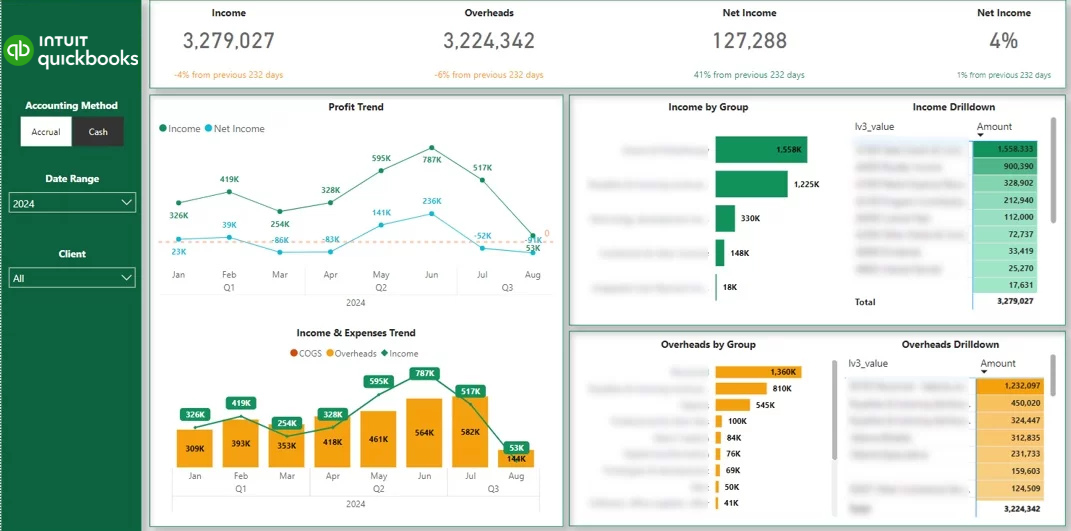
This Power BI P&L dashboard automatically pulls data from one or multiple QuickBooks Online accounts and transforms it into clear, interactive financial reporting. It visualises trends for income, gross profit, COGS, and overheads, allowing you to monitor performance over time with dynamic charts. Users can also view detailed breakdowns of income and expenses by account and drill down to the transaction level.
Common customisations include adding class filters for segmented reporting and implementing currency conversions for multi-currency environments. This ensures the dashboard aligns with the specific structure and reporting needs of your business.
At Vidi Corp, we are an Intuit-certified partner. This means our QuickBooks Power BI connector has successfully passed Intuit’s technical and data security review. Intuit has formally approved and certified our solution for distribution on their marketplace, confirming its reliability and security standards.
This dashboard is powered by the unique P&L table within our proprietary connector. This table is not available in other connectors. It breaks down account balances to the transaction level, provides daily-level data granularity, and includes a dedicated column that allows users to switch between accrual and cash accounting methods instantly.
We also provide the same P&L view in a structured table format. Categories can be expanded or collapsed using plus and minus icons for easier navigation. A percentage column displays the distribution of each category, helping users quickly understand cost structure and margin composition.
Note: In addition to the P&L dashboard, we offer a full suite of QuickBooks Online Power BI dashboards, including Balance Sheet, Cash Flow, Accounts Receivable, and Actuals vs Budget reports.
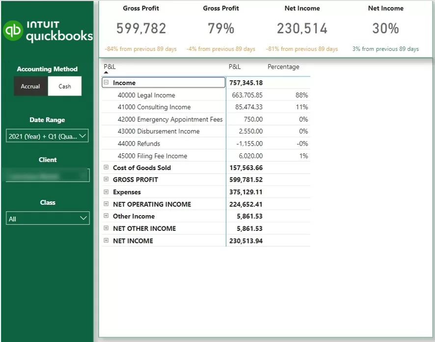
This Tableau P&L dashboard uses our dedicated Tableau QuickBooks Online connector to automatically extract and visualise your financial data. It displays interactive trend charts for income, gross profit, COGS, and overheads, helping leadership teams monitor performance over time with clarity.
Users can easily switch between visual and tabular formats by clicking the table icon. This allows you to move from high-level trend analysis to structured financial statements within seconds, depending on how you prefer to review the data.
The filters at the top of the dashboard allow you to adjust the reporting period and switch between accrual and cash accounting methods. This ensures flexibility in financial analysis and keeps reporting aligned with your accounting preferences.
Please note: we also provide additional free Tableau QuickBooks Online dashboards, including Balance Sheet, Cash Flow, and Accounts Receivable reports.
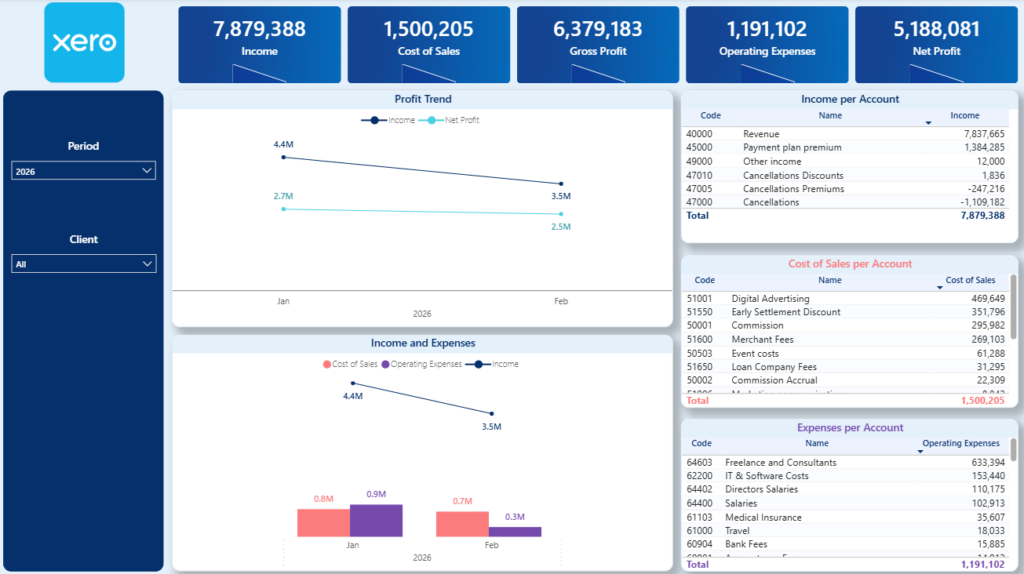
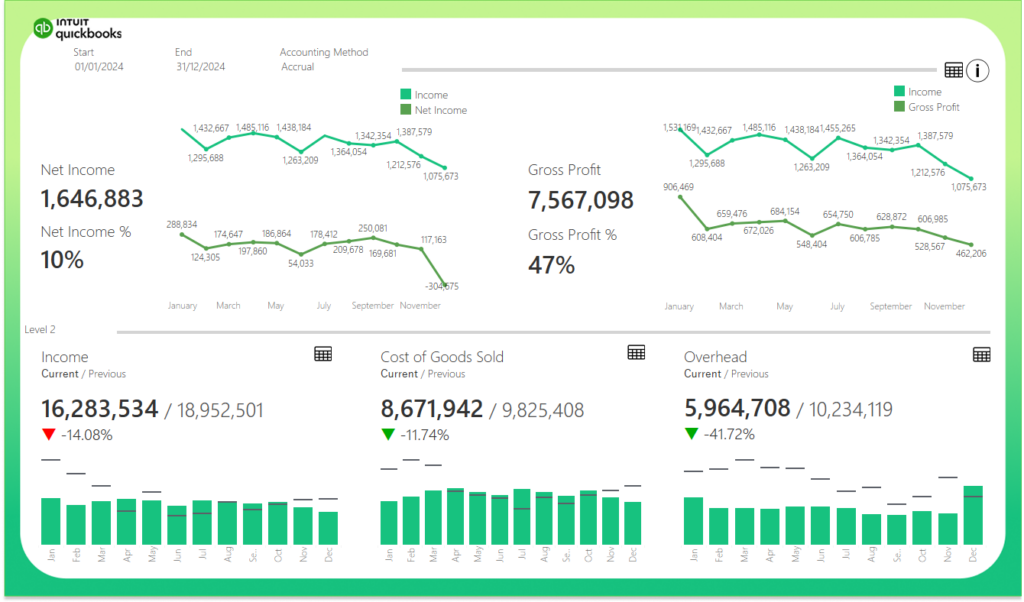
This P&L dashboard is powered by our Xero Power BI connector, which automatically extracts financial data and transforms it into interactive reporting. It tracks trends for Income, Cost of Goods Sold (COGS), Gross Profit, Operating Expenses, and Net Profit, helping you clearly understand how these core metrics evolve.
The main charts highlight monthly movements across these financial indicators, making it easy to identify revenue growth, margin compression, or rising operating costs. On the right-hand side, detailed tables break down Income, COGS, and Operating Expenses by account, allowing you to pinpoint exactly which accounts are driving performance changes.
Note: we also provide a Balance Sheet Xero Power BI dashboard in addition to the P&L dashboard
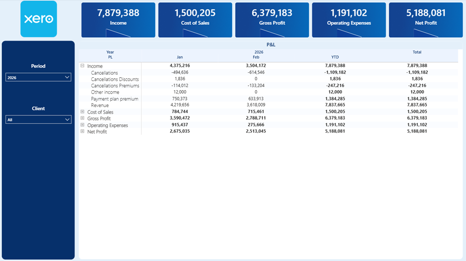
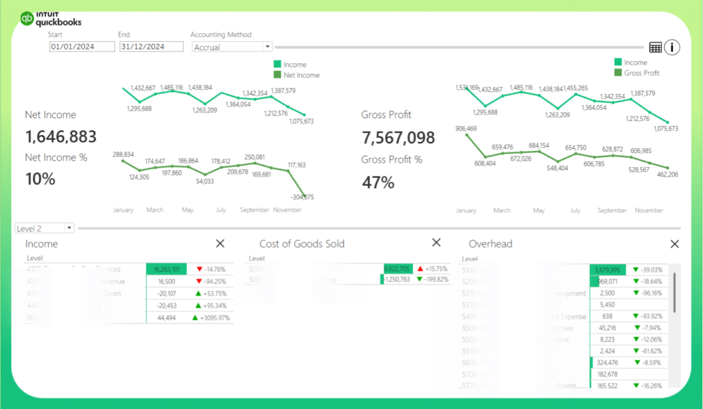
The second tab presents the full P&L statement in a structured table format. It displays results by month and includes a year-to-date view, giving you both short-term and broader performance visibility.
You can expand or collapse each primary P&L category using the plus and minus icons. This allows you to move seamlessly from a high-level summary to a detailed account-level breakdown.
Unlike QuickBooks, Xero does not provide a dedicated P&L table via its API. To build this dashboard, we use the Trial Balance table as the foundation and reconstruct the P&L structure within Power BI to ensure accurate and reliable reporting.
For some clients, we extend this dashboard to include transaction-level drill-down.
To achieve this, we combine the Trial Balance data with the Journals table to reconstruct the detailed movements behind each account. Since every Xero environment is structured slightly differently, this process requires a tailored setup to ensure that all figures reconcile accurately.
If you require transaction-level visibility, contact us and we will review your data structure and implement a customised solution that fits your setup.
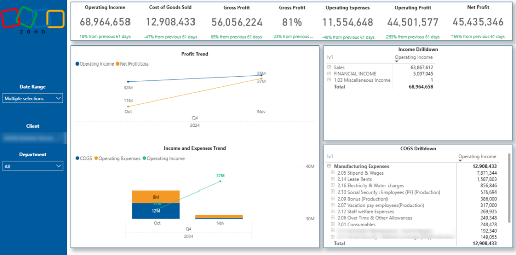
Our Zoho Books Profit & Loss dashboard is powered by our dedicated Zoho Books Power BI connector. It automatically extracts financial data and visualises the core P&L metrics, including Income, Cost of Goods Sold (COGS), Gross Profit, Operating Expenses, and Net Profit.
The dashboard allows you to filter results by client, date range, and department. This makes it easy to analyse profitability across different business units, customer segments, or reporting periods without rebuilding reports.
Zoho Books has a unique data structure, as it relies on two primary tables to calculate P&L metrics: the Chart of Accounts and the Account Transactions table. We combine and model these tables within Power BI to accurately reconstruct the full P&L statement and ensure consistent calculations.
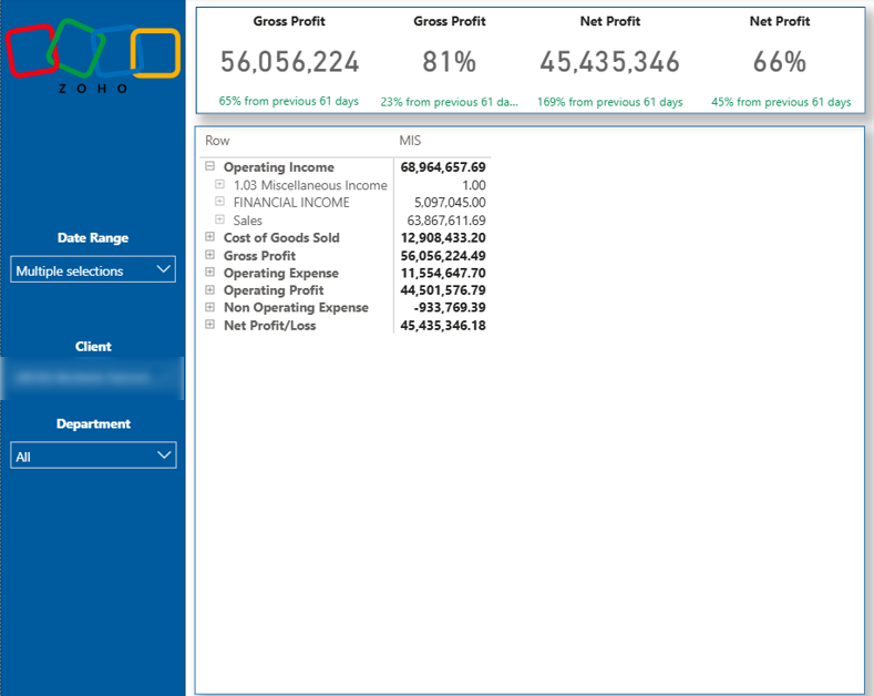
Please note that our Zoho Books Power BI dashboard also includes additional tabs such as Balance Sheet, Cash Flow, Accounts Receivable, and Overdue Invoices, providing a complete financial reporting suite beyond the P&L view.
Our BI consultants have developed 1,000+ dashboards for over 600 clients across finance, retail, manufacturing, professional services, and more. We design custom financial dashboards that connect directly to your ERP or cloud accounting system and transform raw financial data into clear, decision-ready insights.
We have extensive experience building Profit and Loss dashboards using data from NetSuite, Dynamics NAV, SAP, and other enterprise systems, as well as QuickBooks, Xero, Zoho Books, and additional cloud platforms.
If you’re looking for a tailored P&L dashboard built around your specific reporting structure, data model, and KPIs, explore more of our financial Power BI dashboards or contact us to request a custom-built dashboard.
![]()
![]()
![]()