
An OKR dashboard turns objectives and key results into a clear view of progress, helping teams stay focused on what matters most and leaders make better decisions faster.
As a Power BI consultancy we have delivered 1,000+ custom OKR dashboards across all business functions including finance, operations, sales, and marketing. Our team has built OKR and performance dashboards for organizations ranging from fast-growing startups to large enterprise companies. These solutions are powered by modern BI technologies that help teams move beyond static reporting and use data to drive continuous improvement.
In this guide, we’ll explain what an OKR dashboard is, how it differs from KPI dashboards, and the benefits of using one across your organization. You’ll see real-world OKR dashboard examples by department along with practical guidance on how to create an effective OKR dashboard and avoid common mistakes.
An OKR dashboard is a centralized view of how objectives and key results are progressing across a team or organization. OKRs—objectives and key results—are a goal-setting framework that combines clear goals with measurable outcomes. Instead of tracking progress across scattered documents, an OKR dashboard brings objectives, metrics, and status into one place for quick visibility.
At its core, an OKR dashboard makes strategy visible and actionable. Visual elements like progress bars, charts, and status indicators show what’s on track, what’s at risk, and where attention is needed. As teams update their OKRs, the dashboard reflects changes in real time, keeping priorities aligned.
An effective OKR dashboard connects daily work to company goals. Individuals can see how their efforts contribute to key results, while leaders can quickly assess progress and make informed decisions. By creating transparency and accountability, OKR dashboards help teams stay focused on what matters most.
OKRs and KPIs are closely related, but they serve different purposes—and that difference is reflected in their dashboards.
OKRs (Objectives and Key Results) are a goal-setting framework designed to drive focus, alignment, and change. An OKR dashboard shows where you’re trying to go and how close you are to getting there. It highlights objectives, their associated key results, and progress over time, helping teams understand priorities and adjust efforts as needed.
KPIs (Key Performance Indicators), on the other hand, are metrics used to measure the ongoing health and performance of a business or process. A KPI dashboard focuses on what is happening right now, tracking indicators like revenue, conversion rates, uptime, or customer retention to ensure operations stay on track.
In short, OKR dashboards are directional and strategic, while KPI dashboards are operational and diagnostic. Strategic OKRs help align company-wide objectives with tactical initiatives, ensuring that high-level goals are communicated clearly and cascaded throughout the organization. OKRs often use KPIs as inputs or signals, but the intent is different: OKRs are meant to push performance forward, while KPIs monitor and sustain performance.
OKR dashboards help steer organisations toward their strategic objectives by translating strategy into visible, measurable execution. Here are five steps showing how organisations use OKR dashboards in the industry.
By making strategy measurable and progress visible, OKR dashboards turn strategic objectives into ongoing, data-driven decisions rather than static plans.
OKR dashboards can look very different depending on the team and the outcomes they support. While the structure of OKRs stays the same, the metrics, visualizations, and focus areas vary across departments.
We recommend building custom OKR dashboards because goal-setting looks different in every organization. Teams define objectives, measure success, and review progress in ways that reflect their strategy, structure, and culture. One-size-fits-all dashboards rarely capture what truly matters, while a custom OKR dashboard ensures goals, metrics, and reporting are aligned with how your business actually operates and makes decisions.
Below are examples of OKR dashboards grouped by function such as execution, finance, operations, sales, and marketing. Each example shows how teams can translate objectives and key results into dashboards that make progress visible.
Project OKR dashboard showcasing task progress, team performance, and time allocation visualizations.
Our data visualisation experts created Project Execution OKR dashboard that connects project objectives with day-to-day execution. It provides a clear view of task creation, completion, and effort distribution, helping teams stay aligned on project goals while enabling managers to monitor progress and performance in real time.
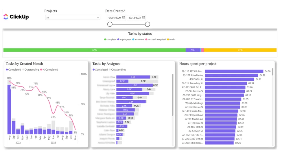
Objectives are defined around successful project execution, such as delivering on time, maintaining consistent productivity, and ensuring balanced workloads across the team. By tying these objectives directly to task activity, the dashboard helps teams understand how operational work contributes to broader OKRs.
Key results are measured through the number of completed and outstanding tasks per month, supported by a trend line that highlights the task completion rate over time. This makes it easy to evaluate whether progress is accelerating or slowing and allows project managers to identify risks early and take corrective action.
By comparing task completion and activity across team members, the dashboard enables managers to assess overall team progress and identify individuals who may be falling behind or not logging activity consistently. Tracking contributing key results from each team member ensures that all efforts supporting strategic objectives are visible and measurable.
Employee OKR dashboard showcasing individual task status, blocked work, and project-level visibility.
Our data analysts created Employee Task Status OKR dashboard that helps project managers and team leads analyze progress at the individual contributor level. By using a filter to select a specific employee, managers can instantly see how that person’s tasks are distributed across different statuses, making it easier to identify blockers and workload issues before they impact delivery.
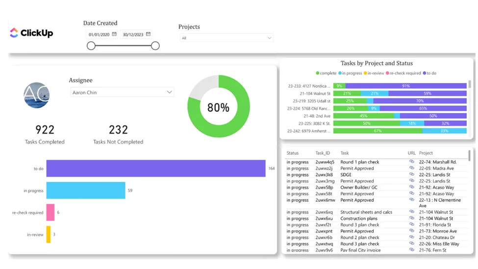
Objectives focus on maintaining steady individual progress, reducing blocked work, and ensuring consistent contribution across projects. By aligning personal task execution with team and project objectives, the dashboard reinforces accountability and clarity around individual OKRs.
Key results are tracked through task status breakdowns, highlighting how many tasks are active, completed, or blocked for each employee. A dedicated filter for blocked tasks allows managers to quickly identify obstacles and take action, keeping work moving and preventing delays from cascading across the project.
By analyzing task statuses and blocked work for each employee, the dashboard enables managers to quickly understand where progress is slowing down and why. This visibility makes it easier to spot recurring blockers, uneven workloads, or lack of activity, supporting timely interventions and more productive, data-driven conversations with team members. Over time, these insights help improve execution consistency and ensure individual contributions stay aligned with project and team OKRs.
Finance OKR dashboard showcasing revenue performance, profitability, and progress toward financial targets.
Our Power BI consultants have previously created a finance OKR dashboard that combines sales activity, revenue, and margin data into a single financial view used by finance and commercial leaders to track progress toward revenue and profitability objectives. By consolidating sales and financial metrics, the dashboard helps teams understand not just how much is being sold, but how sales performance impacts overall financial results.
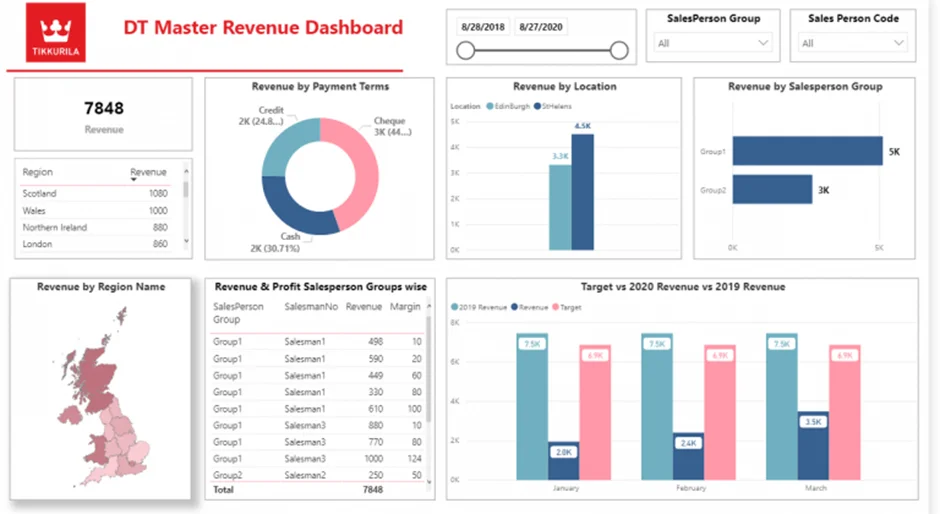
This dashboard shows the company key objectives like achieving revenue targets, maintaining healthy profit margins, and improving financial predictability. By aligning sales-driven metrics with financial outcomes, the dashboard supports more informed planning and performance management.
Key results are measured through revenue versus target, profit and margin performance, and revenue distribution across regions, salespeople, and payment terms. These views provide early signals of financial risk or opportunity, allowing finance teams to act before targets are missed.
By surfacing revenue and margin gaps early, the dashboard enables finance teams to partner more effectively with sales, adjust forecasts, and refine financial plans. Used in weekly reviews and longer-term forecasting, it supports more accurate financial OKRs and more predictable business performance.
Accounting OKR dashboard showcasing budget vs actual performance, forecasts, and financial planning toward targets.
Our BI specialists developed accounting OKR dashboard that helps finance teams and leadership track not only whether financial targets are being met, but also how the organization plans to achieve them over time. By comparing actual sales and expenses against budgeted targets and forward-looking forecasts, the dashboard makes financial OKRs visible, actionable, and measurable throughout the period.
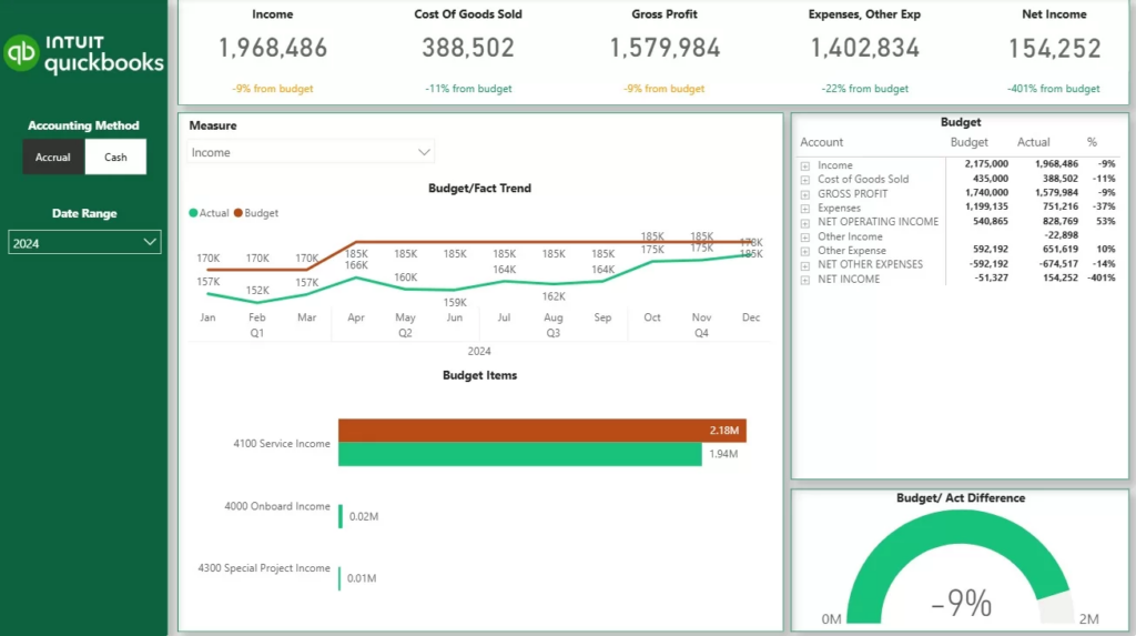
This dashboard visualises company objectives such as achieving revenue and cost targets while maintaining predictable financial performance. By breaking annual or quarterly targets into monthly plans and financial categories, the dashboard aligns long-term financial goals with short-term execution.
Key results are measured through graphs like actual vs. budget performance by month and general ledger category. These views show whether the company is progressing toward its financial objectives as planned or if adjustments are needed to stay on track.
By visualizing both performance and planned paths to targets, the dashboard enables finance teams to course-correct early, refine forecasts, and align spending and revenue activities with financial OKRs—turning budgeting into an active execution tool rather than a static plan.
OKR Leadership dashboard showcases strategic performance, trends, and progress toward top-level targets.
We have built a custom Pharma OKR dashboard for a client that updates them on sales performance of the new drug that they launched. The
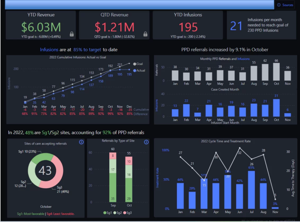
The main business objective that is measured through this dashboard is rolling out the new drug on the market and achieving the sales target. The client used this dashboard weekly performance reviews to check performance and take corrective action.
Key results are measured through YTD and QTD revenue, total infusions, and performance versus predefined targets. Trend analysis of infusions and referrals over time highlights momentum, patterns, and potential anomalies, helping leaders understand whether performance is improving or deviating from expectations.
By combining KPI summaries, trend analysis, comparative views, and target tracking, the dashboard enables executives to quickly assess organizational health and identify areas requiring attention. This visibility supports proactive decision-making and ensures leadership OKRs remain measurable, actionable, and aligned across the business.
Sales OKR dashboard showcasing call performance, opportunity creation, and progress toward targets.
Our data visualisation specialists built Sales Activity OKR dashboard that helps sales leaders and managers track how effectively individual reps and the wider sales organization are progressing toward activity and revenue objectives. By comparing actual performance against clear targets, the dashboard makes it easy to spot gaps early and support reps who need attention.
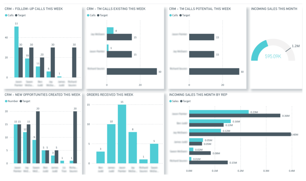
The main objectives measured on this dashboard were achieving a predictable level of sales activity and consistently hitting revenue targets. By aligning individual rep performance with organizational goals, the dashboard ensures that daily sales actions directly contribute to broader sales OKRs.
Key results are measured through the number of calls made versus target, created opportunities by sales rep, and won opportunities by sales rep. An aggregated view of progress toward target across the entire sales organization helps leaders understand whether overall performance is on track.
By breaking down performance at both the individual and organizational level, the dashboard supports focused coaching, fair performance evaluation, and data-driven adjustments that help teams consistently improve sales execution and achieve their OKRs. A team leader can use the dashboard to oversee data accuracy, ensure integrity in manual inputs, and provide timely support to sales reps who need guidance.
OKR dashboards turn goal-setting into a living, visible system. Instead of goals getting lost in documents or weekly updates, dashboards make progress easy to track, understand, and act on.
An effective OKR dashboard is less about design and more about clarity. A good dashboard makes objectives visible, tracks progress through measurable results, and supports regular review and decision-making. Here’s how to build one step by step.
Start by identifying the specific objectives you want to track. These should reflect what success looks like for a team or department over a specific time period. Well-defined objectives are outcome-focused, easy to understand, and clearly aligned with broader company goals. Be careful not to set too many objectives, as this can dilute focus and reduce the effectiveness of your OKR dashboard. If an objective doesn’t guide decision-making, it doesn’t belong on the dashboard.
For each objective, define a small set of key results that show progress toward achieving it. Key results should be specific, measurable, and time-bound. These are the metrics your dashboard will ultimately visualize, so focus on outcomes rather than activities wherever possible.
Select metrics that directly reflect your key results. Depending on the objective, this might include performance metrics, financial data, operational indicators, or conversion rates. A strong OKR dashboard often combines leading indicators (signals of future performance) with lagging indicators (results already achieved) to provide a balanced view.
To keep the dashboard useful and up to date, connect it to the systems where data already lives, such as project management tools, CRM platforms, finance systems, or analytics tools. Automated data updates reduce manual effort and ensure the dashboard reflects current progress.
Using pre-built data connectors makes this process significantly easier. Teams can sync data in real time and focus on reviewing outcomes rather than maintaining dashboards.
While it’s possible to build basic OKR dashboards in Google Sheets, this approach has limitations for tracking OKRs, especially for larger teams or long-term use. Google Sheets can lack real-time data updates, advanced customization, and seamless team collaboration. For more robust needs, dedicated OKR management tools are recommended.
An OKR dashboard should be easy to understand at a glance. Group metrics by objective, use simple visualizations to show progress, and avoid overcrowding the dashboard with unnecessary details. The goal is to highlight what’s on track, what’s at risk, and where attention is needed. Consider creating your own dashboard by customizing views and combining data sources, using widgets or drag-and-drop features to tailor the dashboard to your team’s needs.
Make the dashboard visible to the teams responsible for the OKRs and use it as part of regular check-ins. Reviewing OKRs weekly or biweekly helps teams spot issues early, adjust priorities, and keep objectives top of mind. Using a dashboard to track OKRs can save hours compared to manual tracking and reporting. An OKR dashboard is most valuable when it supports ongoing conversations, not just reporting.
OKR dashboards help teams turn goals into visible, measurable progress. By connecting objectives with real-time data, they make it easier to stay aligned, spot risks early, and focus on what matters most.
A key lesson learned from implementing OKR dashboards is that regular reflection and adaptation drive continuous improvement. These dashboards benefit the entire company by fostering real-time collaboration and strategic alignment across all departments. They also play a crucial role in tracking strategic goals, ensuring everyone is moving in the same direction.
If you want to build or improve an OKR dashboard that supports real execution not just reporting, we can help. Contact us to discuss how we can design an OKR dashboard tailored to your teams and goals!
![]()
![]()
![]()