
In the oil and gas industry, business intelligence directly impacts profitability, safety, and investment risk. Downtime on producing assets can cost millions in lost output, faulty equipment puts people and the environment at risk, and acquisitions or new wells require decisions backed by reliable data. This is why oil and gas business intelligence is essential for companies operating in high-cost, high-risk environments.
At Vidi Corp, we have delivered oil and gas business intelligence solutions for multinational operators, oilfield inspectors, and acquisition advisors. In this article, we share practical, real-world use cases and case studies from our projects, showing how BI supports safer operations, reduced downtime, and better investment decisions.
We will not go into detail about generic HR, financial, and marketing analytics for oil and gas firms. Instead, we will cover analysis that is specific to the oil and gas industry, aimed at operations teams and leadership.
In our work delivering oil and gas business intelligence solutions, we’ve seen the greatest value when analytics is tightly integrated with real operational and financial decisions. The use cases below reflect practical oil and gas business intelligence projects we’ve implemented with teams across operations, planning, and management.
Power BI is the most suitable business intelligence tool for oil and gas based on our experience in business intelligence consulting. It handles large, complex datasets well and connects easily to the systems oil and gas companies already use, including ERPs, operational databases, SCADA-related data, and Excel-based reporting.
It supports both viewing dashboards on both desktops and mobile app which is important since oil and gas operations teams often travel for work. Field and operations teams can track production, downtime, and efficiency, while leadership gets clear, high-level visibility into costs, margins, and asset performance. Strong security, scalability, and seamless fit with the Microsoft ecosystem make Power BI easy to adopt and reliable across upstream, midstream, and downstream reporting.
Our Power BI Consultants worked with an oilfield inspection services company supporting operators such as Schlumberger. They deliver asset inspections, maintenance, pressure testing, and calibrations across three countries, with each entity storing data separately. This fragmentation made it difficult to maintain consistent visibility over equipment.
To operate safely and efficiently, they needed clear insight into calibration status, real-time equipment location, job allocation, availability via status codes, and overall equipment condition. Without this visibility, critical assets could be misused, unavailable, or non-compliant.
This analysis was essential because the company managed over 500 pieces of equipment, some valued at up to £80,000. If a defect or expired calibration is discovered, inspections may be deemed invalid, forcing costly reinspection and risking client trust. Centralised oil and gas business intelligence was required to reduce operational risk and protect revenue.
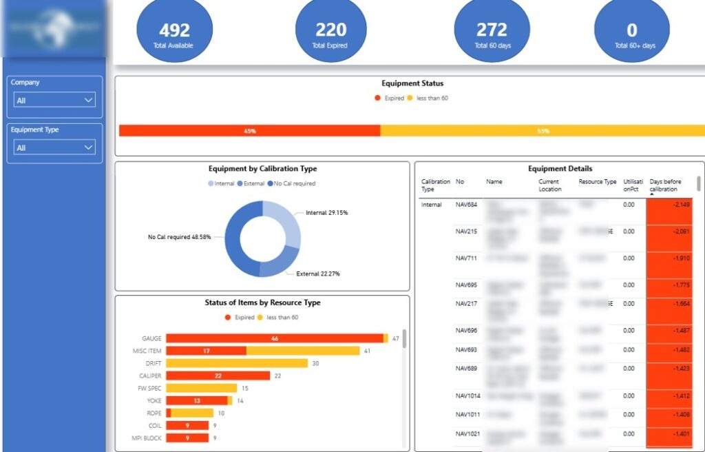
We built a Power BI oil and gas dashboard to give the client a single, reliable view of equipment status across all countries. The master page highlights equipment with expired calibrations and items due for maintenance in the next 60 days, reducing the risk of non-compliant assets being deployed on jobs.
This analysis is broken down by equipment type, such as gauges and calipers, which helps operations teams prioritise high-risk or high-usage assets. As a result, maintenance planning becomes proactive instead of reactive, lowering the chance of inspection failures and costly rework.
The dashboard also shows how many assets require calibration and whether this can be done internally or must be outsourced. This visibility helps oil and gas companies control calibration costs, shorten turnaround times, and avoid unnecessary external servicing.
Finally, a detailed table ranks individual equipment pieces, starting with those already expired. This allows teams to act immediately on the most critical assets, protecting client trust and ensuring inspections are completed with compliant, reliable equipment.
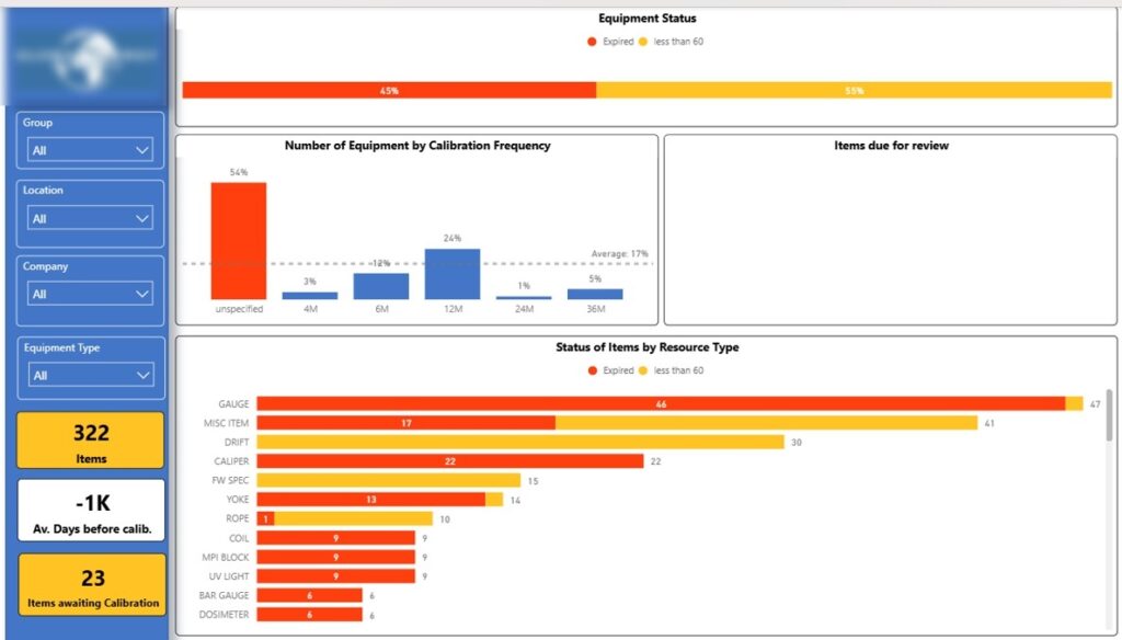
The next page of the Power BI oil and gas dashboard analyzes calibration status in more detail. It shows how many equipment pieces fall under each calibration frequency, helping teams understand which assets require the most frequent attention.
This view allows oil and gas companies to plan calibration workloads more accurately and avoid bottlenecks around high-frequency items. By aligning maintenance schedules with actual calibration requirements, teams reduce downtime and last-minute compliance issues.
The breakdown by equipment type and individual item status makes it easy to spot recurring risks. This helps operations teams intervene early, ensuring critical equipment is always compliant before it is deployed on client jobs.
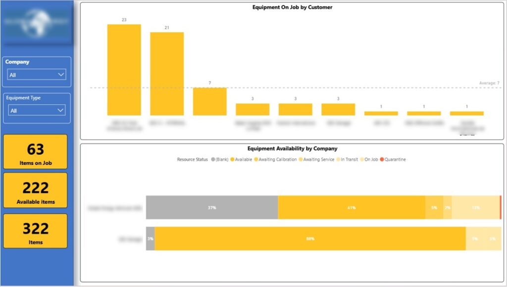
The next page of the Power BI oil and gas dashboard shows how many equipment pieces are currently on-site with each customer. This gives immediate visibility into where assets are deployed and reduces the risk of losing track of high-value equipment.
This analysis helps oil and gas companies understand client dependency and exposure. If a customer holds a large share of equipment, teams can proactively manage returns, swaps, or redeployment to avoid shortages elsewhere.
The bottom chart shows equipment availability by country, reflecting the client’s operating structure. This allows managers to rebalance assets between regions, minimise idle equipment, and ensure each local operation has sufficient tools to deliver services without delays.
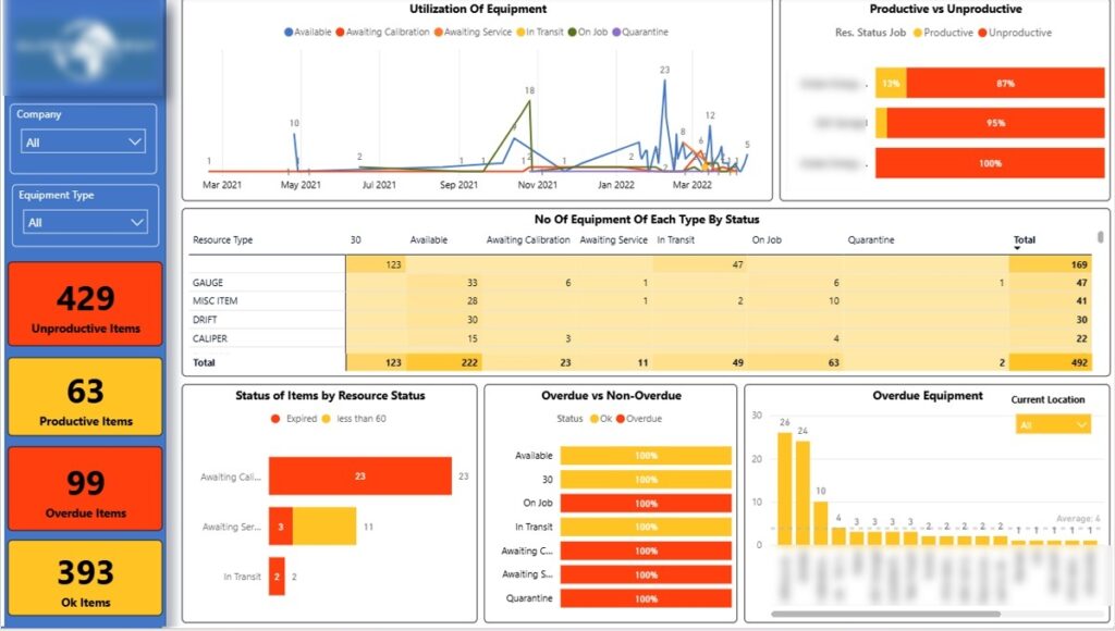
The final page of the Power BI oil and gas dashboard analyzes equipment status, such as available, on-job, awaiting calibration, and in transit. Tracking these statuses over time helps oil and gas companies understand how much equipment is productive versus idle, improving asset utilisation.
By separating on-job equipment from unproductive assets, operations teams can identify inefficiencies and redeploy equipment where it delivers value. This reduces unnecessary capital spend and ensures high-value tools are actively supporting revenue-generating work.
The dashboard also highlights the location of overdue equipment so it can be recalibrated quickly. In one case, this analysis revealed 2 overdue items actively used on a job, allowing the team to replace them immediately and avoid delays, compliance risks, and costly rework.
Our Tableau consultants built an oil and gas dashboard for a consultancy that advises oilfield developers on asset acquisitions. Their work includes asset assessment, valuation, negotiation support, and technical due diligence, all of which depend on accurate production forecasts.
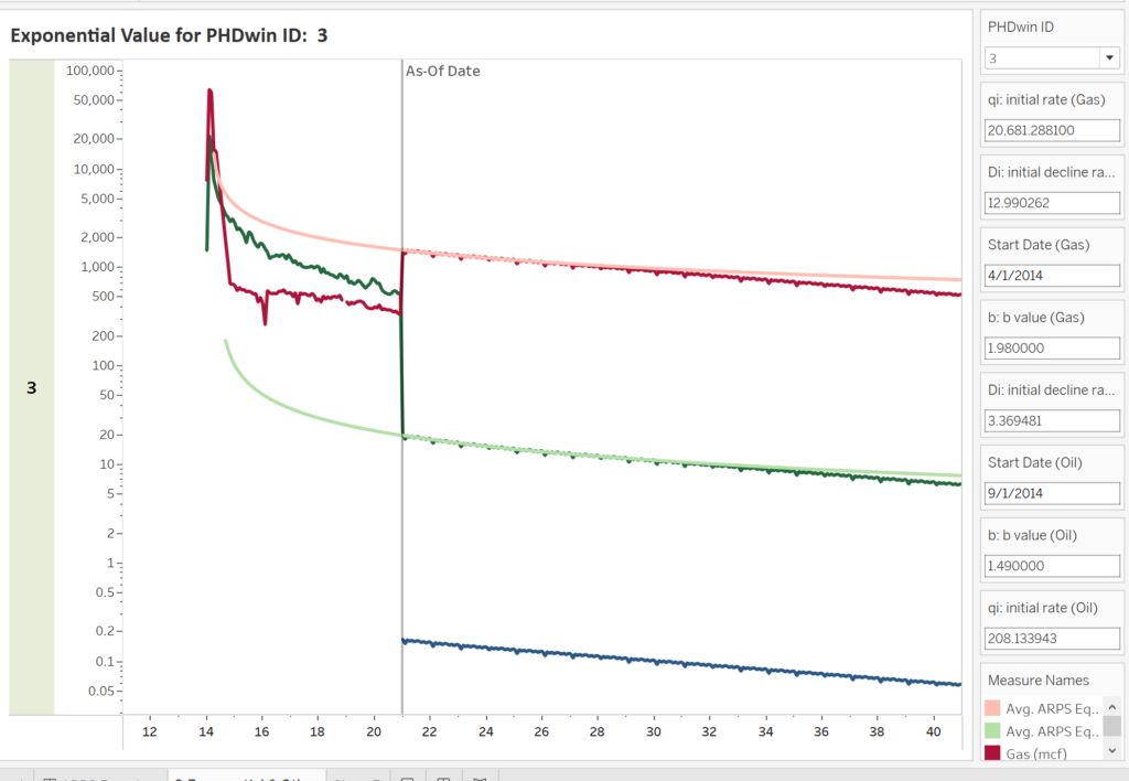
A core part of the analysis was estimating future oil and gas production using Arps decline curves. This model shows how production is expected to decline over time, giving a realistic view of an asset’s remaining productive life and revenue potential.
By visualising these forecasts in Tableau, oil and gas companies can compare assets on a like-for-like basis and test different scenarios. This helps decision-makers assess risk, avoid overpaying for declining fields, and make more confident, data-driven acquisition decisions.
Team utilisation is a major driver of project profitability in the oil and gas industry. We worked with a multinational oil and gas development company running projects across multiple countries, where limited visibility into effort allocation made cost control challenging.
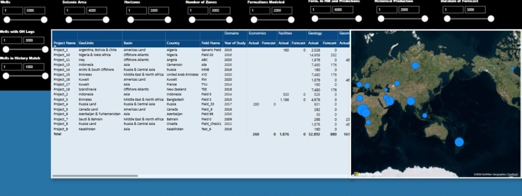
We built executive-level Power BI dashboards comparing forecasted versus actual hours across projects. Hours were broken down by technical domain, such as geology, petrophysics, and reservoir engineering, allowing management to see where effort was exceeding plan and eroding margins.
The dashboards also analysed total hours by country, giving leadership a clear view of where resources were concentrated globally. This insight helps oil and gas companies rebalance workloads, improve forecasting accuracy, and protect project profitability before overruns become irreversible.
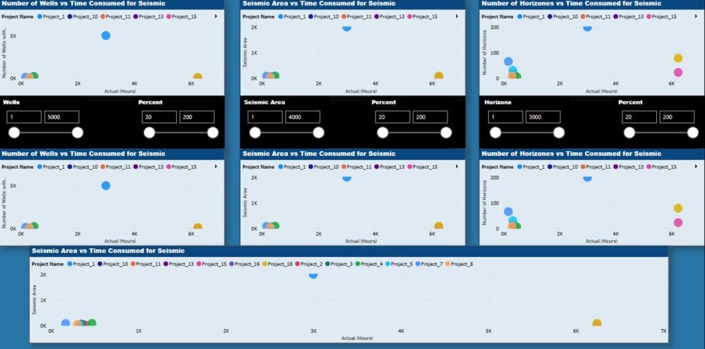
We extended the same Power BI oil and gas dashboard with scatterplot analysis to compare project complexity against effort. The left column shows the number of wells versus total working hours per project, highlighting how effort scales with field size.
The centre column analyses seismic area against total hours for each project. This helps oil and gas companies see whether seismic interpretation effort is proportionate to data volume or if certain projects are consuming excessive resources.
On the right, the number of horizons is plotted against total hours to capture geological complexity.
Together, these views make outliers immediately visible, allowing management to question assumptions, correct underestimation, and prevent inefficient projects from quietly eroding profitability.
Oil and gas companies often need clear visibility into team profitability to protect margins on complex projects. We worked with the same multinational oilfield development company to analyse profitability at team, department, and individual level across geology, petrophysics, and geophysics.
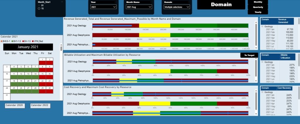
We built a Power BI dashboard tracking revenue generated, billable utilisation (hours booked vs planned hours), and cost recovery (team/individual revenue vs cost) on a monthly, quarterly, and annual basis. This allows management to see whether teams are converting planned effort into billable revenue and recovering their full cost.
Central bullet charts compare actual performance against best-case targets, making underperformance immediately visible. This helps leaders intervene early with staffing, pricing, or scope adjustments before profitability deteriorates.
Detailed tables show results by month, supporting trend analysis and forecasting. A calendar view highlights daily utilisation issues, clearly flagging underutilisation, healthy workload, and overwork, enabling oil and gas leaders to balance capacity, avoid burnout, and maximise billable output.
We added a calendar view to show billable utilisation by day, giving management a clear and intuitive way to spot workload issues. Each day is colour-coded to show how actual hours compare to planned capacity.
Days marked in orange indicate utilisation below 1, meaning the team worked fewer hours than planned and revenue capacity was underused. Green days show healthy utilisation, where teams worked up to 1.5× planned hours and delivered strong billable output. Red days highlight excessive workload above 1.5× plan, signalling delivery risk, inefficiency, or potential burnout, allowing oil and gas leaders to rebalance work before profitability or quality is impacted.
Oil and gas business intelligence turns complex operational, technical, and financial data into clear insights that directly protect profitability, compliance, and decision-making. As these case studies show, the right dashboards help oil and gas companies reduce risk, improve asset and team utilisation, and make better investment and delivery decisions.
If you want to apply the same approach to your organisation, contact us. We help oil and gas companies design practical BI solutions in Power BI and Tableau that deliver measurable impact from day one.
![]()
![]()
![]()