An enterprise dashboard is a centralized reporting framework that brings together key performance indicators from across an organization into one structured, visual environment. It connects data from systems such as ERP, CRM, HR, finance, marketing, and operations, turning fragmented information into clear, decision-ready insight. Instead of relying on disconnected reports, leaders gain a consistent view of performance that supports strategic planning, operational control, and accountability across business functions.
As a business intelligence consulting company, we have delivered 1,000+ enterprise dashboard solutions across sales, supply chain, HR, finance, risk, compliance, marketing, and executive leadership teams. This includes consolidating data from multiple systems, designing scalable data models, and building dashboards that reflect how organizations actually measure and manage performance.
This article explains what an enterprise dashboard is, why enterprise analytics dashboards matter, and how they support decision-making across key business functions. It also covers real-world enterprise dashboard examples, the enterprise dashboard design process, the main benefits organizations can expect, and the leading software platforms used to build scalable enterprise reporting solutions.
An enterprise dashboard is a centralized, visual reporting tool that aggregates, monitors, and displays key performance indicators (KPIs) and real-time data from multiple systems across an organization. It provides executives and managers with a high-level, at-a-glance overview of business performance, enabling faster and more informed decision-making.
Enterprise dashboards consolidate data from multiple sources such as ERP systems, CRM platforms, HR software, marketing tools, and financial databases into a single interface. By transforming complex datasets into clear visualizations, they allow organizations to track trends, monitor strategic objectives, and identify performance gaps across different business functions.
An enterprise analytics dashboard serves as a centralized decision-support system that improves transparency, aligns teams around measurable objectives, and enables data-driven management at scale.
Key Performance Indicators (KPIs) are the foundation of any enterprise dashboard. They define what the organization measures, how success is evaluated, and how performance aligns with strategic goals. Without clearly defined KPIs, even the most advanced dashboard will not support effective decision-making.
Enterprise dashboard KPIs should be measurable, actionable, and aligned with business objectives. They must also be standardized across departments to ensure consistency and trust in reporting. The focus should be on the metrics that directly influence outcomes, rather than displaying excessive data.
At the executive level, KPIs typically include revenue growth, profitability, cash flow, customer acquisition, and risk exposure. At the functional level, KPIs vary by area. For example, sales teams track pipeline value and win rates, supply chain teams monitor inventory turnover and fulfillment rates, HR tracks retention and hiring trends, and marketing measures traffic and conversions.
A well-designed enterprise dashboard combines both leading and lagging indicators, allowing organizations not only to measure past performance but also to anticipate future trends. When KPIs are clearly defined and aligned with strategy, the dashboard becomes a reliable tool for transparency, accountability, and performance management at scale.
Enterprise analytics dashboards provide organizations with centralized visibility into performance across key business functions. By consolidating data from multiple systems into a single interface, they enable leaders to make informed, data-driven decisions quickly and confidently. Instead of relying on static reports or fragmented spreadsheets, decision-makers gain immediate access to accurate and actionable insights.
One of the primary benefits of enterprise analytics dashboards is improved operational efficiency. Automated data integration and reporting reduce manual work, minimize errors, and free up valuable time for analysis and strategic planning. Teams can focus on interpreting insights and optimizing performance rather than gathering and reconciling data from different sources.
Enterprise dashboards also enhance cross-functional alignment by standardizing key performance indicators across departments. When sales, finance, HR, and operations teams are aligned around consistent metrics, collaboration improves and organizational goals become clearer. This transparency promotes accountability, as performance targets and progress are visible across the enterprise.
Another major advantage is real-time performance monitoring. With automated refresh capabilities, organizations can detect issues early, respond to risks proactively, and adjust strategies based on current data rather than historical reports. This agility supports faster reaction times in dynamic business environments.
Finally, enterprise analytics dashboards strengthen governance and scalability. They are designed to handle large datasets, complex organizational structures, and role-based access controls. By serving as a single source of truth, they ensure consistency, security, and reliability in enterprise reporting while supporting long-term strategic growth.
Below are examples of enterprise dashboards across key business functions, including sales, supply chain, HR, risk, compliance, and operations.
Our Power BI specialists developed an Enterprise Strategic Growth Dashboard that provides a consolidated view of turnover performance across the company’s product portfolio, with a strong focus on year-over-year (YoY) growth. It brings together product, supplier, and regional performance metrics into a single executive-level interface, allowing decision-makers to monitor overall revenue trends and performance distribution at a glance.
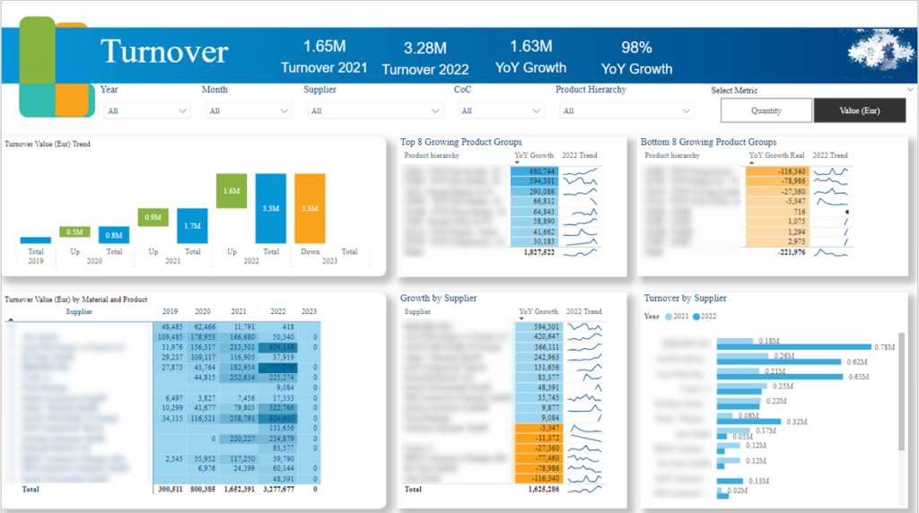
This dashboard enables detailed analysis of YoY growth across multiple business dimensions. It highlights the top 8 and bottom 8 products based on YoY growth, helping identify high-performing products that drive revenue expansion as well as underperforming ones that may require corrective action.
In addition, the dashboard breaks down YoY growth by supplier, offering insights into supplier contribution and performance consistency. Regional YoY growth analysis further supports understanding of geographic performance variations, revealing growth opportunities and areas of stagnation.
Enterprises use this dashboard as a strategic performance management tool. Leadership teams leverage it during executive reviews to prioritize discussions around product portfolio optimization. Procurement and supply chain teams use supplier-level insights to manage relationships and negotiate partnerships more effectively. Regional managers rely on geographic growth data to adjust market strategies, allocate resources, and refine expansion plans.
Our Enterprise Project Management Dashboard provides a comprehensive overview of project execution and workforce utilization across the organization. It tracks total and average work hours per assignee on both a monthly and daily basis, delivering clear visibility into team capacity, workload distribution, and overall project engagement.

This dashboard enables enterprises to evaluate how effectively their human resources are allocated across projects and workspaces. By analyzing total and average hours worked per individual, managers can identify workload trends and capacity gaps. It highlights team members who may be overworked and at risk of burnout, as well as those who are underutilized and able to take on additional responsibilities.
By comparing historical and current time allocation data, the dashboard also uncovers fluctuations in engagement levels, helping leaders understand shifts caused by project phases, priority changes, or operational inefficiencies.
Enterprises use this dashboard to strengthen project oversight and workforce planning. Project managers rely on it to balance workloads, redistribute tasks, and maintain steady progress across initiatives. Operations and HR leaders use the insights to monitor team performance, ensure sustainable productivity, and support strategic resource planning.
Regular review of utilization metrics allows organizations to make proactive staffing adjustments and improve cross-team coordination.
Our BI expert built this Enterprise Sales Dashboard that provides a strategic overview of revenue generation and pipeline value across the organization. It focuses on key sales metrics, enabling leadership to monitor business growth, evaluate revenue sources, and understand performance across markets and acquisition channels. The dashboard integrates directly with Salesforce, allowing users to move seamlessly from insights to execution.
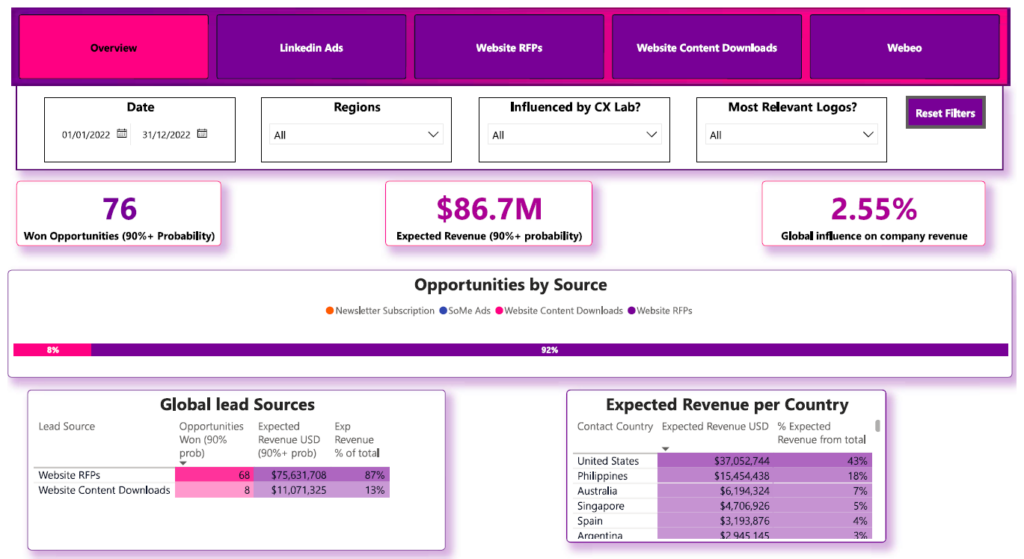
At the top of the overview page, the dashboard highlights won opportunities, total expected revenue, and the percentage of expected revenue generated from marketing data sources. This allows decision-makers to assess both closed performance and projected revenue while measuring marketing’s contribution to sales outcomes.
The dashboard also breaks down opportunities and expected revenue by lead source and customer country. This provides deeper insight into which acquisition channels are driving pipeline growth and which geographic markets are contributing most significantly to revenue performance.
Enterprises use this dashboard during sales and revenue review meetings to track performance against targets and refine growth strategies. Sales leaders evaluate pipeline strength and conversion outcomes, while marketing teams analyze the effectiveness of different lead sources. Regional managers leverage geographic revenue insights to optimize local sales strategies and resource allocation.
Our data visualization experts developed the Enterprise Supply Chain Dashboard that provides real-time visibility into operations and inbound logistics performance. It serves as an operational health check, enabling organizations to monitor how efficiently deliveries are received, stored, and processed within warehouse facilities.
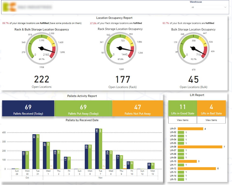
This dashboard enables enterprises to analyze warehouse capacity utilization across different storage methods, such as rack and bulk systems. It highlights how many storage locations are occupied versus available, helping teams assess space efficiency and prevent capacity constraints.
It also tracks daily inbound pallets and evaluates how many have been successfully put away into storage locations versus those still pending placement. This allows managers to identify delays in the put-away process and prioritize outstanding pallets to maintain operational flow.
Enterprises use this dashboard to oversee daily warehouse operations and maintain full visibility over delivery intake and storage allocation. Warehouse and supply chain managers rely on it to identify bottlenecks, prioritize pending pallets, and ensure storage capacity is used efficiently. It also supports better coordination between teams by highlighting where action is required.
The Enterprise HR Dashboard provides a comprehensive overview of workforce dynamics, enabling organizations to monitor headcount changes, employee movements, and workforce composition in a single, centralized view. It delivers both high-level metrics and detailed breakdowns to support strategic workforce planning and talent management.
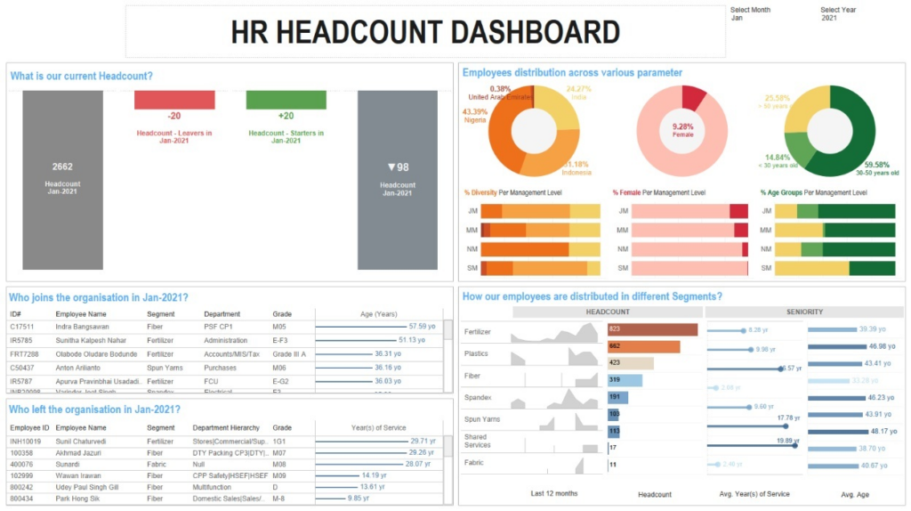
This dashboard allows enterprises to monitor monthly headcount changes, including opening headcount, resignations, new joiners, and closing headcount. It allows HR teams to track exactly who joined or left during a given period, improving visibility into workforce movements.
It also allows organizations to assess workforce diversity by breaking down headcount by age, gender, and nationality. In addition, it allows leaders to analyze headcount distribution by department, evaluate hiring trends over the past 12 months, and measure average tenure and age per department to identify retention patterns and potential workforce risks.
Enterprises use this dashboard to support strategic workforce planning and talent management decisions. HR leaders use it to monitor retention and hiring performance, track diversity metrics, and align recruitment strategies with organizational goals.
Department managers use it to understand team stability, evaluate tenure trends, and plan future hiring needs. Executives rely on the dashboard for high-level workforce insights that inform long-term growth and succession planning strategies.
Our Enterprise SEO Dashboard provides a comprehensive view of organic search performance and visitor behavior. Built using Google Analytics 4 data filtered specifically for Organic Search traffic (such as Google and Bing), the dashboard enables organizations to measure how users from search engines engage with their website. It can also incorporate traffic from AI chatbots, even though this traffic is currently categorized under Referral in GA4.

This dashboard allows enterprises to track key SEO performance metrics, including number of visitors, sessions, conversions, bounce rate, and time on page. It enables marketing teams to understand what users do after landing on the website from organic search and evaluate engagement quality.
The dashboard also provides analysis of performance trends by comparing metrics for the current month, previous month, and year to date. Additionally, it identifies top landing pages by sessions and highlights pages with high bounce rates, helping teams pinpoint optimization opportunities.
Enterprises use this dashboard to monitor the effectiveness of their SEO strategy and measure the business impact of organic traffic. Marketing teams rely on it to assess content performance, improve landing page optimization, and refine keyword strategies.
An Enterprise Risk Management (ERM) Dashboard is a centralized reporting tool that provides a structured overview of risks across the entire organization. It consolidates risk data from multiple departments and categories — such as operational, financial, compliance, strategic, and cybersecurity risks — into a single, interactive interface. The dashboard typically visualizes risk severity, likelihood, impact, mitigation status, and ownership to give leadership a clear understanding of the organization’s overall risk posture.
Enterprises use the ERM dashboard to monitor, assess, and manage risks in a proactive and systematic way. Risk and compliance teams rely on it to track identified risks, evaluate their potential impact, and monitor mitigation progress. Executives and board members use it during strategic reviews to understand exposure levels and ensure that critical risks are being addressed.
The Enterprise Risk Management Dashboard enhances visibility and control over organizational risk. It enables early identification of high-priority threats, improves accountability for mitigation actions, and supports data-driven governance decisions. By centralizing risk insights, enterprises can reduce uncertainty, prevent costly disruptions, strengthen compliance, and protect long-term business stability.
An Enterprise Legal Dashboard is a centralized reporting tool that provides visibility into legal activities, case management, compliance status, and contractual obligations across the organization. It consolidates data from legal, compliance, and operational systems into a single interface, allowing leadership to monitor legal exposure, workload, and performance metrics in real time.
Enterprises use the Legal Dashboard to track ongoing litigation, contract lifecycles, regulatory compliance requirements, and legal team performance. General counsel and legal operations teams rely on it to monitor case status, assess legal risk, manage deadlines, and oversee external legal spend.
Business leaders use the dashboard to gain transparency into contractual commitments, renewal timelines, and compliance progress. It also supports cross-functional coordination by providing visibility into legal bottlenecks that may impact procurement, sales, HR, or partnerships.
The Enterprise Legal Dashboard improves transparency, accountability, and risk control within the legal function. It enables proactive case management, reduces the risk of missed deadlines or non-compliance, and supports better control of legal costs. By centralizing legal insights, enterprises can strengthen governance, accelerate decision-making, and align legal operations with overall business strategy.
An Enterprise Compliance Dashboard is a centralized reporting tool that provides visibility into regulatory adherence, internal policy compliance, audit status, and control effectiveness across the organization. It consolidates compliance data from various systems and departments into a single interface, enabling leadership to monitor compliance performance and identify potential gaps in real time.
Enterprises use the Compliance Dashboard to track regulatory requirements, policy acknowledgments, training completion rates, audit findings, and remediation actions. Compliance officers and risk teams rely on it to monitor control effectiveness, ensure deadlines are met, and manage ongoing regulatory obligations.
It also supports cross-department accountability by clearly assigning ownership for compliance tasks and highlighting overdue or high-risk areas.
The Enterprise Compliance Dashboard enhances transparency, reduces regulatory risk, and strengthens governance. It enables early detection of compliance gaps, improves audit readiness, and ensures timely completion of corrective actions. By centralizing compliance insights, enterprises can minimize legal exposure, avoid penalties, and maintain strong operational integrity.
Designing an enterprise dashboard requires aligning business strategy, data architecture, and user experience to deliver reliable, decision-ready insights. Below is a structured step-by-step approach.
1. Define Business Objectives: The first step is clarifying the purpose of the dashboard. This includes identifying:
Clear objectives ensure the dashboard focuses on outcomes rather than simply presenting data.
2. Identify KPIs: Select KPIs that directly support strategic goals. Metrics should be measurable, actionable, and relevant to the intended audience. Avoid overcrowding the dashboard with too many indicators. Standardizing KPI definitions across departments ensures consistency and trust in reporting.
3. Design the Data Architecture: Determine which systems will feed the dashboard, such as ERP, CRM, HR, finance, or operational platforms. Build structured data models, define data transformation logic, and establish governance rules to ensure accuracy and consistency. A strong data foundation is critical for scalability and reliability.
4. Create the Dashboard Layout: Structure the dashboard logically, beginning with high-level KPIs and allowing drill-down into detailed analysis. Use clear visual hierarchy, consistent formatting, and intuitive navigation to support fast decision-making and user adoption.
5. Implement Automation and Data Refresh: Automate data integration and refresh schedules to eliminate manual reporting. Real-time or scheduled updates ensure stakeholders always rely on accurate and up-to-date insights.
6. Test and Validate: Before full rollout, validate KPI calculations, test data accuracy, and gather stakeholder feedback. Iterative refinement improves usability and ensures the dashboard meets business needs.
7. Deploy and Establish Governance: Assign dashboard ownership, define access controls, and document KPI logic. Ongoing governance ensures long-term reliability, security, and alignment with evolving business requirements.
Effective enterprise dashboards start with a clear business objective. Before selecting visuals or connecting data sources, organizations should define the decisions the dashboard is meant to support and the users it is built for. A dashboard designed around strategic outcomes will always deliver more value than one built simply around available data.
Clarity is essential at the enterprise level. Dashboards should focus on a concise set of high-impact KPIs rather than overwhelming users with excessive metrics. Limiting each view to the most critical indicators ensures leaders can quickly understand performance and act without distraction. Standardizing KPI definitions across departments is equally important, as inconsistent calculations erode trust and create reporting conflicts.
A well-structured enterprise dashboard follows a logical hierarchy. It begins with high-level performance summaries and allows users to drill down into operational details when needed. Visual consistency, including standardized color logic, formatting, and labeling improves usability and reduces cognitive load. Mixing time frames or inconsistent scales should be avoided unless clearly explained.
Interactivity should enhance insight without complicating the user experience. Filters and drill-through features should make analysis easier, not more complex. At the same time, automated data refresh and strong governance practices ensure the dashboard remains accurate, secure, and reliable. Role-based access controls protect sensitive data while maintaining transparency across the organization.
Finally, performance and accessibility matter. Enterprise dashboards must handle large datasets efficiently and function across desktop and mobile devices. When built with scalability, governance, and user experience in mind, enterprise dashboards become trusted tools that support strategic decision-making across the entire organization.
Choosing the right enterprise dashboard software depends on your organization’s data infrastructure, scalability requirements, governance standards, and user needs. Below are some of the leading platforms used to build enterprise dashboards across industries.
Microsoft Power BI is a widely adopted enterprise business intelligence platform that enables organizations to build interactive dashboards, advanced data models, and real-time reports. It integrates seamlessly with the Microsoft ecosystem and supports enterprise-scale deployments.
If you are planning to implement Power BI across your organization or improve your existing setup, our Power BI consulting services can help you design scalable, enterprise-ready dashboards tailored to your business goals.
Key Features:
Ideal For: Organizations using Microsoft technologies, enterprises needing scalable BI with strong governance, and companies requiring both executive and operational dashboards.
Looker is a cloud-native analytics platform that provides governed, scalable dashboards through a centralized semantic modeling layer. It is designed for modern data stacks and cloud data warehouses.
Key Features:
Ideal For: Cloud-first enterprises, data-driven organizations with centralized data warehouses, and companies requiring metric consistency across departments.
Tableau is a powerful data visualization and analytics platform known for intuitive dashboard creation and interactive data exploration. It supports a wide range of enterprise reporting use cases.
Key Features:
Ideal For: Organizations prioritizing visual storytelling, executive dashboards, and cross-functional analytics.
Qlik Sense is an analytics platform built on an associative data engine that enables flexible data exploration and discovery across complex datasets.
Key Features:
Ideal For: Enterprises needing deep data exploration, operational dashboards, and flexible analytics environments.
Description: SAP Analytics Cloud is an integrated platform that combines business intelligence, planning, and predictive analytics in a single cloud solution.
Key Features:
Ideal For: Organizations using SAP ERP systems and enterprises requiring integrated financial planning and analytics.
Domo is a cloud-based business intelligence platform that provides real-time dashboards, data integration, and collaborative analytics.
Key Features:
Ideal For: Enterprises seeking quick deployment, real-time KPI tracking, and strong collaboration features.
IBM Cognos Analytics is a mature enterprise BI solution offering robust reporting, dashboarding, and AI-assisted insights for large-scale environments.
Key Features:
Ideal For: Large enterprises requiring strict governance, compliance reporting, and complex enterprise analytics.
Sisense is an enterprise analytics platform known for its embedded BI capabilities and flexible customization options.
Key Features:
Ideal For: Organizations embedding analytics into products or internal systems and enterprises requiring highly customizable dashboard solutions.
Enterprise dashboards are more than reporting tools, they are structured decision-support systems that bring clarity, alignment, and accountability across the organization. When designed correctly, they connect data from multiple systems, standardize KPIs, and provide leadership with reliable, real-time insight into performance across every key business function.
Whether you are looking to modernize executive reporting, improve operational visibility, strengthen governance, or replace manual spreadsheets with automated analytics, a well-designed enterprise dashboard can transform how decisions are made.
If you are ready to design or scale your enterprise dashboard environment, contact us to discuss your requirements! Our team can help you define the right KPIs, integrate your systems, and build enterprise-grade dashboards tailored to your business structure and strategic goals.
![]()
![]()
![]()