Based on our experience, the data analytics for schools and universities is focused around 4 areas:
As a data analytics consultancy, we have helped universities and schools around the world to create custom analytics solutions around these areas.
In this article we will show some solutions that we have created. If you are interested in developing similar analytics solutions for your school or university, reach out to us!
The analytics process starts by identifying the business questions that you want to answer and the data sources.
Schools/universities with a strong data culture would usually have a database or an ERP that contains the data about every interaction between the student and the institution. Having an ERP helps a lot with strategy analytics projects since all the data is readily available for analysis.
Attendance analytics requires that the university or school track student attendance on lectures, tutorials and lessons. There are plenty of tools that allow a student to scan a QR code to mark their attendance. Alternatively, older systems allow the teaching staff to mark attendance for every student manually.
Marketing analytics is built on top of data sources like Google Analytics, Google Ads, etc. The primary goal of marketing analytics for schools is to find traffic sources that lead to conversions, ensure that relevant audiences are viewing the website and find conversion rate optimisation opportunities.
Finally, financial analytics is mostly around the revenue collected from the students and future revenue. It is common that the number of accepted offers would be used to analyse predicted revenue. The most common data sources are CRM systems like Salesforce and finance systems like Netsuite.
Bufalo Public Schools created a 5 year strategy with specific objectives such as:
We designed a Power BI dashboard that analyses the performance of Bufalo Public Schools according to all the metrics specified in their strategic plan. The Power BI dashboard connects to their ERP and automatically refreshes every day so that the progress over time is clearly visible.
Please note that the screenshots below show randomised data rather than the real data from the project.
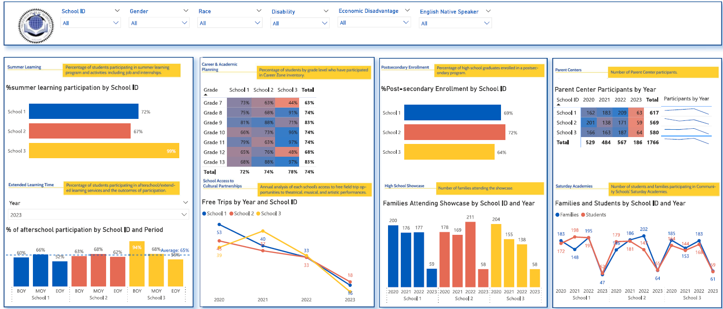
The first page was designed to measure extra-curricular activities for the students and their family participation in those activities. The filters for protected characteristics such as age, gender, disability and economic disadvantage were created so that the groups that require most support could be identified.
Some KPIs were presented for Beginning of Year (BOY), Middle of Year (MOY) and End of Year (EOY) so that the users can see how the performance changed throughout the year.
The next page of this Power BI dashboard analyzes the completion rate of exit surveys from the schools and tracks reasons for leaving. % of students who receive at least one of their school choices is also broken down by school to enable comparison of different schools in the district.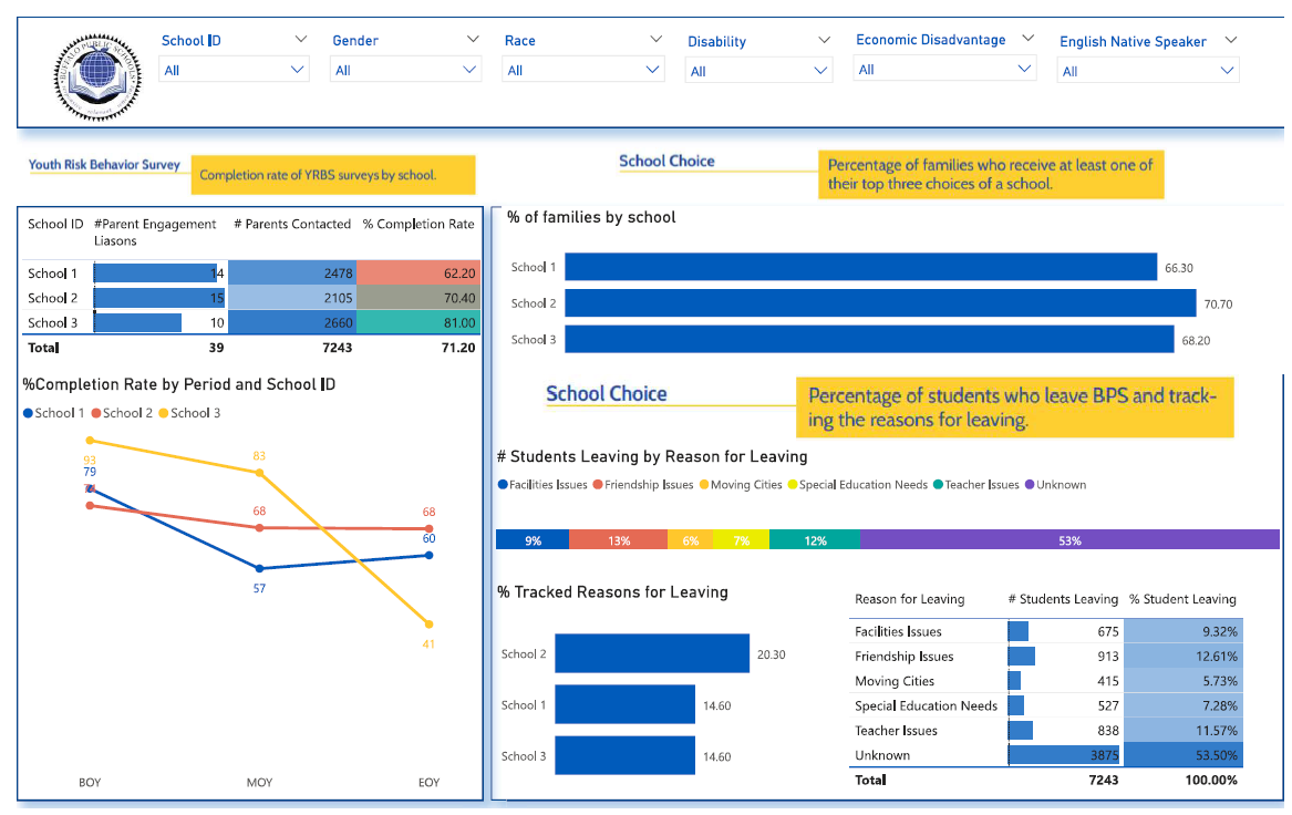
The academic performance tab measures the performance of students in the literacy and math tests. Absenteeism and special education needs are also analysed by school in the following tab.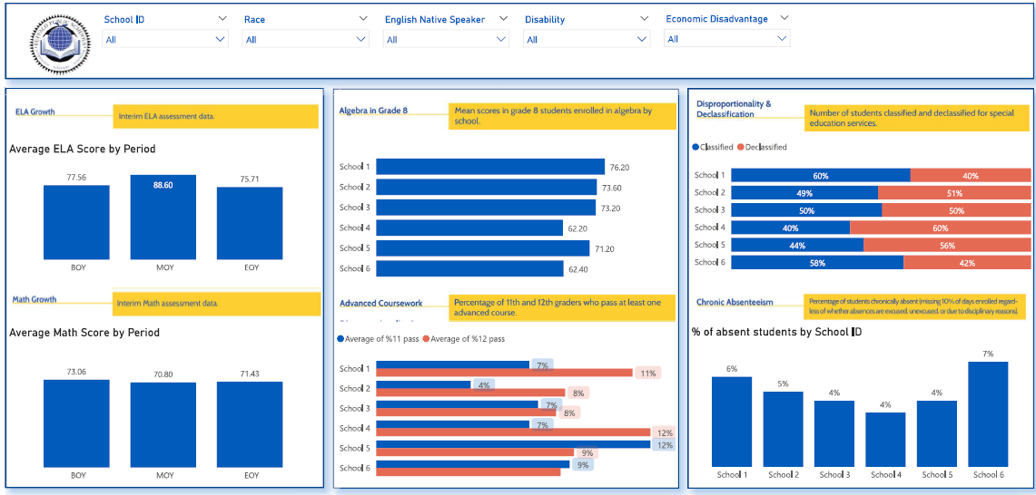
The acceptance tab measures acceptance rates of students into IB and G/T programs. 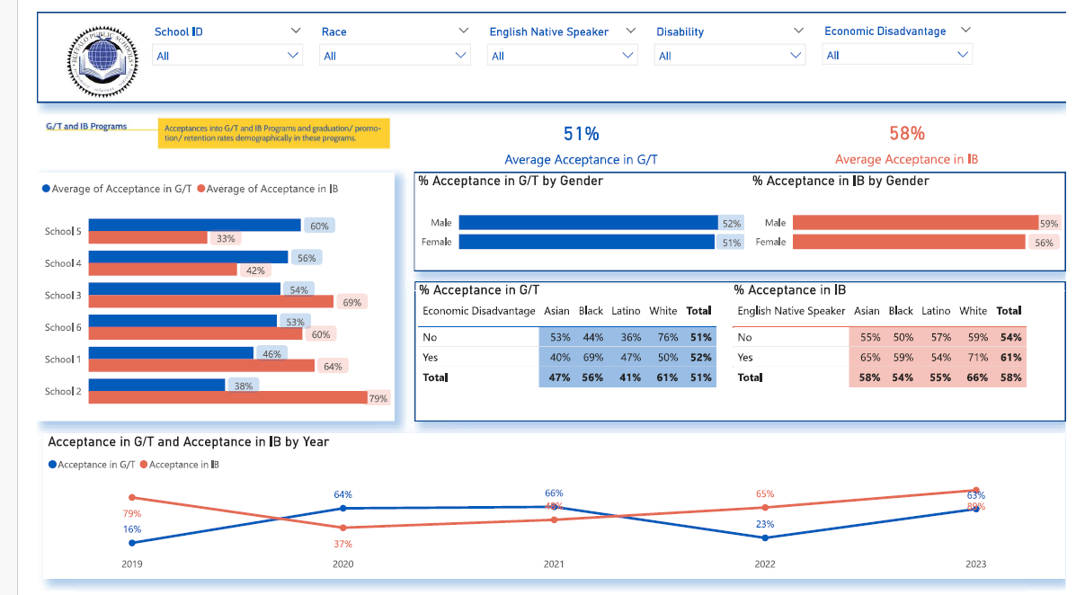
The early literacy test performance is analysed in the following tab. The number of students by grade bucket (60-100) and subject is also analysed below. The comments in green highlight the interactive features of the dashboard. 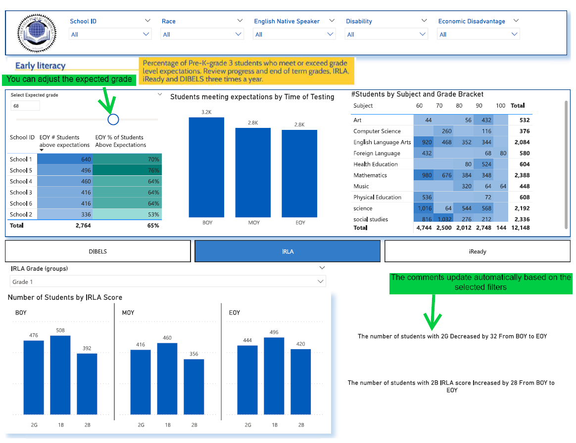
The final tab of this measures suspension and new hire diversity. The goals were to minimise suspensions by identifying the groups of students with highest suspension %. The new hire strategy is to hire the candidates from backgrounds that best reflect the demographic split of the school.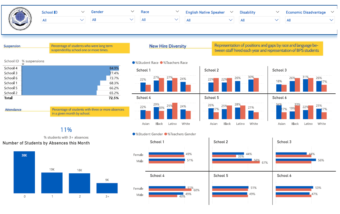
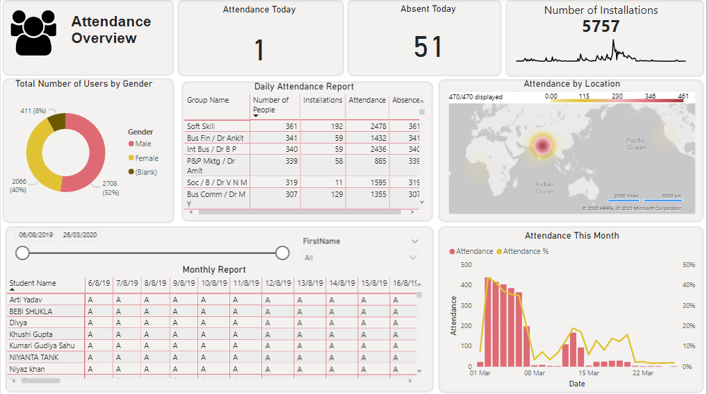
We worked with a university that tracked student attendance using QR codes. Before a lecture the students would scan a QR code to mark their presence.
We created a Power BI report analysing attendance and absence of students. The report can be used every day to monitor the attendance of the students in the university.
There is an analysis on group level that shows how many people in total are in a group, how many have installed the app, how many attendances there was this month and how many absences were recorded.
There is also analysis on student level that shown A for a day when a student was missing and a P when a student was present. There is also an option to export this data to excel, filter this table by date range and by student name.
Finally there is a graph that shows attendance per day as real number and as a percentage of total number of students
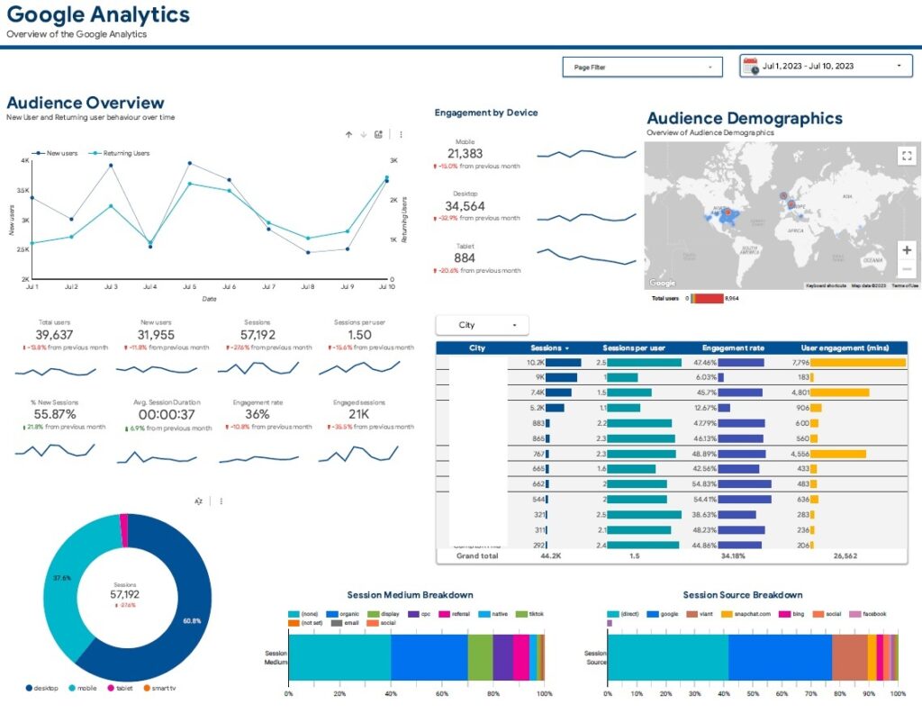
We worked with a marketing director to analyse marketing performance of the community college. We helped them to track their marketing metrics in GA4 and then visualise the performance in Looker Studio.
The first page measures the total number of users that go on the website and where they come from. The college primarily targeted local families in their marketing efforts so we visualised the website visitors by city on the map. The session source and medium breakdown analysis also helped them identify the key sources of traffic for their website.
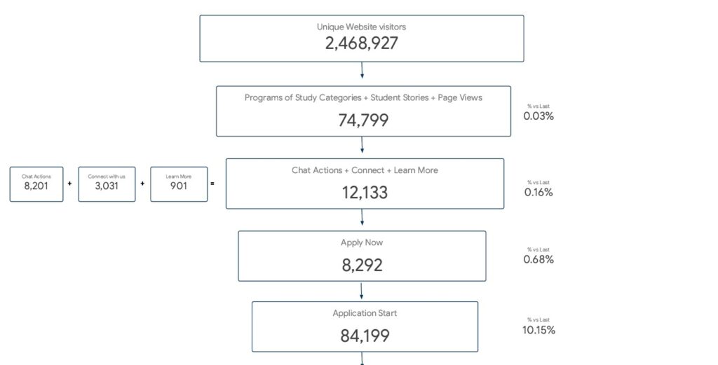
We also analysed the marketing funnel to measure how effectively the college converts website visitors into applications.
The top of the funnel refers to the people visiting the website and navigating to student experience and study categories pages.
The middle of the funnel mainly relates to the micro-conversions happening on the site e.g. visitors getting in touch, clicking “learn more” and connecting with the college.
The bottom of the funnel is mainly around starting their applications and finishing them.
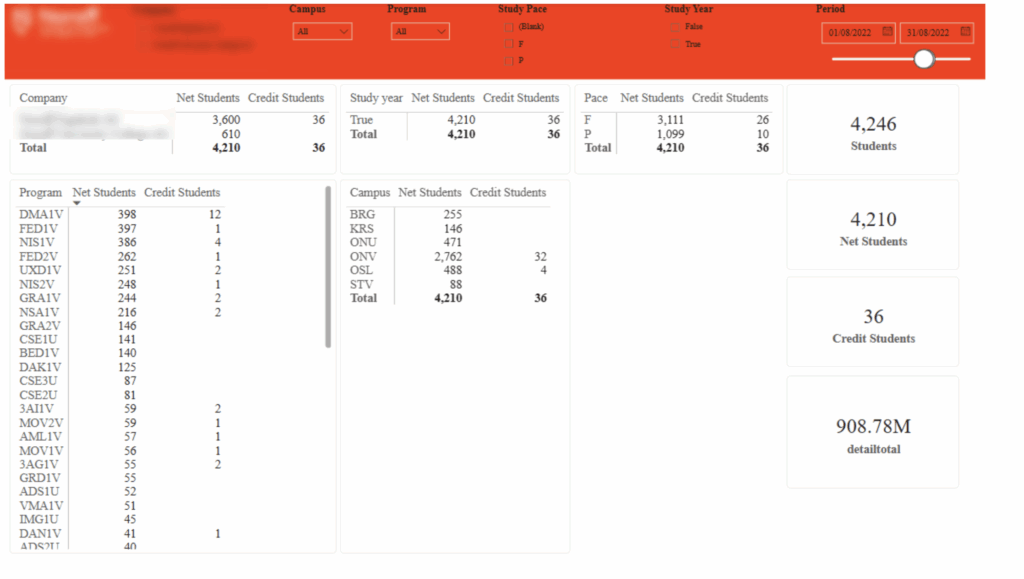
We worked with a CFO of a university in Norway to analyse the financial performance of the business. This data came from their Salesforce CRM and a SQL database that records the financial data.
Crucially we analyse the total number of students in total, by program and campus. We also analysed the number of students who were issued a credit note since they needed a special financial management.
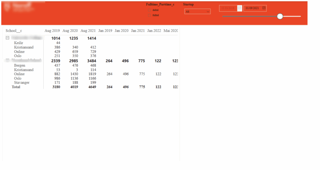
The data from Salesforce was used to analyse the number of applications by course start date. Applications were an important indicator of what future revenue the business could expect.
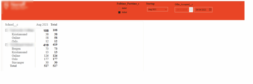
We further analysed the applications by looking into the accepted offers.
We are big advocates for using Power BI for data analytics for schools. Power BI is a powerful data visualisation tool that visualises raw data in interactive and structured reports.
Are you planning to perform analytics for schools or universities? Contact us now to learn more about our approach for data analysis for education institutions.

Support
All the support you need – when you need it. From 1-hour quick fix support to longer-term partnership that drives your business forward.

Consultancy
Advanced data thinking, creative ideas and the best Power Platform practices to unlock the true potential of your business data.

Training
Succeess shouldn’t be a one-off. When we train you teams user adoption surges and your Power Platform results radically improve.
![]()
![]()
![]()