
“Data is the new oil, and analytics is the combustion engine. Retailers leveraging data analytics see a 10–15% increase in revenue and a 20% reduction in operational costs.” McKinsey’s Retail Analytics Report 2023
Retail analytics dashboard cuts through the noise by pooling various bits of info – sales, customers, inventory, and operations all in one spot. By merging data from different sources, they give businesses a clear line of sight on what drives revenue and where they can actually make some improvements.
Here at Vidi Corp, we’ve been proud to deliver over 1,000 data visualisation consulting projects that take data from platforms like Shopify, POS systems and marketing channels and pack it all into one tidy, easy to understand retail analytics dashboards. Our dashboards help teams get away from having to read loads of piecemeal reports and start getting the clear, actionable insights they need to move the business forward.
In this article, we’re going to break down what a retail analytics dashboard is, why it actually matters, which metrics to focus on, and share some real-world examples of dashboards we’ve created. We’ll also be covering the key features, benefits, common problems people run into, and the tools we use to put together effective retail analytics solutions.
A retail analytics dashboard is a data visualisation tool that lets businesses get a grip on how they’re doing across sales, customers, stock, and the day-to-day operations. By pulling all of that data from different systems into one place, teams can keep an eye on the key numbers and get a sense of what’s moving the needle.
These dashboards are used by the people who run retail operations, online teams, marketeers and CEOs to make informed choices. They usually include things like sales, revenue, average spend, conversion rates and what customers are up to. By showing that data in an easy-to-read format through charts and tables, the dashboard makes it simple to work out what’s going on, compare how things are going and pick up on any problems before they get out of hand.
Based on our experience in retail analytics consulting, the main goal of a retail analytics dashboard is to turn masses of complicated data into useful information that people can actually act on. Rather than digging through spreadsheets or getting bogged down in separate reports that aren’t connected, your team gets a clear and interactive picture of the business. That lets them respond to changes as soon as they happen, streamline their performance and make decisions that are actually backed up by the facts, rather than just a hunch.
Power BI is a powerful tool for retail data analytics since it enables brands to automatically extract the data from multiple sources, aggregate it and create custom store performance dashboards.
This is especially useful to retailers nowadays because the retail space has become more complex. Retailers no longer only sell through a brick and mortar store, they also usually have an online store, selling their products through Amazon, Walmart and Target. Power BI supports both brick-and-mortar and online operations by integrating data from all channels, allowing retailers to analyze and improve eCommerce performance alongside in-store results.
Management of multiple sales channels requires collection of data from different systems: POS, Shopify, Facebook Ads, Amazon Seller Central, etc. This is exactly what Power BI is good at: combining the data from different sources into a single management report.
A retail analytics dashboard is really the key to turning all that data into usable insights that can actually inform the decisions you make every day. But in reality, retail businesses are churning out piles and piles of data – from sales, customer interactions & company operations – but if you can’t actually make sense of it, then it’s not really worth much.
One of the main reasons these dashboards are so valuable is that they give you one place to get the truth from. By pulling together all that data from multiple systems into one neat view, teams can at least make sure everyone’s working from the same page & getting the same info. Which makes a huge difference when it comes to making decisions – no more confusion or arguments about what the numbers said.
Retail analytics dashboards also help you make decisions way faster and way more accurately. Forget about having to wait around for some manual report to come through – you can just log in and get the real-time lowdown on how things are going & respond right away to any changes in performance. And in retail, where things can change overnight, that speed is really everything.
And finally, retail business intelligence is really the key to keeping your business ahead of the pack by making all your performance transparent to the whole organisation. Teams can spot the opportunities & nip the problems in the bud, and then just keep tweaking your strategy based on what the data’s telling you. That in turn means better coordination between departments and better execution overall.
A retail analytics dashboard should give you a clear picture of how well your business is performing and should help inform decisions across sales, marketing and operations. In other words, the goal is to pick a varied set of key performance indicators (KPIs) that will give you a birds-eye view of what’s going on and also drill down to the really important stuff.
At the core of any good retail dashboard are the sales metrics. You know, the ones that always seem to be on everyone’s wish list like total sales, revenue, number of orders and how much the average customer is spending. When you track these KPIs over time, you start to see the bigger picture – are things growing, is there a seasonal pattern to business performance and how are we doing overall?
Next up are the product performance metrics which are all about working out what makes money. You’re talking about things like how much is being made from each product, category or collection. This helps teams figure out what’s flying off the shelves and what might be sitting on them. It’s no surprise that this gets used to tweak merchandising, pricing and product range.
Customer numbers and how they behave are also critical to a healthy retail business. You should be tracking how many new customers you’re getting compared to how many are coming back, as well as customer lifetime value, how often they make a purchase and how often they come back and buy again. This helps you understand what makes customers tick and where you need to make a push to keep them.
Also, if you want to make sure your marketing is doing its job then you need to dig into marketing performance. This will include things like conversion rates, how much it costs to get someone to make a purchase and how much return do you get on your ad spend, as well as how much is being made by each sales channel. All of this helps you squeeze a bit more efficiency out of your marketing spend and make sure the campaigns you run are actually worth it.
Finally, operational metrics are crucial for keeping the show on the road. This might include things like how much stock you’ve got on hand, how quickly you’re turning that stock over and how well you’re getting orders out the door. Keeping an eye on these will help make sure you’re running the business in a way that answers to demand and keeps customers happy.
Retail analytics dashboards come in all shapes and sizes depending on what part of the business they’re supposed to be supporting. Whether it’s keeping an eye on stores and online sales, monitoring customer behaviour or forecasting – each dashboard is really just a tool designed to answer a bunch of specific commercial questions and help with day-to-day decision-making.
Below are a few examples of the retail analytics dashboards we’ve actually built for our clients. We’ve tried to illustrate how data can be used to give people some real insights into their business.
A retail store analytics dashboard is a pretty handy thing for retail managers, ops teams and commercial leaders to get a feel for how their stores are performing – whether it’s across different locations, products or product lines. And it’s especially useful for bigger retailers who have lots of different stores and need to understand what’s driving sales at a store level, as well as a product level.
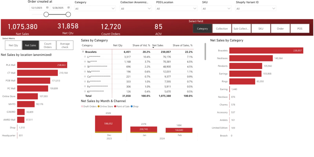
We built a dashboard like this for a jewellery company that mainly sells through their own high street shops. The data all gets pulled in automatically from Shopify POS, which we’ve hooked up to Power BI using a custom Shopify Power BI connector we’ve built. And then we’ve built in some dashboards that let people see sales, revenue, average order value, and order volume – all broken down by store, collection, sub-collection, and product category. Users can then switch between different metrics and apply filters dynamically – it’s pretty intuitive.
What you can do is pick a specific store and immediately get a detailed analysis of how different products are performing within that location. And because the structure of the whole thing is designed to be flexible, teams can easily compare the performance of new collections against the core products and get a sense of demand patterns that are specific to each store. Store managers can quickly get a handle on which categories are driving revenue within their own shop, while the high-ups can keep an eye on the performance of the whole retail network and make informed decisions about how to adjust merchandising or inventory accordingly.
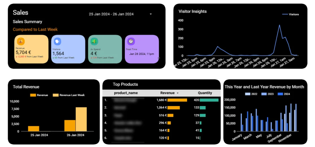
An online store analytics dashboard is used to track sales performance, so those in charge can see how different channels are actually contributing to the bottom line. It takes a bunch of data from various e-commerce platforms – think Shopify, WooCommerce, Magento and BigCommerce – and then tosses in some marketing data from Google, Facebook, Amazon and other channels to give a complete picture of what’s going on with online sales.
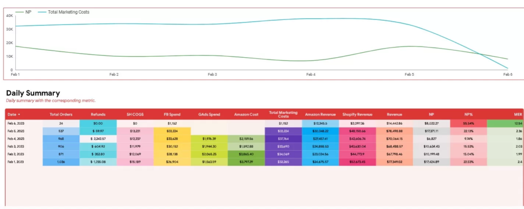
Our business intelligence consultants built this Power BI dashboard for an online retailer so they could get a handle on sales and marketing performance all in one place. The analysis looks at daily sales trends across the Shopify store and Amazon, which helps the team figure out how each platform is contributing to the overall revenue. We also break down marketing performance to see how well different campaigns, ads, and creative are doing, and what kind of channels are driving conversions and where things need to be tweaked. And as a bonus, product level analysis from Shopify lets us see exactly how discounts, refunds & price changes are impacting sales performance.
This set up lets teams work on optimising both sales and marketing at the same time, which is a major win . They can start to figure out which channels are actually raking in the dough, get their campaigns working more effectively, and even use real customer data to refine their product offerings.
A retail sales analytics dashboard is built to keep tabs on how all those products are performing – not just their sales numbers but how they’re doing across different sales channels, stores, and time frames. It gives brands & their retail teams a clear view of what’s going on with sales trends, lets them compare how different locations are doing, and spot which products or channels are actually driving in revenue. You find this kind of dashboard all over retail businesses where they’ve got a big product portfolio to manage and are trying to squeeze as much as they can out of both their bricks & mortar stores and their online channels.
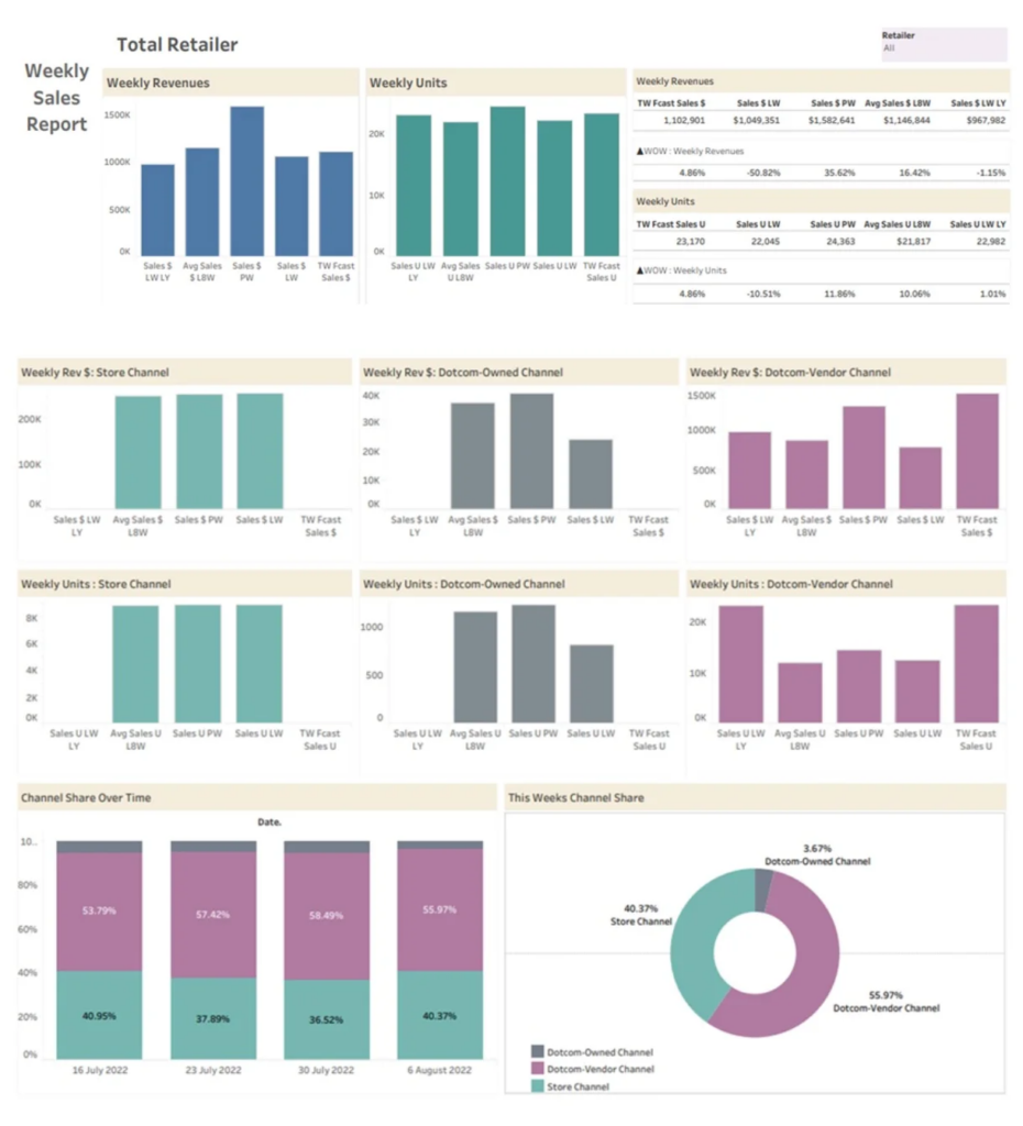
Our Tableau consulting experts built this dashboard for a consultancy that helps manage Walmart sales for loads of different brands. In this case, the analysis is focused on how sales are trending from one week to the next and comparing how current numbers are against last week, the same time last year, and rolling averages to spot any growth patterns. Plus, it breaks sales numbers down by channel to highlight the differences between people buying online and people buying in-store – which helps teams keep an eye on where demand is actually shifting. This in turn means users can quickly identify which channels or products need some attention – like tweaking their product listings or adjusting the way they’re displayed in stores.
This approach lets teams keep constantly tweaking their retail sales performance. They can figure out which products & channels are actually driving growth and adjust their strategy as a result, based on what the real demand looks like across the retail network.
An Amazon retail analytics dashboard – the one-stop-shop for e-commerce managers, marketplace teams and brand owners to take a long hard look at how their sales are performing on the platform. It’s a one-stop-shop for getting a complete picture of their sales performance by combining organic sales data from Seller Central with the paid advertising stuff from Amazon Ads.
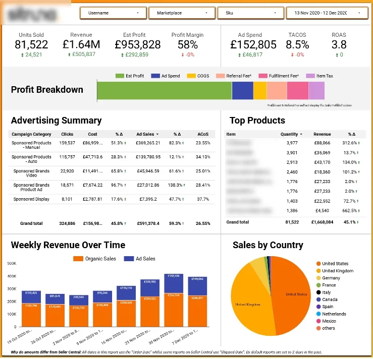
Our Microsoft Power BI consultants built this dashboard for a retailer who’s using Amazon to sell their wares. But what really matters is how we bring together the organic and paid sales to get a proper read on how well their online store is doing. The analysis looks at overall sales performance and profitability, tracks total sales over time, highlights the balance of impact from ads and organic sales, and also makes it easy to compare sales performance across different countries and product lines. And on top of that, there’s this nice extra feature that lets you drill down into specific ad campaigns and see which ones are really driving sales and which ones are getting a poor return – all based on metrics like their ad costs.
Having all this laid out in one place really helps teams figure out their sales and ad strategy at the same time. They can pick out their top-selling products, scale up successful ad campaigns, and turn around underperforming ones all while keeping an eye on how they’re doing as a whole – including their Amazon revenue performance.
A retail inventory analytics dashboard is a key tool that the operations teams, buyers and even the finance managers use to keep an eye on stock levels, track product turnover and make the most out of their inventory investments. It helps businesses find a balance between having products that customers actually want to buy and cash flow by figuring out which items fly off the shelves right away and which ones just sit around and are tying up capital for way too long.
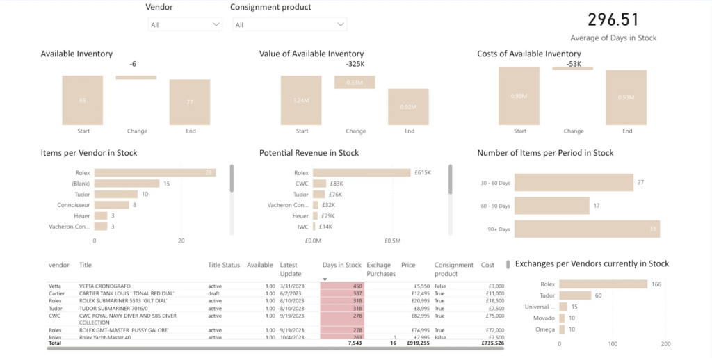
Our Power BI developers built this dashboard for a high-end watch retailer with some very valuable inventory to deal with. The analysis is all about looking at how fast stock is moving across different watch brands and product lines. It spells it out pretty clearly how long each product is just sitting there in inventory and compares the time it takes to sell products between brands to figure out which ones are moving way too slow and which ones are flying out the door in no time. This lets the client really see which products are bringing in cash fast and which ones are just locking up capital for a whole lot longer than they need to be.
All these insights help the team make some much smarter purchasing and inventory allocation decisions. They can focus on sinking their resources into the products that are flying off the shelves, get rid of or limit their exposure to the slow sellers and keep that all-important balance between having enough stock on hand to satisfy customers and keeping cash flowing.
A retail foot traffic analytics dashboard is what store managers and operations teams use to figure out exactly how all those people walking in the door are turning into sales. It lets businesses get a handle on how customers move around the store, when the place is most packed, and how well they’re doing at turning all those visitors into paying customers.
Our Looker Studio consultants built this dashboard for a retail company that put in door sensors to track how many people were walking into their stores. Our analysis focuses on what the foot traffic looks like at different times of the day and compares that to what’s coming in from the POS system – how many sales and how many items are selling. That lets the teams spot the times when lots of people are coming in but not buying anything, which could be a sign that something’s broken with how the store is being run.
This kind of insight really helps the teams run the stores a lot better. They can use it to make sure they’ve got enough staff on hand for the busiest times of day, they can work on making the in-store experience a bit better during those crazy periods, and they can take some targeted shots to try to do a better job of turning customers into buyers in places where there’s already a lot of interest.
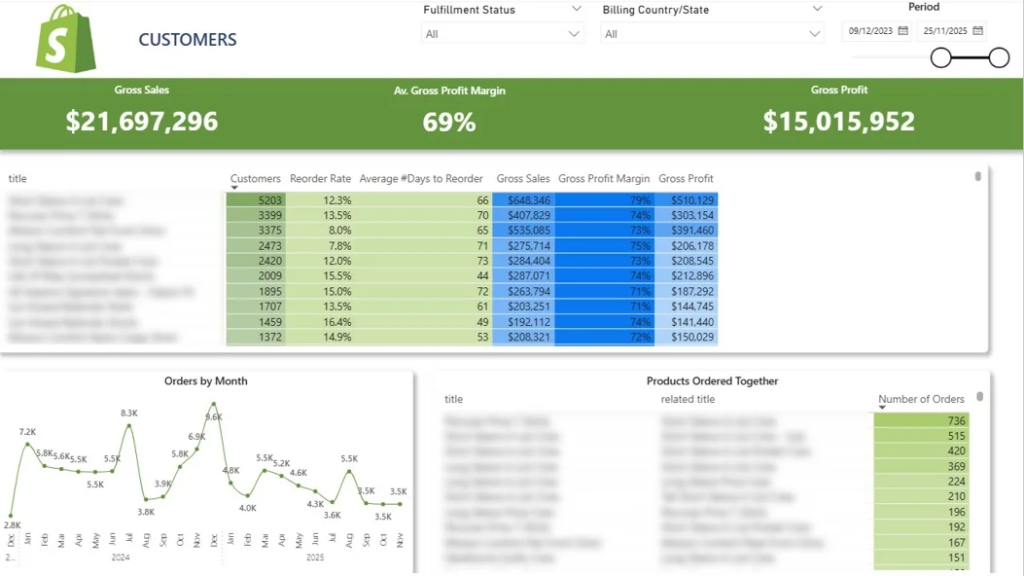
A retail customer analytics dashboard is the go to tool for marketing teams, CRM managers and e-commerce leaders trying to get a better understanding of how customers actually behave over time. The focus here is really on seeing how people who have bought before come back over time – how much they keep on buying, how much value we get from them across their whole relationship and how our revenue from them actually changes as that relationship deepens.
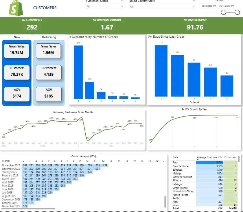
When we set out to build this Shopify analytics dashboard we knew we needed to use the store data to get real insight into customer behaviour. So we started by looking at the basic maths of new vs old customers and how much money each lot is bringing in, as well as the average order size coming in. Then we track how the number of repeat customers changes over time to show just how much of our revenue comes from keeping people coming back. And if that’s not enough we can split this all down to how often people buy and how long it takes them to come back for more, so we can spot the moment when, if we don’t do something, we might lose them for good.
This gives us a solid foundation to start building, better retention, more customer value – the teams using it can spot the super valuable customers, figure out the best time to send marketing emails, and most of all allocate their budget in a way that really targets the customers and regions that will keep on giving us the kind of long-term returns we need.
A retail basket analytics dashboard is used by the e-commerce team, merchandisers & marketing managers to get a better feel for how customers buy products together & what makes them come back for more. Its main goal is to uncover some of the combinations of products that customers like to buy , and what makes them want to reorder. It’s especially interested in working out how to use bundling & cross sell strategies to increase the average order size.
The dashboard gives an idea of how product demand is changing over time and flags up which products are most likely to get customers coming back for more. A quick glance at a summary table shows you how many customers bought a particular product, and how many of those customers came back to buy it again – plus the average amount of time that passes before they buy it all over again. That immediately gives you a good idea of which products are worth putting on special multi-pack offers, or making the focus of a reactivation campaign, or whether they’d be a good fit for a subscription-style promotion. You can then pick out a product and instantly see how demand for it is trending – which makes it dead easy to spot any seasonality or shifts in how well it’s doing.
There’s even more analysis that shows which products frequently get bought together – and that lets the teams create targeted bundles, make their on-site recommendations a lot more effective, and even design promotions that are based on real peoples’ shopping habits. And as a result of all that, businesses can increase the average order size, improve their conversion rates and make better merchandising decisions.
A retail pricing analysis dashboard is used in the trenches by commercial teams, category managers, and pricing analysts like a superpower to help them figure out just how pricing decisions really impact sales and profitability. It’s all about understanding the delicate dance between price changes, demand and margins – all across different products and categories.
These things that pass for dashboards typically take a hard look at price trends alongside sales volume to try and get a handle on just how price-sensitive customers really are and where the sweet spot is for those all-important price points. And they don’t just stop at discounts and promotions – no way, they also break down just how all that affects revenue and margins, and then compare performance across a whole range of pricing strategies. When you drill down to the product level, you can spot which items just cry out for higher prices, and which are doomed to be low-balling it if they want to keep selling.
And the upshot of all this is that you get to make more informed pricing decisions. Commercial teams can do a better job of squeezing the most discount bang for their buck, boost margins without sacrificing a single sale, and even tweak prices on the fly based on what’s happening with demand and how they’re positioned relative to the competition.
A retail promotion analysis dashboard is something marketing teams, category managers and commercial leaders love to have because it helps them see just what sort of impact all their discounting and promotional efforts are having. It’s a tool for businesses to see which promotions are actually driving some real sales and which ones are just a waste of time – and money.
These dashboards typically look at sales numbers during promotional periods as compared to the baseline, just to see what’s really going on. And they don’t just stop at revenue, either – they also track how units are selling and just how much of a discount is being dished out across all the products, promo codes and time periods. And by drilling down to the campaign level, you can see which ones are really bringing home the bacon, while at the product level, you can see which ones are just saying ‘oh, I’ll sell a few more if I give it away at a discount’.
The upshot of all this is, you get to make more effective promotion plans. Marketing teams can zero in on the high-performing campaigns, avoid throwing good money after bad, and craft promotions that drive sales without sacrificing a dime of profit.
A predictive retail analysis dashboard is the holy grail for commercial teams, supply chain managers and execs who need to know what’s coming next. It’s a tool to help businesses break the habit of just reacting to what’s already happened and start making decisions that take into account what’s going to happen next. By working out estimates for demand, revenue, and product performance, these dashboards help you stay ahead of the curve.
These things use historical sales data to make educated guesses about what’s likely to happen next across all the different products, stores and channels. And they don’t just stop at seasonality and growth patterns – they also try to take into account all the external factors that might affect sales volumes. By breaking down the forecasts by product, location, or time period, teams can see where the demand is likely to go up or down.
The result is that teams can start planning ahead – and in a big way. They can gear up inventory, try to adjust marketing efforts in anticipation of demand changes, and make more informed decisions based on what they think is going to happen rather than what’s happened in the past.
A retail demand forecasting dashboard is a supply chain teams, inventory planners, and commercial leaders absolute dream come true – it helps them predict with some degree of precision what kind of sales they can expect on each and every product, across all the stores, channels and time periods. It’s all about knowing just how much of each product to stock up on to meet sales without overdoing it.
These dashboards make educated guesses about the future sales numbers based on historical patterns, seasonality and growth trends. And they break it all down by week or month, just to give you a better idea of what’s coming. They let you compare expected demand across all the different categories, regions, or sales channels. And if you drill down far enough, you can see where there’s going to be a spike in demand, where things are going to be trending downwards, and in a few cases, where the forecast and reality are going to have some pretty big differences.
The upshot is that teams can start lining up purchasing, distribution and replenishment with demand, avoiding stockouts during the busy periods, and keeping a lid on inventory that just eats up all your cash.
An effective retail analytics dashboard is supposed to be intuitive enough that teams can get a real handle on how their business is performing without needing to know the first thing about the tech behind it . At a glance , they need to be able to get a clear picture of where they stand but also be able to dig deeper when they want to.
The dashboard should zero in on a small handful of clear , well-defined Key Performance Indicators , or KPIs , that measure what really matters for your business. Key metrics like sales, revenue, average-order value , and customer retention need to be right there at your fingertips and laid out in a way that’s consistent across the board. When you can easily spot changes and take action without getting lost in the weeds , that’s a huge win.
It should also make it easy to dig in and look at the data from different angles – by product, store, channel, or time period , without having to bounce around between multiple reports. This lets you spot trends , compare different segments, and investigate any issues that pop up all within the same workflow.
Another thing that’s super important is that the data automatically updates in real-time. With retail environments changing on a dime , your dashboard needs to be able to keep up and give you the latest numbers at all times. This way you can make decisions based on how things are going right now rather than relying on yesterday’s numbers.
The dashboard should also be able to bring together data from all of your different sources – that means pulling in info from your POS systems, e-commerce platforms, and marketing channels into one single view. This gives you a complete picture of your business and lets you ditch the manual data consolidation dance.
Last but not least, the design should be super simple and easy to use. Clear visuals, a logical layout and not too much clutter means you can get a handle on what’s going on fast , and that means people across your teams are more likely to use the thing and make decisions with confidence.
Getting a retail analytics dashboard that actually drives results means you need a clear plan and a laser-sharp focus on what matters most to your business. Here’s a step by step guide on how to build a dashboard that gives you real insights and supports your business objectives every step of the way.
Setting Your Business Objectives
The foundation of any decent analytics dashboard is getting a clear picture of what you want to achieve. Before you dive into data, take some time to figure out what your key performance indicators (KPIs) are that line up with your retail business’s main goals – whether that’s boosting sales, getting your inventory turning over faster or getting your customers more engaged. For instance, if you want to see 10% sales growth in the next quarter, your dashboard needs to be set up to track sales, monitor how your customers behave, and check in on your suppliers in real time.
By getting clear on these objectives first, you can make sure your analytics dashboard is focused on giving you the data and insights that really matter. This helps your team to make better decisions, track your progress against targets and make quick adjustments to stay on track. In the end, a dashboard built around what you want to achieve becomes an incredibly powerful tool for seeing how you’re doing, spotting opportunities and driving improvement in your retail operations.
Getting the Right Data
Once you’ve got your objectives sorted, the next step is to get the right data. Retailers these days have lots of different data sources – point of sale systems, ecommerce platforms and CRM software – so you can get a complete picture of what’s going on. Collecting all your retail data from lots of different places means your analytics dashboard will reflect every aspect of your business, from in-store sales to online sales and customer interactions.
Processing that data is just as important as collecting it. You need to make sure it’s accurate and consistent – clean, standardise and validate it to get it right. Tools like Power BI make it easy to connect to different data sources, automate the processing and create a seamless integration that brings all your info together in one place. With a clear view of what’s going on in your retail analytics, you can trust the numbers and make better decisions.
Making Sense of Your Data
The real power of a retail analytics dashboard comes from turning all that complex data into clear insights. The key to this is good data visualisation – presenting key metrics like average transaction value, customer satisfaction and sales trends in a way that’s easy to understand at a glance.
A well-designed analytics dashboard lets you see how your sales are doing, identify trends and monitor key metrics in real time. By making sense of all that data, you can spot opportunities to improve your operations, make your customers happier and make strategic decisions that support your business goals. Whether you’re tracking transaction values or analysing customer satisfaction scores, clear visualisations make it easy to see what’s working and where you should focus your efforts for maximum impact.
Getting a clear picture of your business performance is tough when you’ve got a load of fragmented data scattered everywhere. But by bringing it all together in a neat and tidy view, you can make faster and more accurate decisions with ease. When all your data is centralised and displayed in a dashboard, you can take action on your findings right away, rather than having to rely on somebody else to spin you some reports or make some dodgy guesses.
One of the main advantages here is getting your reporting in order and speeding up your decision-making process. Say goodbye to wasting hours poring over spreadsheets and hello to getting instant access to up-to-date insights – you can focus on actually analysing your data rather than getting bogged down in collecting it. That means your leaders can quickly respond to changes in sales, customer habits or operations – and that’s exactly what happened for one of our clients, who reduced their report-prep time by a whacking 50% and got a real-time dashboard to boot.
Another major benefit is you get more accurate and consistent data. It’s a common problem – manual processes can be prone to mistakes when you’re trying to mash data together from different systems. But by automating the way data gets extracted and transformed, you can be sure that your reports are solid and reliable across the board. And don’t just take our word for it – one client managed to get a whopping 99.7% accuracy out of their data and reduce errors by 80%. Not bad for confident decision-making.
With retail analytics, you can get a faster chip out of your business and be more responsive to changes. When your data is automatically updated and available in real-time, you can keep a close eye on performance without having to wait for weekly or monthly reports. That lets you move fast on any changes in demand, campaign performance or operational issues. Just think of it – one client dropped its report generation time from 48 hours to a paltry 5 minutes – which means they can now focus on daily performance tracking instead of waiting on those Monday morning reports.
Finally, retail data analytics can help drive real growth in revenue and efficiency. By identifying trends, opportunities and inefficiencies, you can then go on to optimise your strategy across sales, marketing and operations. For example, one business used analytics dashboards to find some insight into performance that ended up giving them a 20% boost in service revenue and helped them save some cash.
Retailers today use data analytics to improve their business, but it’s not always easy. There are some common challenges that stores face when working with data. Understanding these problems and finding solutions can help retailers use data better and grow faster. Let’s look at three big challenges: data silos, privacy compliance, and skill gaps.
Data silos happen when information is stored in different systems that don’t talk to each other. For example, customer data might be in one system, while sales data is in another. If these systems don’t connect, it’s hard to get a complete picture.
They are a problem because:
There are multiple strategies to solve this
Skill gaps happen when a retailer doesn’t have enough people with the right knowledge to analyse data or use analytics tools. Data analytics needs special skills in technology and statistics.
The implications of a skill gap are:
The strategies to solve this problem are:
Retailers today use many tools and technologies to understand their business better and make smarter decisions. These tools help them analyse customer behaviour, manage inventory, predict trends, and visualise data easily. In this article, we will explain some popular tools and technologies used in retail analytics and how they help stores grow.
You need to collect the data before you can analyse it. Therefore deciding on your future data source for retail analytics is an important strategic decision.
Point-of-sale systems and ERPs are commonly used as data sources for retail analytics. Whatever data source you pick, make sure that it allows to automatically extract the data from it by offering an API.
Common POS systems that we frequently work with during our retail analytics projects are:
We also often analyse the data from ERPs which helps to capture more information about product costs and broader business operations. We have worked previously analysed the data from the following ERPs:
We are huge advocates of business intelligence software because they give retailers the flexibility they need to create custom analysis based on their needs. There are 2 BI tools that we recommend:
Tableau: A popular tool for creating interactive charts and dashboards. It helps retailers see trends and patterns in their data quickly.
Power BI: Microsoft’s data visualisation tool is affordable and easy to use. It connects to many data sources and creates beautiful reports. You can check out this comprehensive guide to Power BI to help you understand how the tool works.
You can read about how Tableau compares to Power BI in our guide. We recommend these tools because they are:
Retail analytics dashboards are no longer just a nice to have for businesses that want to stay ahead of the game. Without one you’re effectively flying blind, but with one you get a crisp, clear view of how your business is performing across sales, customers operations and marketing – and that lets your teams switch from just reacting to reports to actually making proactive decisions.
Throughout this article we’ve been showing you how different types of retail dashboards fit in with specific jobs that need doing – like keeping an eye on store performance, online sales, customer behaviour, pricing and forecasting. Each one looks at a different bit of the business picture, but what they all have in common is turning data into the kind of insights that help make better choices.
When a retail analytics dashboard is set up properly it really does improve reporting efficiency, gets the data right first time and lets your teams act fast – but that’s only half the story. What it really does is create a shared language of performance across the organisation, so your teams are all looking at the same numbers and heading in the same direction.
If you’re thinking of building a retail analytics dashboard that fits your business like a glove, the next step is to work out how it needs to be shaped by your specific processes, data, and how you like to make decisions.
Get in touch with us to run your ideas by us and we can help build a custom retail analytics solution that works for your business!
![]()
![]()
![]()