Would you like to have an easy way to analyse call data via Power BI Zoom dashboards? Then you should take a look at the Power BI dashboards we offer. It is a quick and an easy option available to visualise data from Zoom in Power BI.
This is the ultimate Power BI dashboard you need to learn more about your Zoom meetings or webinars. We can also help you customize it, so that you can get the most out of it at the end of the day.
We offer Zoom Power BI connector that includes free Power BI Zoom dashboard template. This template focuses on connecting your Zoom meetings with Power BI. Let’s explore what you can build out of this template.
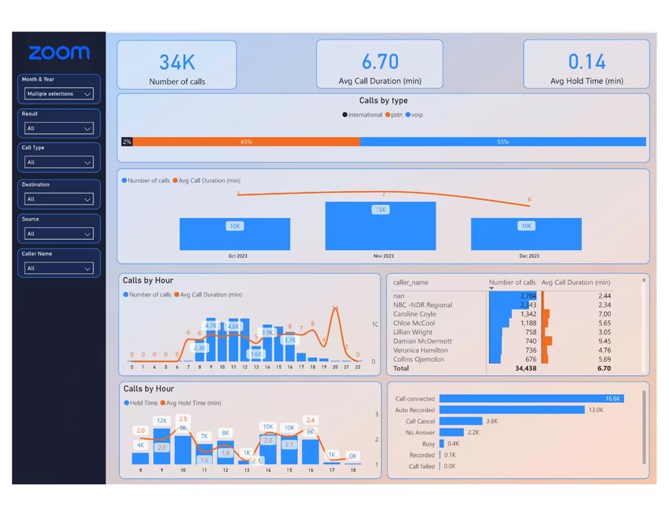
See at a high level how many calls are being made and the average length of those calls. Helpful for understanding overall usage.
View the average amount of time callers are placed on hold during calls made through Zoom phone. Long hold times could indicate poor customer experience or engagement by your team.
Break down calls by categories like answered, missed, voicemails etc. And see number of each call type over time as well as the duration. Spot trends in missed calls that may need addressing or voicemails that could be reduced through call answering protocols.
The default trends cover an aggregated period, but you can also toggle to a daily view. This is helpful if you think there may be day-of-week or weekday vs weekend differences you want to analyze.
Segment call analytics based on the hour of day to identify highs and lows in usage. See which times have the longest calls to assess if availability should be adjusted.
Determine if there are a few individuals skewing up average handle times or patterns of calls that differ by role/department. Marketers for example may take more exploratory calls than billing team members.
In addition to overall hold time metrics, the hour-by-hour analysis can pinpoint peak periods where hold duration is highest. Address staffing during those spans to reduce customer wait times.
Categorize calls by completion status to see where opportunities may lie. High disconnect rates could motivate new answering rules and voicemail best practices to capture more calls.
There are also filters available to slice the data by date range, call result, call type, phone numbers involved, and call initiator. Overall, this template provides an easy pre-built dashboard to analyze your Zoom phone activity at multiple levels and identify potential improvements.
Rather than manually importing your Zoom data, you can use our solution to automatically extract Zoom information into a database. This database can then be connected to Power BI for live visualization.
The solution we offer can pull in Zoom webinar, meeting, and call data every 30 minutes. This keeps the Zoom Power BI dashboards updated in near real-time. This is the solution used to build the template discussed above.
Once implemented, you simply direct the Power BI template to connect to your new AQOL database instead of default sample data. The specific tables included cover details like:
With the automated sync in place, the template displays current analysis without time-consuming data exports or manual refresh. The database updates on its own every 30 minutes.
The benefit is it only takes about 5 minutes to set up, saving you the work of rebuilding visualizations and dashboards from scratch. You get pre-populated tables covering granular details on your Zoom account usage.
In addition to using the out-of-the-box phone calls template, you can use the automatically populated Zoom data in Power BI to create custom dashboards tailored to your business needs.
For example, you can build a dashboard to visualize webinar registration numbers over time, attendance levels, attendee occupations that were collected during registration, referral traffic sources, and more. This becomes especially valuable when analyzing automated sessions like an evergreen webinar, where continuous performance tracking helps optimize long-term engagement. Although not a template itself, it shows what’s possible when combining the live Zoom data feed with Power BI to focus on specific KPIs.
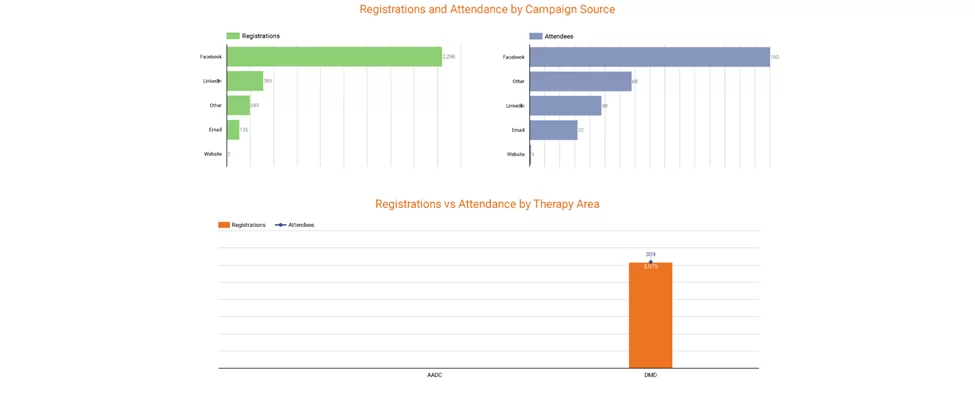
Understand the total number of people who signed up for your Zoom meeting, including the sources where they signed up with. You can also check how many of them attended the meeting as well.
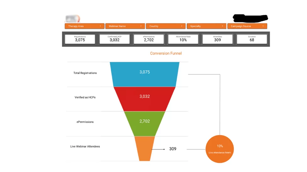
Understand the number of individuals who signed up for your webinars and who ended up attending it. It is also possible to see a breakdown to clearly visualize what your total attendance rate is.
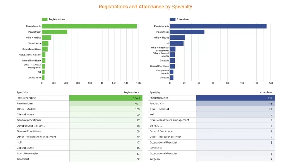
Get a detailed breakdown of the specialty of individuals who signed up with your Power BI. This can help you to get a better idea about the background of your registrations and attendees.
There are also filters available to slice the data by date range, call result, call type, phone numbers involved, and call initiator. Overall, this template provides an easy pre-built dashboard to analyze your Zoom phone activity at multiple levels and identify potential improvements.
Because the data extraction runs continuously without manual exports or updates, you can build dashboards for critical metrics and know the visualizations will stay current. Whether it’s monitoring registration totals daily, weekly webinar participation rates, or monthly calls by department – your dashboards reflect the latest numbers without extra work behind the scenes.
You have full control over shaping analytics around your organization’s priorities. Possible custom visualizations can include:
Webinars:
Meetings:
Calls:
The combinations are truly endless, both in terms of what parts of your Zoom account you analyze and how you visualize that information to drive business decisions.
You can build the dashboards yourself using the automated data foundation or enlist consultants to create Power BI dashboards tailored to your use cases based on your Zoom webinars, meetings,
Whether you want high-level automated insights on phone calls or to drill into your webinar engagement funnel or virtual meeting productivity – Power BI templates combined with real-time data integration provides immense visualization potential with little ongoing manual upkeep.
So, if you’re looking to go beyond static exports to better understand and optimize your Zoom usage, this end-to-end approach delivers. What unique dashboards could you envision for your Zoom data? With the right data foundation now in place, the possibilities are wide open.
![]()
![]()
![]()