Xero is a powerful accounting system, but creating reliable Xero Power BI dashboards is not straightforward. Many businesses struggle to make their Power BI numbers match what they see inside Xero. The main challenge is the lack of clear documentation on which tables and calculations should be used to accurately rebuild financial reports.
Our Xero Power BI dashboard was designed specifically to solve the matching issue. It already includes a structured data model, pre-built measures, and validated formulas that ensure your Profit & Loss and Balance Sheet reports align with Xero.
Our Xero Power BI dashboard allows you to combine data from multiple companies into one centralized report. You can easily switch between viewing a single company or analysing performance across all companies together. The template is fully flexible, so you can customise the layout, metrics, and visuals to match your reporting requirements.
Note: if your data is in multiple currencies you will need to implement currency conversion inside our template.
Our dashboard is built to work with the unique data structure generated by our Xero Power BI connector, so the first step is to install the connector, you can start with a 14-day free trial with no credit card required.
We offer the pages to analyse P&L and Balance Sheet statements. We are planning to expand our template in the future with analysis on account receivables and account payables.
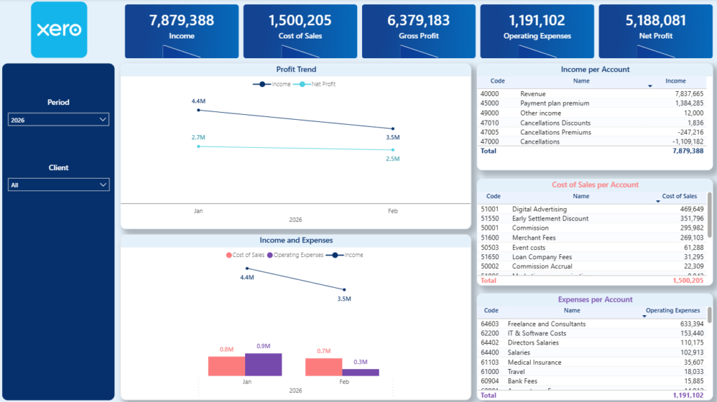
The P&L dashboard gives finance teams and business owners a clear view of monthly financial performance. It tracks trends for Income, Cost of Goods Sold (COGS), Gross Profit, Operating Expenses, and Net Profit, helping you understand how profitability evolves over time.
The main chart shows monthly movements across these core metrics, making it easy to spot margin compression, rising costs, or revenue growth. On the right-hand side, detailed tables break down Income, COGS, and Operating Expenses by account, allowing you to identify exactly which accounts drive changes in performance.
For some clients, we have extended this dashboard to drill down to transaction level. This requires combining the Trial Balance data with the Journals table to reconstruct detailed movements behind each account. Because every Xero setup is slightly different, this consolidation requires a custom approach to ensure the numbers reconcile correctly.
Contact us if you need transaction-level drill-down, and we will assess your data structure and implement a tailored solution.
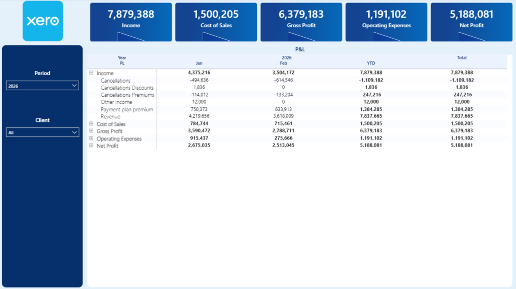
The next tab presents the P&L statement in a structured table format. It displays results by month and also includes a year-to-date view for a broader performance perspective.
You can use the plus and minus icons to expand or collapse each main P&L category, allowing you to move from a high-level summary to a more detailed account breakdown.
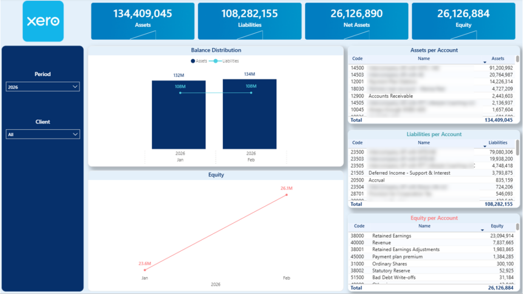
The Balance Sheet dashboard provides a structured overview of your company’s financial position over time. It visualises monthly trends for Assets, Liabilities, and Equity, helping you monitor how your balance sheet evolves and where structural changes occur.
Each of these categories is further broken down into account groups that make up their total values. This allows you to analyse movements in areas such as current assets, fixed assets, payables, loans, or retained earnings, and quickly identify what is driving changes in your financial position.
The dashboard also highlights Net Assets, which represent the difference between total Assets and total Liabilities. As a built-in validation check, you can quickly confirm that Net Assets equal total Equity, ensuring that your balance sheet remains properly balanced and aligned with accounting principles.
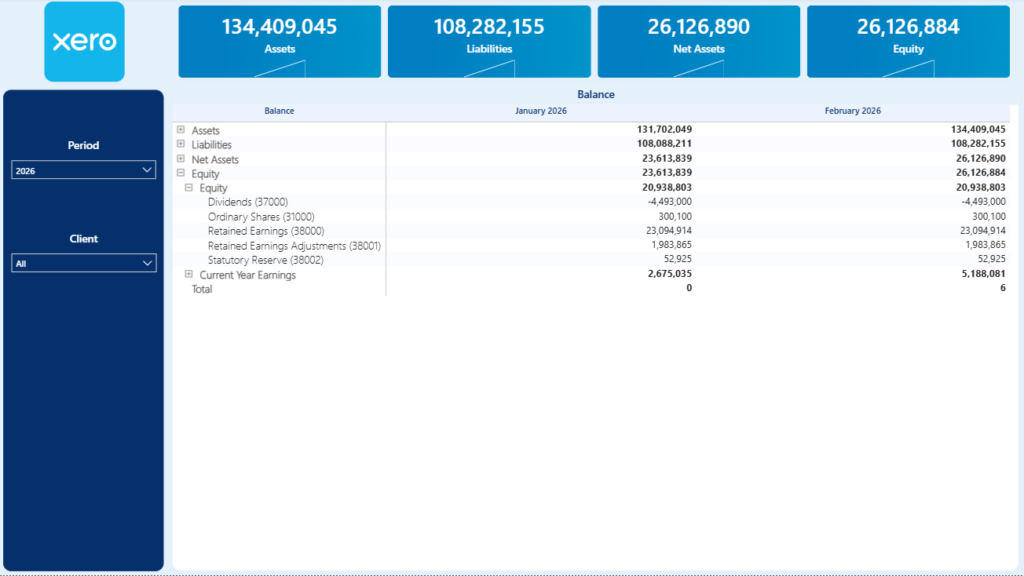
The following tab displays the Balance Sheet in a monthly table format. It provides a structured view of Assets, Liabilities, and Equity across each reporting period.
You can expand or collapse the main Balance Sheet categories using the plus and minus icons to drill down into more detailed account-level information as needed.
A reliable Xero Power BI dashboard should do more than just display numbers. It should ensure that your P&L and Balance Sheet match Xero, consolidate multiple companies when needed, and give you clear visibility into the drivers behind your financial performance.
Our Xero Power BI dashboard is built with a validated data model, pre-configured formulas, and flexible reporting structure so you can start analysing your financials immediately. You can customise layouts, add new KPIs, implement transaction-level drill-down, or extend the model to handle more complex requirements such as multi-currency reporting.
Download the dashboard template to get started. If you need customisations, additional integrations, or a tailored financial reporting setup, reach out to our team and we’ll design a solution that fits your exact requirements.
![]()
![]()
![]()