In this guide, we have put together 26 Power BI best practices that help you optimise your data modelling, performance, design and security of your reports. By using these Power BI best practices, you can greatly improve the reporting experience for your users and set your projects up for success.
As Power BI consultants, we have used these best practices on 1000+ development projects for 600+ clients. Some of these techniques come from our experience, others from official Microsoft guidance.
Data model optimisation is important to speed up your dataset refresh and loading graphs on a page. Power BI also has a limit of 1GB per semantic model under a Power BI Pro license. If this limit is breached, your reports will stop refreshing in Power BI Service.
Power BI data modelling best practices cover everything that happens in Power Query and Relationship View. This part of your Power BI optimisation covers the data transformation steps and the relationship between tables.
There is a well-known principle in data analytics: data should be transformed as far upstream as possible and as far downstream as necessary.
In practice this means that it is better to do your data transformation in your SQL statement before loading your data to Power Query. If this is not possible, the next best thing is to do your data manipulations in Power Query instead of doing them in DAX.
If you don’t have SQL skills you can take advantage of query-folding in Power BI which we will cover later in this article.
There are many reasons to avoid it. Firstly, from a user experience perspective, it is unintuitive and every new filter that you add to your report might result in unexpected results of your calculations. This relationship type just doesn’t provide the flexibility to the users to explore their data freely.
From a technical perspective, your graphs will take longer to load when you use a many-to-many relationship. You can test this yourself by using a performance analyser and comparing how fast the graphs load with multiple one-to-many relationships vs a many-to-many relationship. Microsoft recommends that instead of creating a many-to-many relationship between 2 fact tables, you should use a star schema. This helps to ensure that all the relationships in your data model are set to one-to-many.
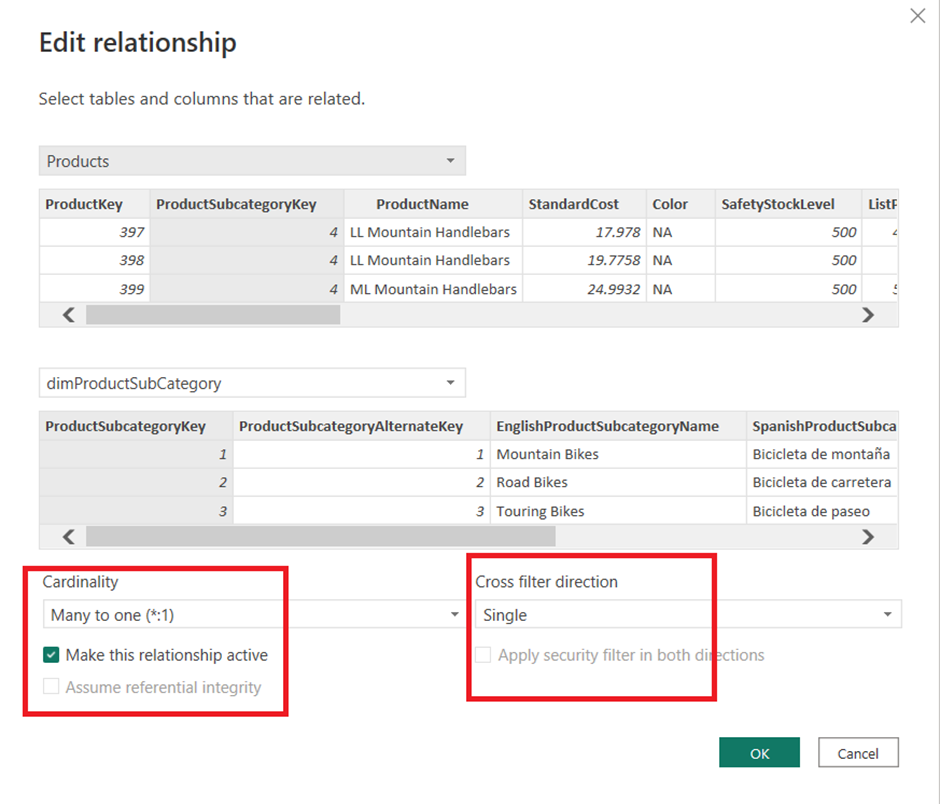
Bi-directional cardinality mostly happens in many-to-many and one-to-one relationships. However, it is also possible to manually set your cardinality to “both ways” in a one-to-many relationship.
Bi-directional cardinality also results in slower performance and non-intuitive filter behaviour for the users. It can especially negatively affect the performance when you have multiple relationships with bi-directional cardinality in your data model.
If you have a one-to-one relationship, we recommend using a “merge” function in Power Query to bring all the columns you need in a single table.
Developers also often use bi-directional relationships because they want a single slicer filtering all the visuals on the page. What you can do instead in this scenario is apply different visual-level filters on every graph. This removes the need for a single column to be used as a filter for everything else.
Choosing appropriate data types for columns can significantly reduce memory consumption and improve performance. Usually, Power BI auto-detects the correct data types but it should be checked and changed if needed for every relevant column to improve the performance.
For example, consider changing the data type from Date/Time to Date. When the data type is set to Date/Time, Power BI will automatically produce a small calendar table in the background including Month, Quarter and Year. When you change the data type to Date, the background table will not be produced.
Text columns would also always take more memory than number columns. As a result, if your data model allows you, you should set your data type to number instead of text.
Beginners in Power BI always tend to keep as many columns in their data model as possible just in case they need them. However, this approach significantly slows down the data model.
Columns that are not used in reports should ideally be removed from Power Query before loading the data. This helps to reduce the volume of data that Power BI has to work with, and as a result, the visuals load a lot faster.
Pay special attention to text columns with long values in them. These columns will take more memory space in your model than all the others. Consider trimming the values in these columns or removing them altogether if you can.
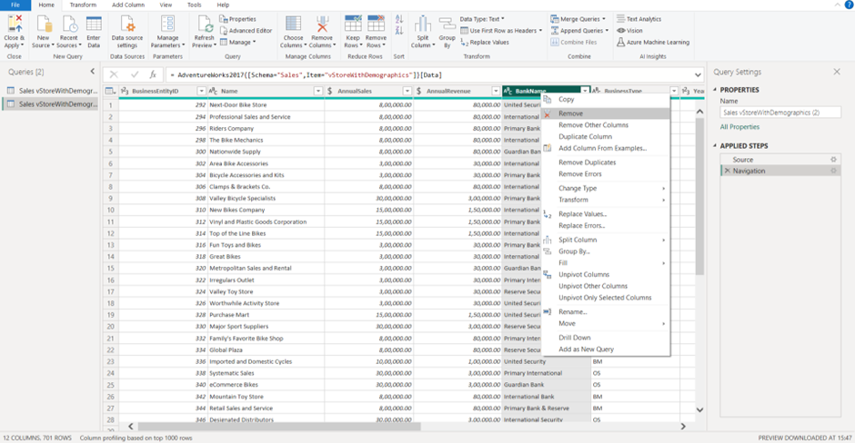
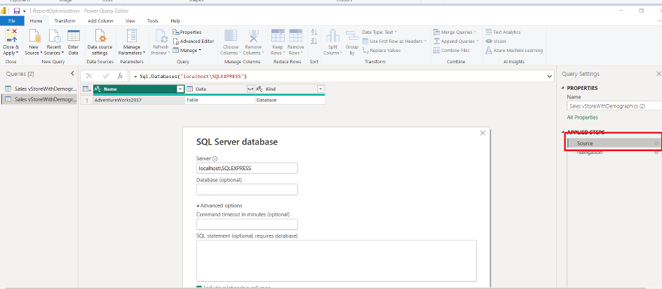
Query folding in Power BI is a technique used to optimise query performance by pushing data transformation steps back to the data source. When query folding is achieved, Power BI sends a modified query to the data source, which performs the required transformations and returns the results to Power BI. It can be used on most relational databases, but if you want to know whether is applicable to your data source, use the steps below:
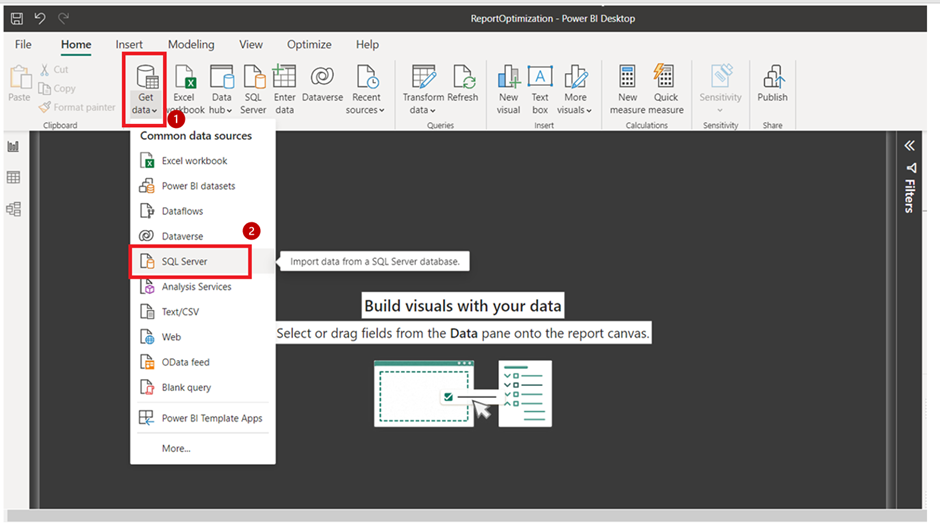
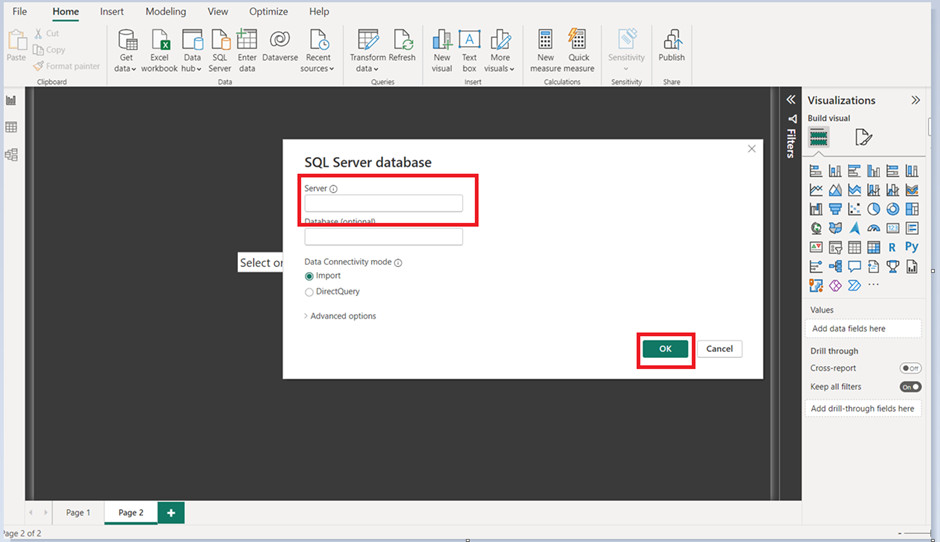
2. Provide the SQL server details and server connectivity mode, then click ‘Ok’.
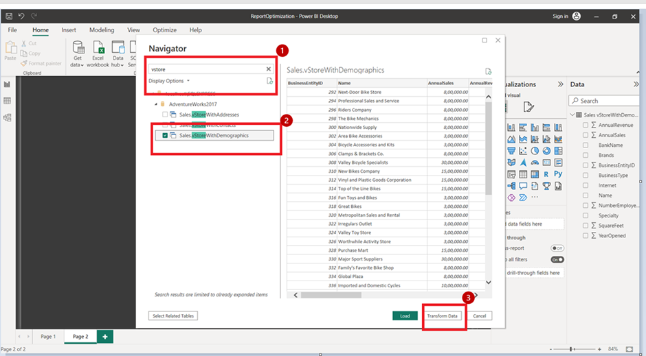
4. It loads the data to Power BI and will show it in the Power Query.
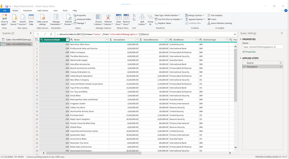
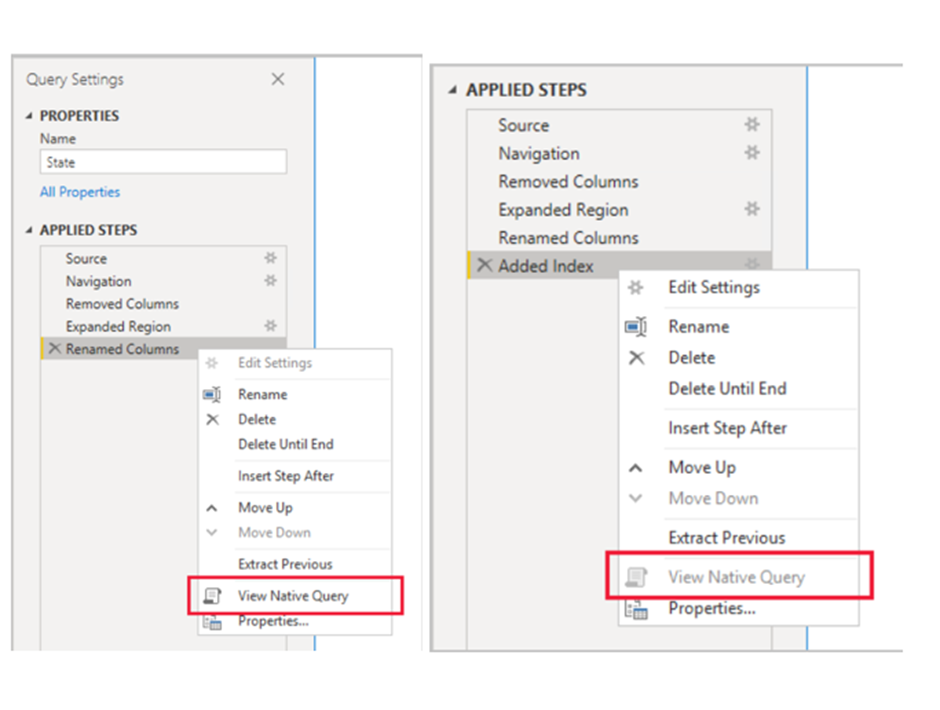
5. To check whether this data source supports Query Folding or not, follow the above steps. (Right-click on the Navigation or any applied steps and see the Native query option.)
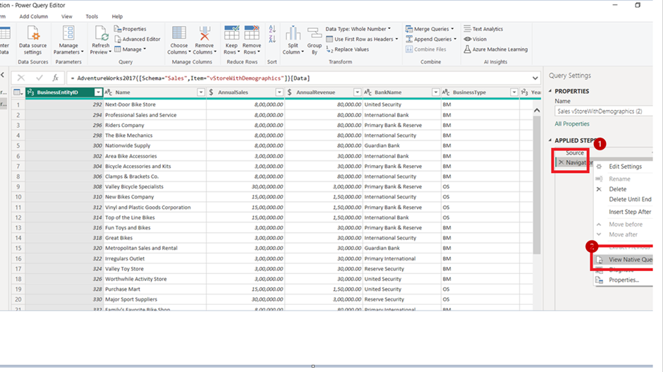
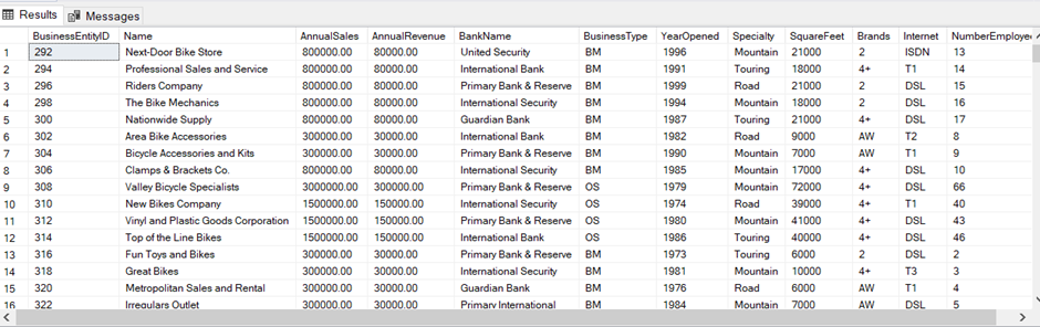
6. So our database supports query folding.
Example:
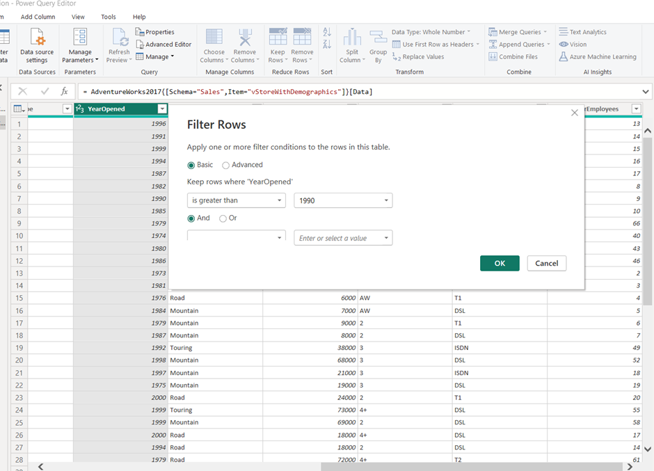
Assume there is a requirement to show only the data with certain filters. In our report, we will have to show only data where YearOpened is greater than 1990 AND NumberEmployees is greater than 10.
We can easily achieve it by applying filters in the Power Query as follows:
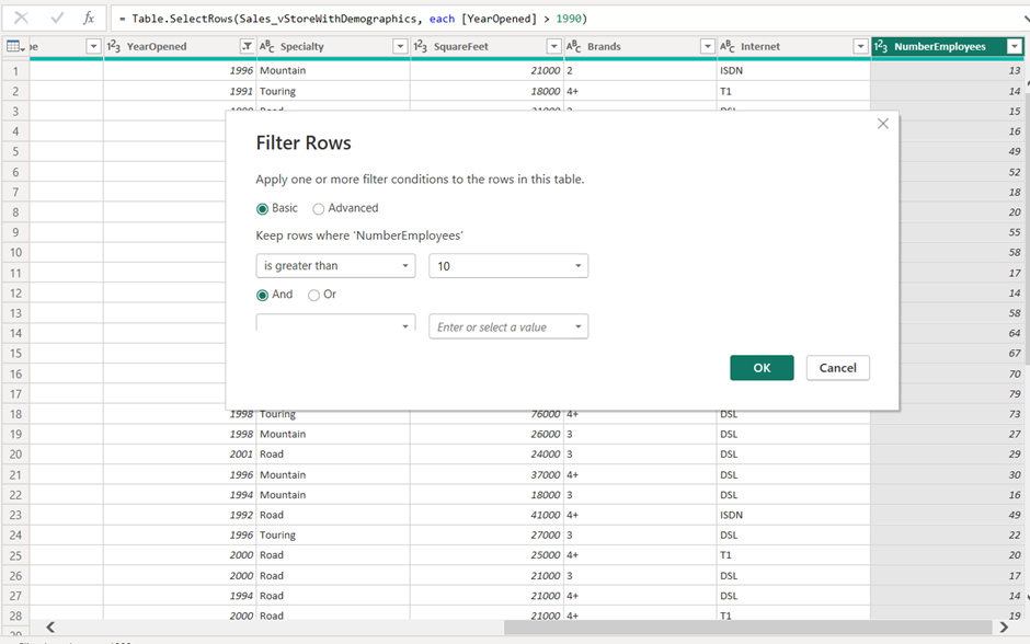
After applying these filters, close and apply will load the filtered data to the data view. Since our database supports Query Folding then we can push these transformations(Filters) to the database instead of doing them at the Power Query level. Let’s understand the process to implement it using Query Folding:
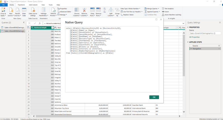
2. Copy the query and double-click on the source item in the applied steps.
3. Click on the advanced action of the window and paste the copied SQL query into the SQL Statement box.
4. Add ‘WHERE’ clause to the query at the end with filter conditions as per requirements. Remember, we need to provide a database name, which is mandatory for query folding.
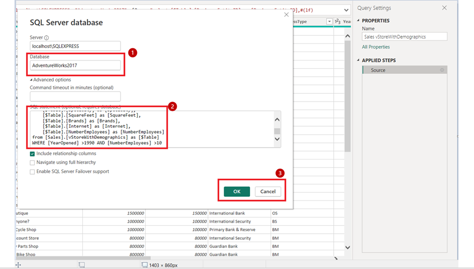
5. Click ‘OK’ and see the filtered data loaded to Power BI, and there are no steps logged in the applied steps section.
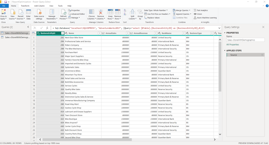
This enables better query performance of the data, improving both data refresh time and report performance.
This article has highlighted how to improve Power BI performance, the benefits of using a calendar table and how to add the table using various methods. Adding a calendar table in Power BI is important for time intelligence calculations, data aggregation, visualisation, customisation, and improved performance.
Suppose you are looking for expert Power BI Consultancy Services to help you develop Power BI solutions rather than learning about the Power BI Service. In that case, you can view our consulting offering.
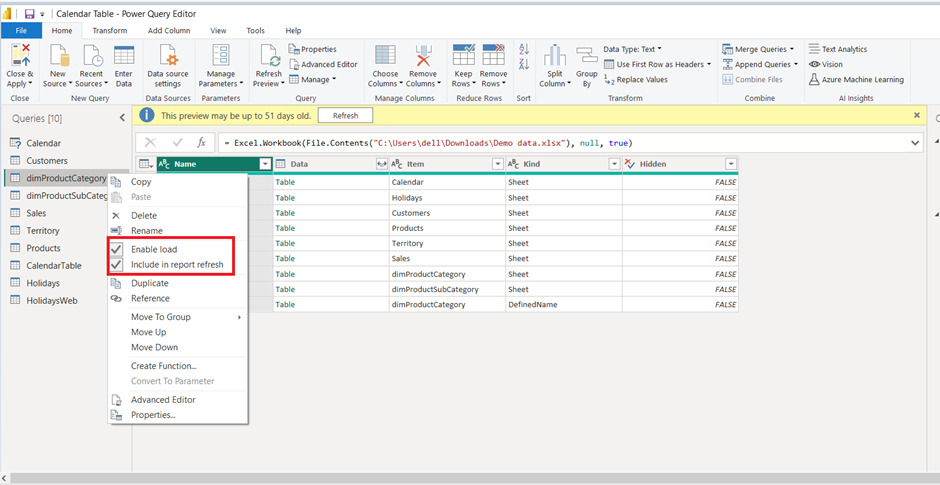
This is also another important method to optimise your report. You can disable loading the table if you are not planning to use it as a dimension or a fact table. This is commonly done for tables that are used for merge or append functions.
Assume we have 3 tables loaded into the Power BI, and append these tables into a single table. Now, if we load all tables, then it would be duplicate data; instead, disable the load of these tables and load only the final appended table to the data view.
To enable or disable a load :
We recommend avoiding direct queries for many reasons. By switching to Direct Query, many Power Query functions become unavailable, so you can only do simple data manipulations. You will also find that your graphs take longer to load when you use direct query, and there is a good reason for that.
When you use direct query, the data is extracted from the source every time you change a filter selection or open a new page. However, when you use Import mode, the data is extracted into Power BI during the refresh and then cached. When you apply a filter in a Power BI report that uses Import mode, the data is sourced from cache, which is a lot quicker.
If you have to use Direct Query for certain tables, consider using Import mode for at least some tables. You can read more about the differences between direct query and import mode in our guide.
When aggregating data, you are summarising it by product, customer or any other dimension of your choice. As a result, you are reducing the number of rows in your data, thereby reducing the table size.
You can use the “Group By” function inside of Power Query to summarise numerical columns by date or categorical columns.
Data modelling optimisation is a big part of overall performance optimisation in Power BI. However, outside of your data model, there are other best practices you can do to optimise your Power BI performance after loading your data and creating your relationships.
When your page has many graphs on it, it takes a long time to load. If you have a large number of graphs on the page, it is best to look for a way to consolidate them. For example, consider grouping several card visuals into a single table.
Each slicer generates two queries: one fetches data and another fetches the filtered results. Applying a lot of slicers to your graphs also makes the data operations more complex. We recommend that you delete the slicers that are not used or don’t add any value to your analysis.
The native Power BI graphs are optimised for performance by Microsoft, and because of this, they load really fast. By comparison, if you use the custom visuals from the Microsoft marketplace, those will take longer to load.
Instead of using custom visuals, try to achieve the design that you want with native visuals. Sure, it might require some clever DAX, but the performance improvements are usually worth it.
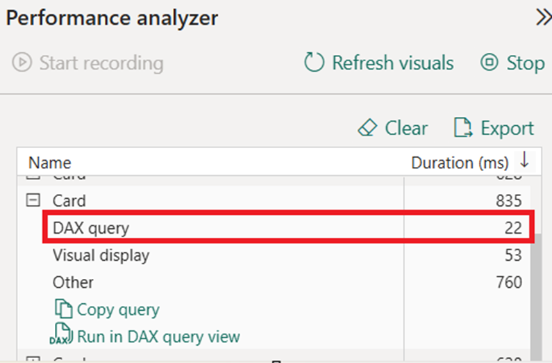
When you use a performance analyser, you can see how much time your DAX queries take to execute. If you notice that those take a long time in comparison to everything else, you should look into optimising your DAX statements.
Our first recommendation is to avoid all the iterator formulas like SUMX, AVERAGEX, COUNTX, etc. Iterator functions apply the specified calculation to one row at a time to produce the final result, which makes them relatively slow.
If you have to use iterator functions, try using them on the smallest table possible. Consider aggregating your tables by using the SUMMARIZE DAX function. Importantly, avoid nested iterator functions where you have SUMX inside of another SUMX.
Microsoft also recommend using variables inside of your DAX to optimise performance.
Consider an example for a formula without variables:
Sales YoY Growth =
([Sales] - CALCULATE([Sales], PARALLELPERIOD('Date'[Date], -12, MONTH))),
    CALCULATE([Sales], PARALLELPERIOD('Date'[Date], -12, MONTH))
Now consider the same formula with variables
Sales YoY Growth =
VAR SalesPriorYear = CALCULATE([Sales], PARALLELPERIOD('Date'[Date], -12, MONTH))
VAR SalesVariance = DIVIDE(([Sales] - SalesPriorYear), SalesPriorYear)
RETURN
SalesVariance
In the first measure definition, the formula is inefficient because it requires Power BI to evaluate the same expression twice. The second definition is more efficient because, thanks to the variable, Power BI only needs to evaluate the PARALLELPERIOD function once.
When you connect to SQL databases by using Direct Query, the loading speed of your graphs depends on how quickly the data can be extracted from the database. It takes less time to extract data from a more powerful database (with higher DTU or vCore). If your budget allows, consider upgrading your database to use Direct Query.
Hardware specifications also matter when you use a data gateway. When using a data gateway, the data flows from your data source to your computer and then to the Power BI Service. As a result, the more CPU and memory you have, the less time your dataset will take to refresh. Consider installing your data gateway on a virtual machine, as you can easily change the CPU and memory parameters on it.
There are some data gateway settings that you can enable on your data gateway to make the data load faster.
By default, when you use a data gateway, the data is first queried from the data source, then processed and compressed into a Power BI data model. Consider enabling the StreamBeforeRequestCompletes command, which causes the gateway to stream the data immediately once it is queried.
By default, the Power BI gateway also performs anti-virus scans for all the folders of your PC. You may consider excluding some folders from anti-virus scanning to improve performance.
Power BI design best practices focus on user experience and clarity of communication through data. The best design practices come down to designing an intuitive report layout, selecting the best graphs and following core data visualisation principles.
There are 7 Gestalt principles of data visualisation that explain how our brains interpret visualised information. These principles are proximity, similarity, continuity, closure, enclosure, symmetry and figure-ground. Make sure that you follow these design principles to make your report intuitive to understand.
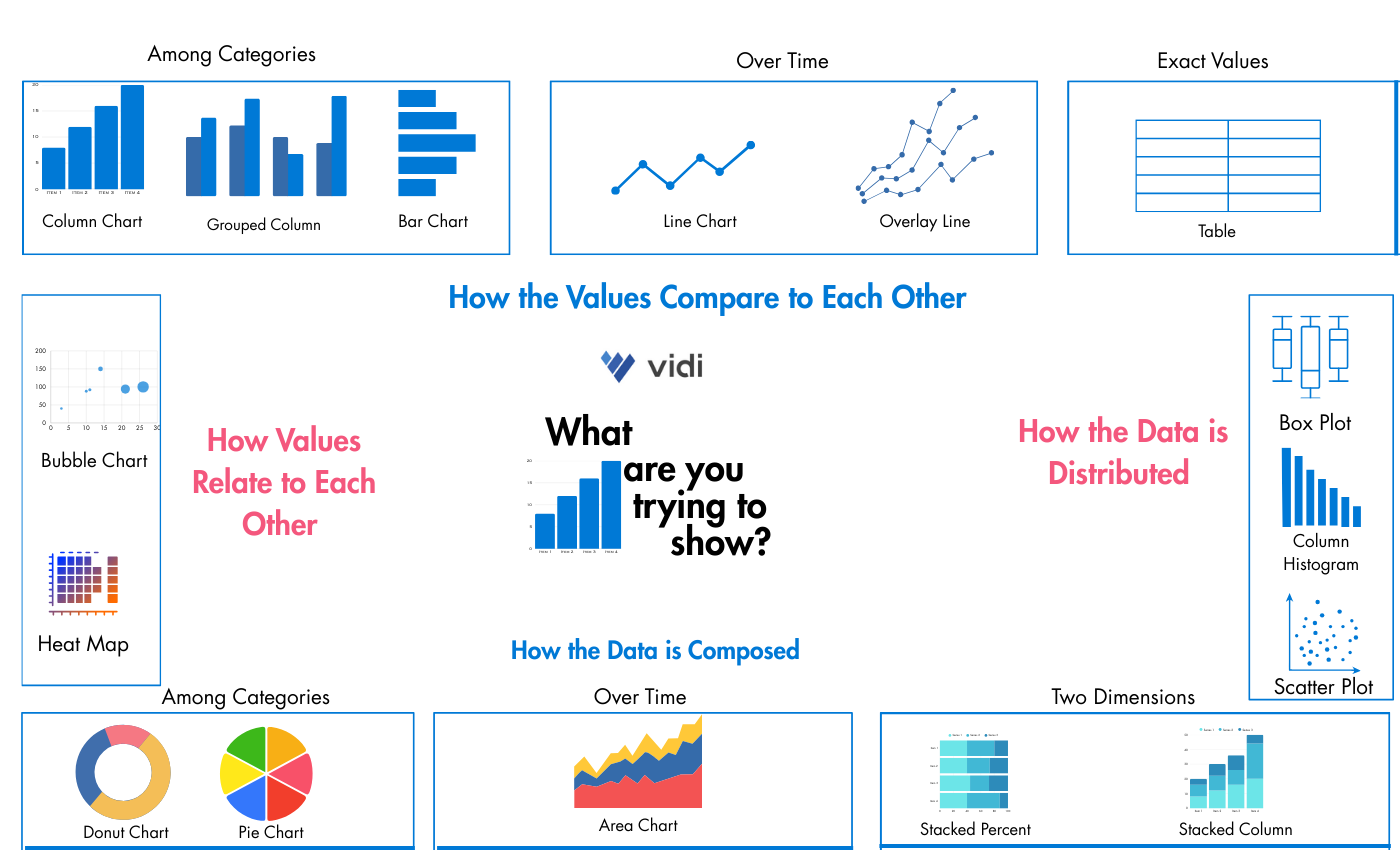
Selecting appropriate graphs makes the analysis easier to read and communicates the insights more clearly. You can refer to our guide on how to select charts for your Power BI report.
Here is a quick demonstration of how to select the appropriate graphs.
The F-shaped layout principle explains that people read Power BI dashboards the same way that they read a book. We first read the first line from left to right, then our eyes switch to the next line and so on.
In practice, this means that we need to drill down into our data as we are going from the top left to the bottom right corner. For example, the top line of our report is a good place for card visuals that provide a quick summary of data. Similarly, the bottom right corner of our report is a good place for a table of data that allows the users to explore data in a lot of detail.
All the formatting elements that do not add value can be classified as noise. It is important to remove those because they lead to a visual overload and distract the users from the analysis.
By default, Power BI adds axis names, which can be easily deleted. If you give a clear title to your chart at the top, you can communicate the same information by using far less text.
Similarly, Power BI often aligns the text in the graphs diagonally or vertically. As a result, you have to tilt your head to read this text, which takes more effort. We always recommend to only horizontal text in your reports because it is much easier to read.
Avoid packing your report pages tightly with graphs because they become a lot harder to read. Make sure that you leave gaps of white space between the visuals. Using white space is similar to using pauses after every sentence when you talk. This adds clarity and gives mental space to your users to digest your point before moving on to the next one.
Similarly, avoid visual elements like background colours and gridlines that reduce the amount of white space. Those design elements clutter the data visualisation too much and make it more difficult to read.
Our brain already has colour-related associations: green means good, red means bad, etc. It makes sense to make use of those associations when designing your Power BI reports. Use conditional formatting with these colours to make it more obvious for your report readers whether the findings are good or bad.
Another best practice is to teach your audience to associate a colour with a particular metric by using it consistently. Scanning a report page for colours is much quicker than reading a graph title. By using the same colour consistently for the same metric, you are making your report easier to understand.
Row-level security allows you to limit the displayed data in the report depending on the role that users are assigned to. For example, we can have a US team, a UK team and a corporate team using our reports. By using row-level security, we can show only the UK data to the UK team, the US data to the US team and all the data to the corporate team.
It is best practice to follow the principle of least privilege, where you give users the minimum level of access that they need to perform their tasks.
Users with admin-level access to a workspace can grant access to any other users. Make sure that you don’t grant admin-level access to any sensitive data assets.
Users with admin or member access can allow others to reshare workspace items and manage permissions to access a data model. If you don’t want your reports or dataset to be reshared unexpectedly, preserve these levels of workspace access.
Users with admin, member or contributor access can download the Power BI files, which enable them to share those with others. If you don’t want users to be able to share Power BI files, then give them viewer access.
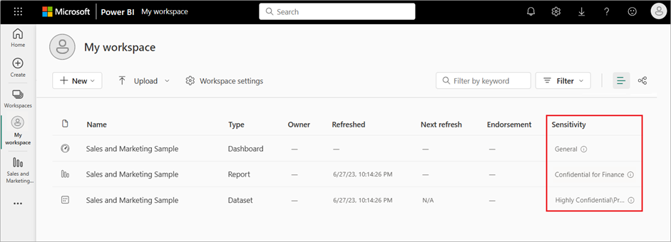
Power BI workspace admins can assign sensitivity labels to dashboards and datasets. These sensitivity labels help users know which assets are highly confidential and should not be shared with any other users. These labels will be visible to users in their workspace menu, but also when they open their Power BI reports.
If you have sensitive on-premise data which you do not want to import to the Power BI cloud, you can leverage the Power BI Report Server. Power BI Report Server basically allows you to deploy a Power BI Service environment on-premises.
Report Server is sold bundled with a SQL Server Enterprise license, which also gives you enough computing power to process 100M+ rows. It is an expensive tool, coming at $15,000 per year, so it is only worth considering when you have a large amount of sensitive data and have the budget for it.
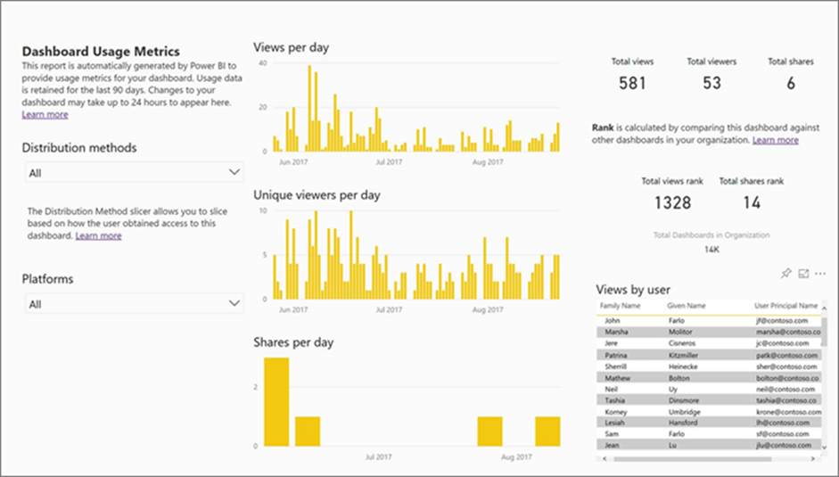
Power BI administrators can see system-generated reports of what users accessed their dashboards and what pages they saw. It is worth monitoring these reports to spot any irregular activity which could mean a data security issue. For example, this report will tell you if someone who is not meant to see the dashboard is accessing it.
![]()
![]()
![]()