Whether you’re tracking sales performance, monitoring marketing campaigns, or analyzing customer behavior, these templates are fully customizable to fit your unique needs—no advanced skills required.
Save $3,000: Get this premium Tableau QuickBooks Online template FREE when you buy our Connector! 📈💡 Transform your financial reporting instantly—no extra cost, just smarter insights.
Free Tableau QuickBooks Online Templates
P & L
Balance
Cash Flow
Receivable
Vidi Corp has launched a suite of powerful Tableau QuickBooks Online template, now available as turnkey solutions for businesses like yours. Designed to streamline your financial analysis, these dashboards solve critical challenges:
✅ Unified Financial Visibility: Seamlessly combine data from multiple QuickBooks Online accounts into a single, intuitive dashboard—drill down into individual accounts or view consolidated metrics in one place. ✅ Visual Clarity, Instant Insights: Transform raw numbers into interactive charts, graphs, and visual reports, making complex data easy to understand and act on. ✅ Tailored to Your Needs: Customize every detail! Adjust the dashboard’s design, integrate additional data sources, or add new visualizations—either in-house with user-friendly tools or through Vidi Corp’s expert customization services.
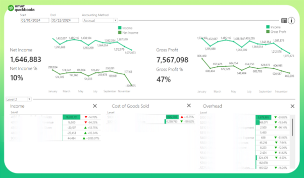
This QuickBooks Template Dashboard, built with Tableau displays a business’s financial performance and assets. You have interactive filters to select date ranges and accounting methods (accrual or cash), it combines trend lines, detailed tables, and bar comparisons to provide a comprehensive analysis of your financial health.
Customizable Filters: Adjust the date range and switch between accrual or cash accounting methods to adjust the dashboard to your needs.
Trend Comparisons: Line charts display Income vs Net Income and Income vs Gross Profit, offering a quick way to spot profitability and revenue trends over time.
Scorecard & Bar Comparisons: A scorecard highlights current vs previous period data for Income, Cost of Goods Sold, and Overhead with percentage differences, while bar charts provide a month-by-month visual comparison to identify changes and patterns.
Interactive Access: Click the table icon to expand the view, revealing additional details for Income, COGS, Overhead, and assets, enhancing your ability to explore data.
Drill-Down Levels: Use the level parameter to toggle between detailed breakdowns (Level 2 and Level 3) in the tables, allowing you to drill down into specific categories or view higher-level summaries.
Detailed Asset Table: An expansive table lists asset categories with transaction type values (Level 0, Level 1, Level 2) and balances, giving a clear overview of your financial position.
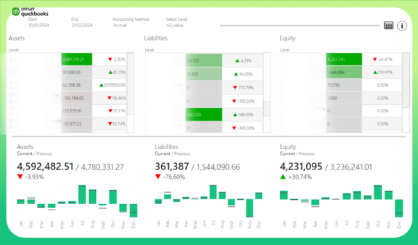
Balance Dashboard
This QuickBooks Template Dashboard, built with Tableau provides a detailed and interactive view of your business’s financial position. Featuring three tables for Assets, Liabilities, and Equity, along with scorecards, bar charts, and drill-down capabilities, this template helps you monitor balances and track changes with ease.
Customizable Filters: Adjust the date range and switch between accrual or cash accounting methods to align the report with your preferences. Additionally, use the dimension filter to toggle between Level 2 and Memo/Description views in the tables for a tailored analysis.
Balance Tables: Three tables display Assets, Liabilities, and Equity, showing balances with percentage differences compared to the previous period and you can toggle between Level 2 and Memo/Description.
Scorecards & Bar Charts: Scorecards summarize total Assets, Liabilities, and Equity with current versus previous period data and percentage differences. The accompanying bar charts visualize monthly trends, with green bars representing the current period and gray bars showing the previous period for easy comparison.
Interactive Drill-Down Tables: Click the table icon to reveal detailed tables for Assets, Liabilities, and Equity, where you can drill down between Level 0, Level 1, and Level 2 to explore balances at varying depths of detail.
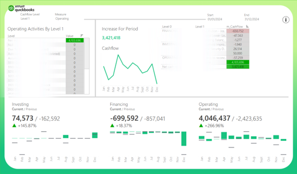
Cashflow Dashboard
This QuickBooks Template Dashboard, built with Tableau provides a detailed and flexible view of your business’s cash flow using accrual accounting. Equipped with interactive filters for start and end dates, it features dynamic tables, a cash flow trend line, bar charts, and KPI scorecards to track and analyze cash movements across Operating, Financing, and Investing activities.
Customizable Filters: Adjust the start and end date range to focus on specific periods, tailoring the report to your needs.
Dimension & Measure Switching: The top left table allows you to switch between Cash Flow levels (Level 1, Level 2, and Account) and measures (Investing, Financing, Operating).
Detailed Drill-Down Table: The right-side table displays cash flow details, with the ability to drill down between Level 0, Level 1, and Level 2 by cash flow, providing deeper insights into specific activities.
Cash Flow Trend Line: A line chart visualizes the overall cash flow trend over time, helping you identify patterns and shifts in liquidity.
Bar Charts & KPI Scorecards: Three bar charts below compare current (green) and previous (gray) cash flow for Investing, Financing, and Operating activities on a monthly basis. Accompanying KPI scorecards show current versus previous totals with percentage differences, indicating whether you’ve achieved an increase or decrease in cash flow.
Increase/Decrease Indicator: A KPI uses the calculated total cash flow to clearly mark an increase or decrease compared to the baseline.
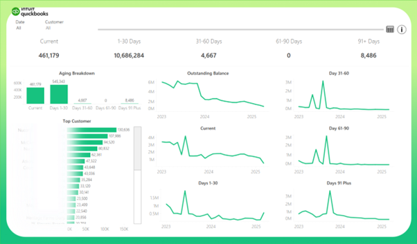
Receivable Dashboard
This QuickBooks Template Dashboard, built with Tableau offers a detailed and interactive view of your outstanding balances using accrual accounting. Featuring date and customer filters, KPI cards, trend lines, and dual bar charts, it helps you track and manage receivables effectively.
Customizable Filters: Adjust the date range and select specific customers to focus on targeted data, tailoring the report to your needs.
KPI Cards: Display total outstanding balances across Current, 1-30 Days, 31-60 Days, 61-90 Days, and 91+ Days categories, providing a quick overview of receivable status.
Trend Lines: Line charts visualize the outstanding balance and aging breakdown trends over time, helping you identify payment patterns and delays.
Bar Charts: Two interactive bar charts include a Top Customers chart, showing outstanding amounts by customer, and an Aging Breakdown chart, categorizing balances by aging periods. Clicking the Top Customers bar filters all charts based on the selected customer, while the Aging Breakdown bar filters the Top Customers chart accordingly.
Detailed Table (On-Demand): Click the table icon to reveal a detailed table with breakdowns of balances by customer and aging periods, enhancing your ability to explore data.
The price of this report is $500 and delivery time is around 1-2 working days.
If you didn’t find the analysis that you were looking for on this page, please contact us. We can create custom reports for our clients. We have a lot of experience in working with QuickBooks Online data so we would be able to create a custom dashboard for you quickly and efficiently.