We have had several projects where the clients asked us to create Power BI call centre dashboards. Our Power BI consultants created those from data sources like Zultys, Zoom Call Centre and LiveChat.
In some call centres these dashboards are displayed on TV, on others the management uses them to guide operational decisions and optimize call centre performance.
The process of creating these dashboards is always the same:
In this article we will talk you through several call centre KPI dashboards that we have created for clients, explain the common KPIs and give recommendations based on our experience.
The call centre KPIs would be different depending on the purpose of the call centre (e.g. sales, customer support, etc) and whether you are dealing with outbound or inbound calls.
Outbound call centre performance is most often measured based on the volume of calls made and the number of conversions. The common sales call centre KPIs are quite self explanatory:
Inbound call centres are incentivised to answer more incoming calls, resolve issues quickly, improve customer satisfaction. As a result they have are a lot more nuanced KPIs.
KPIs measuring customer experience:
KPIs measuring agent performance
Operational efficiency KPIs:
Now that you understand the call centre KPIs and how they are used for operational management we can look at some examples of call centre dashboards that our team has created.
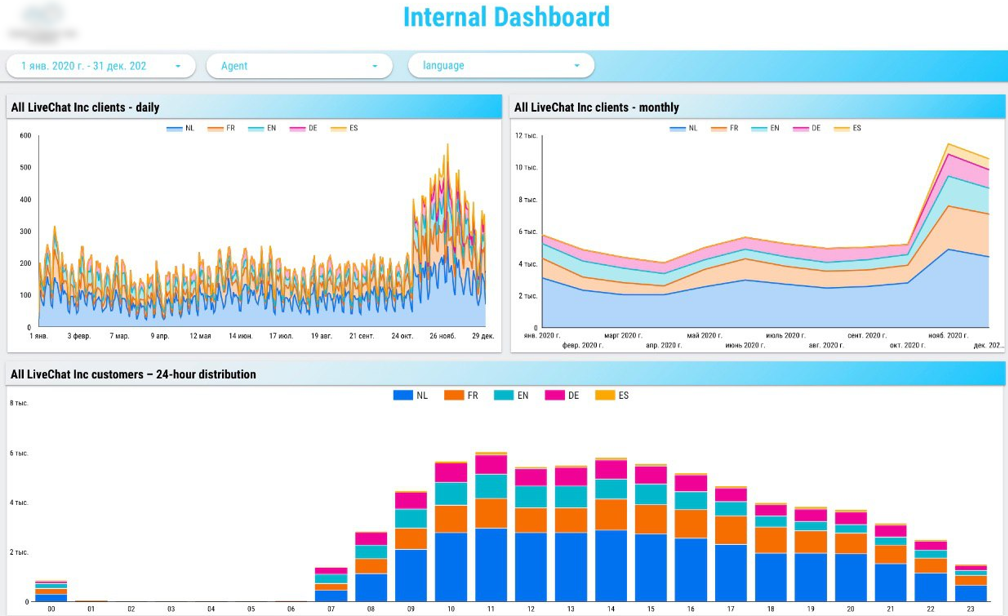
This dashboard was created for a global company that had a multi-lingual customer support centre. It was built with the data from LiveChat which is software connecting customers to agents via chats widgets on the website.
The dashboard helps to track the number of requests per language and how it is trending. It is also tracking the average number of requests for every working hour. These insights help with the capacity planning and agent shift scheduling.
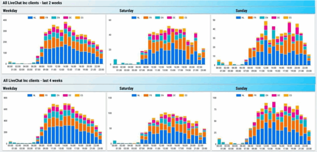
Similarly, we analysed the number of customer requests per hour for each weekday. This analysis helps to plan for capacity throughout the week as weekly patterns become more visible.
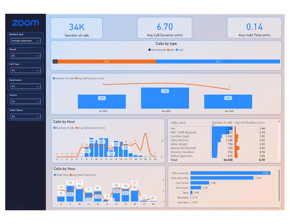
This dashboard was created from Zoom call centre data. We used our proprietory Zoom connector to extract the data automatically.
The dashboard measures important operational KPIs such as number of calls, average call duration and average hold time. You can also see the number of calls by status which helps to measure the perfentage of calls that actually get through to an agent.
Breaking down the number of calls and average calls duration by agent helps to measure the efficiency of every team member. You can clearly see who is taking less time to resolve the customer queries as compared to other members of the team.
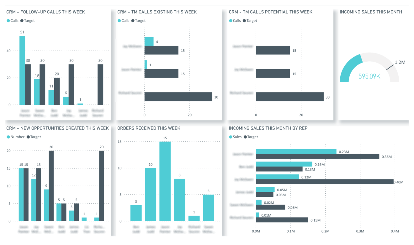
We created this dashboard for a sales call centre and was displayed on a TV to update the team on their performance. The management wanted to create a sense of transparency so that the team can motivate each other to meet their targets.
You can clearly see which sales agents meet their activity target (number of calls) and their conversion targets (number of new opportunities, orders and revenue). You can also see the overall team sales vs target for this month which measuring how the team is moving as a whole towards their common objective.
Building an automated call centre dashboard in Power BI takes a lot of expertise in creating custom connectors, transforming data in Power Query and visualizing the data effectively. Contact us today to discuss your project and get proffessional help building your analysis.

Support
All the support you need – when you need it. From 1-hour quick fix support to longer-term partnership that drives your business forward.

Consultancy
Advanced data thinking, creative ideas and the best Power Platform practices to unlock the true potential of your business data.

Training
Succeess shouldn’t be a one-off. When we train you teams user adoption surges and your Power Platform results radically improve.
![]()
![]()
![]()