A well-designed ecommerce analytics dashboard in Power BI or Looker Studio can turn an online store into a truly data-driven marketing engine almost overnight. The ecommerce dashboards built by our Power BI consultants help ecommerce brand owners to:
Our clients who use these ecommerce dashboards mainly come from fashion, jewellery and food supplements industries. However, they would also be useful for other types of ecommerce brands.
In this article, we’ll first walk through our standard ecommerce KPI dashboard templates, which are available for free and ready to download. We’ll then showcase custom ecommerce dashboard examples we’ve delivered for clients who wanted to take their analytics to the next level.
An ecommerce dashboard is an analytics tool that pulls together sales and customer behavior data from your online store. The most common data sources for analyzing purchasing patterns are ecommerce platforms such as Shopify, Magento, or BigCommerce.
Many ecommerce brands also sell through marketplaces like Amazon, so an ecommerce analytics dashboard often combines data from the ecommerce platform with marketplace data.
Google Analytics is commonly used in ecommerce dashboards to understand how potential customers interact with the website.
In addition, ecommerce dashboards frequently integrate data from marketing channels such as Google Ads and Facebook Ads.
These dashboards are typically used by brand owners and marketing teams to design new campaigns, uncover growth opportunities, and make data-driven decisions.
There are many software companies that offer ready-made ecommerce dashboards, such as Triple Whale. These platforms come with built-in integrations for a wide range of online marketing data sources and automatically funnel that data into preconfigured dashboards. The main drawback, however, is their limited dashboard customization options.
Ecommerce brands that require more advanced or highly customized analytics are often better served by tools like Looker Studio or Power BI. These ad hoc reporting tools allow businesses to build fully automated ecommerce dashboards tailored to their specific needs. We typically recommend starting with a ready-made Power BI ecommerce dashboard template and then customizing it to include the exact analyses you require.
When using Power BI or Looker Studio, you’ll also need third-party connectors to automatically extract data from your various data sources.
For paid advertising platforms such as Facebook Ads and Google Ads, we recommend Windsor.ai. Their connectors cost $20 USD per month for up to three data sources, making them a very cost-effective option.
If you plan to extract data from Shopify, we recommend the Vidi Corp Shopify connector for two key reasons:
Ready-made dashboards: The Vidi Corp Shopify connector includes 4 free Power BI Shopify dashboards that offer advanced analytics such as customer lifetime value (CLTV), reorder rates, cohort analysis, and product bought together. These are the most advanced ecommerce dashboard templates currently available on the market.
First, we’ll walk through the 4 ecommerce dashboard templates that Vidi Corp provides for free when you install our Shopify connector. You can try the Shopify connector free for 14 days, and no credit card is required.
All 4 ecommerce dashboards are built in Power BI, which means they’re easy to customize—whether that’s adding new data sources or extending the analysis to suit your specific business needs.
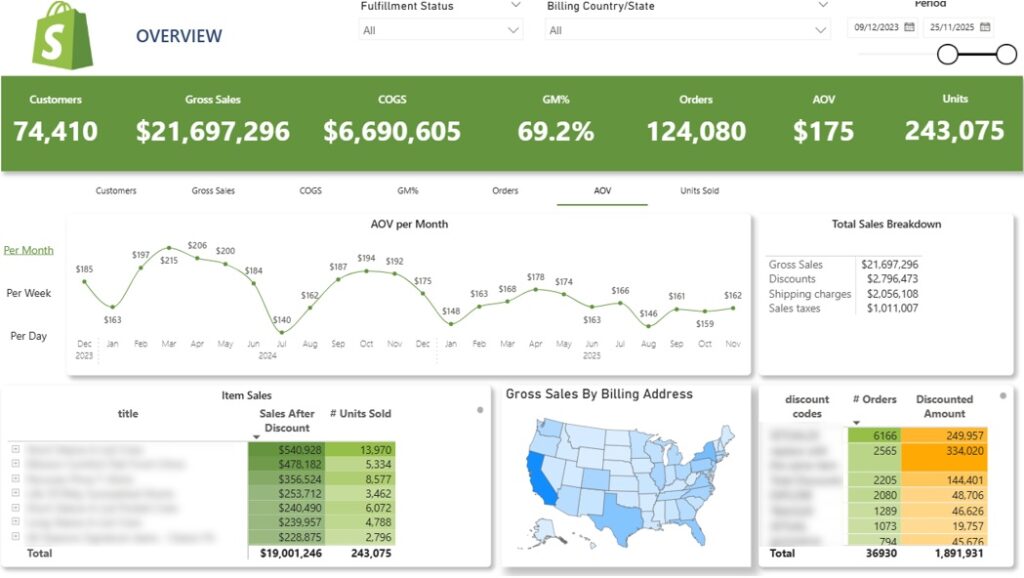
The Ecommerce Sales Dashboard gives Shopify brands a clear view of how their store is performing over time. It surfaces essential revenue metrics such as total sales, discounts applied, shipping revenue, sales taxes, average order value, and total items sold.
At the top of the dashboard, an interactive trend chart visualizes the selected metric across daily, weekly, or monthly timeframes. Users can toggle between KPIs including customer count, total revenue, cost of goods sold, gross margin, order volume, average order value, and units sold.
A detailed table below breaks down sales performance by product, showing total quantities sold. Each product row can be expanded to reveal performance at the variant level (product colours/sizes).
The geographic map visualizes gross sales based on customers’ billing locations. Selecting a specific state automatically filters all other visuals to reflect sales from that region.
To round out the analysis, a table in the bottom-right corner summarizes order volume by discount code, allowing brands to quickly assess which promotions are driving the most sales
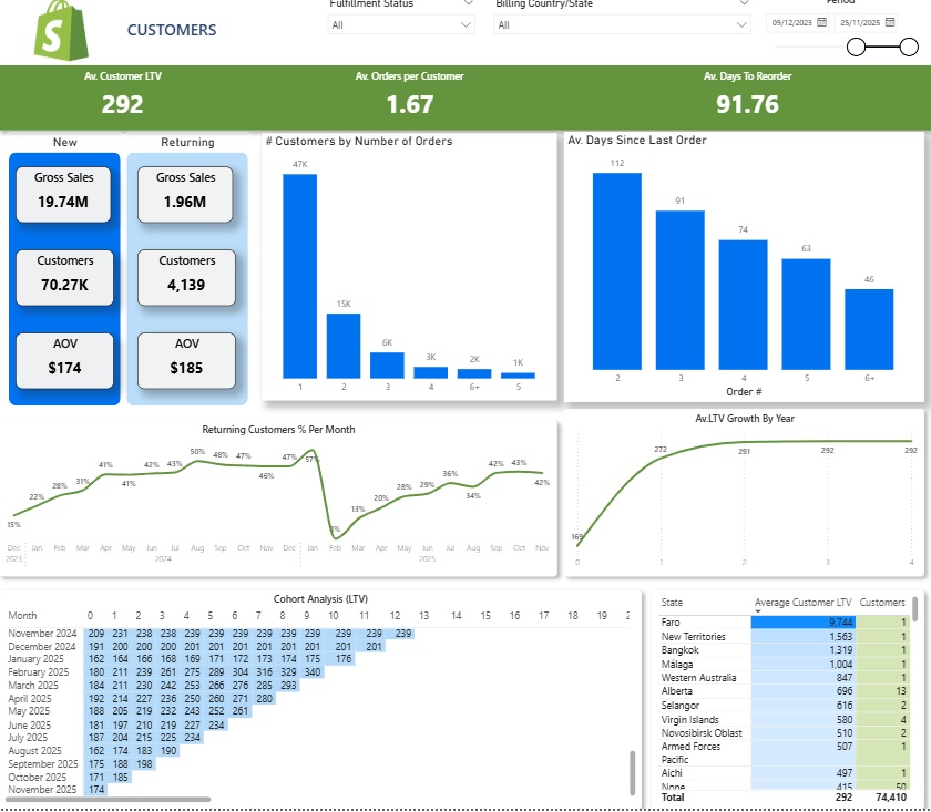
The Ecommerce Customers Dashboard delivers deep visibility into how customers interact with your store over time. It helps you understand repeat purchase behavior, long-term customer value, and how revenue per customer evolves as relationships mature. This makes it one of the most powerful components of our Shopify analytics framework.
The dashboard opens with an overview of new versus repeat customer cohorts, alongside the revenue and average order value generated by each group.
A monthly trend chart then illustrates the share of returning customers, allowing you to see what percentage of your revenue comes from returning customers.
The bar chart section at the top breaks down how many orders an average customer places. For instance, the bar charts above show that the majority of customers make only a single purchase, while smaller segments go on to place two, three, or more orders.
On the right-hand side, a bar chart shows the typical time gap between a customer’s first purchase and their second, third, and subsequent orders. This insight is especially useful for timing re-engagement marketing campaigns across email and paid social channels.
The focus then shifts to customer lifetime value. A trend line tracks how average LTV increases year over year, providing critical input for setting sustainable customer acquisition budgets and ensuring that long-term value outweighs acquisition costs.
At the bottom of the dashboard, a cohort analysis groups customers by the month of their first purchase and follows how their average LTV develops over time. This makes it easier to understand how quickly different cohorts become profitable. For example:
Finally, the table on bottom right breaks down average customer LTV by state. This helps identify geographic regions with higher-than-average lifetime value, allowing you to focus your marketing spend where it can generate the strongest long-term returns.
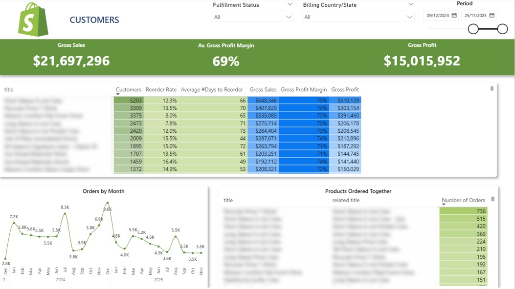
The Ecommerce Product Dashboard allows you to track product demand over time, identify which items encourage repeat purchases, and see which products are often bought together. These insights can guide the creation of new product bundles for your website and help shape more effective customer reactivation campaigns.
At the top of the dashboard, a summary table shows how many customers purchased each product, what share of those customers bought the product again, and the average time between repeat purchases. These insights can inform your product and merchandising strategy. For instance, products with high reorder rates may be good candidates for multi-pack offers, cross-sell incentives, or inclusion in customer reactivation campaigns to increase average order value.
Selecting a product from the table dynamically updates the line chart below, which displays monthly order volumes for that specific item. This makes it easy to spot trends, seasonality, and shifts in demand.
At the bottom of the dashboard, a separate table highlights product combinations that are frequently purchased together. This information can be used to create targeted promotions, build product bundles, and surface relevant recommendations to website visitors—ultimately driving higher order values and increased revenue.
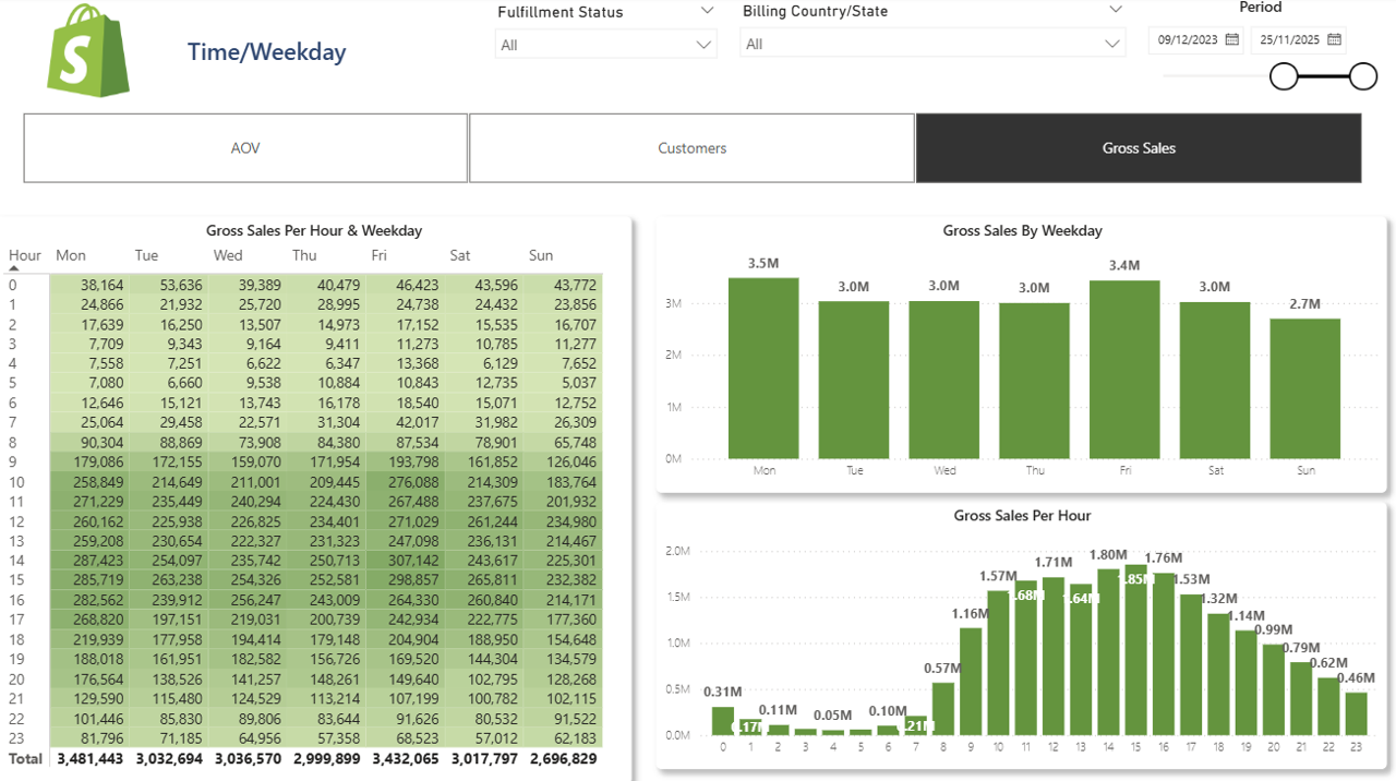
The Ecommerce Order Time Dashboard provides insight into when your customers make purchases, breaking down sales, average order value, and customer numbers by both weekday and hour of the day. This makes it easy to identify patterns in shopping behavior.
A toggle at the top allows you to switch the displayed metric across all visuals, choosing between AOV, customer count, or total sales.
The histogram in the top-right corner visualizes the selected metric by weekday. For example, on the dashboard above, Mondays and Fridays emerge as the busiest days, indicating that shoppers are more active at the start and end of the workweek. These patterns can inform the timing of marketing emails or promotional campaigns.
Below, another histogram breaks down the same metric by hour, showing when customers are most likely to shop. This is particularly useful for scheduling paid advertising campaigns, such as Facebook Ads, to align with peak activity times.
On the right, a heatmap-style table combines weekdays and hours, with each cell representing the value for the chosen metric. Darker shades highlight higher performance, allowing you to quickly spot:
The ecommerce KPI dashboards shown below are custom solutions we’ve created for previous clients. They aren’t available for instant download, but you can work with our ecommerce consultants to build a similar dashboard tailored to your business.
Even so, these examples still demonstrate the types of insights and analyses that can be generated using data from our Shopify connector and other sources.
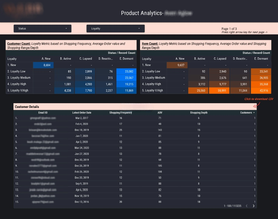
This Google Data Studio ecommerce dashboard uses Shopify data to group customers based on their loyalty level and stage in the customer lifecycle.
The loyalty score ranges from 0 to 1 and is assigned to each customer based on their average order value, purchase frequency, and the variety of products they’ve bought.
The retention metric is determined by the date of a customer’s most recent purchase. Customers are then categorized into one of the following groups:
The dashboard allows users to filter by loyalty score and retention group, making it easy to target specific customer segments. For example, you can extract a list of dormant customers and launch email campaigns to re-engage them.
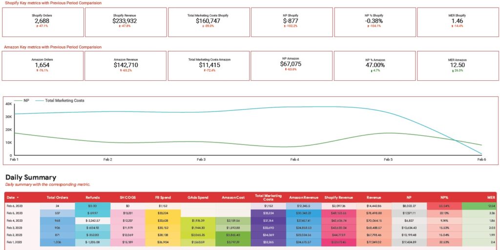
A good ecommerce marketing dashboard combines sales data with advertising expenses from paid ad platforms. Since marketing costs are often the largest overhead, analyzing them is crucial for understanding overall brand profitability.
The Google Data Studio ecommerce dashboard above was designed for an ecommerce brand selling on both Amazon and Shopify. It begins with two rows of card visuals summarizing sales performance for each platform.
Daily performance is detailed in a table, showing the total number of orders, cost of goods sold, revenue, and refunds across Shopify and Amazon. The table also breaks down advertising spend on Facebook, Google, and Amazon, along with the combined total marketing cost. It then calculates net profit (after COGS and marketing expenses), profit margin, and the marketing efficiency ratio (total revenue divided by total marketing spend).
A line chart in the center tracks daily marketing costs alongside net profit, making it easy to monitor how profitability fluctuates over time.
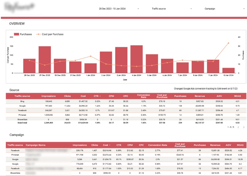
Another key component of any ecommerce marketing dashboard is evaluating marketing efficiency across channels. This analysis highlights which channels are driving the most profitable customer acquisitions and supports budget allocation decisions.
For instance, the ecommerce Looker Studio dashboard we developed for a flower delivery company combines data from Google Analytics, Bing, Google Ads, Facebook, Pinterest, and ShareASale.
At the top, a bar chart displays daily purchases alongside the cost per purchase, helping ensure customer acquisition costs remain below the average order value.
Below, a table breaks down key marketing metrics by channel. Metrics like impressions and CPM indicate which channels are most effective for building brand awareness, while Cost Per Purchase and ROAS measure the profitability of ad spend. Conversion rates, purchases, and revenue help pinpoint the channels that contribute most to overall business performance.
A second table provides the same metrics broken down by individual campaign and channel, making it easy to identify the campaigns that deliver the best balance of cost efficiency, sales volume, and brand exposure.
Google Analytics is another key data source for ecommerce analytics dashboards. GA4 provides valuable insights into traffic acquisition channels, user demographics, and how visitors interact with your website content. This information plays a critical role in conversion rate optimization (CRO), SEO, and overall traffic growth strategy.
The GA4 section of an ecommerce dashboard typically includes add-to-cart, checkout, and purchase events. While this data is available directly in GA4, we generally recommend sourcing transaction-level data from your ecommerce platform, such as Shopify or Magento.
GA4 purchase data is inherently imperfect due to factors like cookie restrictions, ad blockers, and tracking limitations. That said, GA4 is still extremely useful for understanding the demographic breakdown of conversions and for analyzing performance by landing page, traffic source, or campaign.
We recommend relying on Google Analytics primarily for traffic acquisition and on-site behavior metrics, including new/returning visitors, session volume, and average session duration. These metrics tend to be more reliable in GA4 and are not available within ecommerce platforms themselves.
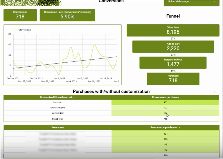
The Google Analytics ecommerce dashboard shown above was built to help a wristband brand track and analyze conversions. Its key advantage is the ability to segment conversion performance by landing page, traffic source, and customer demographic characteristics. GA4 also records whether a purchased wristband was customized, using a custom parameter captured directly within Google Analytics.
On the right-hand side, a funnel visualization shows how users progress through each stage of the purchase journey, along with the conversion rate between steps. Below, supporting tables break down purchases by product, including a comparison of customized versus standard wristbands sold.
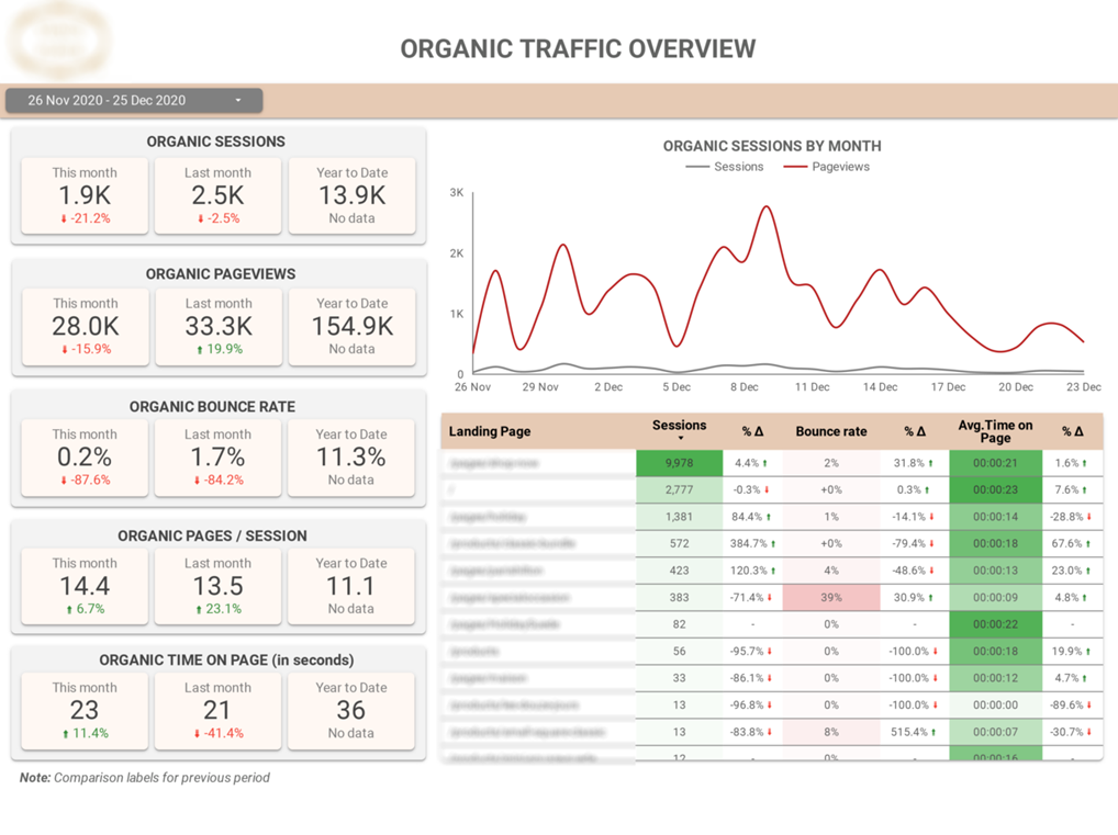
The Looker Studio ecommerce Google Analytics dashboard shown above was created to evaluate how effective organic search is as a traffic acquisition channel.
It highlights core website performance metrics such as sessions and pageviews, with a strong focus on daily trends and month-over-month comparisons to track growth over time.
A detailed table below breaks down sessions, bounce rate, and average time on page by landing page, making it easy to identify which pages drive the most traffic to the site. This dashboard represents just a portion of what’s possible with SEO-focused ecommerce analytics. Additional examples and deeper analyses can be found in this related article
Our experienced ecommerce analytics consultants have developed 1000+ dashboards for 600+ clients including large ecommerce brands such as Chilly Bottles, Dermalogica and Ray Ban. We would be excited to bring our experience into your project!
![]()
![]()
![]()