You get this Power BI QuickBooks Online template when you start a free trial for our connector 📊
Why reinvent the wheel? Our template already has all the formulas to make your numbers match between QuickBooks Online and Power BI. Installing this template only takes 5 minutes!
Old price of the template – $3000
New price – free with the trial of our Power BI QuickBooks Online Connector.
Vidi Corp has created the following list of QuickBooks Online Power BI dashboards. These dashboards are now offered to our clients as products.
The dashboards solve multiple problems:
All the QuickBooks Online Power BI dashboards are customisable. The clients can do changes themselves or Vidi Corp can do the customisations as a service. Customisations can include changing the look and feel of the dashboard, extracting data from more sources and adding new graphs.
All the dashboards require a QuickBooks Online connector by Vidi Corp in order to work.

This dashboard shows monthly trends for Income, Overheads, and Net income. The income and overhead are then broken down by account and transactions that make up the value of those accounts.
It is possible to switch from accrual to cash method of accounting, filter by client (if you have multiple QuickBooks accounts) and filter by class.
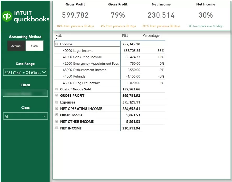
The P&L table report shows the familiar tabular look and feel of the profit statement. Categories can be collapsed and expanded as needed using the plus and minus icons. A percentage column is used to show a % distribution of amounts in a particular category.
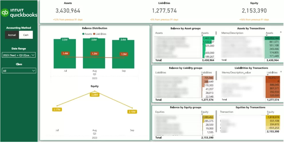
The balance sheet report is showing the trends for assets, liabilities and equity. All of those are also broken down by account groups and transactions that make up the value of all accounts.
Same as before, the data can be viewed for accrual or cash basis. The filters by date, class and client are also possible.
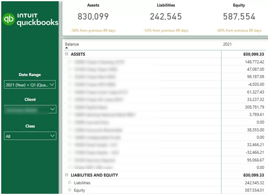
Balance sheet table is showing the familiar tabular interface for this financial statement. The columns in the main table show a breakdown of amount by year. If multiple years are selected you can easily view the trends.
Same as before you can filter by class and client.
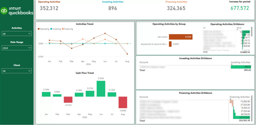
The cash flow dashboard shows the total increase or decrease in cash reserves in the selected period and month over month. This change in cash reserves is broken down by operating, investing and financing activities which is the same breakdown you would see in QuickBooks Online. Each activity group is broken down further into accounts.
Please note that it is possible to add a class column inside of this report upon request
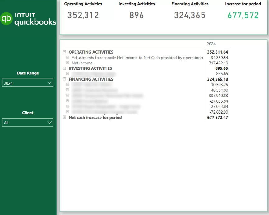
The Cash Flow table report mimics the Cash Flow statement format in QuickBooks Online. You can expand and collapse categories using the plus or minus icons.
Apart from the free QuickBooks Power BI templates, we also offer services in building custom templates to our clients. As part of these projects, we would work with the clients to identify their reporting needs and create the functionality they need in Power BI. Below you will find some custom QuickBooks Power BI templates that we have built for our clients.
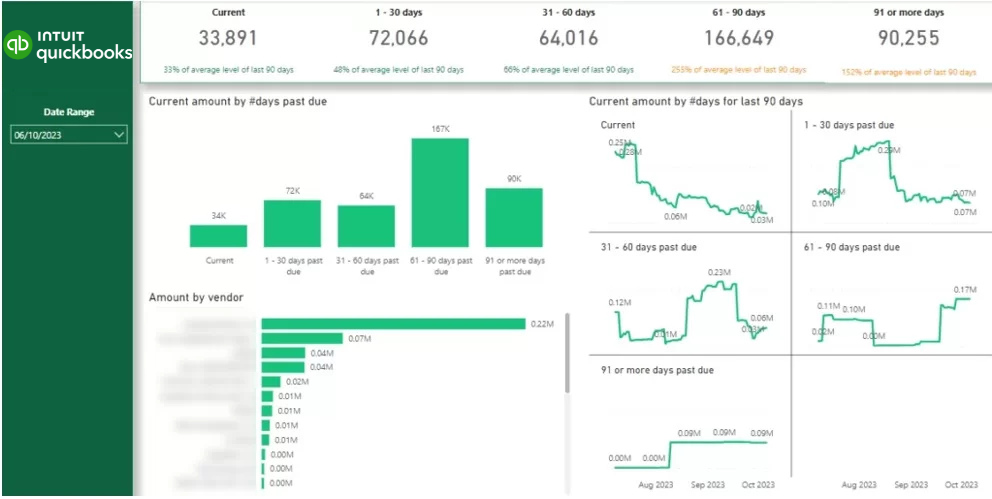
This report is showing the account receivable balance. The histogram is showing the amount outstanding by number of days for the current date. The line charts on the right are showing the trends for each of those categories. Finally, the bar chart shows the total amount outstanding by counterparty.
The price of this report was $500 and delivery time was around 1-2 working days.
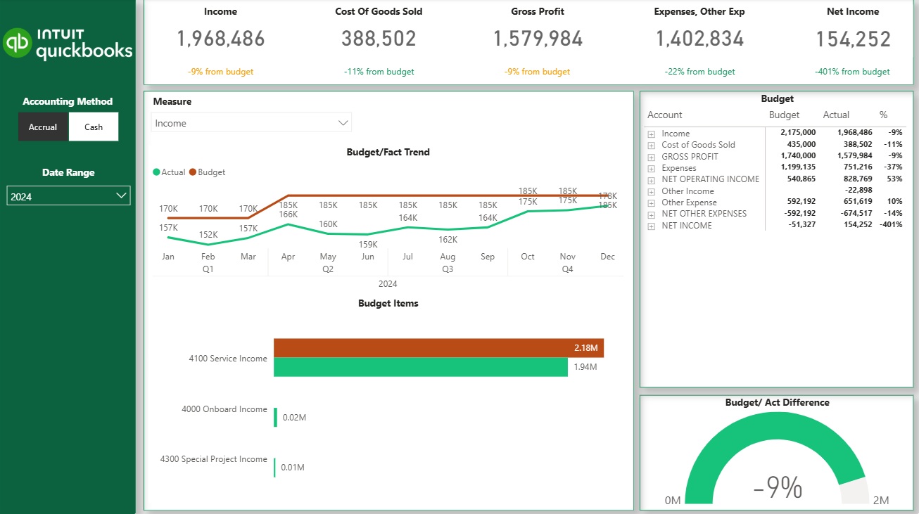
The dashboard is showing actuals vs budget for the P&L statement. It shows both full year and YTD views for the actuals.
The price of this report is $500 and delivery time is around 1-2 working days.
If you didn’t find the analysis that you were looking for on this page, please contact us. We can create custom reports for our clients. We have a lot of experience in working with QuickBooks Online data so we would be able to create a custom dashboard for you quickly and efficiently.