

Have you ever wondered how to design a professional-looking Power BI Dashboard? The difference between a good enough dashboard and a professional one is that extra layer of quality, attention to detail, meticulousness, and finesse that makes it a pleasure to use.
There’s a reason more value is placed on a Michelin-starred restaurant than a fast-food joint even though they both sell the same thing: food.
The difference is in the how, not the what.
A Michelin-starred restaurant doesn’t just serve food; it sells an experience. You can see how much care and attention goes into every dish, from how it’s prepared to how it’s presented.
One word for it is professional.
The same applies to dashboard building.
A professional dashboard is like a Michelin-starred presentation of your data.
A fair-to-middling dashboard will do the bare minimum of visualizing your data while a professional one takes it a step further and creates an experience that’s not just informative but also enjoyable.
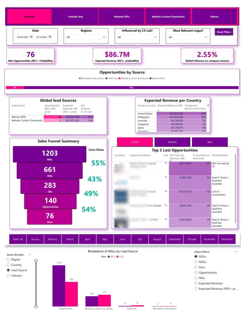
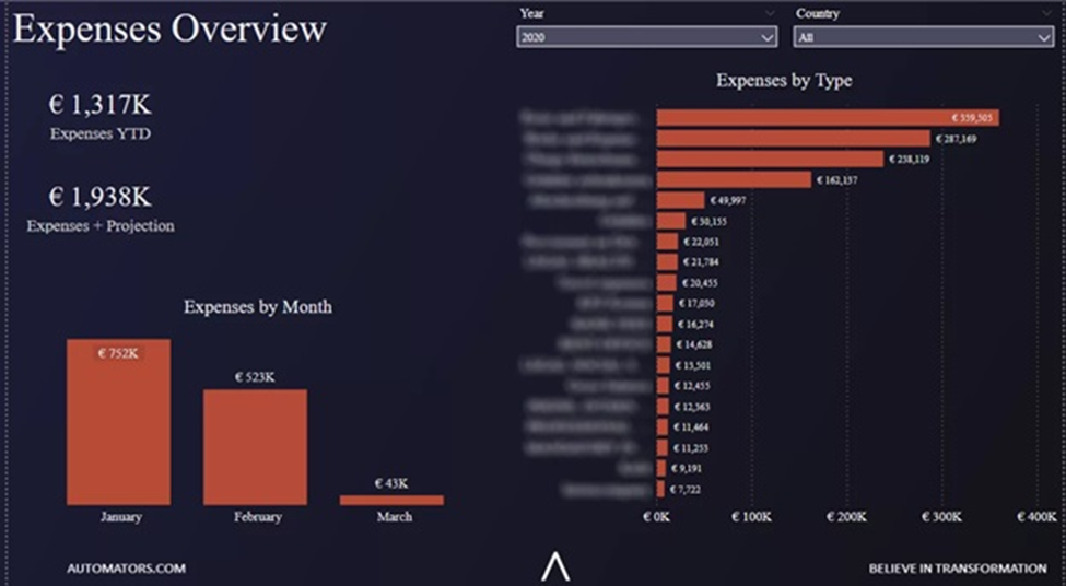
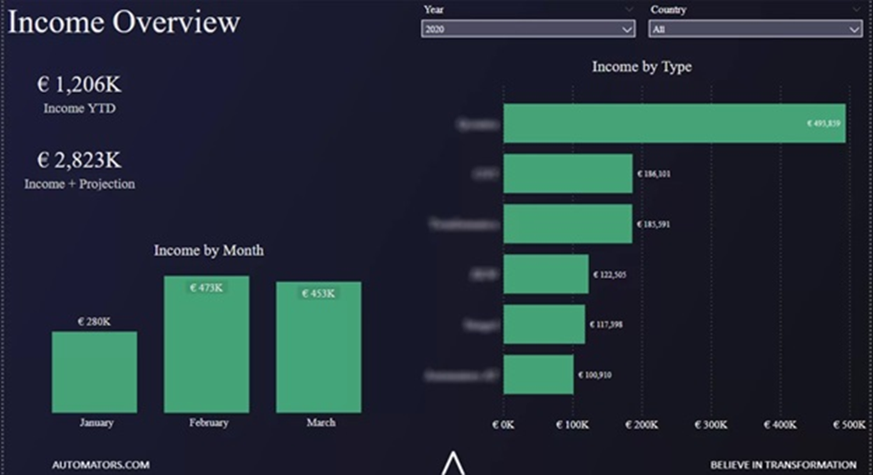
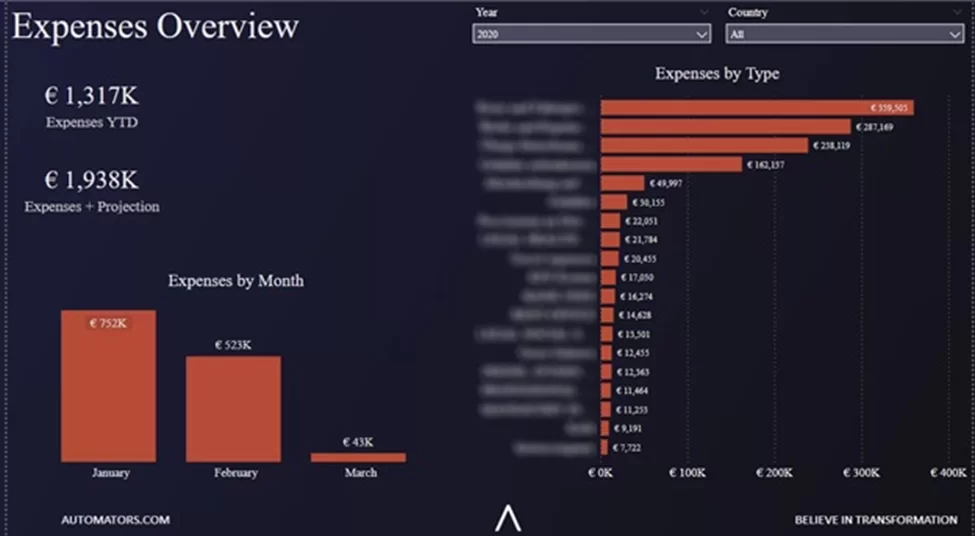
The image above shows a shining example of what a professional Power BI report looks like.
Notice it’s informative, well-designed, and easy to understand. Those three things form the basis of a professional-looking dashboard.
If you want to create something as high-quality as this, keep reading.
In this blog, we’ll discuss the six general steps and guiding principles that go into creating professional-looking dashboards like the one above.
P.S. The tips we’ll discuss can also be used for other BI tools like Tableau, Looker Studio, etc.
Before throwing visuals up on a dashboard, you need to get the answer to two important questions that will guide the rest of your dashboarding journey.
1. Who will be using the dashboard? Their roles, responsibilities, and technical skills will influence the complexity and concept of the design.
2. What are they looking for? The dashboard should show them that information clearly and concisely.
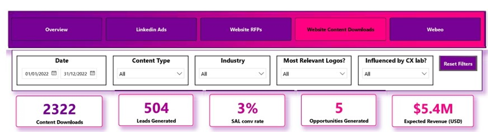
For example, the report above was created for the global head of marketing of a firm– the user.
The user was looking for insights around won opportunities, expected revenue, and conversion rates across different lead sources and countries, all of which we delivered in an easy-to-digest, easy-to-navigate, and visually appealing manner–professionally.
By the end of this article, you’ll be exposed to all the often-ignored details and guidelines that make a professional dashboard stand out from amateur ones.
It’s good practice to plan out the visuals you intend to use even before planting any on the dashboard.
Your findings from the pre-design phase will guide your choice of visuals.
For example, if you’re building a dashboard for a non-technical audience, then you might want to cut back on the complex visuals and limit your options to intuitive ones such as bar charts, line charts, pie charts, and so on.
What your audience wants to learn from your data also plays a big role in picking the right visuals because they give you a clear idea of the questions your dashboard is meant to answer.
A simple trick is to simplify those questions into one of the eleven common types of visuals.
What do I mean?
If the business question is “How do sales compare across different stores?” — you can categorize it as a comparison insight, which you will present using a comparison visual like a Bar Chart or Column Chart.
With this, it becomes easier to match your data with the perfect chart–just a little more intuition and a user-centric mindset, and you’ll fly.
Let’s look at all 11 types of visuals and a few examples of each:
Rules of Thumb
In addition to everything that has been said, some general rules of thumb to keep in mind when trying to pick the right visual:
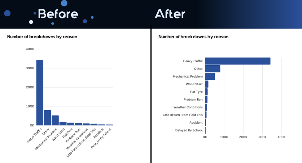
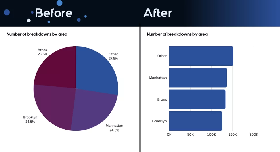
Notice the visual on the right is easier to read than the one on the left, even though they’re both comparison visuals?
3. The only time you should ever use a line chart is when visualizing trends. Don’t use a line chart for anything else.
This is where the difference between professional-looking dashboards and mediocre ones really begins.
You need to have your dashboard design fully planned out, thought through, and wireframed before dropping any visuals on it.
N.B. You can use tools like PowerPoint, Canva, or Figma to create a basic layout template to guide you during the design process.
When planning the layout, you need to think deeply about how people will follow the flow of information.
Studies show that most people read from left to right, top to bottom.

This is called an F-shaped layout. Here’s how to apply it:
– Put the most important and high-level information at the top (in the header).
– Avoid placing key details on the far right or bottom, as they might get overlooked.
You can use this checklist to plan your layout:
Planning and building a layout may not be as straightforward as you expected, but it’s absolutely worth it.
You have to keep some UI design principles in mind even from the layout-building stage.
A well-known and widely accepted principle is the C.A.R.P which stands for—Contrast, Alignment, Repetition, and Proximity.
Contrast
Contrast helps in making certain elements stand out and guide the viewer’s attention. Ask yourself: what do you want people to see first? Use contrast to make that element pop.
Alignment
Alignmentis all about organizing and cleaning up your dashboard. Nothing should look random. Use the “Grid-lines” and “Snap to grid” in Power BI to keep everything neat and aligned.
Repetition
Repetition helps create consistency across your dashboard. This means reusing fonts, colors, shapes, and other visual elements throughout the report. It keeps things visually connected and makes the dashboard easier to navigate.
Proximity
Proximity involves grouping related information together. For example, if you’re showing several KPIs, keep them close to each other so they’re easy to compare. This makes the dashboard more logical and easier for users to understand.
When designing a dashboard, always keep the user in mind so they can easily navigate and find what they need. Think about the most important tasks your users will want to do and prioritize those in your design.
For example, if users need to check a specific metric frequently, make sure it’s easily accessible and obvious.
Labels on menu items and buttons should be clear, simple, and to the point—so users don’t have to guess what each section or button does.
Providing extra context improves the user experience and also reduces the risk of data misinterpretation.
You can easily add more context to your visuals and elements by including page tooltips.
Tooltips help you give more info without cluttering the main screen. These tooltips can give extra info when users hover over certain areas, so they can understand the data or action better. This way you can guide users through your dashboard smoothly and keep the layout clean and user-friendly.
Colors are probably the trickiest part of dashboard designs because they carry different meanings and can easily confuse users if not used carefully.
For example, using too many bright colors can overwhelm the viewer, while too little contrast might make important data hard to see.
If you’re building a dashboard for an organization, chances are you’d work with their custom color theme.
But even with that, colors are still to be used wisely.
Below are some general guidelines to guide you on your use of colors in dashboard design:
Humans process images much faster than text, so you should use this to your advantage.
You can use images in several ways:
– Icon images for navigation buttons such as page navigation
– Images in matrix and table visuals (look at the company logos included in the table visual below)
– Image as wireframe layout
– Images associated with data fields i.e. images of actual items in the inventory for an inventory management dashboard, for tooltip and context
– Stock or animated images that are related to your overall message to make your dashboard more interesting.
Images are not must-haves in dashboards, but they sure add some next-level professionalism to your work when used effectively.
Simplicity is the New sophistication. keep your dashboard simple and decluttered— Choose simple visualizations over complicated ones and present only the minimum information required for the task at hand.
When it comes to building dashboards the professional way, less is usually more.
![]()
![]()
![]()