We’ve generated a SAP BW Dashboards in Power BI and utilized SAP connectors for Power BI. This report was designed for strategy teams to grasp different KPIs and metrics, aiding their comprehension of business operations and addressing critical inquiries regarding the company’s sales performance. Let’s walk through it together to explore the KPIs and uncover insights from the data.
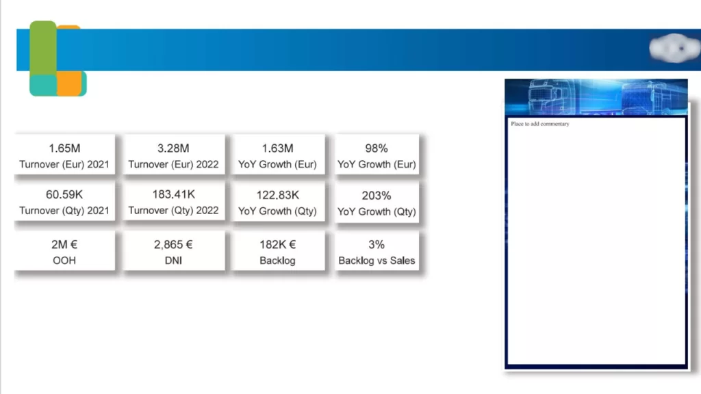
This page offers a comprehensive overview of turnover, growth, backlog, and sales in both the current year and year-over-year (YOY) timeframe. It provides a consolidated view that enables business users to assess the company’s performance in the current year at a glance.These insights/KPI’s include
Turnover: Describes the company’s turnover for the current and previous year.
Backlog: Details the current backlog of the company.
Growth: Illustrates the year-over-year (YOY) growth of the company across various categories.
Additionally, other KPIs are provided to give business users a comprehensive view of performance.
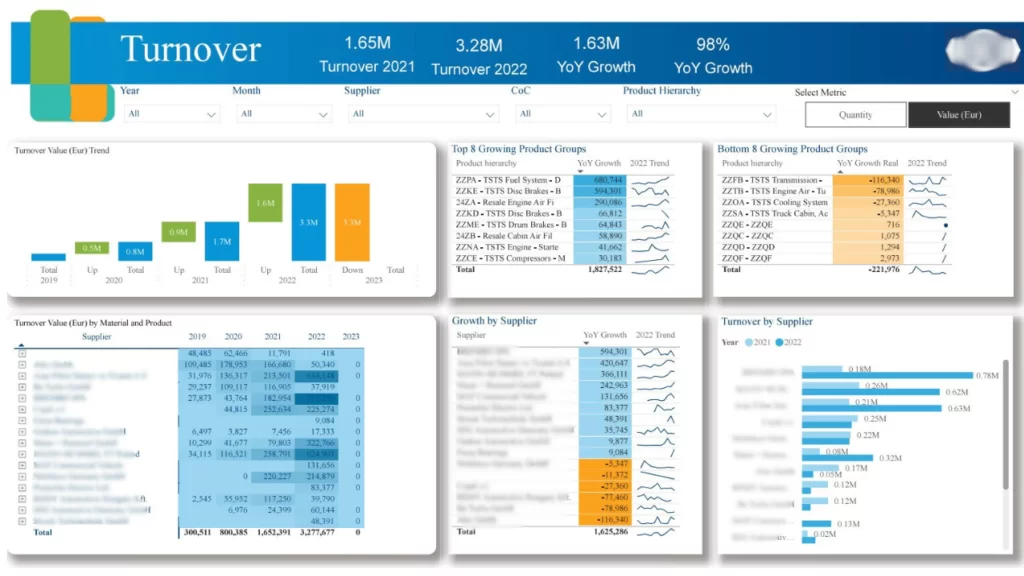
The Turnover page provides insights into KPIs related to the company’s overall turnover, incorporating various dimensions. Business users gain a multidimensional perspective of turnover across different groups within the company.These insights/KPI’s include
Trend Analysis: Illustrates the turnover value trends over the past few years, highlighting the percentage increase or decrease.
Top/Bottom Growing Products: Displays the top 8 and bottom 8 product groups showing year-over-year (YOY) growth. This aids in identifying top performers and areas needing attention for underperforming products.
Supplier Performance: Offers insights into how different suppliers have performed in terms of turnover and growth in the current and previous years for the company.
Turnover Value by Material and Product: Provides a comprehensive table view to understand the turnover value over the last 4 years categorized by material and product.
Also, there are filters provided for users to refine and analyze the data. These filters enable users to focus on specific values or dimensions using the available slicers. Additionally, users can choose the metric type as Quantity or Value (EUR).
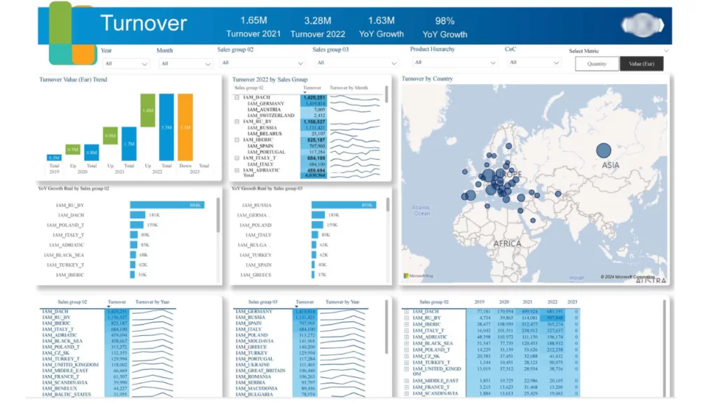
Another page dedicated to Turnover Analysis expands on additional KPIs to offer valuable insights to users. These insights and KPIs are:
Turnover by Country: Displays turnover across different countries on a map.
Turnover by Sales Group: Provides details on turnover by various sales groups in the current and previous years.
YOY Growth by Sales Group: Highlights year-over-year growth of turnovers within different sales groups.
Additionally, slicers are provided for Year, Month, Sales Groups, and Product Family, enabling users to filter and analyze data based on specific dimensions of interest.
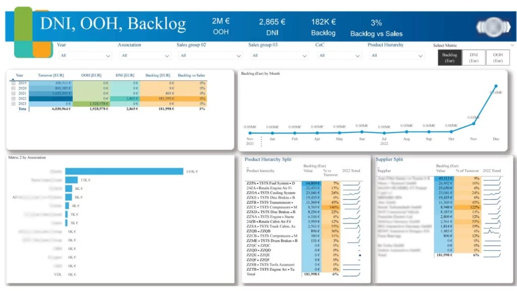
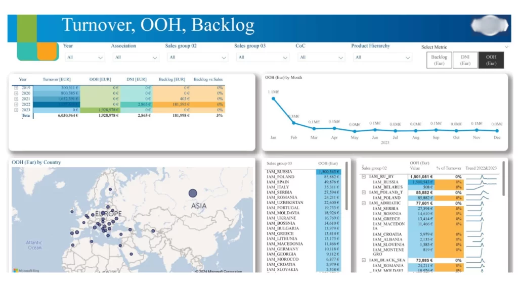
This page offers the capability to view various metrics across different dimensions in a single consolidated view. Users can select metrics using the Metrics slicers, which then display corresponding data in the visuals. For example, currently displaying Backlog, OOH, and DNI metrics. The page includes the following KPIs:
Monthly Trend: Illustrates the monthly trend for the current year.
By Country: Displays metrics by country using a map visualization.
Sales Groups: Details metrics across different sales groups.
Table View of Backlog, OOH, Turnover, and Backlog: Provides a comprehensive view of all metrics over recent years and allows data export to Excel.
Supplier and Product Hierarchy: Explains metrics categorized by suppliers and product hierarchy.
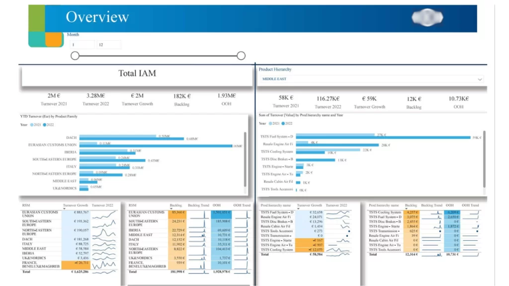
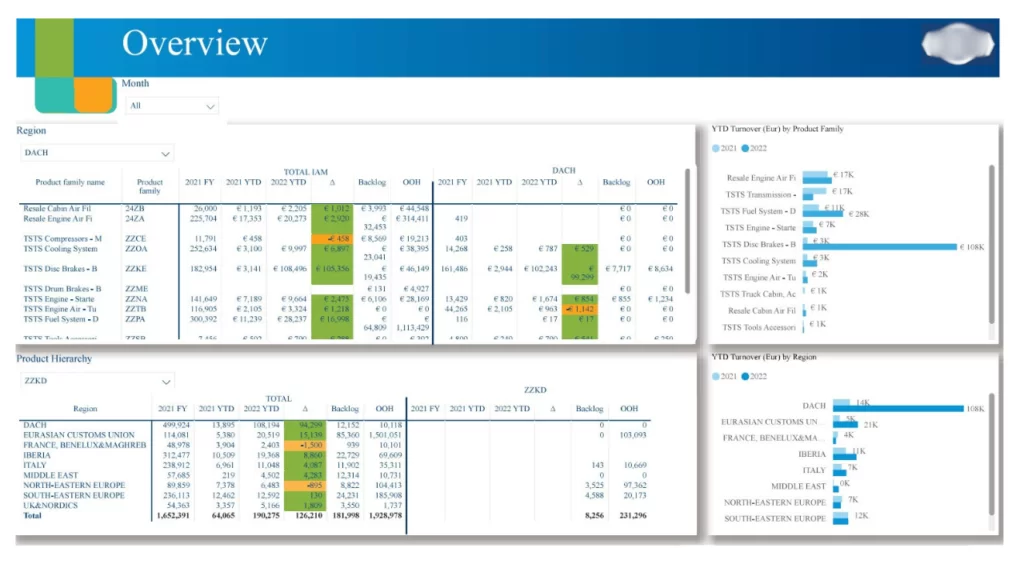
The Overview page offers various perspectives to present Total IAM in comparison to product hierarchy and region. Here, users gain insights into how metrics compare within specific regions or product hierarchies against overall company performance. This helps identify the performance of particular regions in a given year.
Table View of Product Family: Provides insights into the performance of each product family using metrics such as previous year, year-to-date (YTD), delta, backlog, and OOH, alongside total IAM and selected regions from the slicer.
Table View of Region: Details the performance of each region with metrics including previous year, YTD, delta, backlog, and OOH, alongside total IAM and selected product family from the slicer.
YTD Turnover by Product Family/Region: Charts the year-to-date turnover across different regions and product groups.
Additionally, we have other charts that analyze turnover, growth, and trends across dimensions such as RSM and product hierarchy.