Integrating Salesforce data with Power BI unlocks powerful visualization and analysis capabilities for businesses.
By seamlessly importing Salesforce objects and reports into Power BI, you can create dynamic dashboards, uncover trends, and generate actionable insights. Whether you’re a sales manager tracking performance or an analyst diving into customer data, this step-by-step guide will help you harness the full potential of Salesforce data within Power BI, enhancing your business intelligence strategy..
We have analyzed the data to understand how marketing influences the sales of a company. Using Salesforce as our data source, we employed our Salesforce connector to seamlessly import the data into Power BI. This allowed us to create comprehensive visualizations and conduct in-depth analyses to reveal the impact of marketing efforts on sales performance.
By integrating these platforms, we gained valuable insights that can drive strategic decisions and optimize marketing strategies to boost sales outcomes.
Let’s explore and understand the different KPIs generated in the dashboard for business users:
This view provides comprehensive information on opportunities and revenue over a set period. At the top, three cards display single values for Opportunities Won, Expected Revenue, and Global Influence on Company Revenue (Marketing). Users can filter data using slicers for Date, Regions, Influenced by CX Lab, and Most Relevant Logo. These filters allow users to see specific numbers for particular time frames or values.
A chart shows opportunities by source, indicating the origin of each opportunity. For example, 92% of opportunities came from Website RFPs, while the remaining 8% came from other sources. This breakdown helps identify the most effective channels for generating opportunities.
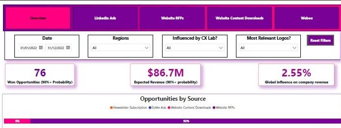
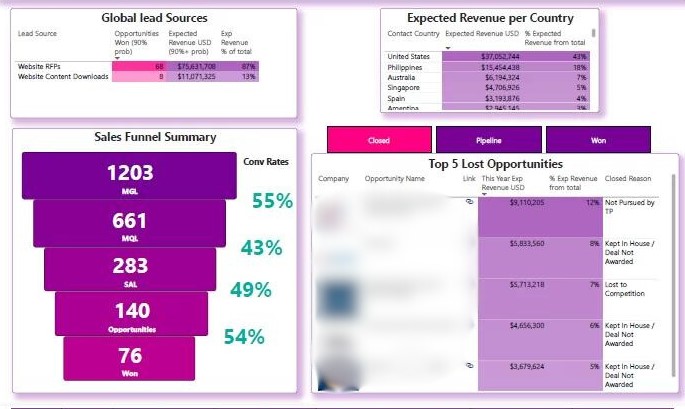
We also have a graph displaying Expected Revenue by Country, which helps identify the geographical contribution to the overall revenue. Additionally, there’s a chart showing Global Lead Sources. This chart allows you to view the number of opportunities won, the revenue generated by them, and their contribution to the total revenue. These visualizations provide valuable insights into regional performance and the effectiveness of different lead sources, aiding in strategic decision-making and resource allocation.
Not only do we provide a view of won opportunities, but we also offer insights into the top 5 lost opportunities, along with their revenue and reasons for loss. This information helps teams develop better strategies for future engagements. Additionally, users can view the top 5 opportunities in the pipeline and those won by the company. These features allow business users to understand both successes and setbacks, enhancing their ability to plan effectively and improve performance.
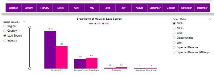
The last chart on this view is fully customizable, allowing users to decide the metrics and breakdown (x-axis). This chart displays data for each year to facilitate comparisons. For example, the default graph shows MGL’s value by lead source for 2021 and 2022. Users can select any combination of metrics and breakdown values, enabling self-service analysis within the report. This flexibility empowers users to tailor the visualizations to their specific needs, enhancing their ability to derive meaningful insights from the data.
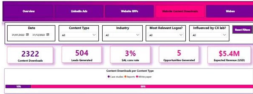
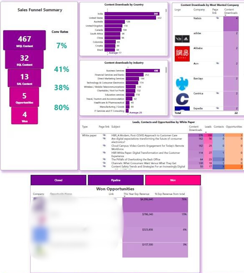
As the website is a major contributor to opportunities, this view provides metrics and KPIs related to website content. A list of cards displays single values for key metrics, including Content Downloads, Leads Generated, SAL Conversion Rate (%), Opportunities Generated, and Expected Revenue. These metrics help users assess the effectiveness of website content in driving engagement and generating sales opportunities
We have charts to explain content downloads by different categories:
These charts provide valuable insights into user engagement and content effectiveness across various dimensions.
We have a chart that shows the Sales Funnel Summary with respect to content type and conversion rates. This chart helps identify which types of content are most effective in converting opportunities into wins by tracking conversion rates at each stage of the funnel.
Additionally, there is a chart focusing on large companies that downloaded content. This visualization highlights the names of these companies, potentially revealing valuable leads and opportunities for further engagement or business development.
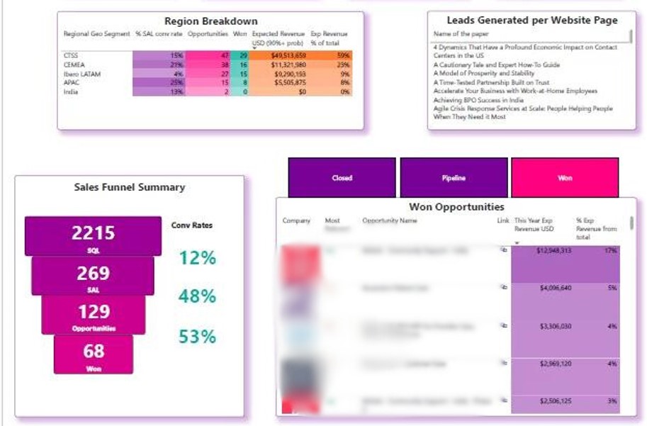
As observed in the overview tab, Website RFPs contribute the highest number of opportunities created. This view focuses on KPIs related to Website RFPs:
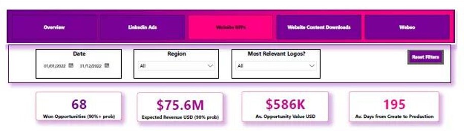
Similar to the overview page, there’s a top 5 view showcasing the top 5 won opportunities, top 5 opportunities in the pipeline, and top 5 closed opportunities related to Website RFPs.
The Sales Funnel Summary provides insights into opportunities created, converted to won, and their conversion rates.
Finally, a table at the bottom offers a self-serve analysis where users can select metrics and breakdown dimensions from a list. The table displays year-wise numbers, with options to filter by specific months for detailed analysis.
![]()
![]()
![]()