Power BI in Finance – 10 Use Cases with Examples

22 September 2024

Power BI is an essential data visualization and business intelligence tool that has become indispensable for modern finance departments. It can integrate data from multiple sources, handle complex data transformations, and create interactive dashboards to analyze all aspects of financial performance.

This comprehensive guide provides 10 real-world examples of how leading-edge finance teams use Power BI for budgeting, forecasting, financial reporting, and more.

Why is Power BI Used in Finance Departments

Power BI is often the tool of choice for financial reporting and for a good reason!

Firstly, Power BI evolved from Excel which offers the finance departments room the important functionalities that they are used to. Power BI essentially becomes a natural next step from crude financial Excel reports.

Secondly, Power BI has superior data visualisation capabilities which allows financial analysts to improve the user interface. We have seen many cases when the companies switched away from Excel tables to build Power BI financial dashboards. Many noticed that the visual presentation of data in Power BI makes it easier to discover actionable insights and leads to more data-driven decisions.

Finally, Power BI has integration with many financial systems like QuickBooks, Xero, Anaplan and many others! Those integrations enable companies to automate the financial date extraction and save valuable working hours.

1.    Balance Sheet Dashboard

Balance Sheet Power BI Dashboard

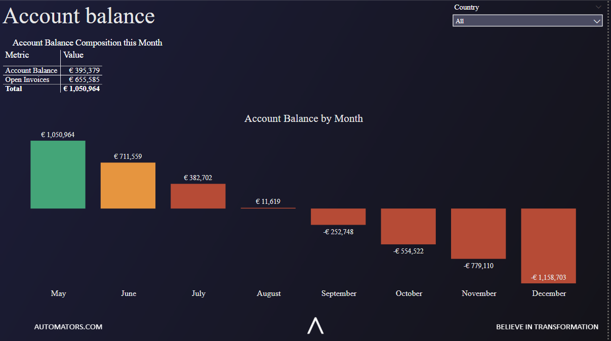
Power BI balance sheet dashboards showcase trends for assets, liabilities, and equity. Key breakdowns include cash, accounts receivable, inventory, fixed assets, goodwill, accounts payable, short-term debt, long-term debt, and shareholders’ equity. Metrics are displayed prominently as cards with supporting account details shown in tables below. This provides finance leaders with both the high-level picture and ability to drill down into specifics.

Advanced balance sheet dashboards allow toggling between visualizing monthly and annual trends over time. Line charts contrast cash balances and major liability accounts to examine net working capital. Bar charts break down asset and liability sub-categories for insights like which customers owe the most receivables. Tables can flexibly show balances based on reporting date or period-ending balances.

Filters enable slicing the balance sheet by date ranges, accounting methods (cash vs accrual), regional business units, or other attributes. This allows financial analysts to dig deeper into areas of concern. For example, isolating one region may reveal cash flow problems not visible in consolidated results.

2.    Profit and Loss Statements Dashboard

 Power BI in Finance - P&L Dashboard

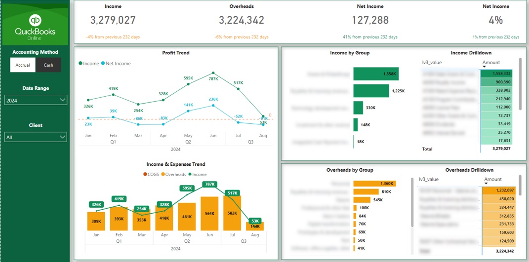
Profit and loss dashboards are essential for monitoring business performance. Power BI P&L reports track metrics like total revenues, cost of goods sold, gross margins, key expense categories, operating income, interest expense, tax expense and net profit. Trends can be shown historically over any time period depending on data availability.

Advanced P&L dashboards allow finance teams to analyze performance by business segments, product lines, geographic regions or other dimensions. For example, charts can contrast software vs. services revenue or domestic vs. international. This equips executives to understand what drives the top and bottom line results achieved.

See also  How to Share power BI report with external user without license

KPI cards prominently display net profit margin, gross margin, or other metrics compared to goals and historical benchmarks. Supporting P&L tables break out all major income and expense accounts for transparency into how results are achieved. Teams can spot high growth costs to address and low growth business areas to investigate further.

Filters enable isolating the P&L analysis by date ranges, managerial accounting constructs like cost centers, or sales representative to diagnose performance issues. Toggling between fiscal and calendar views handles nuances like 13 month accounting years.

3.    Aging Accounts Receivable Dashboard

Account Receivables Power BI Dashboard

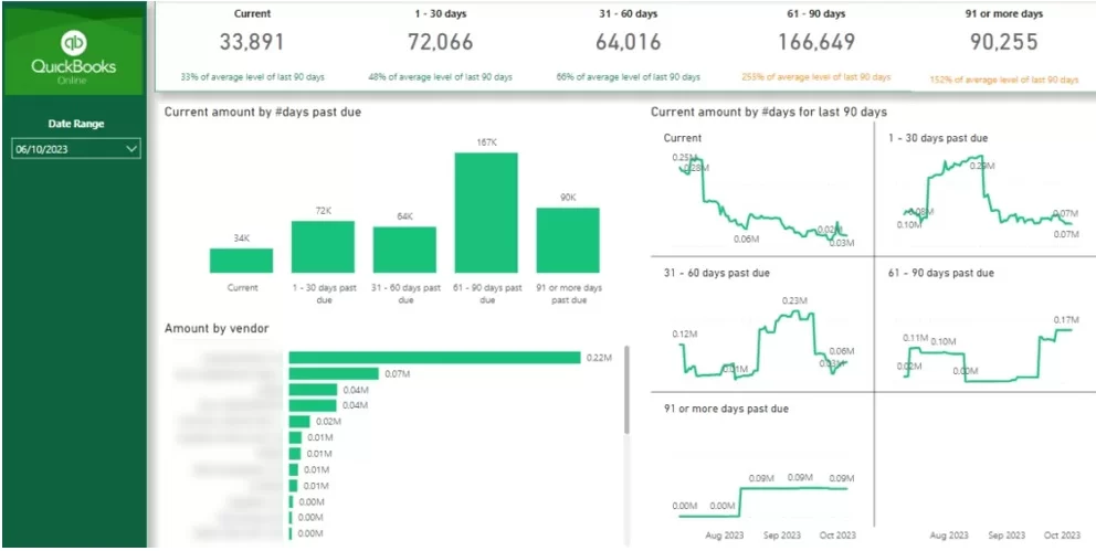
Understanding customer payment cycles and delinquent accounts is vital for healthy cash flow. Power BI readily delivers aged AR analysis through integrating data from billing systems like QuickBooks, Sage, SAP, Oracle, Dynamics and more.

The aged AR dashboard displays total receivables, highlighting high risk past due balances by the number of days outstanding such as $xxx >90 days overdue. KPIs show the percentage of receivables in risk categories, days sales outstanding, average order value, and top late-paying customers. Conditional formatting and icons draw attention to the most severe cases needing priority action.

Supporting tables list all unpaid invoices by customer, days outstanding, amount due, assigned account rep and related purchase orders. This equips accounts receivable teams with actionable order-level details for every past due account to guide their collection processes. Integrations with Excel or Power Apps enable managers to take context-specific actions like sending reminders or directly emailing invoices all from within Power BI.

Filters enable isolating AR analysis by date range, regional business units, customer segments, sales reps, accounting methods and more. Additional visualizations analyze trends in receivables cycles and late payments over time.

4.    Cash Flow Analysis Dashboard

Power BI in Finance Cash Flow Analysis

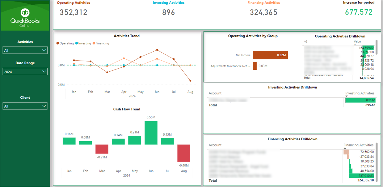
Cash flow visibility is a common gap for finance teams lacking complex accounting systems. Even using tools like QuickBooks, Sage 200, Dynamics GP, the raw data does not readily convert into insightful cash flow analysis. Power BI provides easy connectivity to these systems with automated data refreshes. It calculates and presents clear cash flow KPIs spanning operating, investing and financing activities.

For operating cash flow, the dashboard integrates data from AR/AP subledgers and revenue/expense financial statements. Investing flows link capital expenditures, fixed asset projects and acquisitions. Financing reconcile debt issuances, principal repayments, dividends and stock transactions. Charts contrast periodic and year-to-date cash activities with plans and prior year trends to assess performance. Other views provide 12 month cash flow forecasts based on budgets, separating discretionary and non-discretionary flows for planning. Detailed activity breakdowns prevent ambiguity about what drives cash in any period.

Financial controllers get an accurate consolidated view of enterprise cash flow they can trust and action. The dashboard equips department heads with transparency for their area’s contribution to cash results to drive accountability and ownership.

5.    Financial Ratio Dashboard

Power BI Financial Ratio Dashboard

Financial ratios assess business performance, financial health, operational efficiency and risk areas needing attention. Power BI readily calculates ratios such as gross margin, operating margin, ROE, ROA, asset turnover, days payables outstanding, debt-to-equity etc. It also determines commonly used liquidity, leverage, efficiency and earnings ratios.

KPI cards display the most critical ratios prominently, ideal for discussion in monthly reviews. Sparklines show historical trends and performance against goals. Variance tables concisely quantify changes from prior periods. Comparison to budgets, past performance or industry benchmarks helps contextualize the numbers to identify underperformance.

See also     7 Fixed Price Supermetrics alternative in 2024

Ratio analysis dashboards also provide flexible broken down views of performance. For example, margins, capital turns, days outstanding metrics and other ratios are shown by business unit, product line or regional operations. This equips executives to pinpoint the highest and lowest performing areas of the company. Custom ratios can also be defined using Power BI’s DAX calculation language.

Financial analysts save hours of effort through automated ratio dashboards versus compiling the calculations manually. The interactive reports enable on-the-fly sensitivity testing like impacts of increased costs, larger inventories or changes that alter capital structure. Dashboards are distributed via PowerBI.com and update datasets automatically for rapid insights.

6.    Budget vs. Actuals Reporting

Power BI Financial Budget vs Actuals dashboard

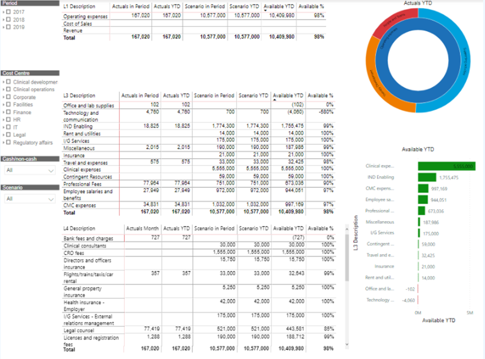
Monitoring actual spending versus approved budgets is essential for financial control and decision making. Power BI delivers easy-to-interpret variance analysis through integrated P&L, balance sheet and cash flow reports spanning any period.

Timeseries charts present cumulative budgeted expenses/revenues and actuals by week/month/quarter. Absolute and percentage variance columns quantify overages or savings. KPI cards highlight the biggest deviations from plans needing investigation or action. Tables break down analysis by account groups, departments, programs or dimensions like regional operations.

Drill-downs diagnose root causes behind minor budget overruns or major performance gaps. For example, isolated overspending may require adjusting departmental plans and requests. Much larger sustained deviations could indicate flawed forecasting assumptions requiring revisiting at the executive level.

Beyond analyzing historical variances, Power BI facilitates data-driven budget updating. Building on the example above, forecasts can be revised to reflect macro trends, reprojected based on year-to-date actual run rates, or recast based on updated business assumptions. Dashboards distribute updated budgets and financial plans to functional leaders.

7.    Inventory Management Dashboard

Power BI Financial Inventory Dashboard

For manufacturers, distributors and retailers, inventory is one of the largest balance sheet items and a key cost factor directly impacting profitability. Suboptimal buying or production decisions easily result in excess stock needing write-downs, out-of-stock that reduce revenues, or insufficient buffers causing backorders and customer defections.

Power BI provides informative inventory analysis dashboards covering metrics like total quantities on-hand, days-of-supply, months-of-coverage, inventory turns by product/location, obsolescence reserves, excess or slow-moving stock and more. Integration with bookkeeping systems like Oracle, SAP, Dynamics and QuickBooks Online maintains data accuracy. Charts visualize fast/slow-moving SKUs, detect growing backorder trends and compare performance across distribution centers. Interactive maps highlight regional differences to equip planners. Filters help analysts isolate products, brands, seasons, factories or raw materials.

Executives monitor how effectively working capital is invested in macro and micro views from the consolidated enterprise down to SKU-location combinations. Inventory teams gain micro-level insights to optimize decisions, service levels and turns. Sales and operations planners see how inventory aligns to depart demand forecasts. These integrated insights help optimize inventory investments, carrying costs and fill rates.

8.    Accounts Payable Dashboard and Vendor Analysis

Power BI Financial Account Payable Dashboard

Managing invoices, outflows, liabilities and vendor relationships is vital for minimizing costs and maintaining strong cash flow. Power BI provides unified AP dashboards showing bills due, payment schedules, discount potential and critical vendor insights.

Key content includes invoices pending, invoices due soon, invoices already paid for the current period, as well as future liabilities by 7day, 30day, 60day+ buckets. Charts overlay scheduled payments and available discounts/penalties over time to optimize cash outlay. DAX measures quantify the total discount or penalty projection based on proposed payment timing. Tables list unpaid invoices by vendor, amount due, due date and assigned approver for transparency.

See also  Design Principles for a Professional-Looking Power BI Dashboard

Vendor analysis includes top vendors by year-to-date spend, spend trends over previous years, average days to pay each supplier and calculations like the percentage of spend eligible for prompt payment discounts. Reviews help strategically tier vendors for priority treatment, discounted terms or accelerated payments.

Payables teams gain visibility to sharpen execution of outstanding liabilities. Financial planning groups enhance control over short-term outflows and improve working capital efficiency. Procurement sees data driving supplier relationship decisions.

9.    Sales Analytics and Performance Dashboard

Power BI Finance Analytics Dashboard

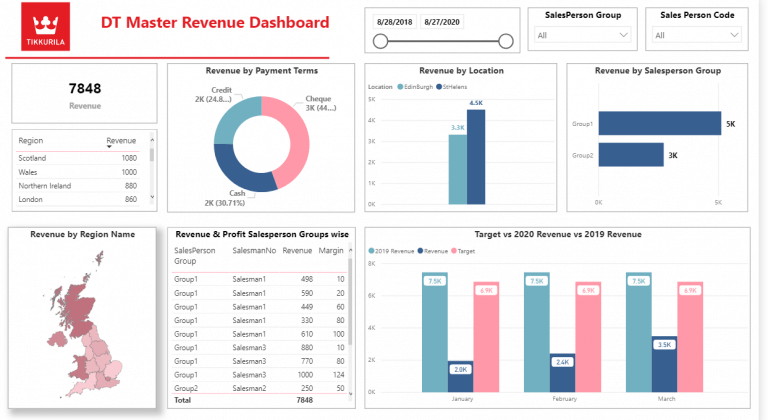
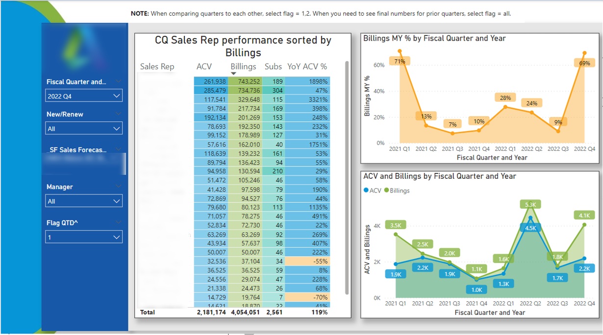
Business financials ultimately depend on topline sales, so understanding performance drivers is essential for revenue growth and profitability. While Excel remains commonplace, sales teams increasing rely on Power BI instead for interactive data analysis uncovering hidden trends.

Smart sales analytics integrate data from sources like Salesforce, Microsoft Dynamics 365, NetSuite, Zuora and legacy systems. Real-time connectivity funnels new data into reports for timely insights. Robust trend charts contrast actual revenues with quotas, forecasts and prior periods at region, rep, product line, customer segment and transaction-level detail. Performance is analyzed through gross sales, discounts, net sales, margins and other lenses. Waterfall charts quantify the revenue impact of larger deals, losses or cancellations.

Beyond results tracking, Power BI diagnostics dig deeper into performance issues. Sales activity metrics indicate pipelines shaped by new prospects, calls, proposals and conversions. Deal progression funnels track bottlenecks causing stalls. Rep-specific views reveal training gaps and coaching opportunities, so underperformers improve. Customer analysis indicates growing or declining spend patterns to guide account planning. Exposure forecast predicts pending large renewals. These insights help sales leaders target improvement areas.

10.  Financial Consolidations and Reporting

Power BI Financial Consolidation Dashboard

For diversified enterprises, business groups and conglomerates, consolidating disparate financial data is vital but difficult. Various units may utilize platforms like Oracle, SAP, Dynamics, QuickBooks Online, Sage Intacct and other solutions. Handling consolidations manually in Excel with email attachments wastes time and raises risk.

Power BI uniquely delivers integrated views independent of the underlying systems. It connects 100+ data sources for flexibility now and future continuity as ERPs change. Built-in transformations handle currency conversions, intercompany eliminations, minority interest calculations, shared services allocations, equity consolidations and other complex accounting. Hundreds of subtleties are handled automatically.

The output is unified corporate financial reporting spanning the consolidated income statement, balance sheet cash flow statement and featured KPIs. Dashboards surface insights at enterprise, global business unit, region and divisional views. Teams drill-down into transaction details. Auditors perform verifications with visibility into subledger entries. Changes to ownership stakes, org structures and acquisitions flexibly consolidate based on security rules. Performance analysis incorporates custom drivers meaningful to the business. Financial consolidation dashboards distribute fully refreshed datasets via PowerBI.com on any device.

Is Using Power BI in Finance a Good Idea?

As these 10 real-life examples demonstrate, Power BI brings interactive and self-service business intelligence to finance teams for an immense variety of mission-critical uses. It flexibly eliminates dependency on rigid reporting formats that leave finance bottled up waiting for IT help. Every CFO and VP of Finance owes it to their team to evaluate where Power BI aligns with the greatest financial reporting and analytics needs. The outcomes may launch a new era of finance empowerment and data-driven performance.

Microsoft Power Platform

Everything you Need to Know

Of the endless possible ways to try and maximise the value of your data, only one is the very best. We’ll show you exactly what it looks like.

To discuss your project and the many ways we can help bring your data to life please contact:

Call

+44 7846 623693

eugene.lebedev@vidi-corp.com

Or complete the form below