—
Power BI is one of the most popular business intelligence and analytics platforms from Microsoft. As of 2024, more than 66,000 companies around the world use Power BI as their business intelligence tool. Within Power BI, the two main ways to visualize and work with data are through dashboards and reports. At a high-level, a Power BI dashboard provide broad overviews of data while reports allow drilling down into details.
But what exactly are dashboards and reports in Power BI? What are their similarities and differences? Which should you use and when? This article will compare Power BI dashboards vs reports so you can leverage them for optimal analytics and decision making.
A dashboard in Power BI is a single page, often personalized, view that visually tracks key metrics and insights important to an individual or team. Power BI dashboards consolidate high level visualizations and actionable insights into an interactive canvas.
To create a Power BI dashboard, you will need to import data to it. There are few different ways available to import data. You can either:
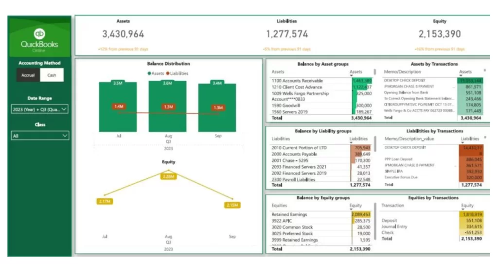
If you have business financial data in QuickBooks, you will prefer to visualize it on Power BI. Vidi Corp offers a custom connector for it. This is one of the easiest options available to get your data on Power BI. The best thing about working with Vidi Corp is that we can offer a free dashboard when you buy the QuickBooks Power BI connector. It will help you to save time and effort in creating a Power BI dashboard on your own.
Here are some of the benefits you can get out of a Power BI dashboard.
Dashboards transform raw data into transparent and actionable business insights. They often serve as the centralized access point for executives and managers to monitor overall company or departmental performance.
CHECK OUT SAMPLES OF POWER BI DASHBOARDS
Reports in Power BI provide business users with detailed data analysis and visualizations on a specific dataset. While dashboards consolidate a handful of high level metrics, reports allow drilling down into the detail and nuances within granular data.
For example, the regional sales manager might have a report analyzing 5 years of historical sales data including trends by:
The report allows slicing and dicing data with filters, custom visualizations, conditional formatting, and synced slicers across multiple pages of detail charts. This equips the regional sales manager to uncover granular trends, root causes, and opportunities hidden within the data.
Here are some of the benefits of Power BI reports.
Reports help business teams analyze data more deeply to uncover trends, root causes, and insights to drive continuous improvement. They serve as customizable portals for technical and non-technical users alike to analyze business data.
While dashboards and reports serve different end purposes, Power BI offers a unified experience building and interacting with both. Below are some of their core similarities:
With Power BI, reusable data models feed consistent metrics into both dashboards and reports. Authors can build and interact with visuals across both using similar core experiences. And any Power BI user can leverage published dashboards and reports to analyze data.
However, Power BI dashboards and reports serve very different purposes reflected in key differentiation points:
Dashboards provide executives and managers with a centralized hub to monitor company or department health. Reports enable analysts and front line users to analyze operational details & improve processes.
Dashboards fit key insights onto a single screen while reports allow heavy analysis across dozens of pages.
Dashboards track a handful of high level KPIs while reports showcase data patterns, correlations, and drill down analysis across granular elements.
Limited filters and drill downs on dashboards while reports offer deep dive customization with synced slicers, drill throughs, and conditional formatting.
Dashboards display insights the BI team gleans from reports while reports allow business teams hands-on data analysis themselves. The analysis in reports might even power and improve dashboards over time.
As you can see, dashboards offer wide but shallow analysis while reports provide narrow but extremely deep data analysis. Reports empower business teams to uncover hidden insights to actually improve organizational KPIs showcased in dashboards over time. Together, they provide organizational visibility at all levels to drive better decision making.
CONTACT US TO SET UP OUR POWERBI DASHBOARD
Now that you understand how Power BI dashboards provide high-level overviews of data, explore some best practices that set dashboards up for success. You can learn more about them by following our Power BI course.
Dashboards should focus on the vital few metrics most important for fast and accurate decisions. Too much complexity slows down information absorption. Use reports for deeper analysis.
Lead with the most critical company, departmental or individual metrics the audience cares about rather than burying them. Make powering organizational goals the dashboard’s purpose.
Avoid density and clutter. Use basic charts and graphs over complex visuals. Format charts minimizing gridlines, legends, labels that impede quick analysis. Use white space appropriately.
Make anomalies, underperformance or changes easy to spot with simple color coding, metrics against targets, spark lines showing trends etc. Alert users to change with indicators.
Provide line of sight linking data insights on dashboards directly to actions users should consider taking within daily workflows. Provide next step recommendations.
On the other hand, best practices for reports in Power BI focus on enabling interactive analysis for business teams to uncover granular insights. Reports randomly dump data but reveal powerful insights through deliberate designs.
Create reports to answer pressing business issues. Explore causes of problems and sources of opportunities rather than generic reporting which dilutes meaning.
Organize report pages and visualizations in sequences that follow users’ analytical thought processes vs. disconnected charts that leave users lost.
Use grids and shared axes so different charts reflect common groupings and base measures allowing users compare related metrics apples-to-apples.
Empower report consumers to apply filters, alternate visual types, add metrics etc. to support ad-hoc analysis. Different users can customize views for their context.
Help users grasp how filtering certain chart values will94878 change all related data views in reports through synced and high-lighted slicers for each section.
In general, focus on enabling self-service analytics through deliberate report design so business teams uncover granular insights themselves vs. the BI team predetermining analysis. If you purchase a Power BI connector from us at Vidi Corp, we can create the dashboard. Our experts will ensure to stick to these best practices for delivering the best results on your way.
Now you have a basic idea about the similarities and differences that exist between Power BI dashboards and reports.
Dashboards provide broad overviews of data while reports offer deep analysis of granular details. Dashboards serve executives through KPI roll-ups while reports empower business analysts through customizations.
Dashboards consolidate many datasets while reports analyze a single subject deeply.
While their end purposes differ, Power BI offers a unified experience building and interacting with both dashboards and reports. Underlying data models feed reusable metrics into both. Simple interactivity empowers end user analysis across both.
The keys are using Power BI dashboards and reports for the right situations instead of as substitutes for each other. Dashboards offer wide but shallow visibility to help leaders monitor company health. Reports enable deep diagnostic analysis by front line business teams to actually improve processes over time.
Used together, Power BI dashboards and reports serve as the one-two punch at the heart of data-driven decision making in businesses.
![]()
![]()
![]()