
Eugene Lebedev is a Power BI consultant by background. Before founding Vidi Corp in 2021 he created Power BI reporting for Autodesk. His Power Bi reports were used by VPs of Finance and C-suite of Autodesk. As part of Vidi Corp, Eugene created dashboards for Google, Teleperformance, Delta Airlines and 200+ clients worldwide.
As A Beginner Data is king. Want to optimise the insights it gives? Analyse it well.
One of the best ways to do this is to use Power BI dashboards to report your data. From any data source like Excel, SQL Server, or SharePoint, you can connect to Power BI to get comprehensive data insights in 20 minutes, even as a beginner. Do you need coding skills? No. Plus, Power BI is beginner-friendly. In this guide, we’ll show you how to build an insightful Power BI dashboard in just 20 minutes as a beginner. So, let’s get you started with the steps below.
To get started with creating a Power BI dashboard as the end result of our YouTube video shown here, you need to have the Power BI software installed on your computer. If you don’t have it on your computer, you can download the software here –Download Microsoft Power BI Desktop from Official Microsoft Download Center. Once you have downloaded and installed the software, you also need the data set you want to report on and visualise on the Power BI dashboard. Go to Kaggle (Supermarket sales | Kaggle) and click the download button to get the software.
Now that those two are downloaded and installed, you are ready to get started fully.

Open Power BI on your device, and this should show you the default home screen of Power BI.
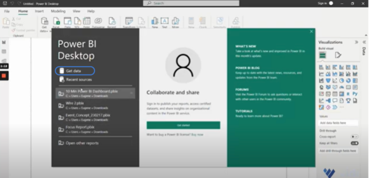
The default home screen shows the reports that we’ve created in the past and some information about the product. That’s not our focus, so I’m going to close that. I will click the Get Data menu at the top right display bar of the screen here to extract the data.
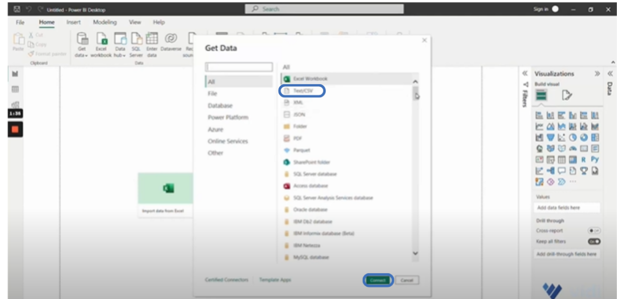
Once you click on the icon, you will see the full list of data sources that Power BI can work with. You can scroll down and browse through the data source options if you are interested. However, for this tutorial, the Text/CSV is our data source.
So, I’m going to select Text/CSV and click “connect”.
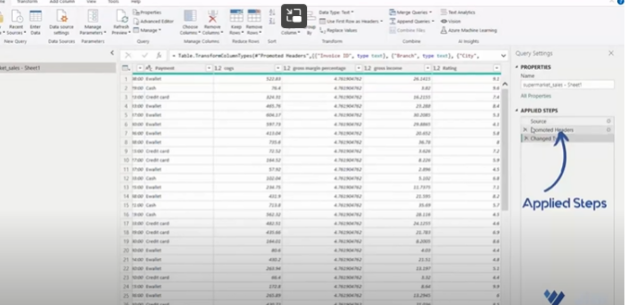
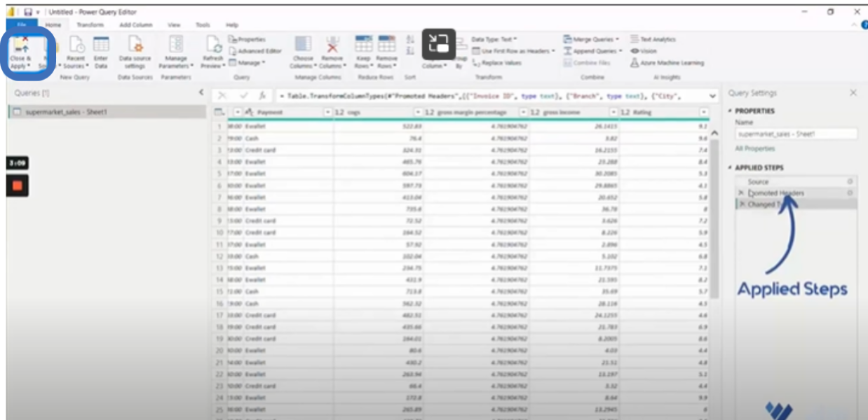
A list of available CSVs will pop up, and we’ll need to select the specific CSV that we’ll be working with. Power BI already allows us to load the data, but before loading, I just want to transform the data and also show you the functionality of Power BI. We’re going to go to the data transformation interface by clicking the ‘transform data’ button, and now you will find yourself in Power BI query, which is the data transformation interface where you transform the data before loading it to your dashboard.
I’ll just show you the overall interface. At the top, you’ve got several ribbons grouping the functionality of our projects together. We’ll be using some of them. On the left, you’ve got the list of tables that you’ve downloaded to your file; in the center, obviously, you’ve got the data screen, which you can just browse through. On the right, you have the list of applied steps, so you can see how Power BI applies data transformation steps.
Now, each time you refresh the data in your file, the transformation steps are repeated.
Here, you need to do some data editing. So, let’s scroll to the right and see whether the data types have been applied correctly. In this scenario, the date field is still text, but we need it to be a date type, so we’ll click the ABC icon, and the data types will pop up so we can select and assign the date. By default, the date is set to the UK date format. Again, we’re going to click the ABC icon and choose the user login to assign the data type to the column. We’ll change from text to date and select the US data format. We’re also interested in the hour, so we are going to add a custom column to extract the hour from the time column. Go to “Add Column” on the menu bar and select “Extract.” Extract the first two characters and click “OK.” Rename the column “Hour” and change it to a whole number.
Scroll to the left to ensure the data types are all correct. For example, if you recall, the rating column should be a whole number rather than a decimal number. So, let’s make the change. Now, our data is ready to be worked with, and we can return to the home icon at the top menu bar and click “Close and Apply”.
Having done that, you will see that the data is loading into your file. Once data loading is complete, a new interface with report and data views will appear for us to build our report.
The report view is where we build our reports, and the data view is where we see our data and choose filters. Now that we have our data, we can start building our reports. First, we’ll go back to the report view for you to see some functionality. On the right, you’ll see the visualisation tab, which allows you to select the visualisation type for the data, and when you expand the arrow by it, you’ll also see your actual data and every column that you’ve got. Just before making our report, you can improve aesthetics by doing a little bit of design work. So, switch from the visual tab to the format tab and go to ‘Wallpaper’ from the drop-down options.
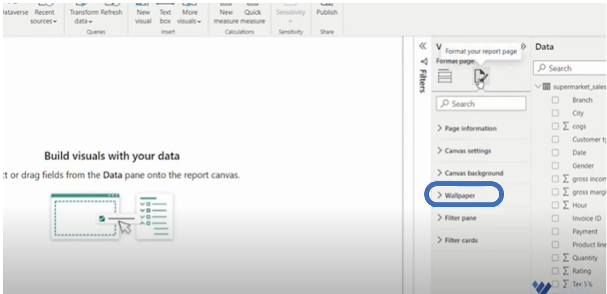
We will select an image (find the image here: background image.jpg – Google Drive).
To optimise your data reporting with Power BI, make an enquiry here.
The next action is to build our first visual. Go to the data tab and put a checkmark next to every field you want to include in your visual, in this context the “Date” and “Total” fields. Now, we have the sum total by date, which is the revenue. Better still, if you like, you can double-click to change “Total” to “Revenue”.
Let’s go back to the Visual tab because, unlike it being a table, we want to visualise it. We’ll select the line chart. The first line chart is created already, the color needs some fixing, so let’s change the color scheme. Go to “View” on the menu bar, and you’ll find the available themes to scroll through.
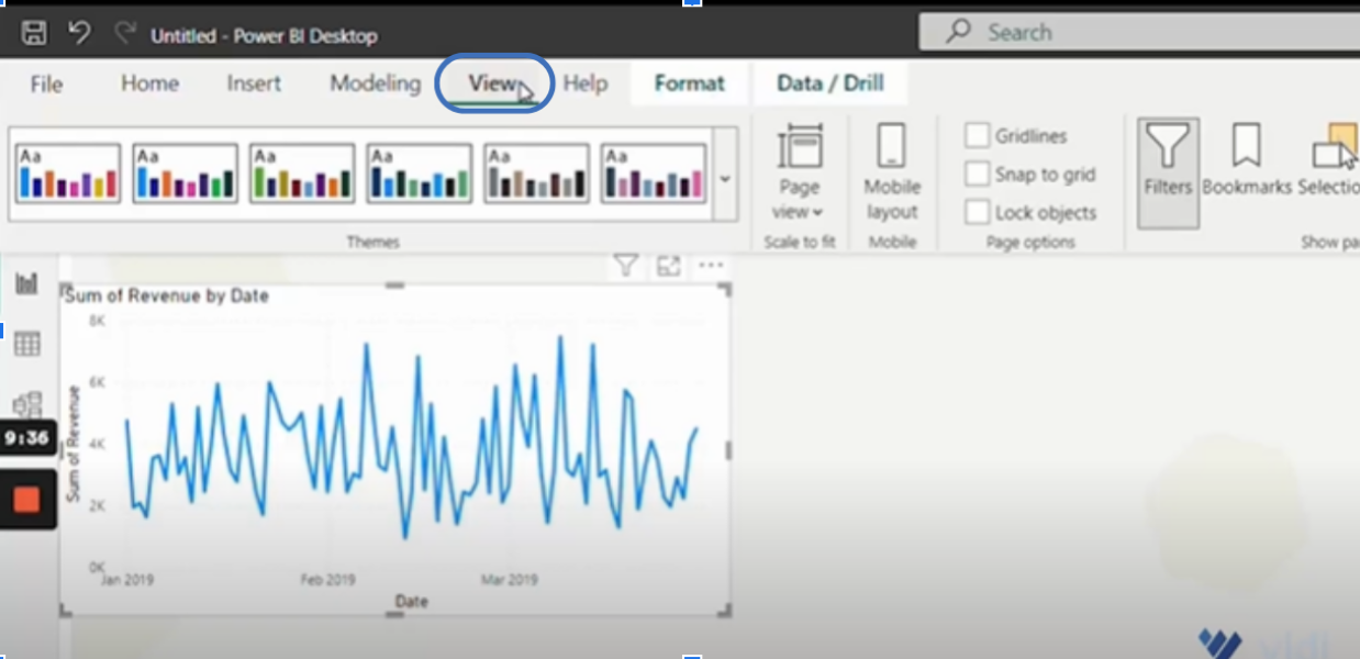
Yes, click on the city park theme. Yeah, it’s looking better.
The next action is to understand whether the numbers are transiting up or down. To do this, first ensure your visual is selected by clicking it, then go to the visualisation tab and click “Add further analysis to your visual” and then turn on the “Trend line”. This will make our visual stable and give better context to our data.
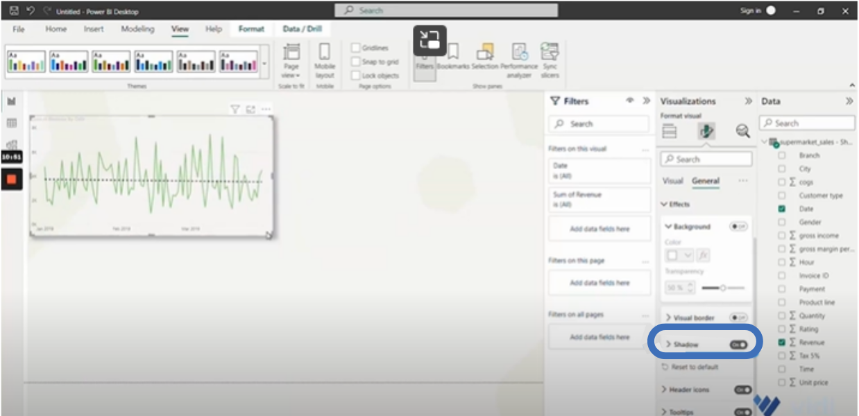
Next, let’s go to the “Format tab” and switch from visual to general. Then, click on “Effect” and turn on “Shadow” from the drop-down options.
Further, we need to look at the distribution of revenue by the hour of the day.
So, we’ll drag the hour field onto the canvas. It’s a number field, so let’s change it to a table under the visualisation tab and change “Sum” to “Don’t summarize” under the “Sum of hours” options.
As we have our distribution by the hour, let’s see our revenue by the hour. I want us to visualize it, so we select “clustered column chart” from the visualization tab. From here, we can visualize it a bit better. So, we’ll go to “Add further analysis”, select the “Average line,” and “Add line” to see which line is below or above average.
To format this visual, do it like we did the other one. After you switch the “shadow” on, drag the visual a little bit forward and to the right.
Now, let’s see which product generates more revenue and which is more profitable. Checkmark “Product line”, “Revenue”, “Quantity”, and “Gross income”. With these, we have a table. So, let’s improve the style of the table a little. Go to the “Format Your Visual” tab, click “Style,” and select “None”.
Decimals are showing on the table; let’s format them. From the format menu, we can select a specific column, and we’re picking “sum of revenue”. I’m going to sum it to zero and do the same formatting for “gross income”. Let’s add some colors to our table to make it easier to interpret. So, let’s switch to the visual tab, where we’ll see the list of all the columns. Here, select the mark by the “Sum of revenue” and click “Conditional formatting” from its pop-up menu. Then, click “Background colour”.
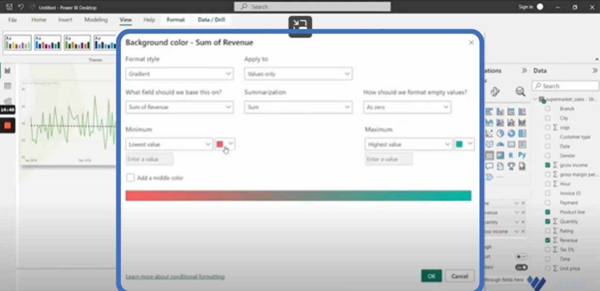
Adjust your lowest and highest values for the background colour appropriately. Make sure you do the same for the other columns. And remember to add shadow,” as we have done with the previous visuals.
Our data set gives us ratings for every transaction people do. So, let’s see the rating the customers give every transaction carried out. Here, I’m going to select the rating. But before we do that, let’s show you different ways of creating the visuals. First click the visual (table icon), then checkmark “Rating”. From the pop-up, click the downward arrow by “Sum of Rating.” From the options displayed, select “Don’t summarise”. Now, we’re going to see how many transactions fall into this category.
So, we’ll checkmark “Invoice ID” to enable Power BI to show invoices that are available. However, as we want to summarise them instead, we’ll click the downward arrow by “Invoice ID” and select “count distinct”. This will display the number of invoices by rating on the rating table. For clarity, let’s turn our table into a bar chart.
The last thing to do is visualise the payments. We’ll drag the field from the column onto the canvas. We’ll checkmark “revenue” on the field and select “clustered bar chart” from the visuals tab. Now that you have your chart, switch to the “general tab” under the Format Visuals and follow the usual process to turn on “Shadow”. Thereafter, go back to the “Visual tab” and turn on the “data labels”. Just adjust the visuals a little bit, and you are good to go.
One more thing to do is to drag the “City” field onto the canvas. To format, we’ll change to “Slicer” by selecting the icon from the “format visuals” section. Click “Slicer settings” to edit the slicer. We’ll select “Dropdown” under style, which will make our slicer smaller, and then we can start filtering by city. With that, we can see the performance indicators, which were not visible before. For example, the dashboard shows that most sales happen in the morning and afternoon.
Now, you can see the power of Power BI and how straightforward it is to build and visualize dashboard reports without necessarily having any coding skills. The process we have gone over is comprehensive, but not overwhelming as long as you have properly extracted, edited, and loaded your data.
Power BI software also gives users a variety of tools for visualising and integrating data. These tools not only make data reporting more interactive, but they also help users learn quickly and in real-time. Ultimately, it makes collaboration between team members, stakeholders, and clients very easy.
Got questions? You can send us a message today. Also, follow us on our YouTube channel to learn how to create more of this dashboard.
![]()
![]()
![]()