Our Looker Studio Dashboard template helps you visualise your Facebook Ads performance in Looker Studio by following a very simple process.
Our Looker Studio Dashboard solves several problems for our clients :
You can obtain the Vidi Meta Ads connector with a 20% discount when you purchase this template. Alternatively, you can use any third-party connector that you prefer.
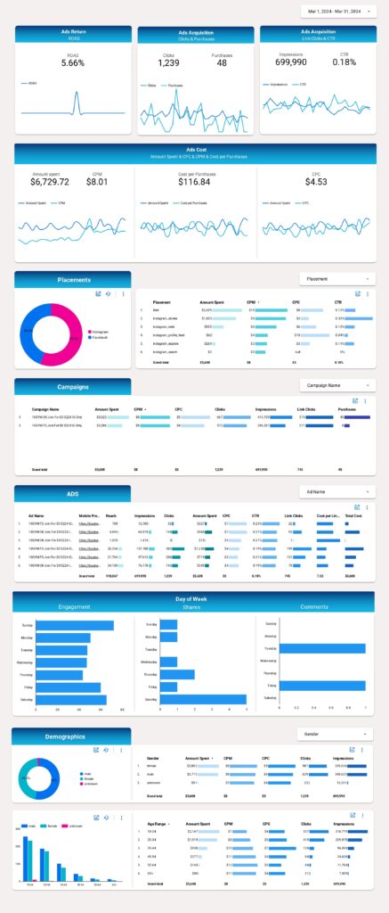
You have the freedom to customize the report, including adding charts and tables, creating new reports, and making different versions of the same report using Looker Studio. This tool not only presents data from Facebook Ads Manager visually, making it more presentable and useful for non-campaign personnel, but also enables more detailed analysis and identification of patterns and trends.
Customisation options and other Advanced Settings in Looker Studio Facebook | Instagram Ads
The level of flexibility and customization is what makes Looker Studio the optimal Facebook ads reporting software. Not only can you add charts and apply filters, but you can also add fields to charts, change chart types and edit chart properties, you can also add interactive elements such as date ranges and control Datas…
You also add other visual elements like text boxes, lines, circles, frames and much more. Additionally, you can add external content items such as videos or external web resources.
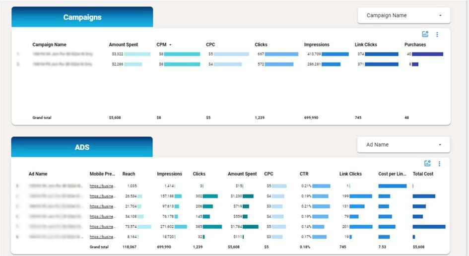
This Looker studio Facebook dashboard allows you to see where the ad spent money was allocated: including details on which ads, placements, demographics, etc. You can also see which results these ads achieved such as impression, clicks, purchases, etc.
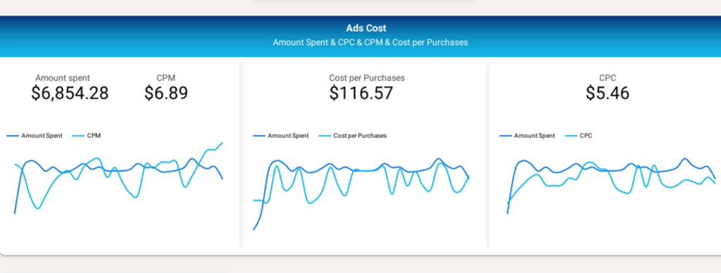
You can also see the cost per result such as CPM, CPC, cost per purchase and the overall return on your ad spent
Facebook & Instagram Ads Report:
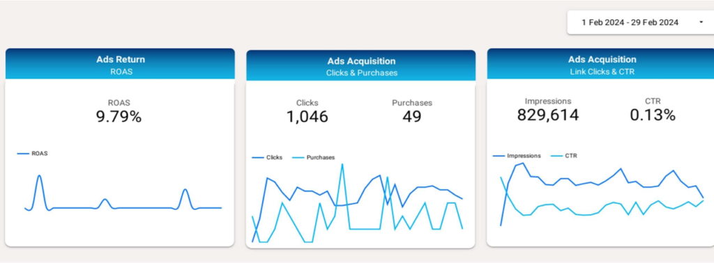
The top part of the dashboard shows the summarised key metrics for the selected date period and also the trends for them.
You can use this section to gain a bird’s-eye view of your FB Account: identifying which metrics meet your benchmarks, observing positive trends in specific metrics, etc.
The dashboard then shows what exactly the money was spent on including placements, campaign and ads. It is possible to search a specific ad or campaign using the filters above the graphs.
You can dynamically select the metric to see in the donut chart if you click the graph icon. This includes metrics like cost, revenue, clicks, impressions, etc
Mobile preview column also has a hyperlink to Facebook where users can see the campaign thumbnail. This section can be used to determine which placements make more sense for you and which ads/campaigns you should keep running.

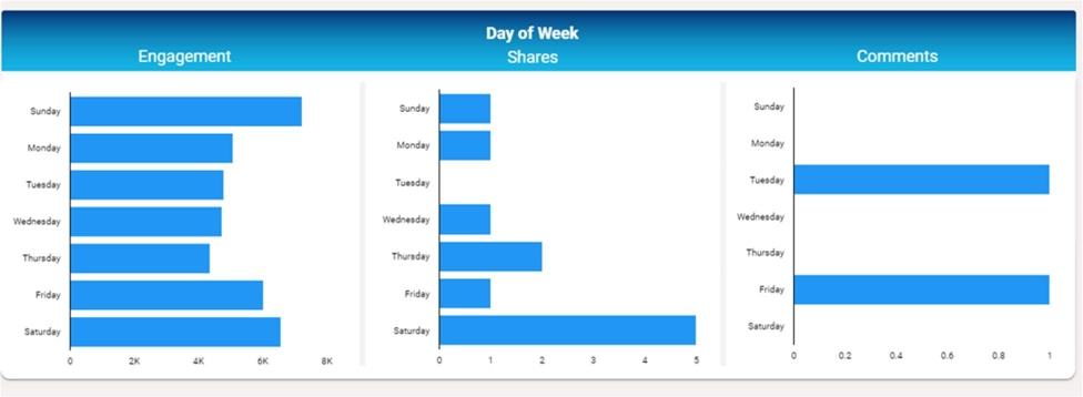
Engagement section below helps to determine which day of the week your ads get most engagement. It can be used for determining which day of the week is best for posting your ads on Facebook.
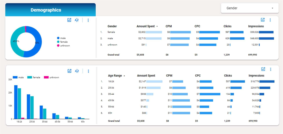
Demographics section below breaks down the key metrics by age and gender. It is possible to select which metric you want to see in the donut chart and histogram.
It can be used for determining which demographic it makes sense for you to target on Facebook and Instagram.
