Looker Studio Klaviyo dashboard is a powerful tool that provides marketers with a comprehensive view of their email and SMS marketing performance. As the central hub for tracking and analyzing campaign effectiveness, the dashboard offers real-time insights into key metrics, customer engagement, and revenue generation.
We have analyzed the email data for a well-known brand and provided various insights in Looker Studio. Let’s walk through it together to explore the KPIs and uncover insights from the data.
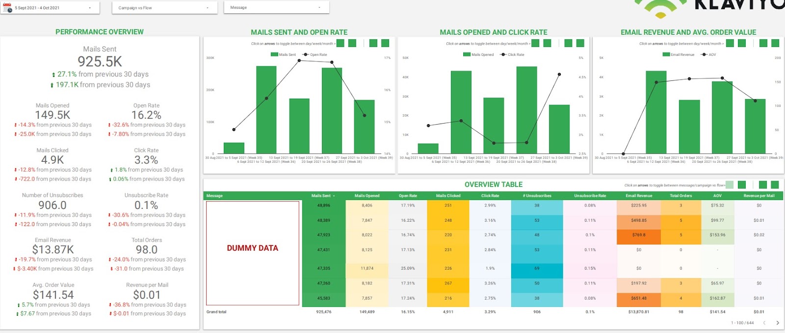
Looker Studio Klaviyo dashboard: Overview
This view offers a performance overview of email data within the selected time frame, helping businesses understand key aggregated values for important KPIs.
In addition, it shows the change in value and percentage compared to the previous 30 days. For example, the number of emails opened decreased by 14.3%, with 25,000 fewer emails opened in the current cycle. These insights help businesses identify patterns in the data changes.
There are charts to display trends over time for different KPIs. For example, a bar chart shows the number of emails sent over a period, and a line chart shows the open rate. This helps visualize trends for the KPIs.
There is a table view that explains the different KPIs by message, allowing business users to see the KPI numbers for each message. It provides a comprehensive overview and also allows users to export the data for further analysis if needed.
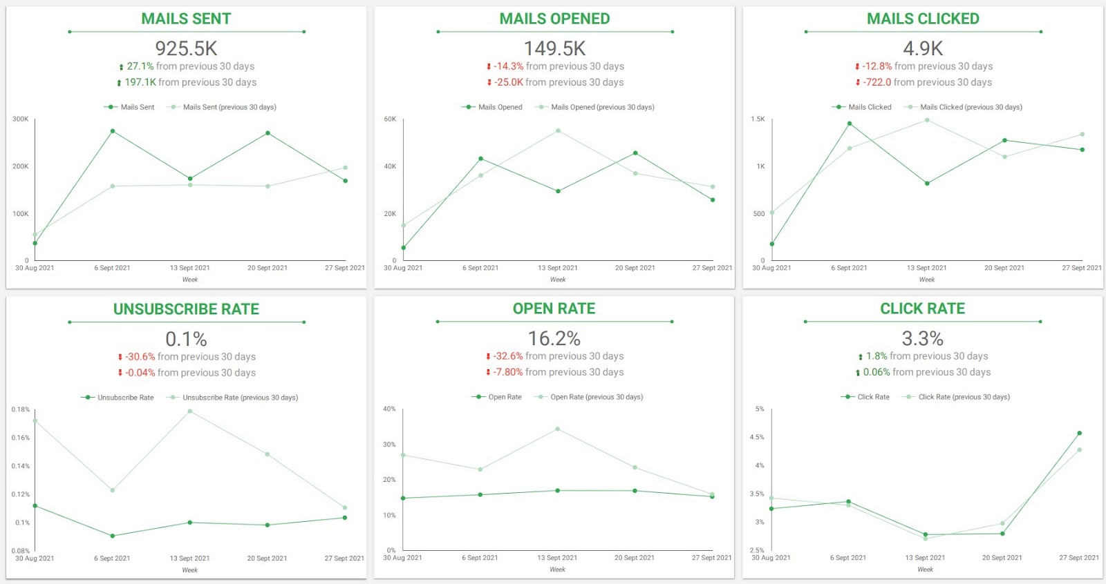
Trends
This Looker Studio Klaviyo dashboard view includes a list of line charts that focus on trend lines for each KPI. It provides detailed information about the KPIs along with trend data for different time periods. Users can also see how the values have changed compared to the previous 30 days.
Mail Sent: Number of emails sent
For example, a line chart for “Mails Clicked” shows the number of emails clicked as of today, along with the trend over the last 30 days. Another line shows the variance between the current values and the values from the previous 30 days.
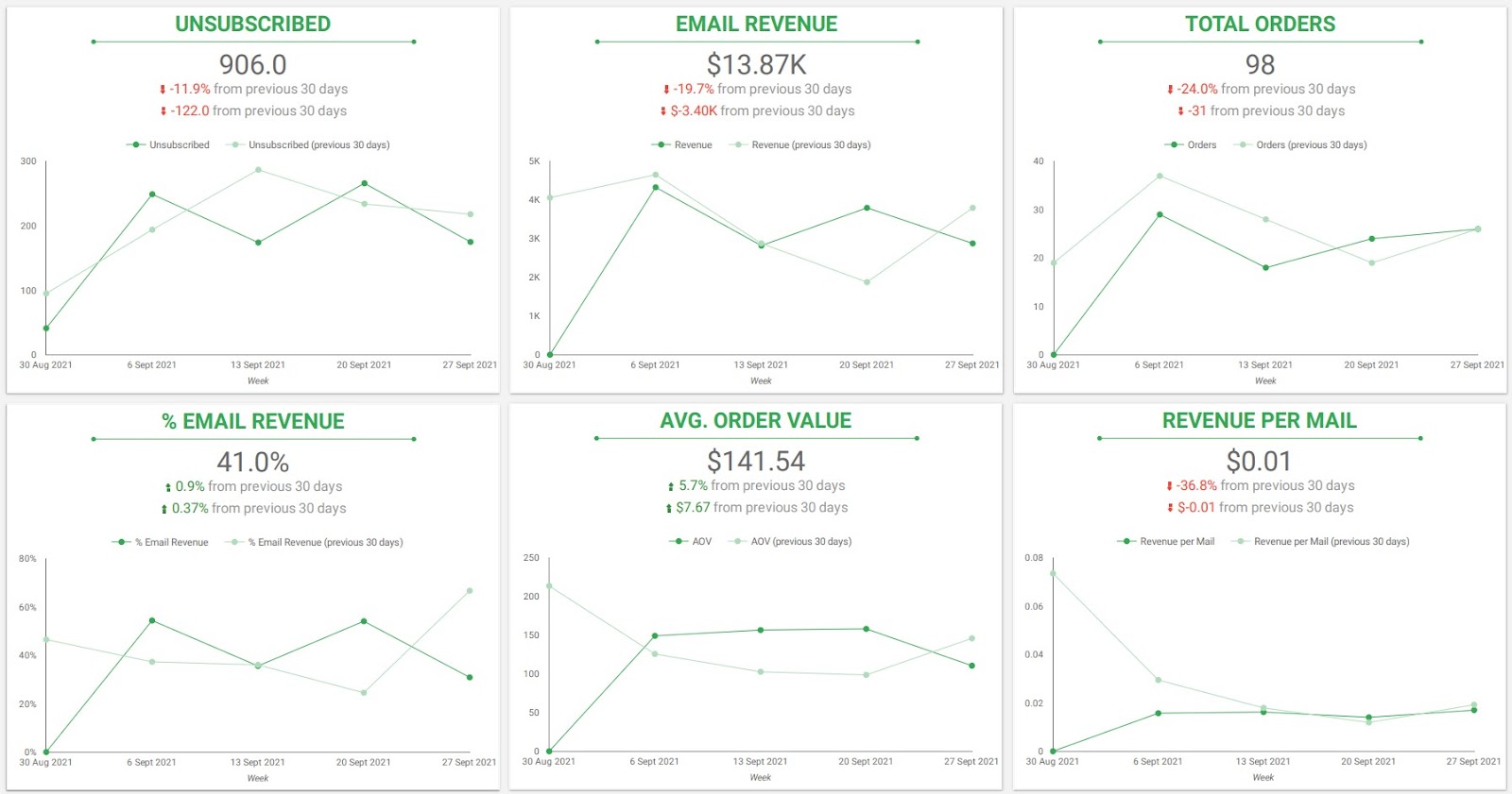
This is another trend view designed to cover additional KPIs for the business. It provides the current value, change in value from the previous 30 days, percentage change, and a 30-day trend line for each KPI. The KPIs covered include:
For example, the average order value (AOV) is $141, which has increased by 5.7% from the previous 30 days, with a value increase of $7.67. The trend chart shows that the AOV rose from August 30 to September 6, 2021, but experienced a decline from September 20 to September 27 that same year.
In conclusion, data dashboards enhances email marketing efforts by offering powerful, interactive reports that consolidate and visualize key metrics. It enables businesses to track campaign performance, analyze trends, and gain actionable insights into open rates, click rates, and unsubscribe rates.
![]()
![]()
![]()