
Have you been wondering how to build Power BI SAP dashboards?
SAP systems are pivotal in business analytics, offering robust data management and integration capabilities. By integrating tools like SAP HANA and SAP BW with Power BI, organizations can perform advanced analytics, generate real-time insights, and support data-driven decision-making. These systems streamline operations, enhance reporting accuracy, and provide a comprehensive view of enterprise performance, driving strategic growth and efficiency.
Integrating SAP systems with Power BI provides a powerful combination for data analysis and visualization, enabling organizations to leverage their SAP data effectively for better decision-making. Here’s a detailed guide on how to connect Power BI with SAP systems, create dashboards and the benefits of doing so.
The short answer is yes but the process will be different depending on which SAP system you are using for storing your data. This guide will cover how to connect Power BI with:
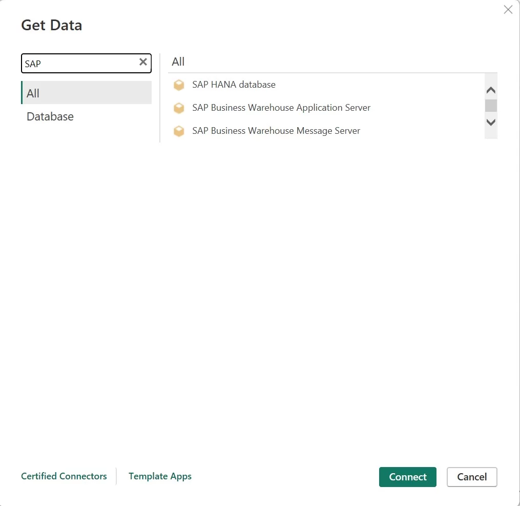
Power BI needs an ODBC driver to be installed to leverage these connectors to get SAP systems data.
You should install SAP HANA ODBC Driver on your local system to connect to SAP HANA Data using Power BI. You can get this driver from https://support.sap.com/en/my-support/software-downloads.html
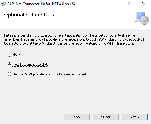
To utilise the SAP BW Message/Application Server connector within Power BI Desktop, the installation of SAP .NET Connector version 3.0 or 3.1 is necessary.. The SAP .NET Connector is available for download directly from https://support.sap.com/en/product/connectors/msnet.html .
During the installation process, ensure that you choose the option “Install assemblies to GAC” within the Optional setup steps.
Both the SAP Connectors support Import and Direct query connections from Power BI. You can refer our article here to understand the concepts of Import and direct query in Power BI.
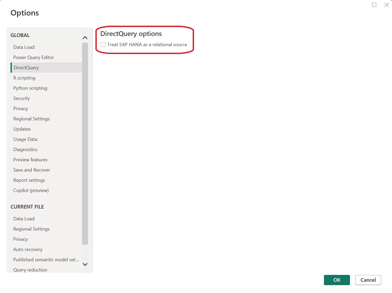
When you are connecting Power BI to SAP HANA Database, there are two options available: multi-dimensional source and relational source
When deciding whether to treat SAP HANA as a multi-dimensional or relational source in Power BI, it’s crucial to align with your business requirements. Let’s explore the benefits and constraints of each approach:
In this scenario, Power BI acts similarly to when it connects to other multi-dimensional sources such as SAP Business Warehouse or Analysis Services. When connecting Power BI to SAP HANA with this configuration, a single analytic or calculation view is chosen, granting access to all its measures, hierarchies, and attributes in the field list.
When visuals are generated, aggregate data is consistently fetched directly from SAP HANA. This method represents the preferred approach and serves as the default setting for new DirectQuery reports on SAP HANA.
Advantages:
Limitations:
With this approach, Power BI treats SAP HANA as a relational source, providing greater flexibility. However, you need to be cautious to ensure that measures aggregate correctly and to avoid performance issues.
To use this option, go to File > Options and settings > Options > DirectQuery and check the box for “Treat SAP HANA as a relational source.
Advantages:
Limitations:
We’ve previously generated a Power BI report using SAP data and utilized SAP connectors for Power BI. This report was designed for strategy teams to grasp different KPIs and metrics, aiding their comprehension of business operations and addressing critical inquiries regarding the company’s sales performance. Let’s walk through it together to explore the KPIs and uncover insights from the data.
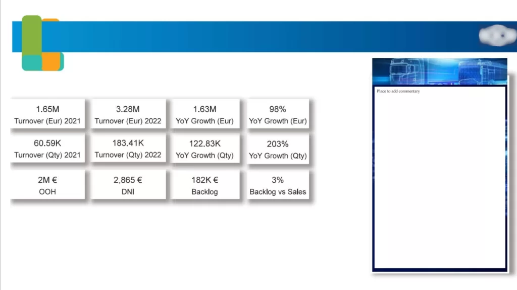
The first page offers a comprehensive overview of turnover, growth, backlog, and sales in both the current year and year-over-year (YOY) timeframe. It provides a consolidated view that enables business users to assess the company’s performance in the current year at a glance. These insights/KPI’s include
Additionally, other KPIs are provided to give business users a comprehensive view of performance.
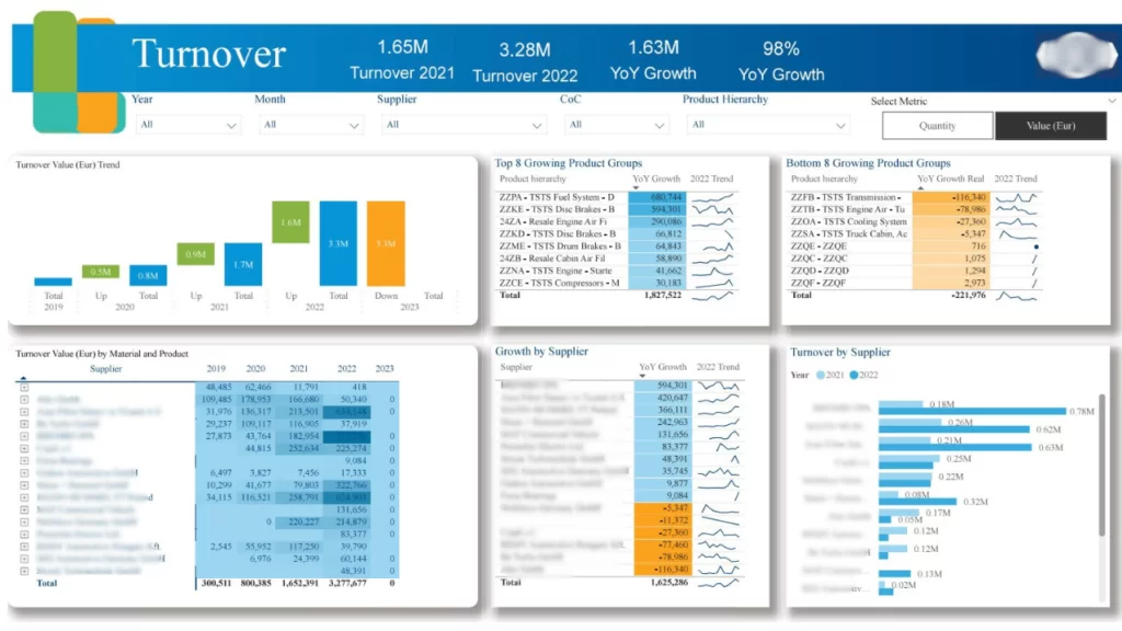
The Turnover page provides insights into KPIs related to the company’s overall turnover, incorporating various dimensions. Business users gain a multidimensional perspective of turnover across different groups within the company. These insights/KPI’s include
Also, there are filters provided for users to refine and analyze the data. These filters enable users to focus on specific values or dimensions using the available slicers. Additionally, users can choose the metric type as Quantity or Value (EUR).
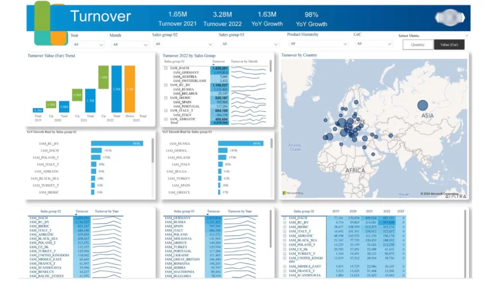
The next page dedicated to Turnover Analysis expands on additional KPIs to offer valuable insights to users. These insights and KPIs are:
Additionally, slicers are provided for Year, Month, Sales Groups, and Product Family, enabling users to filter and analyze data based on specific dimensions of interest.
The next Power BI SAP report page offers the capability to view various metrics across different dimensions in a single consolidated view. Users can select metrics using the Metrics slicers, which then display corresponding data in the visuals. For example, currently displaying Backlog, OOH, and DNI metrics. The page includes the following KPIs:


Additionally, we have other charts that analyze turnover, growth, and trends across dimensions such as RSM and product hierarchy.
Define Clear Objectives
Focus on Key KPIs
Keep the Design Clean and Intuitive
Use Visual Elements Effectively
Ensure Real-Time Data Integration
Tailor Dashboards to User Roles
Test and Refine Based on Feedback
Overall, we can conclude that Integrating Power BI with SAP enhances analytic capabilities, enabling real-time insights and informed decision-making. This synergy facilitates agile reporting and visualisation, empowering organisations to optimise operations and drive growth.
By leveraging the SAP connector, businesses can cultivate a data-driven culture that translates analytics into actionable outcomes, thereby ensuring a competitive advantage in the market.
Power BI is a versatile, modern BI tool suitable for diverse environments, while SAP Dashboards are specialised for SAP-centric organisations but are increasingly being phased out in favour of newer tools like SAP Analytics Cloud.
SAP Analytics Cloud (SAC) is a premium solution, often priced higher than Power BI, especially at the entry level. While SAC offers advanced features, its cost can be a barrier for smaller organisations. According to data from G2.com, Power BI is more commonly used by small and medium-sized businesses, whereas SAP Analytics Cloud is predominantly adopted by larger enterprises
SAP Business Intelligence (SAP BI) encompasses the tools and processes used to analyse data gathered from business operations. However, it goes beyond just analysis; it supports ongoing decision-making and strategic planning
![]()
![]()
![]()