Vidi offers custom Google Analytics SEO dashboards that show trends, KPIs, and patterns that help you focus on what’s working and fix what’s not.
It’s easy to create an SEO dashboard in Google Analytics by customizing a template in the gallery, but this approach is quite limited in terms of:
Vidi uses Looker Studio (formerly Google Data Studio) to create custom SEO dashboards that solve these problems plus more upsides like:
Let’s walk through a world-class example dashboard created by Vidi’s professional team.
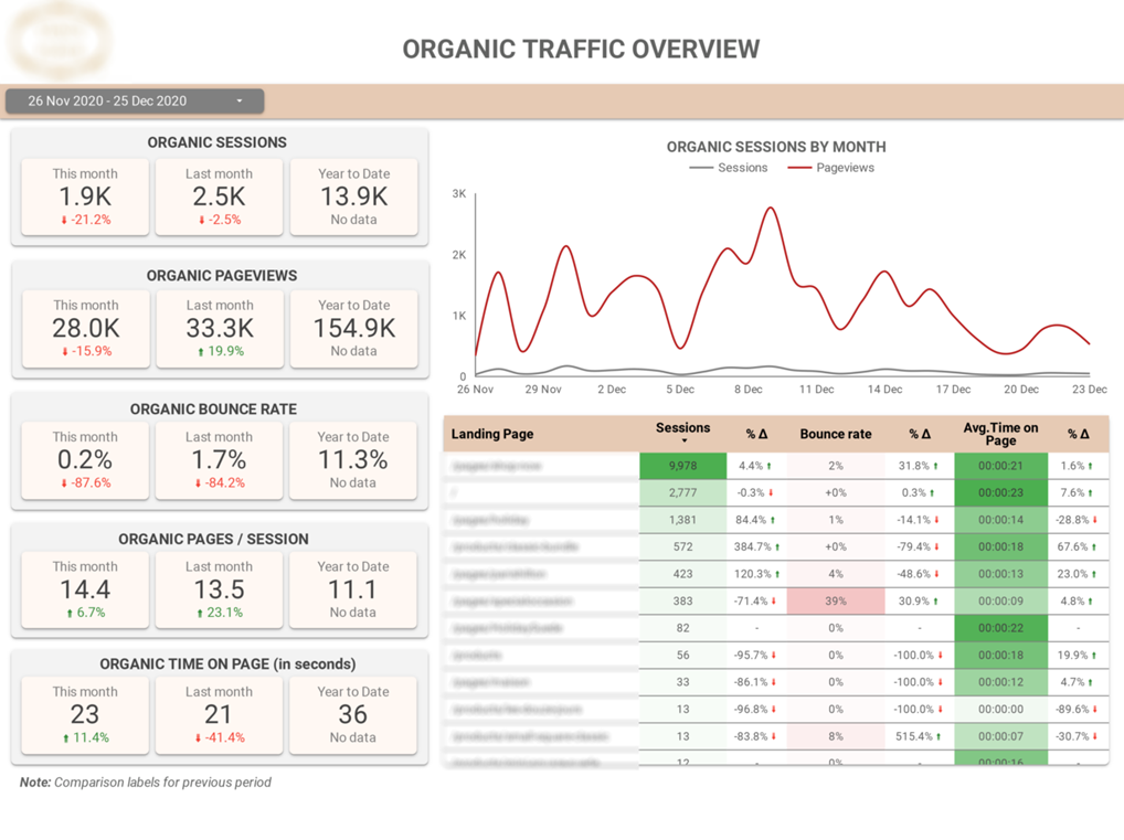
This dashboard helps you monitor metrics that tell you how many visitors came from organic searches, how many pages they viewed, how many left right away (bounce rate), how many pages they visited on average, and how long they spent on your site.
You can see all these KPIs for the current month and compare them easily with the previous month. You can also see how your website’s performing in terms of organic traffic generally for the current year or a specific date range.
There’s also a color-coded chart to help you understand these metrics as they apply to all landing pages. Above it is a trend line that lets you see exactly how your organic sessions and page views have changed over time.
This is just the beginning.
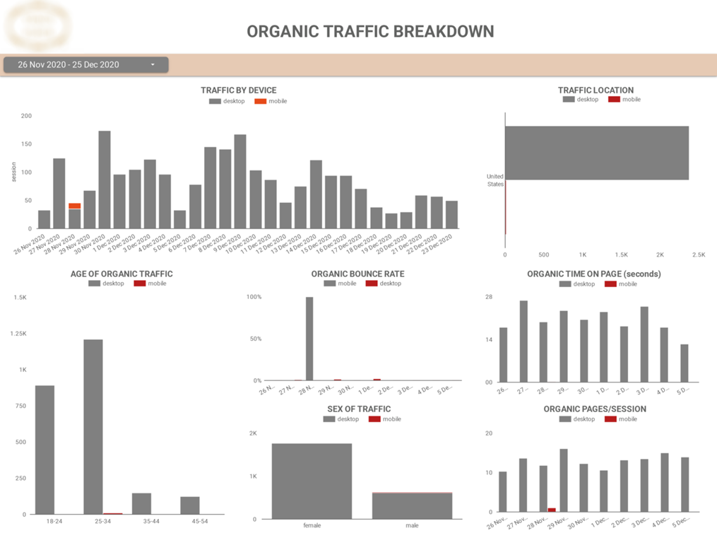
With this dashboard, you can learn more about the people visiting your website i.e. the device they often use to access your website, their age, sex, and location.
The dashboard also lets you see you see the behavior of your visitors based on the device they use. You can gain insights such as if users who access your website with a desktop spend more time on the pages.
You can use these insights to improve your SEO results by optimizing your website for the most popular devices and tuning your SEO content and overall marketing strategy to relate better with the most popular ages, sexes, and locations.
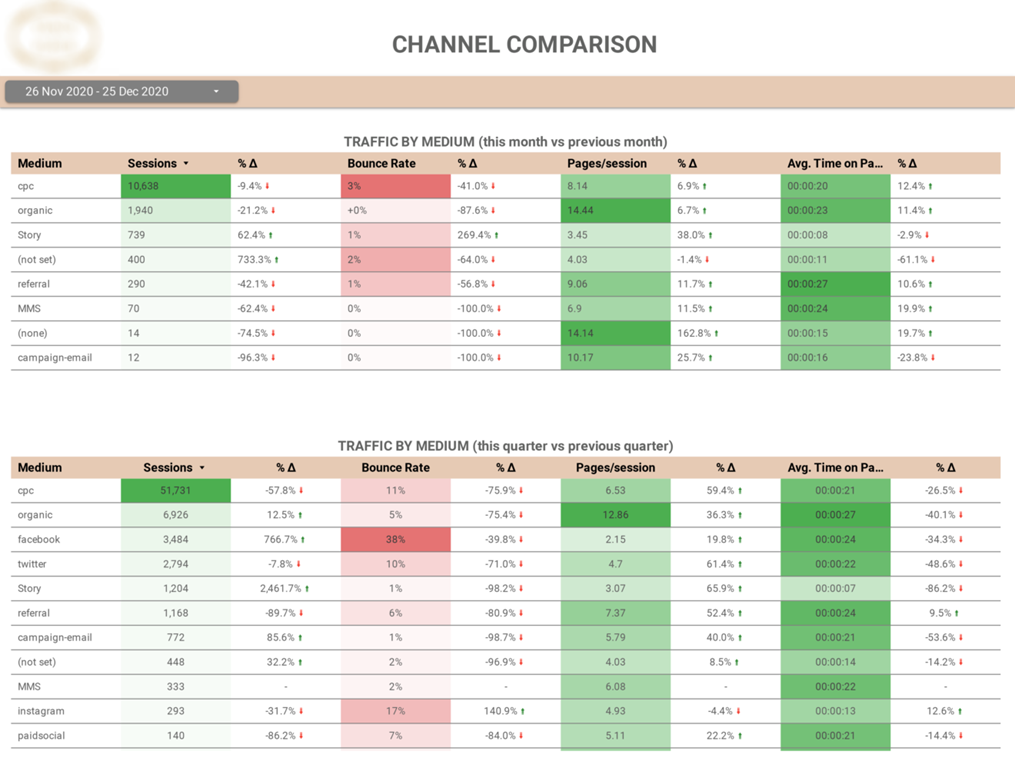
This dashboard lets you analyze your traffic based on organic and inorganic sources. It tells you which platforms are bringing in the most traffic and lets you compare your progress month over month and quarter over quarter.
It’s designed to be very intuitive with green arrows and shades representing good progress and red arrows and shades implying decrease.
You can visually keep an eye on important metrics like bounce rate, number of sessions, pages per session, and average time spent on the pages for each medium.
That’s not all!
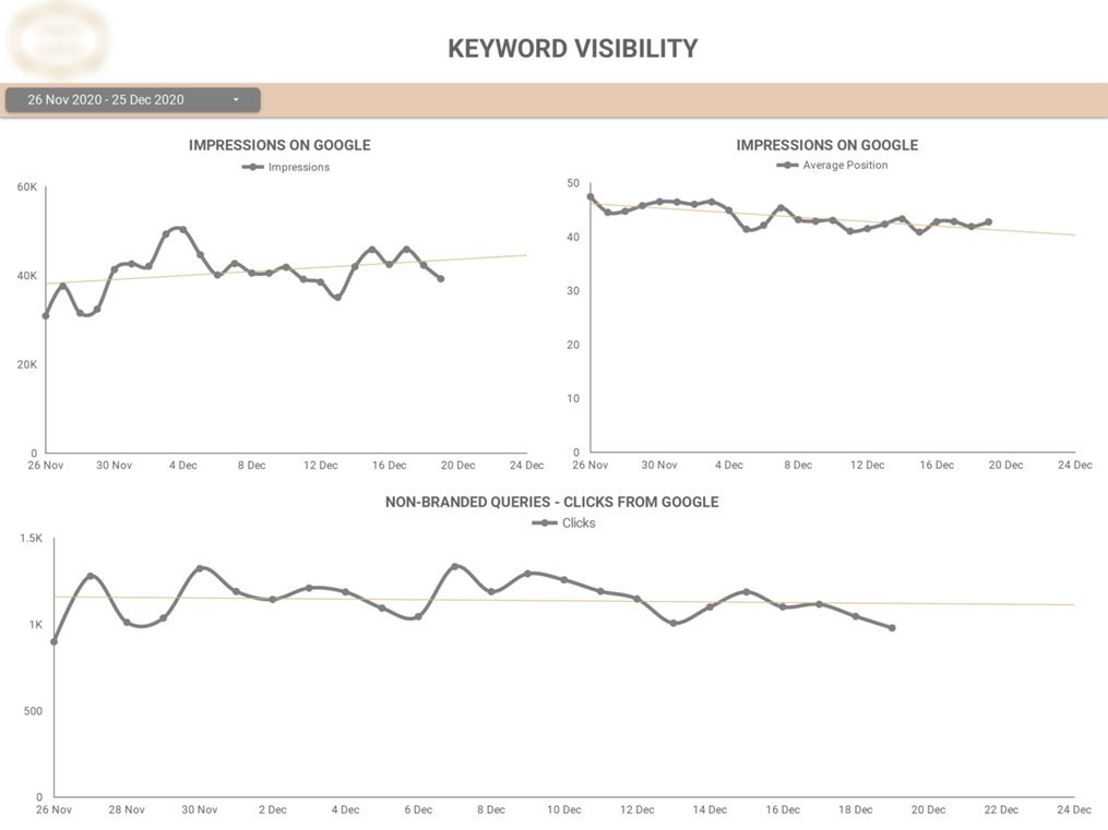
The trend lines in this dashboard let you see how often people see your website in search results (impressions), how many times they click on it when they see it (clicks), and your average ranking in search results (average position).
This helps you understand if your SEO efforts are attracting more visitors and increasing your brand visibility over time or not.
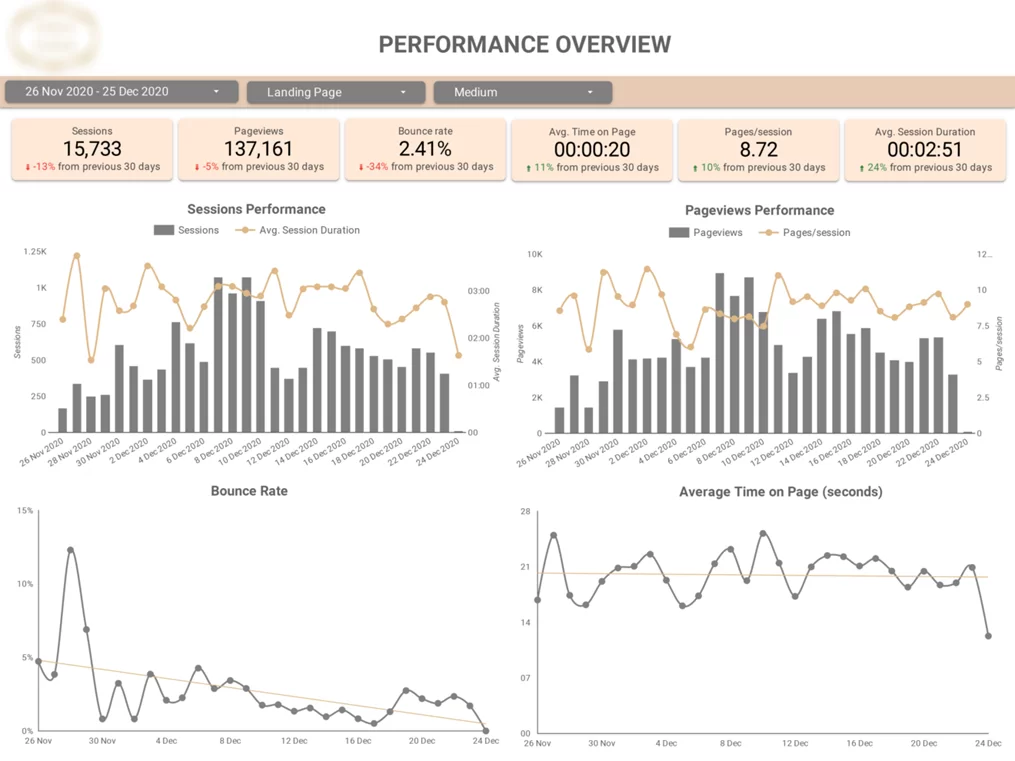
This dashboard summarizes many of the metrics we looked at in previous dashboards. It gives an overall view of your SEO performance and if you want, you can filter what you want to see using the slicers and focus on a particular date range, landing page, or/ and traffic medium.
You can monitor several KPIs such as bounce rate, page views, average session duration, and so on as well as see the daily trend of all these metrics all in one place.
Save the best for the last, right?
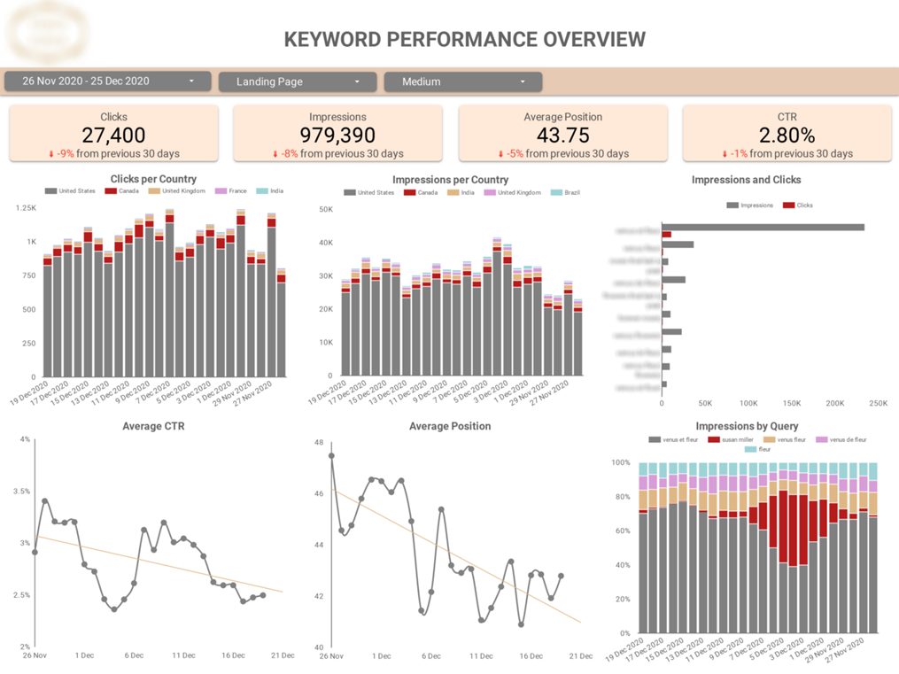
This dashboard gives you a rich account of your keyword performance. It shows you the impact of your keywords on the number of clicks, impressions, click-through rate (CTR), and average ranking position of your website.
The best bit is the impression by query chart which exposes the exact search terms that are generating the most organic traffic for your website. This information is very useful for improving your SEO strategy and results i.e. refining your content to reflect the high-performing keywords will attract even more traffic.
P.S. Vidi combined insights from Google Analytics and Google Cloud Console to create this wholesome SEO dashboard.
![]()
![]()
![]()