
Eugene Lebedev is a Power BI consultant by background. Before founding Vidi Corp in 2021 he created Power BI reporting for Autodesk. His Power Bi reports were used by VPs of Finance and C-suite of Autodesk. As part of Vidi Corp, Eugene created dashboards for Google, Teleperformance, Delta Airlines and 200+ clients worldwide.
Data visualisation is a key skill for any data analyst. Effective data visualisation helps you make sure that the findings of the analysis are clearly communicated. Only when the style of communication through data is effective, the message gets across and provokes an impactful change within the organisation.
In this article, I want to look through how to select the visualisation in a way that makes your message very clear. I will discuss the principles of effective data visualisation, different chart types, the thinking behind effective visualisation and much more.
I will use Power BI to visualise the data for this article simply because of my personal preference. However, the principles that I describe here will be applicable to any technology: Tableau, Excel, Looker Studio, etc.
For the purposes of this article, I will be using the US bus breakdown dataset from kaggle. Feel free to use it to make your own data visualisation.
Table of content:
1. Principles of effective data visualisation
2. Chart types
My first principle is to reduce clutter as much as possible. Clutter distracts the viewer of the dashboard from the main message that you are trying to get across. It makes the overall communication style very unclear and all the cognitive stimuli kind of blend together.
By clutter I mean things like:
Later in this article, we will look into what brings clutter to each chart type and how to avoid it. Keep reading to find out.
The second principle comes with the dos and don’ts.
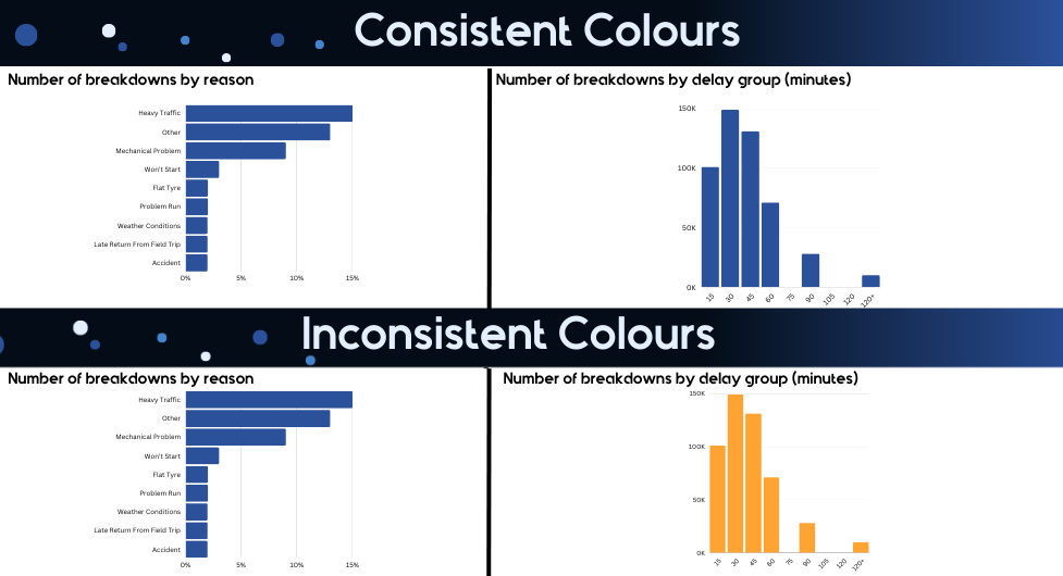
Don’t use bright and toxic colours – Consider the chart below. Simply glancing at this chart makes me want to look away. Bright colors will fatigue the users of your dashboards a lot quicker than any pastel shades or more neutral colours
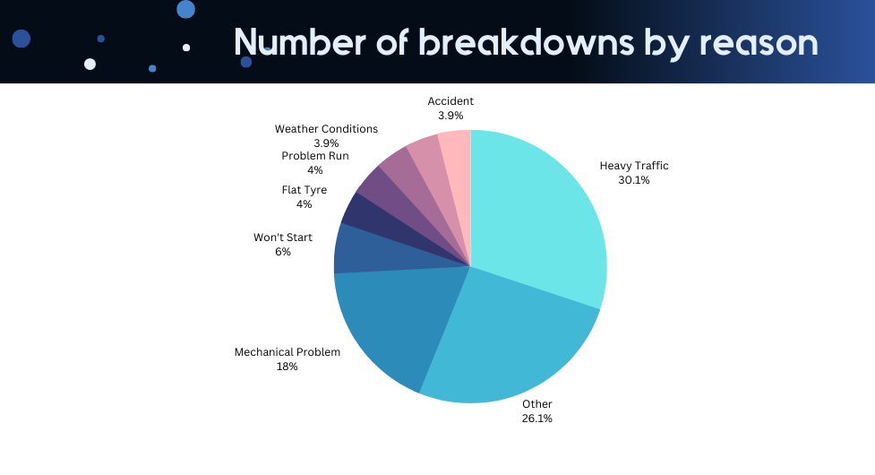
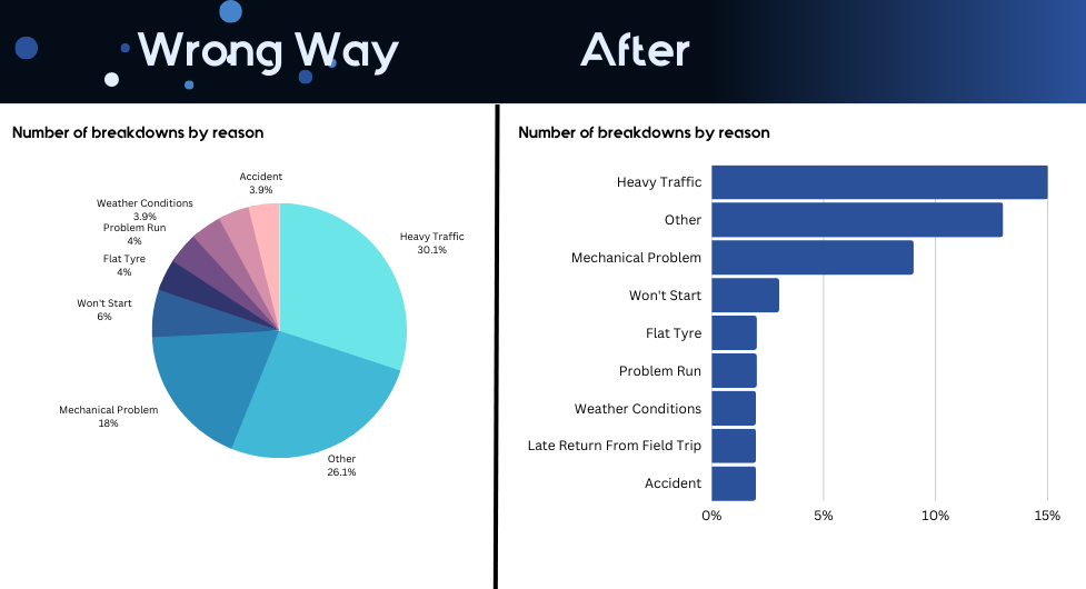
Don’t use too many colors – the pie charts that we looked at earlier are a great example of them. There are many alternative data visualisations that don’t require the use of many colours like horizontal bar charts.
Do choose colours that carry some meaning with them. For example, green indicates good findings whereas red is commonly interpreted as negative findings.
Do use colours consistently across all your data visualisation. If you colored the number of breakdowns in blue in one visual, keep using blue to visualise the number of breakdowns.
Once you remember the key principles discussed above, you can start selecting the most appropriate data visualisation to present your insights. Depending on what visual you select, it would be easier or more difficult for your audience to understand what you are communicating.
In order to select the most appropriate visual for answering a business question, it is worth it for us to discuss each data visual type individually. Below I will discuss what each visual should be used for. Make sure that you remember this so that you don’t misuse a visual. Remember, when a visual is misused, it leads to your audience misinterpreting or ignoring the insight!
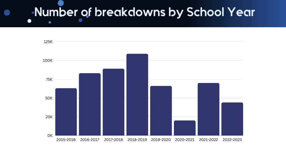
The general rule for using this chart is that there must be a certain logical order for categories on the X-axis. I personally only use the vertical bar chart in 2 cases: to visualize a distribution or a trend.
Consider the chart below which visualises the distribution of breakdowns by the delay that they caused. There is a clear order for the categories on the X-axis: 15, 30, 45, etc. When we have this clear order of categories, vertical bar charts should be used to visualize the distribution.
Other examples where this visual type may be appropriate are visualising the age distribution or income group distribution.
Note: that if there is no clear order of categories on the X-axis, this chart type is not appropriate to use.
As for the visualising trends, consider the chart below. There is a clear order of categories in the X-axis again which makes the vertical bar chart appropriate to use.
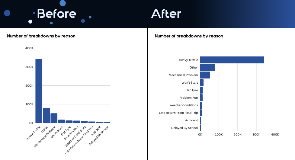
If there is no logical order of categories on your X-axis, then a horizontal bar chart is much more appropriate.
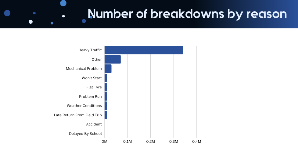
Another advantage of a horizontal bar chart is that it often makes the text in the categories easier to read. For example, compare the 2 charts below. The vertical orientation of the bar chart automatically leads to the diagonal orientation of the text on the X-axis when the text is long. Leaving diagonal text on your graphs will definitely cause some cramped necks and your audience will not thank you for that.
If you change this to a horizontal orientation, the text instantly becomes a lot easier to read.
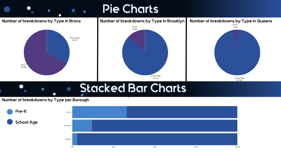
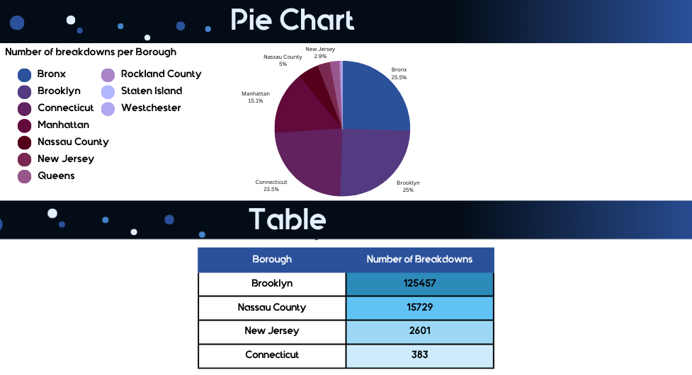
Pie charts or any variation of them such as donut charts are some of the hardest charts to interpret. Because of this, the only appropriate scenario to use them is when you have 2 categories to break down your data by.
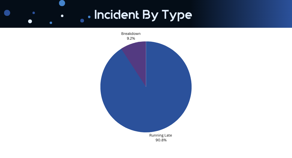
When you have more than 2 categories, your pie chart becomes a source of confusion. In the example below I deleted data labels for the pie chart. Can you tell me now which one is a larger segment?
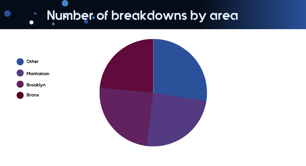
Well, the correct answer is below. See if you got it right.
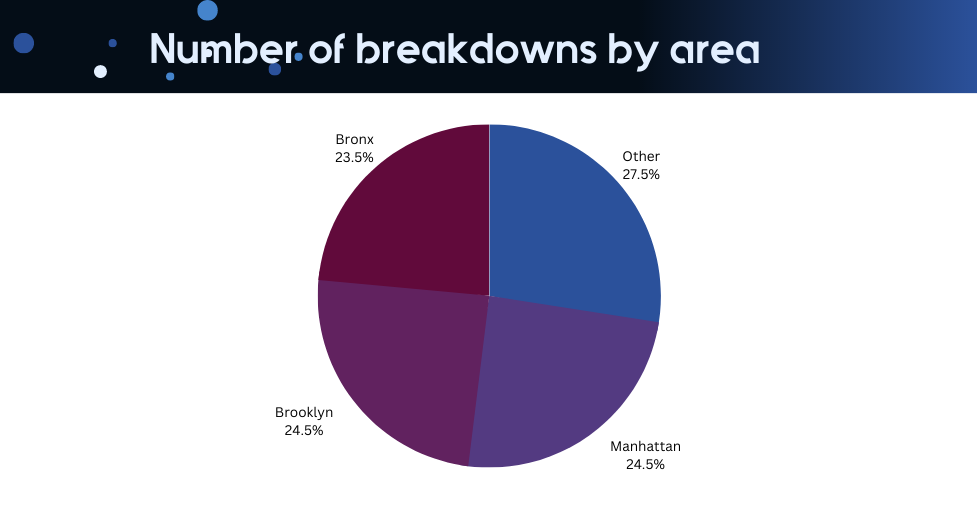
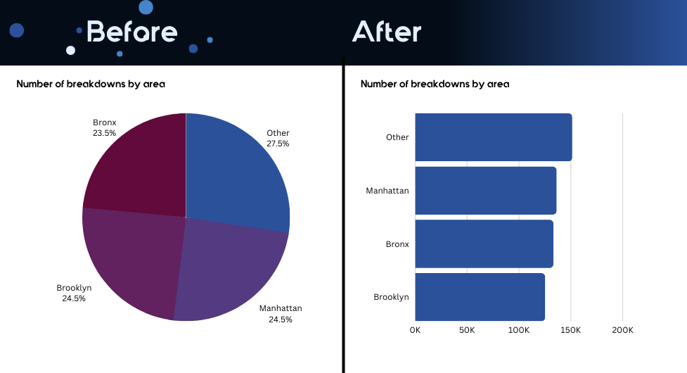
Your users will definitely have a much easier time interpreting length than the size of a pie segment. See for yourself and compare the 2 methods of data visualisation to each other.
Those could be a really useful alternative to bar charts for several reasons:
The rule here is that horizontal orientation should be used when there is no logical order for the categories in the Y-axis.
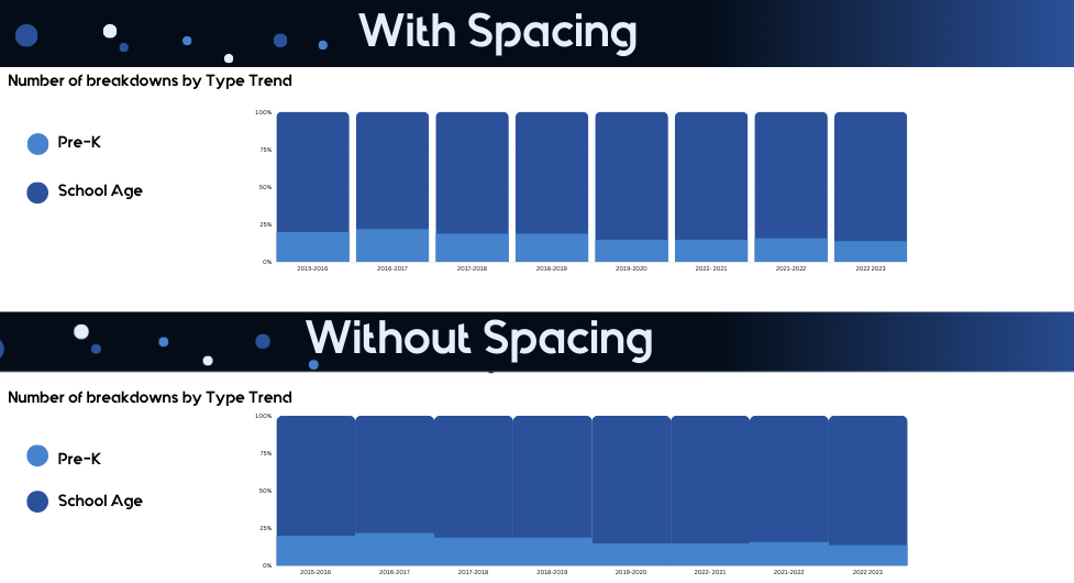
This visual type is best used to show the trend of a distribution. The way you format this chart would largely depend on the magnitude of change within data over time.
Consider the 2 examples below. Which one do you feel makes it easier for you to see the trend visually?
For this reason, if the change is small, I prefer to reduce the spacing between the bars.
Since the dots on the line chart are always connected, it forms a perception of a trend. Therefore, we should always only use Line charts for visualising trends.
Using line charts for anything else than trends would only confuse your users.
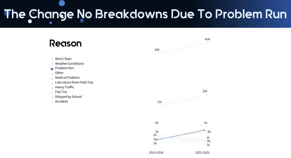
One other variation of line charts that you may consider using is slope graphs showing the change between 2 points in time.
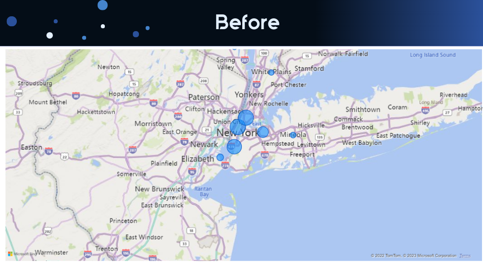
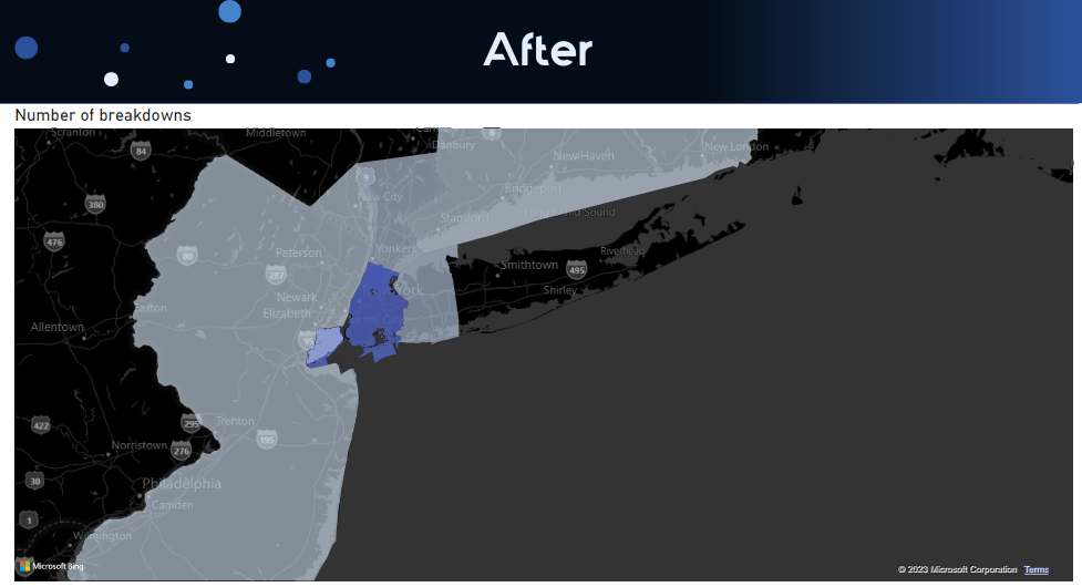
There are 2 main types of maps: bubble maps and filled maps. Bubble maps show bigger bubbles for bigger segments whereas filled maps color bigger segments in a darker colour.
Personally, I find it difficult to compare the size of the bubbles to each other. In my opinion, it is easier to compare the gradient of the color. In my work, I almost always replace bubble maps with filled maps.
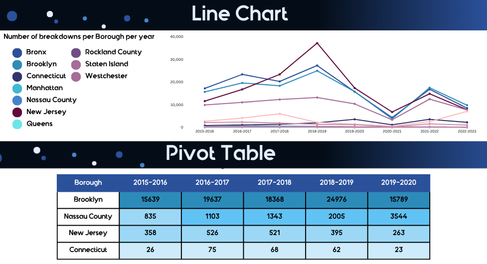
This is one of the most standard data visualisation methods, yet one of the most effective. Often when line charts or bar charts lead to clutter, it makes sense to replace them with a simple pivot table.
Consider the example below where I replaced a line chart with a pivot table. See how much cleaner this is?
Adding colour to your pivot tables is really important, this makes the tables feel much easier to read. In the example below I designed it in a way that if the value of the next year goes up, the colour becomes darker which replicates the lines going up and down on a line chart.
My recommendation would be to replace your visual with a pivot table every time you see the clutter of different lines or colours.
Again, very often analysts choose to avoid tables because the data needs to be “presented visually”. However, very often a simple table allows us to present the data in a much clearer way.
Consider the screenshots below where I replaced a pie chart with a table. The table helps to declutter the visual presentation of the data by getting rid of multiple colors. Adding gradients of blue to the table also helps the users to visually see which categories are larger than others.
My recommendation would be to replace your visuals with a table every time you see the clutter brought by different colours.
In order to visualise the data effectively, it is essential to keep the data visualisation principles in mind. The main ones are avoiding clutter and using color strategically. Everything else is a matter of choosing the right data visualisation.
Use this article to help you pick the right data visualisation method and use the principles described here to declutter your current reports!
The next thing that you need to know is how to structure the visuals on your custom dashboard. This would help you make sure that you communicate insights in a structured way and are really telling a story with your data. A story is much easier to interpret than a bunch of disconnected statements.
An article on dashboard design principles is coming up very soon. Make sure that you subscribe so that you don’t miss it.
![]()
![]()
![]()