Salesforce is where your customer story lives; Power BI is how your team reads it. Connect the two and you ditch clunky CSVs for live, trustworthy dashboards that drive decisions.
The Salesforce Reports connector by Vidi solves multiple problems
1. Allows you to overcome 2000 rows limitation imposed by the native connector
2. You don’t have to use Salesforce Objects connector which can be slow and has 100+ tables.
3. Supports Direct Query connectivity
As you probably know, the native Salesforce Reports connector is the easiest way to extract data into Power BI. You just select the report you want to load and Power BI loads all the columns from it. The Salesforce Reports connector has a significant constraint: it allows you to download only 2000 rows at a time. This problem is a bit annoying but there are multiple solutions.
One possible solution is to use the Salesforce Objects connector which does not have such limitations. However, this process might be pretty complex. Finding the specific columns you need within the 100+ tables of this connector can feel as challenging as searching for a needle in a haystack. 🧐🔍
An easier solution would be to extract your Salesforce reports in multiple chunks of data. For example, if your report is 9000 rows, you can send 5 requests (2000 rows each) and then combine all the data together. This is much easier to accomplish if you send data from Salesforce to a data warehouse. The best data warehouse to use for Power BI is Azure SQL Server since Azure is also a Microsoft product.
The process looks like this:
Here is a video demo of how this process works:
Your Azure SQL database can then be connected to Power BI and become a datasource for your reports.
We employed this approach while building a Salesforce dashboard in Power BI for the global head of marketing at a public company. They had their data in 7 different Salesforce reports, which we extracted using the method described above.
We now offer this Salesforce data extraction process as a service to other companies. We charge $1,000 per Salesforce report and the service takes 1-2 days.
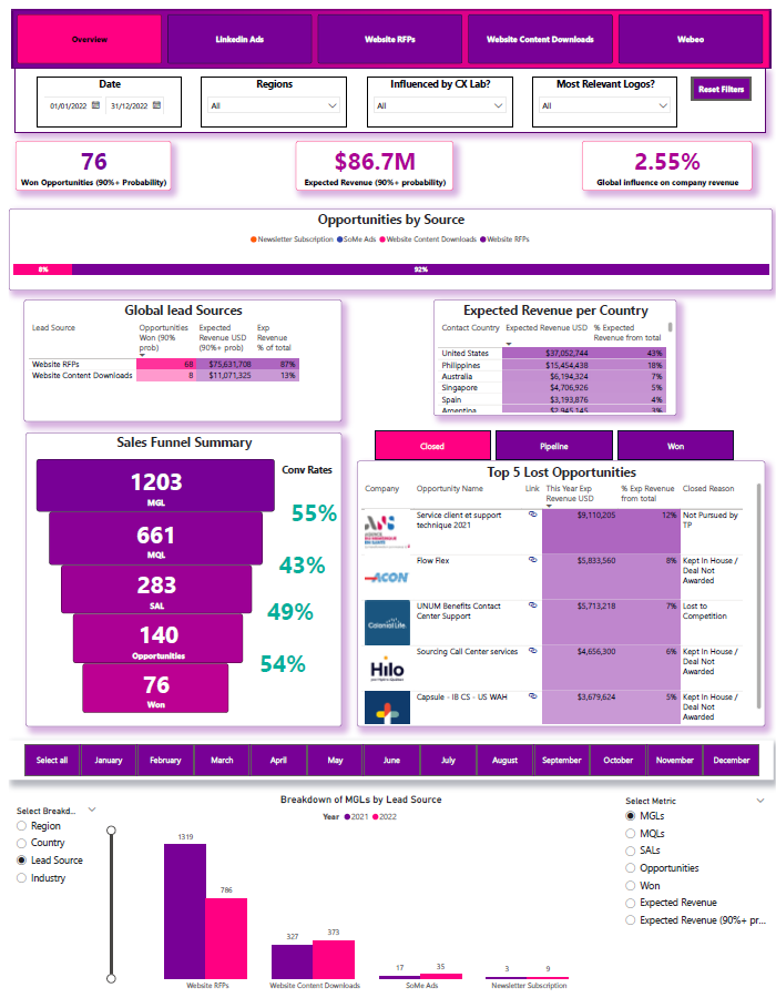
Below is the dashboard that we created for that public company. This should give you a feel for what is possible to create using the data from our scripts.
The dashboard measured the impact of the marketing activities on the overall sales pipeline of the organization.

The overview tab provides information on:
On the right side, the users can select whether they want to see won/lost/live opportunities. They also have a hyperlink to Salesforce to see the sales opportunity there. The dashboard automatically generates the company logo from the website URL.
The graph at the bottom allows to see your growth by selected metric and broken down by a selected category

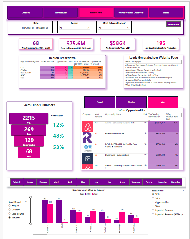
The website RFP tab shows the analysis for leads that specifically came through the website “contact us” forms. Most of the analysis is the same as on the overview page. The main difference is that users can see which web page generated the lead by clicking on it in the table above.

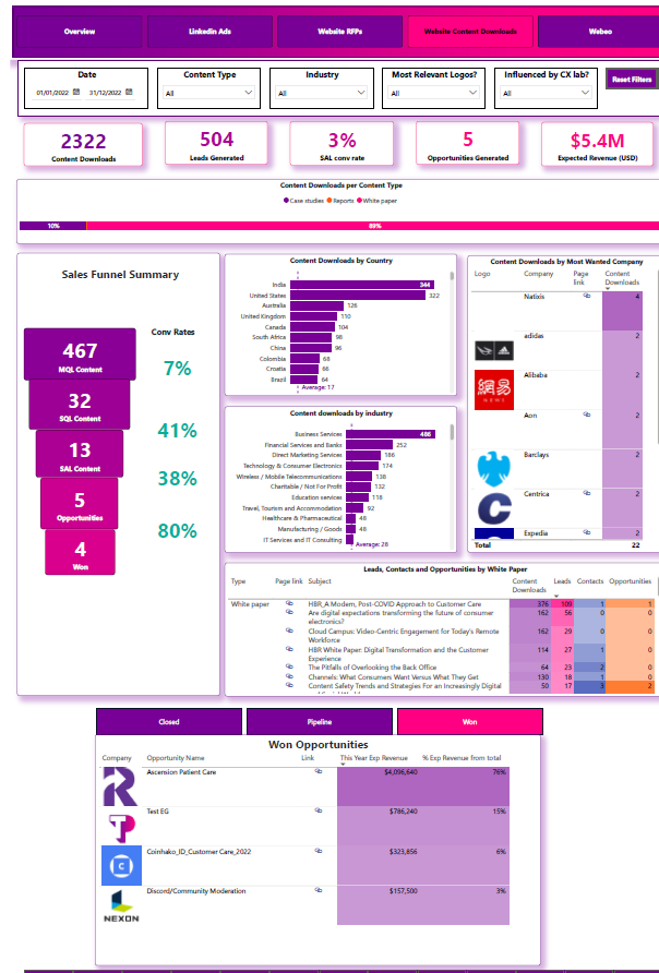
We analysed the leads generated through downloading website content, including the number of downloads by country, industry, and targeted key accounts. The dashboard also provides hyperlinks to the website content.
Ready to connect Salesforce to Power BI?