Firebase Power BI dashboard can significantly enhance how businesses analyse and visualise app performance data. Advanced Power BI visualisation surpasses Firebase’s built-in reporting features, allowing business to integrate Firebase data with multiple databases, automatically update and share reports. In this article, we will explore Firebase and Power BI, how to create a seamless Firebase Power BI integration, and identify KPIs to drive impactful engagement analytics. We will also cover real-world case studies where our Power BI consultancy developed Firebase Power BI reports to visualise engagement analytics data.

Power BI is a powerful tool to create Firebase reports for several reasons.
Firstly, Power BI visualisation is much better than Firebase built-in reporting capabilities since it allows to integrate multiple databases along with Firebase data. This leads to more insights about your user behaviour and deeper analysis.
Secondly, Power BI reports can easily be shared with other users that leads to improved collaboration. If you don’t want some users to access Firebase but still give them access to Firebase data, creating a Power BI dashboard might be a good solution.
And finally, automated data refreshes and scheduled reporting makes it easier to keep reports up-to-date without manual intervention.
Firebase is a Google technology for back-end development of mobile apps and web apps. We see many of our clients using it for their Android and IOS applications. SaaS companies often install Google Analytics for Firebase to capture key metrics about how users engage with their apps, what actions they complete, logs about app crashes and so on. Gathering this data opens many opportunities for data analysis in Power BI.
Power BI is a Microsoft business analytics tool that helps you to gain insights from the data. It allows you to connect to different data sources to create visual reports such as charts and dashboards. It also allows you to share reports with other users and teams. Reports are updated automatically by Power BI, ensuring that all visualisations are up-to-date. Thus, businesses use it to track performance and identify trends, improving efficiency and decision-making processes.
Power BI provides native connectors for multiple data sources. However it does not have a native connector for Firebase. This means you’ll need to find alternative ways to establish this integration.
Firebase has a native connector to Google Big Query which is a Google-owned database solution. We recommend using this integration to quickly and efficiently extract the data from Firebase. Big Query has a native connector to Power BI which allows you to bring the data in for analysis.
We recommend using the connector to Big Query for several reasons. For example, it supports large datasets and it can scale as your business grows, ensuring that Power BI can handle increased data volumes without compromising performance. Additionally, this pre-built connector reduces the need for manual data extraction and transformation. This streamlines workflows and allows teams to focus on actionable insights instead of complex integrations.
Companies mainly create Firebase Power BI dashboards to analyse user engagement. The goal of the analysis is to find ways to make the users more engaged, make them come back to the app as often as possible and identify the reason why users churn.
Below we have the list of KPIs that we commonly build for our clients. This list includes screenshots from our Firebase Power BI dashboards to help you visualise these KPIs.
1. DAU/WAU/MAU – number of unique users who engage with the app daily/weekly/monthly. You would need to first identify which actions make the users active e.g. they log in, take a photo using your app, etc. Users who perform those key actions would be classified as active. The next thing is to measure the growth of active users over time and ensure that it is going up.
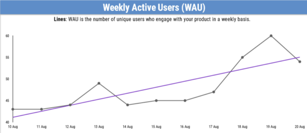
2. Engagement Rate that shows the percentage of users that actively engage with the app vs total users. This metric helps to assess the quality of your app as it reflects how users interact with the app.
3. Session duration shows the user’s average time in the app per session. This indicator allows app owners to analyse how engaging their content is. This metric shows frequency and duration of user engagement with the app.
4. User Lifecycle reflects the growth of the app’s user base over a period of time by dividing the user base into new, current, resurrected and dormant subgroups. The goal is to increase the number of current and resurrected users by maintaining their engagement or encouraging them to return. Additionally, it is vital to monitor dormant users and target them with notifications and personal outreach.
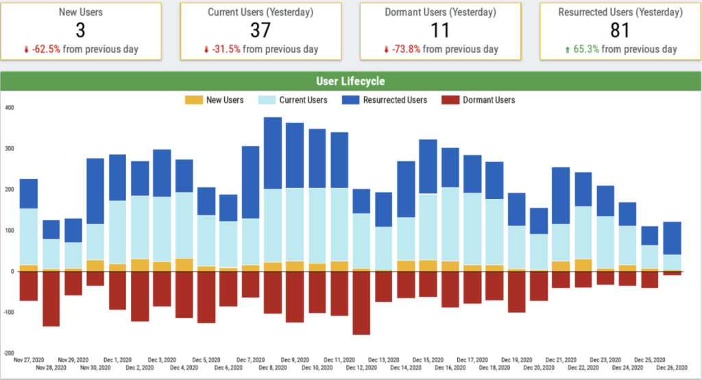
5. Retention Rate that shows percentage of users who engage with the app after installment. This is an important KPI since it shows what percentage of your users keep using your app as time goes. This helps businesses to make informed decisions about whether the retention and marketing strategies are working.

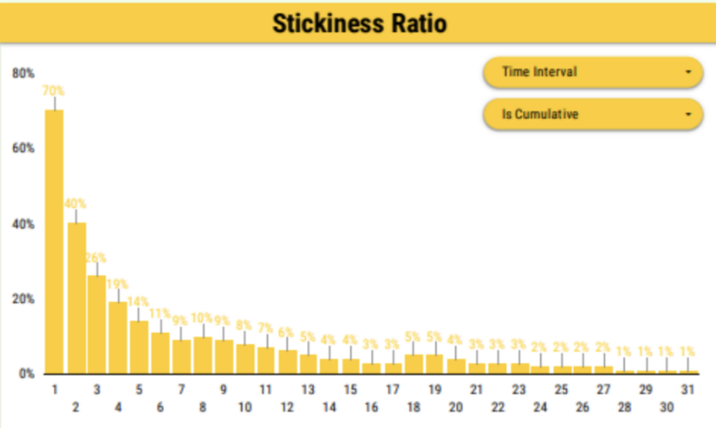
6. Stickiness Ratio shows how frequently the app is used by a user. It is calculated by dividing DAU by MAU. This metric is another good way of measuring user retention. Stickiness Ratio of 20% is considered as healthy. Having a healthy Stickiness Ratio percentage is vital in assessing users’ loyalty to the app.
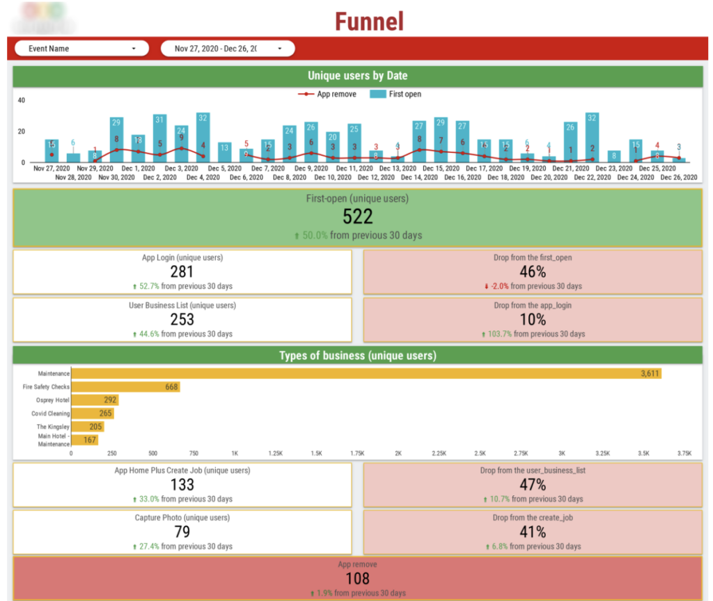
7. Funnel Analysis visualises the user journey from launching the app for the first time to engaging with it and dropping from the funnel (uninstalling the app). It helps to identify the weak points where users churn. Understanding of the causes of users’ churn provides an opportunity for developers to optimize the user experience, increasing retention.
8. User Conversion shows the proportion of visitors who successfully completed a crucial action that is specific for the business such as add to cart or make a purchase. A high User Conversion signals that users are engaging positively while a lower rate means that an app needs optimisation. User Conversion helps businesses to assess the efficiency of marketing strategies and improve user experiences.
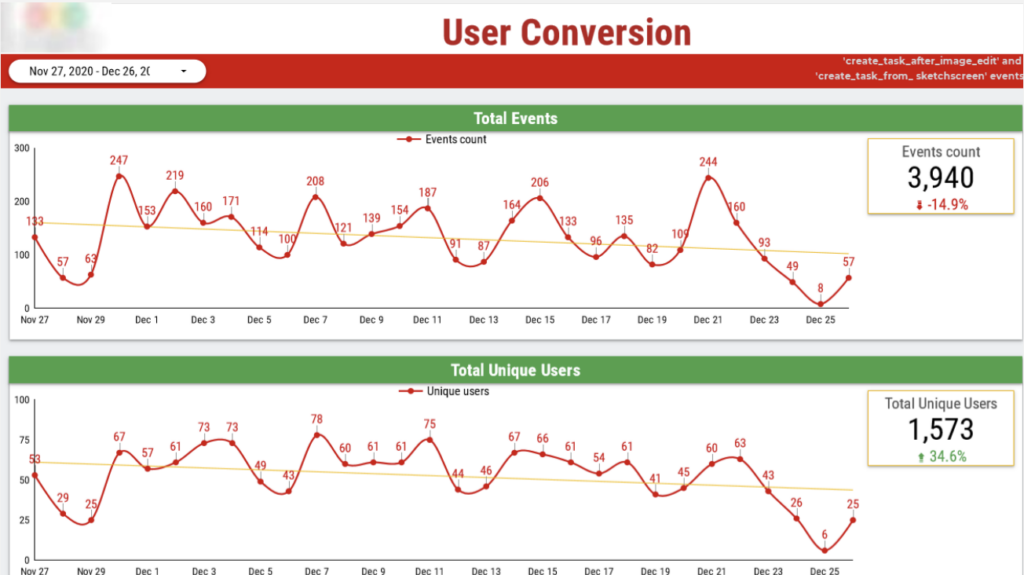
The client had all the data for their app in Big Query. They wanted to analyse their high-level app usage metrics and a breakdown of users by medical problems they experience.
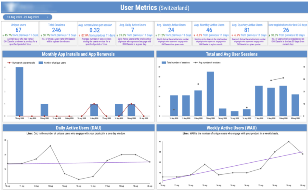
Our Power BI consultancy developed a Firebase Power BI report that shows trends in key user metrics and shows some insights on users.
The first page shows User Metrics including users that are active daily and weekly. Also, fluctuations of the number of sessions and comparison of installs to removals.
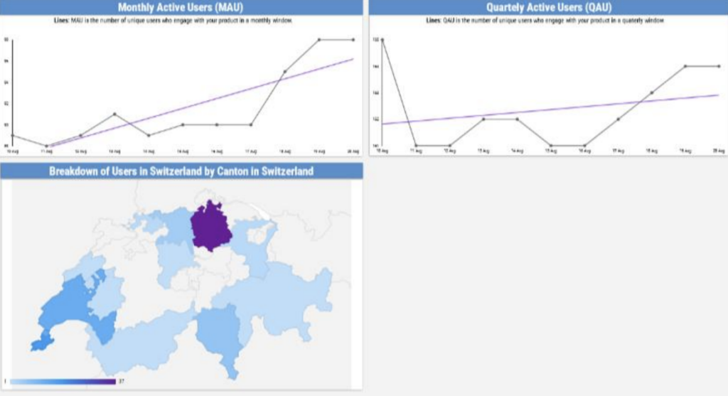
The second page contains the graphs that shows the number of users that are active monthly and quarterly. And the map of a country where users were broken down by demographics.
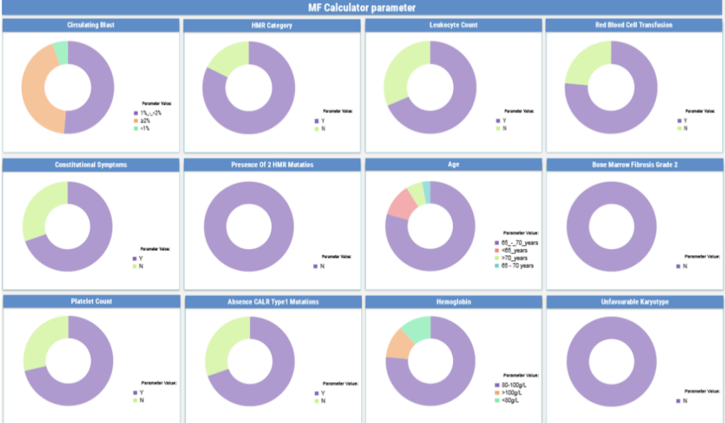
Users are broken down by specific categories that are shown as different pie charts on the third page of the report.
We worked directly with the CTO to produce a Firebase Power BI report. We linked Firebase to Big Query, created the formulas for KPIs in SQL and visualized findings in Power BI.
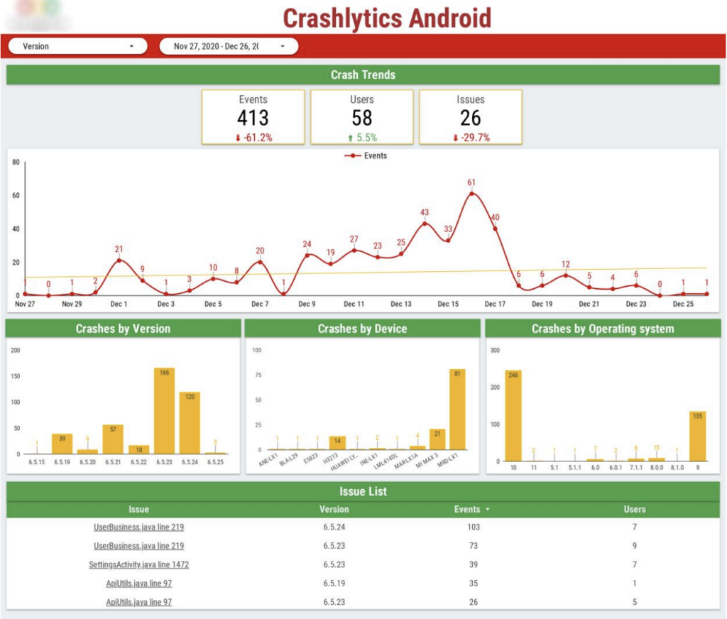
The first page shows the Crashlytics report that provides detailed insights into app crashes, helping developers identify, analyse and resolve issues effectively.
This report provides information about the frequency of crashes that is divided by versions, devices and operation system over a period of time. It also reflects crash trends over time and lists the issues.
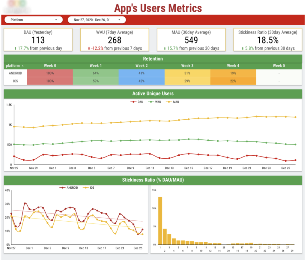
The second page of our Firebase Power BI dashboard fully focuses on user retention. At the top we have high-level metrics such as Daily/Weekly/Monthly Active Users.
Stickiness ratio shows the ratio of daily active users to monthly active users. It essentially measures how ‘sticky’ an app is. For example the ratio of 17.2% means that 17.2% of users who use the app on a monthly basis also use it on a daily basis. On any particular day, the stickiness ratio measures how many users that day also logged in over the last 30 days.
Retention percentage is analysed to understand how many users that start using the app still use it in 1 week, 2 weeks, etc.
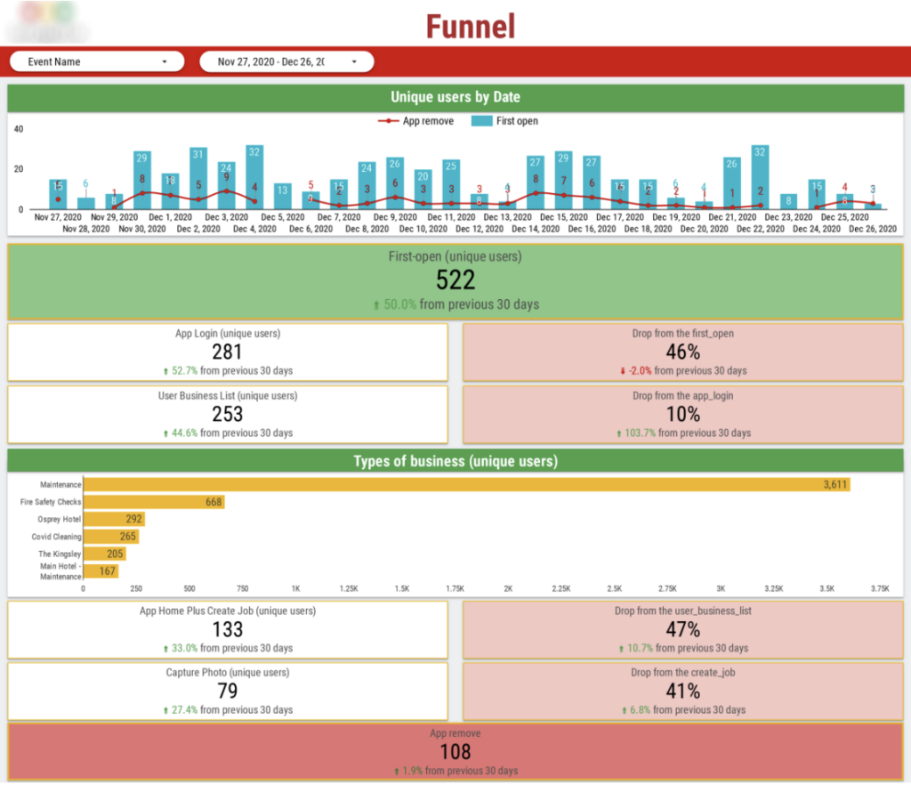
The third page of the Firebase Power BI dashboard shows funnel analysis. It analyses app first open and removal events as standalone numbers and trends per day. The number of different events that contribute to the definition of an active user are also calculated such as creating a job or uploading a photo. Types of businesses that contribute to these events are also analysed.
Firebase Power BI dashboards can significantly enhance app performance analysis because of advanced visualizations and seamless data integration. Imagine if you had the same insights about your app at your fingertips. You would be able to use these insights to drive your product development strategy and evaluate whether it is working!
Want to learn more about our Firebase Power BI experience? Simply contact us and we will be happy to share our knowledge in the area!
Support
All the support you need – when you need it. From 1-hour quick fix support to longer-term partnership that drives your business forward.
Consultancy
Advanced data thinking, creative ideas and the best Power Platform practices to unlock the true potential of your business data.
Training
Succeess shouldn’t be a one-off. When we train you teams user adoption surges and your Power Platform results radically improve.