Financial Director of one Healthcare company approached us as he wanted to transition the financial reporting from Excel into Power BI. We worked with him to identify the KPIs to track in the reports, data structuring and identifying the data visualisation style that fits best the analysis.
Data Source
Sharepoint Lists
Analysis Tool
![]() Power BI
Power BI
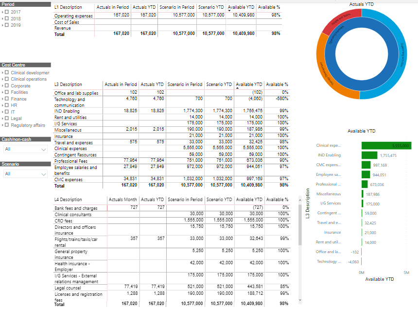
This tab compares actual revenue, COGS and operating expenses in a selected month and year to date to budgeted amounts. Revenue, GOGS and Operating Expenses are broken down to a more granular level in the tables below.
The visuals on the right break down operating expenses by cost centre and break down the available budget for every expense category.
Finally, there are options to filter these visuals by time period, cost centre, budget scenario and cash/non-cash.
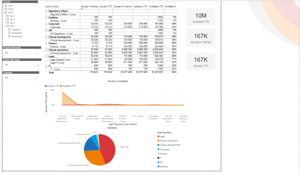
Actual and budgeted expenses are broken down by sub function. A more visual way of showing this breakdown is provided through line chart and pie chart below.
There are also options to filter the visuals by time period, project, cash/non-cash and budget scenario.
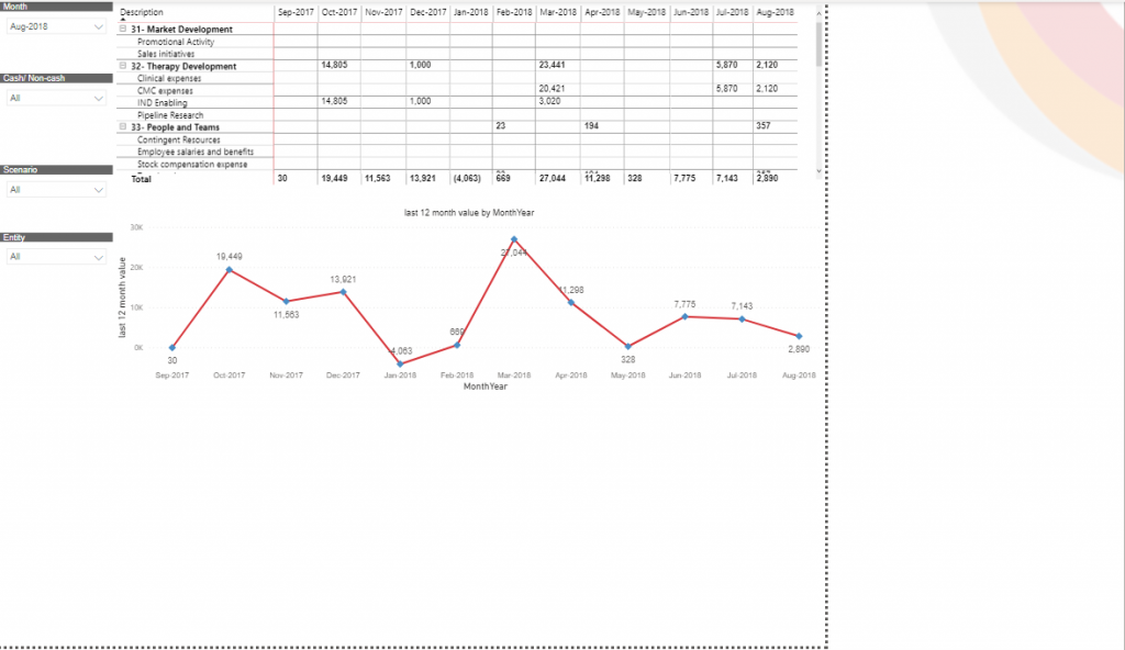
The breakdown of available budget is provided by cost account and by month.
The month slicer controls the month up to which the data is shown on the visuals. There are also options to filter transactions by Cash/Non-Cash, business entity and budget scenario.

Support
All the support you need – when you need it. From 1-hour quick fix support to longer-term partnership that drives your business forward.

Consultancy
Advanced data thinking, creative ideas and the best Power Platform practices to unlock the true potential of your business data.

Training
Succeess shouldn’t be a one-off. When we train you teams user adoption surges and your Power Platform results radically improve.
![]()
![]()
![]()