This Active Campaign Looker Studio template was built for one of our customers in 2020. The template helps the client to analyse their email marketing efforts in more detail and discover areas for optimisation.
Email marketing is a powerful tool for business growth, enabling targeted communication with potential and existing customers. It helps build relationships, drive sales, and boost brand awareness through personalized and engaging content.
To maximize its effectiveness, businesses can use Looker studio or Power BI to analyze campaign performance. By integrating email marketing data, companies can track key KPIs such as open rates, click-through rates, conversion rates, and ROI. Looker Studio dynamic dashboards and visualizations provide actionable insights, allowing businesses to refine their strategies, optimize campaigns, and make data-driven decisions for better results and sustained growth.
The purpose of this template is to analyse the email sequences to identify the patterns in the email clicked and purchases. The top-most graphs are used to show the top of the purchase funnel e.g. email clicks while the bottom section analyses conversions which in this case are purchases.
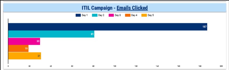
The “Email Clicked” chart provides insights into the number of emails clicked by users on different days during the active campaign. It helps visualize the reach of the emails, showing which days received the highest engagement.
By analyzing this data, you can identify peak days when users are most likely to click on emails, allowing you to optimize future campaign scheduling for maximum impact. This chart effectively highlights the days with the highest reach and engagement, helping businesses understand user behavior and refine their email marketing strategies.
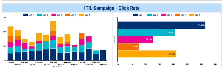
Click rate measures the percentage of recipients who clicked on one or more links within an email compared to the total number of emails delivered. Since the campaign lasted for 5 days, the charts display the click rate for each day, allowing you to observe trends and variations in engagement throughout the campaign. The charts provide:
These visualizations help in determining which days were most effective in driving clicks, enabling you to optimize future campaigns based on this insight
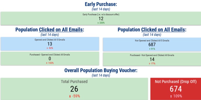
This view provides key performance indicators (KPIs) for the last 14 days:
These KPIs help identify whether people are engaging with all the emails and how their engagement impacts their purchasing behavior.
![]()
![]()
![]()