As a Power BI consultancy we often work with pharma companies helping them create interactive dashboards. In this article we will talk about one project where we developed a Power BI pharma dashboard for a biotech company.
Our client was a biotech company that recently rolled out a new drug. We were tasked with the development of a Power BI dashboard analysing the roll-out of the new drug on the US market.

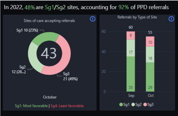
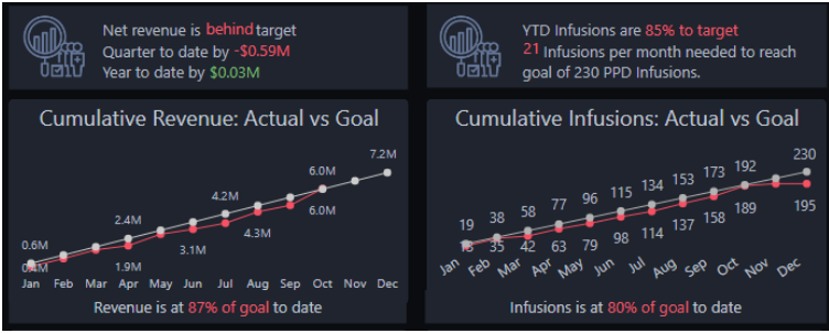
The page that you see above is an executive Power BI pharma overview dashboard where we have shown a high-level summary of key metrics and insights explicitly designed for executives and decision-makers. It provides a quick and concise snapshot of the organization’s performance and helps leaders make informed strategic decisions.
1. Key Performance Indicators (KPIs): Below are KPIs like YTD Revenue, QTD Revenue, YTD Infusions, and the number of Infusions that directly impact the business’s success. We are displaying these KPIs prominently on the dashboard at the top, so executives can instantly assess the organization’s performance.

2. Trend Analysis: We visualised Infusions and referrals over time by the use of line charts to visualize the historical performance and identify patterns or anomalies. Trends help executives understand the trajectory of the business, identify areas of improvement, and make data-driven decisions.

3. Comparative Analysis: We also took comparative data to provide context and benchmarks for performance evaluation based on different departments

4. Performance vs target: This section shows progress towards predefined goals and targets. We have displayed target values alongside actual values for each KPI i.e. for Revenue and Infusions. It allows executives to quickly assess whether the organization is on track or if corrective actions are required.


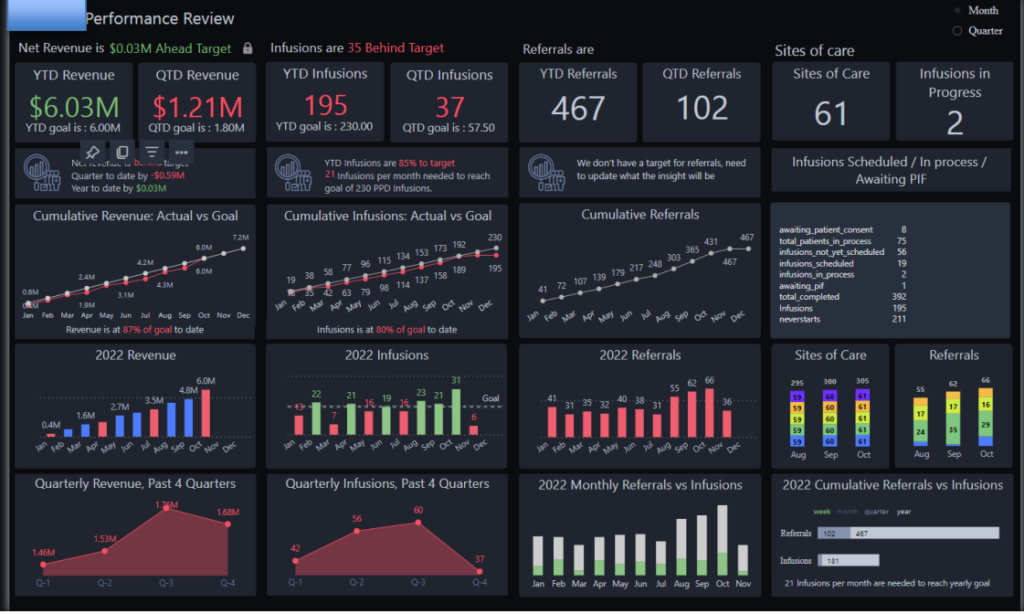
Another page that we created analysed the rollout of the new drug in a bit more detail. The dashboard is split in 4 columns: revenue, infusions, referrals (number of times the drug was prescribed to patients) and sites of care (hospitals).
We used the first row of our visuals to give high-level insights on all the 4 metrics for a selected time period.

The second row focused on the monthly trends for these 4 metrics and comparison of actual performance to target. The months where the performance is below target are labeled in red.

Finally, we analysed the quarterly trends and referrals vs infusions

Our Power BI consultancy has built 1000+ Power BI dashboards for our clients! Simply contact us today to discuss the data analysis that you want to create!
You can also view other examples of our work from our Power BI portfolio!
Support
All the support you need – when you need it. From 1-hour quick fix support to longer-term partnership that drives your business forward.
Consultancy
Advanced data thinking, creative ideas and the best Power Platform practices to unlock the true potential of your business data.
Training
Succeess shouldn’t be a one-off. When we train you teams user adoption surges and your Power Platform results radically improve.