
Key Performance Indicators (KPIs) are crucial for businesses to measure progress towards their goals and make informed decisions. They provide a clear and objective way to track performance, identify areas for improvement, and align efforts with strategic objectives. Power BI KPI dashboard help businesses focus on what matters most, ensuring resources are used efficiently and effectively.
In this article we will show 25 different Power BI KPI dashboards to get you inspired for designing your next management report. Some of the dashboards in this article are free templates that you can install today for your business.
Power BI is an excellent tool for monitoring and analyzing KPIs. It allows businesses to create interactive dashboards that display real-time data, making it easier to track performance against targets. With Power BI, users can visualize complex data in a user-friendly manner, enabling quick insights and data-driven decisions. Its powerful analytics capabilities, combined with seamless data integration, ensure that businesses have the right information at their fingertips to drive success. As a Power BI consultancy, we have developed over 1,000 KPI dashboards. We’ll present the dashboards that we believe will benefit your business the most. Some of these are available for free, while others can be custom-built to suit your specific needs.
This Power bi KPI dashboard displays monthly trends for Income, Overheads, and Net Income. It provides detailed breakdowns of income and overheads by account, along with the transactions that contribute to these values. Users can switch between accrual and cash accounting methods, filter by client (for those with multiple QuickBooks accounts), and apply filters by class. Key metrics include:
Net Income: The total profit after deducting all expenses from total revenue.
Overheads: The ongoing operating expenses that are not directly tied to specific business activities.
Profit Trend: The pattern or direction of profitability over a specific period.
Income and Expenses Trend: The pattern or direction of income and expenses over time, highlighting financial performance.
Please note: we also provide QuickBooks Online Balance Sheet and Cash Flow Power BI dashboards inside of our template

The balance sheet report displays trends for assets, liabilities, and equity, with detailed breakdowns by account groups and the transactions contributing to each account’s value. Similar to other reports, the data can be viewed on an accrual or cash basis, and filters by date, class, and client are also available.Key metrics include:
Total Assets: The combined value of everything a company owns.
Total Liabilities: The total amount of debts and obligations a company owes.
Total Equity: The net value remaining after subtracting total liabilities from total assets.
Balance Distribution by Assets/Liabilities: The proportional distribution of total assets compared to total liabilities within the balance sheet.
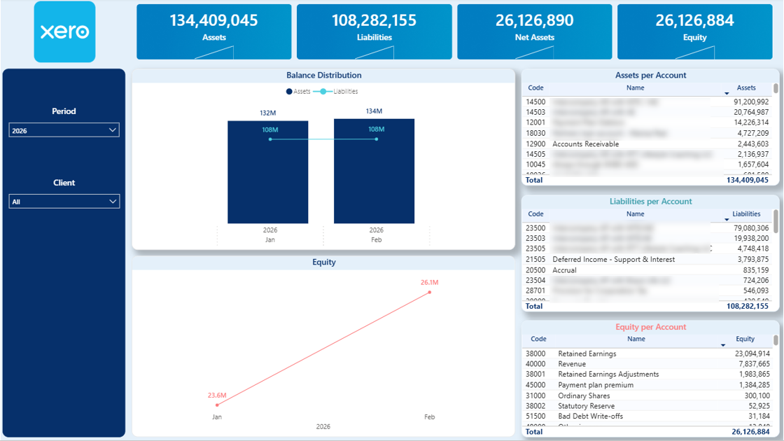
Please note: we also provide the Xero P&L dashboard inside of our Power BI template
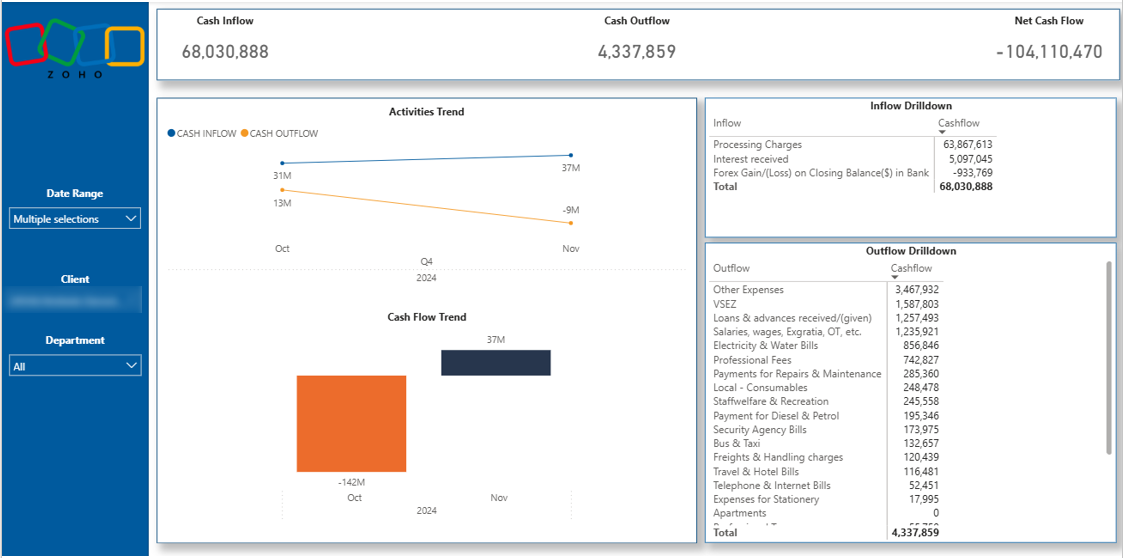
The cash flow dashboard illustrates the total increase or decrease in cash reserves over the selected period and month-to-month. This change is categorized by operating, investing, and financing activities, mirroring the breakdown found in QuickBooks Online. Each activity category is further detailed into specific accounts. Key metrics include:
Total Cash Inflow: Total amount of cash flowing in.
Total Cash Outflow: Total amount of cash flowing out of the business.
Net Cash Flow: The difference between the cash flowing in and out of the business.
Please note: we also offer the P&L, Balance Sheet, Aging Receivables and Outstanding Invoices dashboards in our Zoho Books template
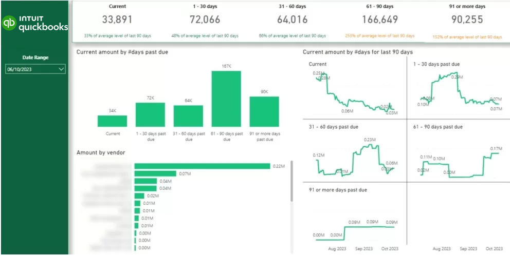
This report highlights the accounts receivable balance. The histogram displays the outstanding amounts categorized by the number of days overdue as of the current date. The line charts on the right illustrate trends for each of these categories. Additionally, the bar chart shows the total outstanding amount by counterparty. Impressively, this report was delivered within just two days.Key metrics include:
Current Account Receivable Balance: The total amount of money owed to the company by its customers.
Current Amount by Days Past Due: The outstanding receivables categorized by the number of days they are overdue.
Current Amount by Days in Last 90 Days: The total receivables accumulated over the past 90 days.
Current Amount by Vendor: The total outstanding amount categorized by each vendor.
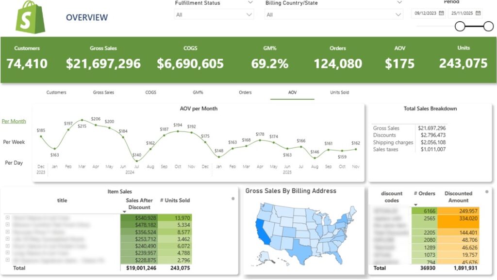
The Shopify Sales dashboard provides a clear overview of your store’s selling activity over the selected timeframe, showing both overall trends and detailed breakdowns. It highlights essential commercial KPIs such as gross sales, discounts, shipping revenue, taxes, average order value, and total units sold. Core components include:
Sales Trends: A dynamic line chart that visualizes your chosen metric—daily, weekly, or monthly. Users can switch between KPIs like customer count, gross sales, COGS, profit margin, order volume, AOV, and units sold to analyze performance from different angles.
Product-Level Insights: A table outlining sales by product, including total units sold. Each product can be expanded to see variant-level performance for deeper analysis.
Geographic Breakdown: An map showing gross sales by customer billing location. Selecting any state instantly updates all the other graphs to reflect activity in that region.
Discount Code Analysis: A table summarizing order counts by discount code, helping users evaluate which promotions drive the most conversions and overall effectiveness.
This Shopify Power BI report helps e-commerce brands discover customer behaviour patterns that increase their sales. It delivers a deep view into customer behavior, revealing how frequently shoppers return, how much they spend across their relationship with your brand, and how their lifetime value (LTV) evolves year over year. This section of the analytics suite is designed to support retention strategy, acquisition planning, and long-term profitability analysis. Key elements include:
New vs. Returning Customers: A top-level comparison showing how many customers are new versus returning, along with their associated revenue and average order value.
Customer Retention Trends: A monthly line chart tracking the percentage of returning customers, helping you measure how effectively first-time buyers convert into repeat purchasers.
Orders per Customer: A distribution view showing how many orders customers place over time. For example, in the dashboard preview, 47k customers purchased once, while 13k made two purchases, and smaller groups continued to reorder.
Repeat Purchase Timing: A bar chart illustrating how many days customers typically take to place their second, third, and later orders. This insight is ideal for planning targeted reactivation or remarketing campaigns.
Lifetime Value Growth: A dedicated LTV section shows how average customer lifetime value increases year over year. This metric is essential for determining sustainable acquisition costs and ensuring long-term profitability.
Cohort Analysis: A cohort table groups customers by the month of their first order, tracking how each group’s average LTV builds over subsequent months.
For example:
LTV by State: A final table compares average customer LTV across states, helping identify high-value regions for focused marketing and improved return on ad spend.
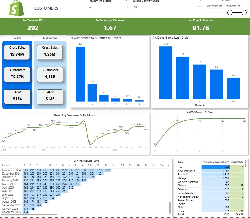
This dashboard provides a visual analysis of LinkedIn Ads data, focusing on campaign performance relative to their objectives. For instance, awareness campaigns are evaluated using specific awareness metrics, while lead generation campaigns are assessed based on lead generation metrics. This approach ensures that each campaign is measured against relevant targets, offering clear insights into their effectiveness.Key Metrics include:
Ad Spend: The total amount of money spent on advertisements.
Ad Spend by Objective: The breakdown of ad spending according to specific campaign goals.
Total Impressions: The total number of times the ad was displayed to users.
Cost per Click (CPC): The average cost incurred for each click on the ad.
Click-Through Rate (CTR): The percentage of ad views that resulted in clicks.
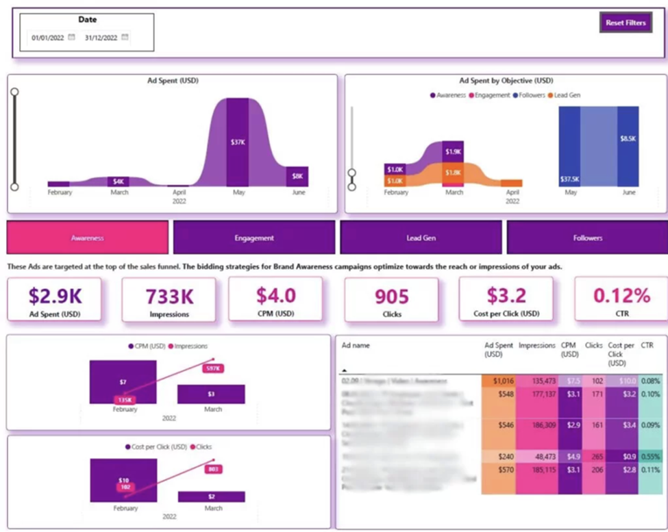
This template provides a comprehensive overview of Zoom call activity, presenting both the total number of calls made and their average duration. By visualizing these metrics, it offers valuable insights into overall call usage patterns and helps identify trends and areas for improvement in communication efficiency.Key metrics include:
Number of Calls Made: The total count of calls made.
Average Call Time: The mean duration of each call.
Average Hold Time: The average duration callers were on hold.
Calls by Type : The distribution of inbound and outbound calls.
Calls by Hour: The distribution of calls made during different hours of the day
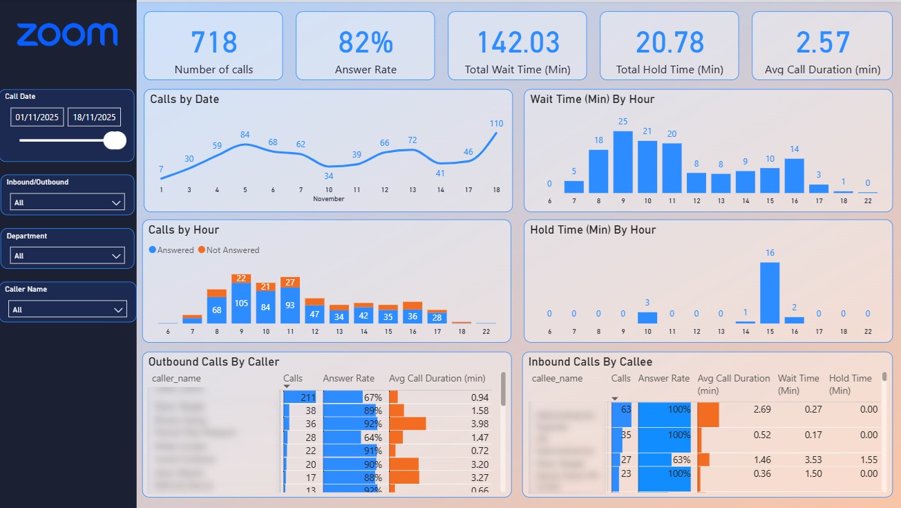
This dashboard offers quick overviews to measure a company’s overall profitability. Users can compare their proposed revenue targets against their actual performance and get into more details by viewing profit margins for particular products or the amount of revenue specific departments generate.
The dashboard includes the following KPIs:
Target revenue: The revenue a company should reach within a given period.
YTD revenue: The actual revenue the company generated since the start of a year up to the present point.
Profit margin: Specif products’/services’ profit margins.
Year ROI: The return-on-investemt a company generated during one or more years.
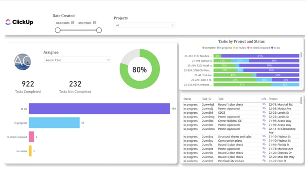
This task tracker dashboard allows you to monitor the status of tasks in your workspaces, including those that are completed, in review, or in progress. It provides a clear overview of project progress, indicating that projects with numerous completed tasks are likely nearing completion. Additionally, you can view each assignee’s workload based on their completed and ongoing tasks, helping to balance workloads more effectively within the team.Key metrics include:
Tasks Completed: The total count of tasks that have been finished.
Tasks Not Completed: The total count of tasks that are still pending.
Total Tasks by Status: The breakdown of tasks by their current status—To Do, In Progress, Recheck, and In Review.
Tasks by Project and Status: The distribution of tasks categorized by both project and their current status.
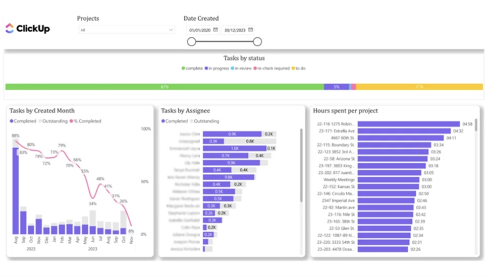
This dashboard offers a comparative analysis of tasks created and completed over time, enabling an assessment of task completion efficiency. It provides valuable insights into the productivity and performance of each individual assignee by highlighting their task completion rates. This visual representation helps identify trends in task management, allowing for better evaluation and optimization of workflow processes within the team.Key metrics include:
Tasks by Created Month: The number of tasks created in each month.
Tasks by Assignee: The distribution of tasks assigned to each individual.
Hours Spent on Each Project: The total hours dedicated to each project.
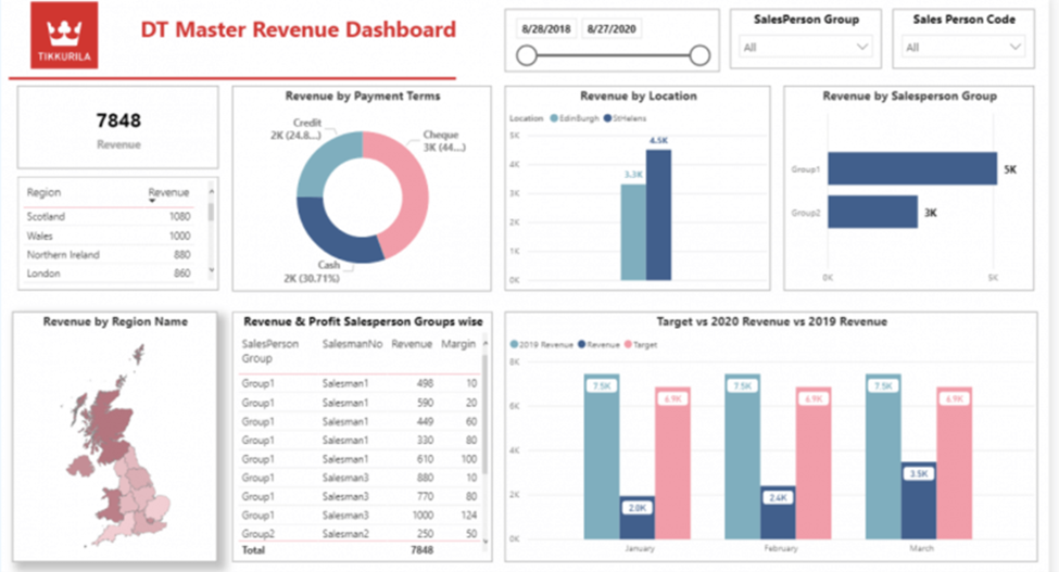
This dashboard aids financial directors in identifying areas of business growth and decline. It offers valuable insights that support crucial financial decisions, such as forecasting target achievements. By analyzing key metrics and trends, the dashboard helps optimize resource allocation and strategic planning to enhance overall financial performance.Key metrics include:
Total Revenue: The total income generated from sales.
Revenue by Payment Terms: The income categorized based on the payment terms agreed upon.
Revenue by Location: The income generated from different geographical locations.
Revenue by Salesperson Group: The income generated by different groups of salespeople.
Revenue by Region Name: The income generated from various regions.
Revenue and Margin by Salesperson: The income and profit margin attributed to each salesperson.
Current Revenue vs. Target: The comparison of current income against the set revenue targets.
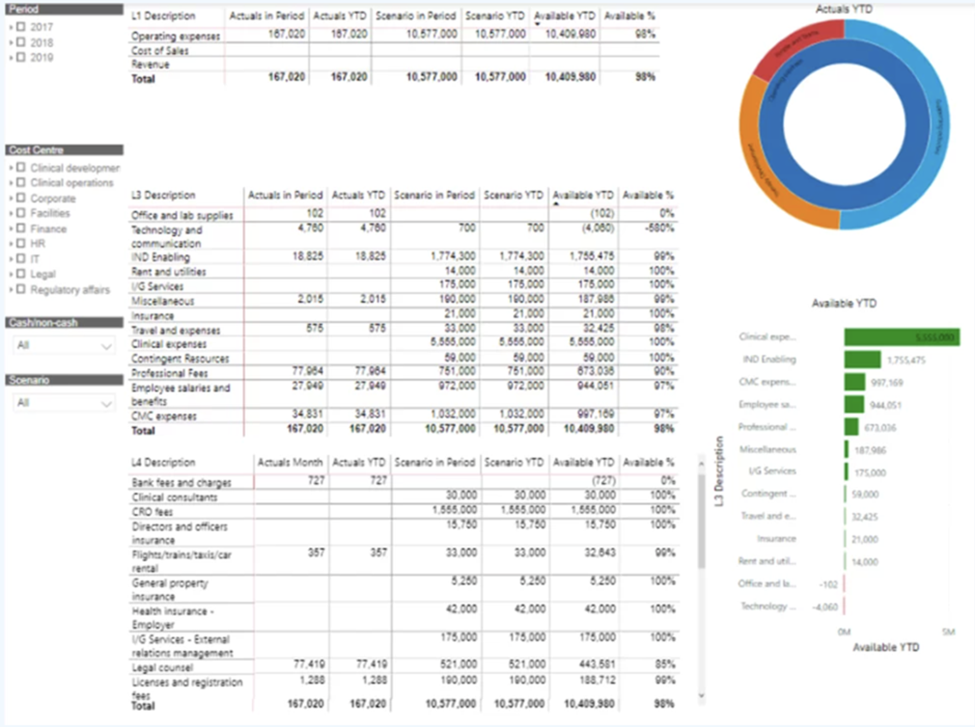
This Power BI financial dashboard is designed to compare actual spending against the budget and evaluate the remaining available funds. This functionality allows the OPEX manager to quickly determine if the requesting department has sufficient budget left when a reimbursement request is received. By providing a clear comparison of expenses versus budget, the dashboards facilitate better financial oversight and informed decision-making. Key metrics include:
Actuals in Period: The real financial figures for the current period.
Actuals YTD: The real financial figures from the beginning of the year to the present.
Scenario in Period: The projected or planned financial figures for the current period.
Scenario YTD: The projected or planned financial figures from the beginning of the year to the present.
Available YTD: The remaining funds available from the budget year-to-date.
Available %: The percentage of the budget still available year-to-date
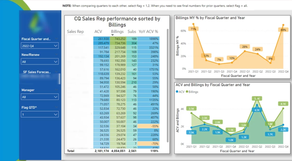
This financial dashboard helps finance business partners identify top performers and encourage them to share their expertise. It also highlights salespeople with declining performance, enabling targeted support measures like adding extra leads to their pipeline or providing additional training. By offering insights into individual performance, the dashboard facilitates strategic interventions to optimize overall sales effectiveness. Key metrics include:
ACV by Sales Representatives: The Annual Contract Value attributed to each sales representative.
Billings by Sales Representatives: The total amount invoiced by each sales representative.
Subs by Sales Representatives: The total number of subscriptions secured by each sales representative.
YOY ACV % by Sales Representatives: The year-over-year percentage change in Annual Contract Value for each sales representative.
ACV and Billings by Fiscal Quarter and Year: The Annual Contract Value and billings categorized by each fiscal quarter and year.
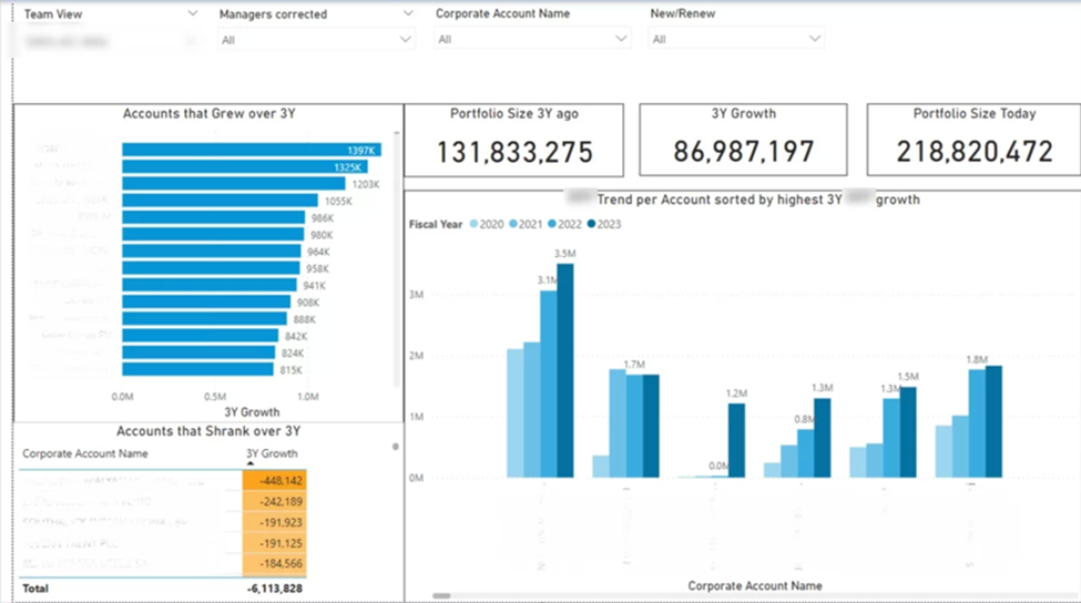
This Power BI financial dashboard I created measures the total growth of each sales manager’s client portfolio. It helps quickly identify accounts that grew and those that shrank over the past three years.
Sales teams started focusing on accounts that shrank to understand the reasons and provide support. Sales managers identified growth patterns, realizing that top-growing accounts belonged to the same industry. Salespeople then shifted their focus to industries with high growth potential.
Using this Power BI financial dashboard can pinpoint specific targets for account management, directly leading to increased sales and revenue. I’ve personally witnessed significant revenue growth once companies became more proactive with their account management.Key metrics include:
Portfolio Size 3 Years Ago: The total value of the client portfolio three years ago.
3 Years Growth: The change in portfolio value over the past three years.
Portfolio Size Today: The current total value of the client portfolio.
Accounts that Grew in Last 3 Years: The number of accounts that increased in value over the past three years.
Accounts that Shrank Over 3 Years: The number of accounts that decreased in value over the past three years.
Account Growth Trend in Last 3 Years: The pattern of account growth or decline over the past three years.
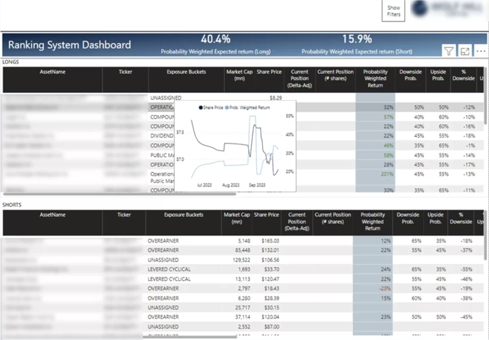
This dashboard delivers an in-depth analysis of an investment portfolio’s performance, consolidating trading positions into a single view. Users can easily track price trends by hovering over lines in the table, providing a clear and interactive experience. This streamlined approach enhances understanding and evaluation of the portfolio’s status and market movements.Key metrics include:
Probability Weighted Return: The expected return on an investment, adjusted for the likelihood of different outcomes.
Market Cap: The total market value of a company’s outstanding shares of stock.
Current Position: The present value of an investment or portfolio.
Downside Probability: The likelihood of an investment’s return falling below a certain threshold.
Upside Probability: The likelihood of an investment’s return exceeding a certain threshold.
% Downside: The percentage loss expected if an investment’s return falls below a certain threshold.
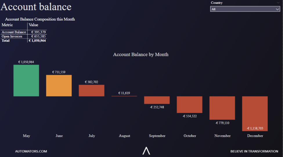
This Power BI financial dashboard reveals that the company has sufficient cash reserves to cover the next four months. However, it highlights the critical need to collect outstanding invoices to maintain continuous operations. By providing a clear overview of the financial status, this dashboard aids in identifying the urgency of cash flow management and ensures that proactive steps are taken to secure necessary funds for the company’s ongoing stability and growth.Key metrics include
Account Balance: The total amount of money currently available in the company’s bank account.
Open Invoices: The total value of invoices that have been issued but not yet paid.
Account Balance in Current Month: The current month’s available funds in the company’s bank account.
Account Balance by Months: The total amount of money in the company’s bank account, tracked month by month.
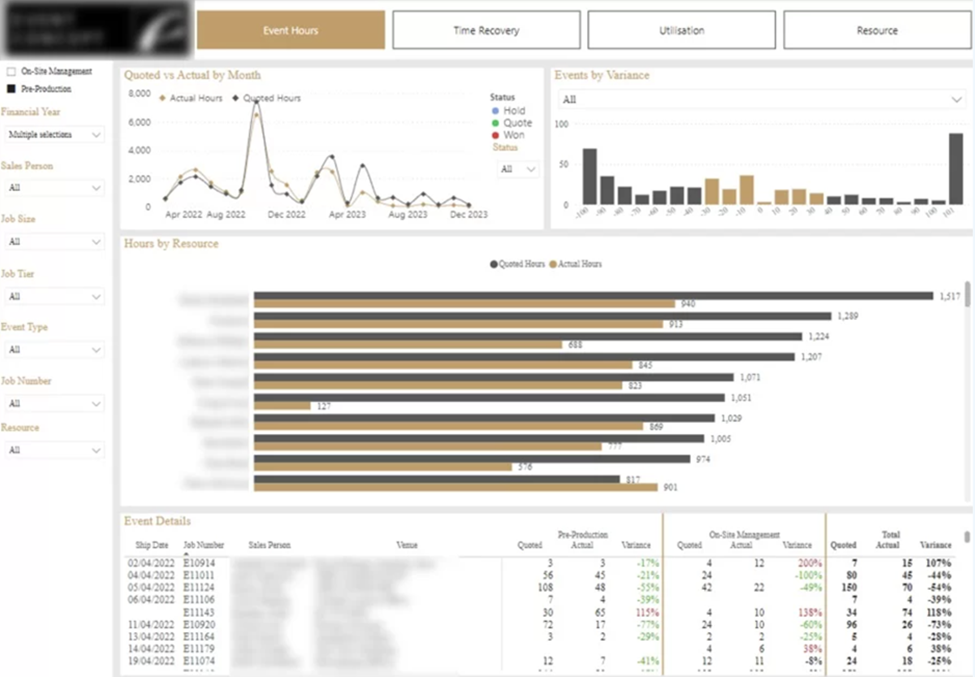
This Power BI dashboard illustrates trends in the discrepancy between quoted and actual hours spent by resources for clients over time. A histogram depicts event counts by variance levels, such as 40 events where actual hours were 10% less than quoted. Additionally, the dashboard features a comparison of actual vs. quoted hours for each resource. A table provides detailed event information, including hours spent in Pre-Production (PP) and On-Site (OS) stages. This comprehensive view aids in analyzing resource efficiency and identifying areas for improvement.Key metrics include:
Event Hours: The total number of hours recorded for specific events.
Quoted vs Actuals by Month: The comparison of initially estimated (quoted) hours versus the actual hours spent, categorized by month.
Events by Variance: The distribution of events based on the difference between quoted and actual hours.
Hours by Resource: The total number of hours worked by each individual resource.
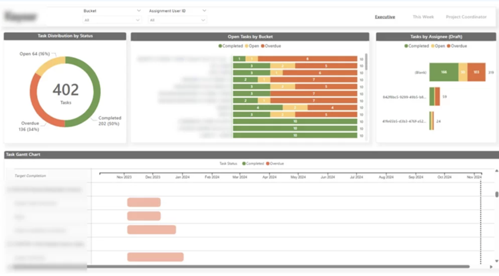
This dashboard presents an overview of Microsoft Planner tasks, displaying the number of tasks categorized by status, assignee, and open tasks by bucket. It features a Gantt Chart to illustrate the progress of each task, offering insights into the project’s timeline and overall status. This comprehensive view aids in tracking task completion, understanding workload distribution among team members, and identifying any potential delays in the project schedule. Through visualizing task progress and assignments, it helps ensure better project management and timely completion.Key metrics include:
Tasks Distribution by Status: The breakdown of tasks categorized by their current status(open, overdue, and completed).
Open Tasks by Bucket: The number of open tasks grouped by different buckets or categories.
Tasks by Assignee: The distribution of tasks assigned to each individual team member.
Task Completion Gantt Chart: It is visual representation of the progress and completion timelines of tasks to track the real time status.
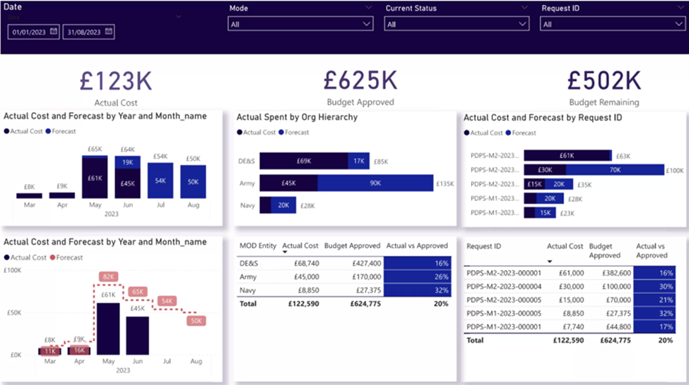
This Power BI dashboard is designed to monitor financial metrics in project management. It includes essential KPIs like Actual Cost, Approved Budget, and Remaining Budget, giving project managers a clear, high-level overview of their financial performance. The dashboard also features detailed graphs that show both actual and forecasted costs across different dimensions, aiding businesses in better understanding their project management finances. Users can analyze these metrics by month, organizational hierarchy, or request ID, providing flexibility in how they view their financial data.
Additionally, the dashboard offers a comparative view of actual costs versus approved budgets, broken down by entity or request. This feature helps users easily identify variances and manage financial performance more effectively. By offering comprehensive insights into project financials, this Power BI dashboard supports informed decision-making and enhances overall project management efficiency.Key metrics include:
Actual Cost: The total amount of money spent on a project or activity.
Budget Approved: The total budget that has been sanctioned or allocated for a project.
Budget Remaining: The portion of the approved budget that has not yet been spent.
Actual Cost and Forecast by Year: A comparison of the actual expenses incurred and the projected costs for each year.
Actual Spent by Hierarchy: The breakdown of actual expenses based on organizational hierarchy levels.
Actual Cost and Forecast by Request ID: A comparison of actual expenses and projected costs for each specific request ID.
Actual Cost, Budget Approved, and Remaining by Entities: A detailed view of actual expenses, approved budgets, and remaining budgets for different entities within the organization.
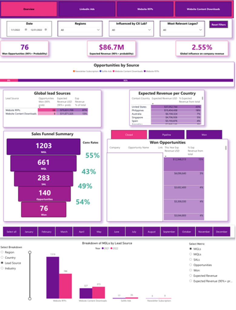
This Power BI sales pipeline dashboard was developed for a global company with over 400,000 employees to automate reporting from Salesforce, Webeo, and LinkedIn Ads. Previously, refreshing each report manually took six hours, and the company aimed to refresh these reports daily.
The dashboard provided a comprehensive analysis of the marketing department’s impact on the company’s overall sales pipeline. Key stakeholders included the Global Head of Marketing and several regional marketing directors. This automation allowed for efficient and timely reporting, significantly reducing the time and effort required for data analysis. The dashboard offered valuable insights into marketing performance and its influence on sales, enabling informed decision-making and strategic planning across different regions. This innovation ultimately enhanced the company’s ability to track and optimize its sales pipeline effectively.Key metrics include:
Opportunity by Source: Tracks the number of sales opportunities generated from different sources, such as marketing campaigns, referrals, social media, and direct sales efforts.
Won Opportunities (90% Probability): The number of sales opportunities with a high probability (90%) of being successfully closed.
Expected Revenue (90% Probability): The projected revenue from sales opportunities that have a 90% chance of closing successfully.
Global Influence on Company Revenue: The impact of global sales activities and marketing efforts on the overall company revenue.
Global Lead Sources: The origin of sales leads from various regions around the world, helping to identify the most effective lead generation channels.
Expected Revenue by Country: The projected revenue from sales opportunities in different countries.
Won Opportunities by Company and Opportunity Name: The list of successfully closed sales opportunities, categorized by the company and the specific opportunity name
This dashboard provided a quick overview of how efficiently warehouses accepted deliveries. There were two storage methods: rack and bulk. We analyzed how many of these locations were still open versus occupied.
The client received products packed into pallets daily, as shown in the vertical bar chart. We examined how many of these pallets were put away into storage locations versus those that were not. The goal was to identify and prioritize pallets that were still not stored.
Additionally, we analyzed the number of items per forklift. Warehouse managers could identify which forklifts still had items, click the “view items” button to see the specific items, and instruct their team to store them accordingly.Key metrics include:
Storage Location Occupancy: The percentage of storage locations that are currently occupied.
Total Open Locations: The number of storage locations that are available for use.
Open Locations (Rack): The number of rack storage locations that are currently open and available.
Open Locations (Bulk): The number of bulk storage locations that are currently open and available.
Pallets Received (Today): The total number of pallets received in the warehouse today.
Pallets Put Away (Today): The number of pallets that have been moved to their designated storage locations today.
Pallets Not Put Away (Today): The number of pallets that are still awaiting storage placement today.
Lifts in Good Shape: The number of lifts that are in proper working condition.
Lifts in Bad Shape: The number of lifts that require maintenance or are not operational

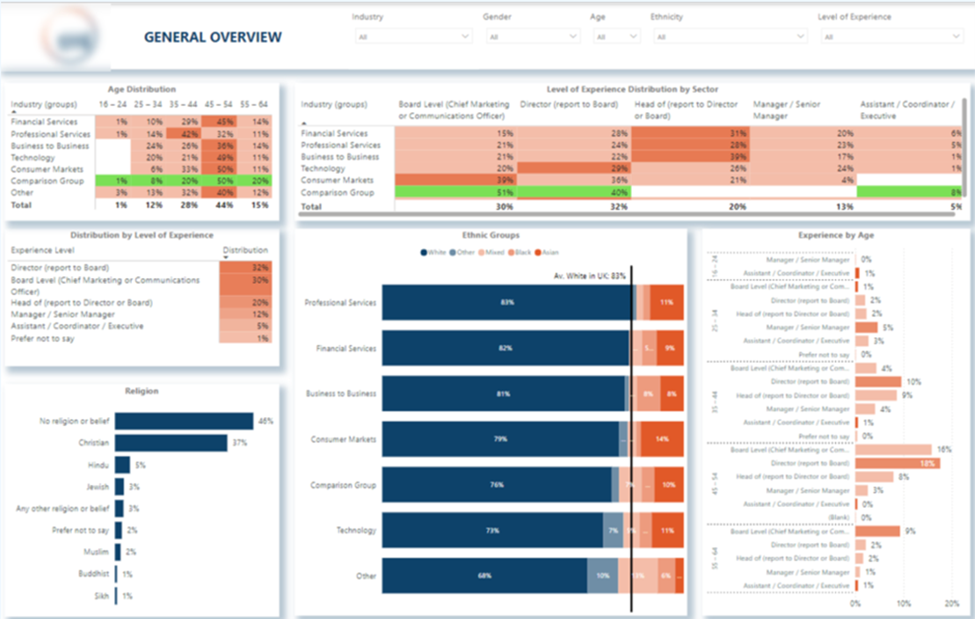
This Power bi KPI dashboard showcases the age distribution of marketing professionals across various industries. Industries were also compared to the US average percentage of white employees. The technology sector emerged as the most ethnically diverse, while the professional services sector was the least diverse..Key metrics include:
Age distribution by industry: Represents the ages of employees within specific industries.
Level of experience distribution by industry and sector: Shows the experience levels of employees across different industries and sectors.
Distribution of levels by experience: Highlights how experience is spread across organizational levels (entry, mid, senior).
Distribution by religion: Details the religious composition of the workforce.
Distribution by ethnic groups: Shows the ethnic diversity within the workforce.
Experience by age: Illustrates the correlation between employees’ ages and their levels of experience.
This report reveals several interesting insights:
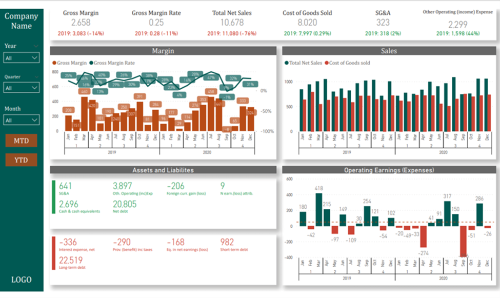
This Power BI KPI Dashboard presents key accounting metrics and ratios in Power BI. At the top, it highlights high-level metrics such as Sales, COGS, Gross Margin, and more, while also showcasing the growth of these metrics compared to the previous year.
The top section emphasizes sales and cost of sales on a monthly and quarterly basis. Below that, it displays balance sheet metrics covering assets, liabilities, and operating earnings.
Filters on the left side allow clients to customize their view by year, quarter, or month, and to switch between MTD (Month-to-Date) and YTD (Year-to-Date) perspectives.
This comprehensive approach helps in effectively tracking and analyzing financial performance.Key metrics include:
Gross Margin: The total revenue minus the cost of goods sold (COGS), representing the amount of money the company retains after incurring direct costs associated with producing the goods or services it sells.
Gross Margin Rate: The percentage of revenue that exceeds the cost of goods sold (COGS), calculated as (Gross Margin / Total Sales) x 100.
Total Net Sales: The total revenue generated from sales after deducting returns, allowances, and discounts.
Cost of Goods Sold (COGS): The direct costs attributable to the production of the goods sold by a company, including materials and labor.
SG&A (Selling, General, and Administrative Expenses): The combined costs related to selling products and managing the business, including salaries, rent, and office expenses.
Other Operating Income/Expense: Income or expenses not directly related to the main business activities, such as interest income or loss from the sale of assets.
Margin by Month and Year: The gross margin analyzed on a monthly and yearly basis to observe trends and performance over time.
Sales by Month/Year: The total sales revenue tracked monthly and yearly to monitor growth and performance.
Assets and Liabilities: The balance sheet metrics showing the company’s total assets (what it owns) and total liabilities (what it owes).
Operating Earnings (Expenses) by Month/Year: The earnings or expenses from the company’s core business operations, analyzed monthly and yearly.
Key Performance Indicators (KPIs) are essential in any business domain as they provide measurable and actionable insights into the performance and efficiency of various processes. By tracking KPIs including KPIs for affiliate marketing, organizations can make data-driven decisions, identify areas for improvement, and align their strategies with business goals. Effective KPI management ensures that companies stay on track to achieve their targets, enhance productivity, and maintain a competitive edge.
With Power BI, organizations can easily monitor their KPIs in real-time, identify trends, and make timely adjustments. The ability to customize dashboards and reports ensures that businesses can focus on the most relevant metrics for their specific needs.
If you need similar Power BI KPI dashboard or any other KPIs requirements, feel free to reach out to us at Contact – Vidicorp. We’re here to help you harness the power of data to drive your business forward.
Broadly speaking the Power Platform products are priced per user per month. The more users you have the higher your licensing will be. Most licenses are around $15-25 USD per user per month. However, in rare scenarios license costs go up to $200 per month and even higher. If you want to understand the licensing costs of your specific solution, we would encourage you to speak to a Power Platform consultant.
Revenue growth
Revenue per client
Profit margin
Client retention rate
Customer satisfaction
To build a KPI dashboard, start by selecting the key metrics you want to monitor. Next, identify the appropriate data sources. After that, visualise the data using suitable charts and graphs. Finally, share the completed dashboard.
The three main types of dashboards are: Operational Dashboards, Analytical Dashboards, and Strategic Dashboards