Welcome to our Ultimate Guide to Power BI! Here we will aim to give you an overview of Power BI, it’s capabilities and how it compares to other tools in the market. As a Power BI Consultancy we have completed 500+ Power BI dashboards for our clients and this guide is based on our experience and the knowledge that we gained from all of these projects.
Do you know why some businesses struggle while others succeed despite having access to the same data?
The answer is simple: Some have data, while others have insights.
Many businesses are only data-aware, meaning they know data is important and may even generate large amounts of it.
But data-driven businesses understand that data has zero business value until it’s transformed into actionable insights.
When a business starts using data to improve its decisions and operations, it becomes data-driven.
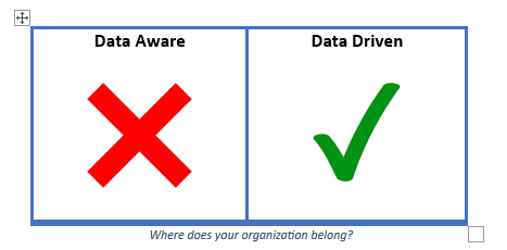
Where does your organization belong?
A study from Mckinsey shows that data-driven organizations are:
Every modern business should strive to become data-driven to stay competitive, and you can by investing in and prioritizing Business Intelligence.
BI or Business Intelligence is, by and large, a set of technological processes that involves collecting, managing, and analysing data to improve business decisions and operations.
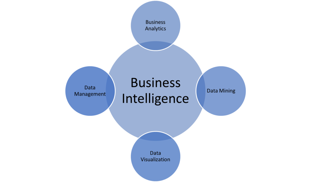
Business Intelligence or BI has been a buzzword in the business world for several years now and it’s still yet to reach its pinnacle.
The advent of BI has made it easier than ever for businesses to:
Research compiled by Yellow Fin BI revealed that the average ROI for enterprises using business intelligence and analytics is 1300%.
This proves Business Intelligence is more than just a buzzword today. It’s something every modern business must adopt at every level to stay ahead of the curve.
Now, you may be wondering, how can you incorporate Business Intelligence into your organization to become data-driven?
The answer lies in the tools and processes that turn raw data into insights.
One of the best solutions for this is Power BI. This business intelligence tool allows you to collect, analyse, and visualize data in an automated way, so you can easily discover insights that drive better decisions.
By using Power BI, you can integrate data from multiple sources, create interactive reports, and share these insights across your organization so everyone has access to the information they need to make informed decisions.
Power BI by all means brings out the power in BI, don’t you agree?
In this guide, you’ll learn every detail about Power BI, with a greater focus on how to use it to improve your business performance.
Power BI has been called many things:
And you’ll like this one:
None of these things perfectly tell you what Power BI really is but they do give you an idea of its capabilities.
You’ll see how at the end of this chapter.
Power BI has an interesting backstory that starts with its earlier versions: Power Pivot and Power Query in Microsoft Excel.
In the summer of 2010, Ron George designed what was first called Project Crescent. This tool was first available for public download on July 11, 2011, as part of SQL Server Codename Denali.
Then, in September 2013, Microsoft renamed it to Power BI for Office 365.
The first version of Power BI was based on add-ins like Power Query, Power Pivot, and Power View that worked with Excel.
Over time, Microsoft added many new features, such as the ability to ask questions in plain language, better connections to business data, and stronger security through Power BI Gateways.
On April 14, 2015, Microsoft acquired the Canadian company Datazen to enhance Power BI. This acquisition helped improve its mobile features and compatibility with SQL Server. Also, many of the visuals in Power BI today were originally from Datazen.
Power BI officially launched to everyone on July 24, 2015, and has since been available in different formats like desktop, web, and mobile apps.

Microsoft Power BI is the leading business intelligence (BI) tool today. It allows data analysts to create interactive data visualisation and deliver management reports where the leadership teams can discover valuable insights.
One of the reasons Power BI is so popular is because of it integrates well with 100+ other Microsoft technologies like Teams, SharePoint, Azure, etc. Microsoft made it easy for companies to integrate Power BI into their software ecosystems by providing these integrations.
When Business intelligence (BI) first became a practice, it was regarded as a costly and complex field exclusive to large enterprises. But now, with the use of Power BI, the power of Business Intelligence is available to businesses of all sizes.
Power BI’s self-service capabilities and competitive pricing led the evolution of Modern Business Intelligence by democratizing BI and catering to the BI needs of both big corporations and small companies alike.
Modern Business Intelligence is empirically a technological process that helps organizations use data to make informed decisions. The BI process typically goes this way:
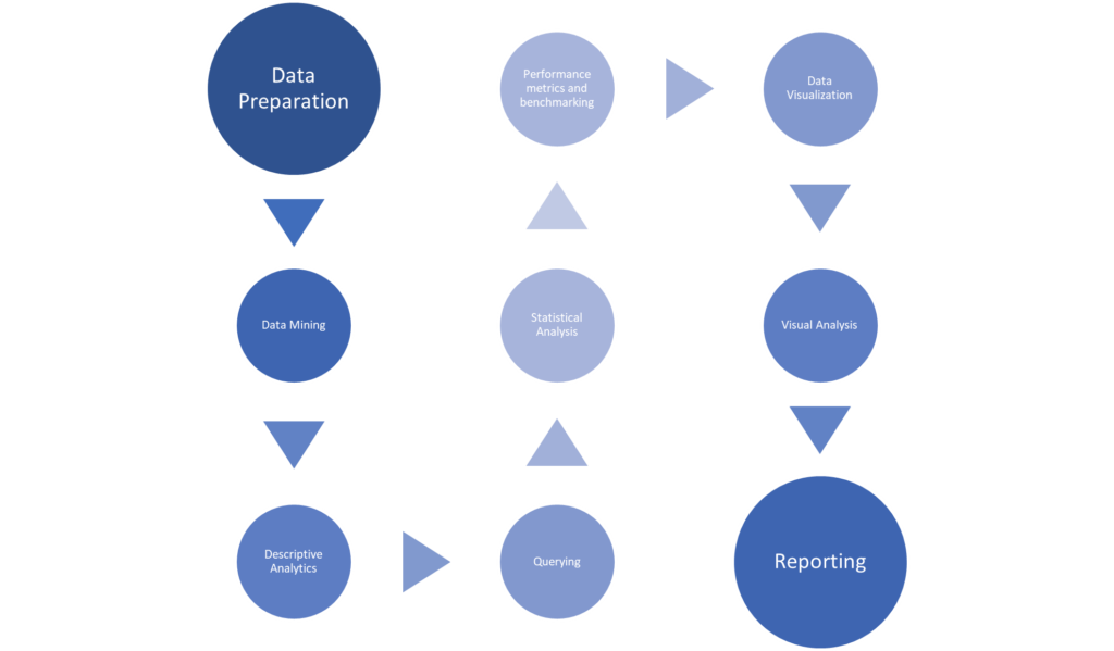
The single most important reason why Power BI is a must-have for Business Intelligence in today’s world is that it provides a simple and intuitive platform that takes care of each and every step of the BI process, from data preparation to insightful reporting.
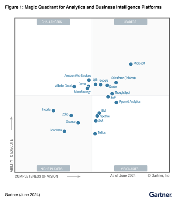
Power BI is one of the big players in business intelligence and data visualization today. It has been positioned as a Leader in the 2024 Gartner Magic Quadrant for Analytics and Business Intelligence Platforms for the seventh consecutive year.
The biggest advantage of Power BI is how relatively easy it is to use (even for non-technical users) when compared to Excel sheets which most businesses and analysts are already familiar with. Power BI takes Excel to a whole new level by letting you visualize your data beyond rows and columns.
Power BI is definitely your go-to option if your business is looking for a complete business intelligence solution that could help you to:
As your business grows, so will the complexity of your data. Valuable data is everywhere and today’s estimate suggests that internet users generate approximately 402.74 million terabytes of data each day (SOURCE: Statista)
Collecting valuable data is paramount to the success of BI in your organization but it’s tricky because:
A 2020 study carried out by Accenture shows that US businesses lose 100 billion dollars every year due to data inaccuracy.
Managing your data to avoid these issues then becomes another hurdle in becoming a data-driven organization.
Data management involves collecting, cleaning, and organizing data to ensure its accuracy and reliability.
Thankfully, Power BI takes care of data management for you by integrating and organizing data from multiple sources and automating data transformation so that only accurate and consistent data is used for analysis.
With Power BI, your team no longer needs to email large files or store them in shared drives. Analysts can publish dashboards directly to the platform which all authorized parties will already have access to. This makes reporting and sharing easier and more efficient.
The streamlined data pipelines—automated pathways for data processing—ensure that information is updated in real-time as new data becomes available. This means that decision-makers are always working with the most current information.
Even if your organization uses disparate data systems, Power BI can pull data from all of them into one centralized location. This saves both time and effort and allows you to focus on analysis rather than data management.
A survey from Learn G2 reveals that the most challenging issues for self-service business intelligence are data combination (20%) and data security (14%).
The last point already talks about how Power BI solves the issue of data combination. Over to data security.
As powerful as data and information are, they are still sensitive objects that need protection. You want to make sure your business’s data and insights don’t fall into the wrong hands or get deleted by accident. This is what data security is all about and of course, Power BI provides a solution for that as well.
For example, Power BI allows you to apply the same Microsoft Information Protection sensitivity labels used in tools like Office and SharePoint and role-based access control. These features, among others, make sure that only the right people have access to your company’s confidential data.
Power BI also helps you control who views which reports and dashboards to maintain overall data governance.
14 percent of C-suite respondents of a McKinsey survey say they spend more than 70 percent of their time making decisions.
On average, employees in a business spend more than 30 percent of their working time making decisions.
These statistics show a need to improve the speed of decision-making in businesses.
Power BI not only helps you make business decisions faster but also increases your confidence in those decisions, as they are backed by current data and facts.
Speaking of facts, another survey revealed Data analytics makes decision-making 5x faster for businesses.
Power BI makes this possible by providing a full-spectrum view of all key metrics in one location. You can set specific goals, track progress, and visualize data trends—all from a single dashboard. This allows you to make quick, informed decisions based on real-time insights.
Also, Power BI lets you to customize dashboards and reports so that you can focus on the data and insights that matter most to you.
Many of the robust systems and tools we use today can be seen as functional wholes made up of functional parts.
Power BI is not any different.
In the last chapter, you got to understand that Power BI is this super tool that takes care of all your BI needs. Now, let’s break it down into its key features and benefits to see how each part works together to make Power BI as powerful as it is.

Power BI has a feature called ‘Get Data,’ which lets you connect to 250+ data sources. Chances are, your data is stored in multiple locations—such as Excel sheets, SQL servers, cloud storage, you name it (list of all supported data sources).
Power BI enables you to combine the data from multiple data sources in a single dashboard. As a result you don’t have to switch between different tabs which makes it easier to interpret the analysis.
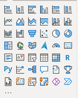
Power BI has a variety of visuals, such as bar charts, line graphs, and pie charts, that you can use to present your complex data clearly in a report.
What sets Power BI reports apart from traditional reports is interactivity. Hovering over a visual gives you more information without cluttering the main view. You can click on a data point in one visual and it will filter other visuals on the dashboard to show only relevant information.
This allows you to explore your data from different angles without creating separate reports. For example, if you’re looking at sales by region, clicking on a region will adjust the entire report to show only sales trends, customer demographics or product performance for that area. Being able to drill down and highlight specific details helps you find what you need quicker and makes your decision-making process faster and more effective. It’s like having a conversation with your data – you’re not just looking at numbers, you’re engaging with them to find the story behind the numbers.
You can also build customized dashboards that combine key metrics from various reports. This is done by pinning visuals onto a single dashboard to track important data in one place.
Reporting automation is a big topic in the data analysis community. Businesses everywhere are looking for ways to spend less time on maintaining their management reports and more time on creating additional analysis.
Power BI often plays a big role in automating reports that are manually maintained. For example, businesses can use the Power BI connectors to connect to their data sources and then automatically refresh their data going forward.
This is made possible by a feature in Power BI called Refresh.

It keeps your reports up to date with the latest data from your sources. There are a few ways this happens:
Real-time analytics allows you to access and analyse data as it happens. You can be assured that you’re making decisions based on the most accurate and timely data and also respond quickly to changing business conditions.
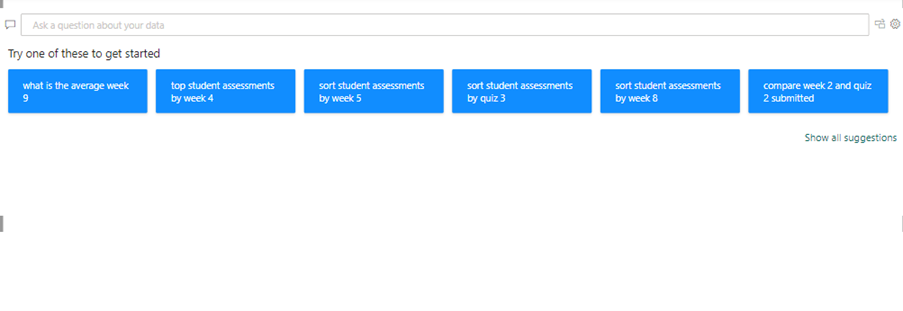
Microsoft recently announced Co-Pilot which integrates AI into some important features of Power BI. As of now Co-pilot can automatically generate description of your formulas, help you write DAX formulas and learn more about different DAX functions.
Microsoft Co-pilot also gives chatbot-like functionality where users can write a command in plain English and execute it. As of now Co-pilot can generate simple Power BI reports, edit report layout, change colors, create additional graphs, etc.
Power BI uses artificial intelligence on a smaller scale as well to enhance data analysis and its self-service capabilities. The Q&A feature lets you ask questions about your data in natural language and then Power BI will generate the right visualizations to answer your questions. This makes it easy for anyone in your organization to gain insights without needing advanced skills.
The AI capabilities also include Quick Insights, which automatically identifies trends and anomalies in your data. Features like the Key Influencers visual highlight the factors affecting your outcomes based on the data provided. This AI integration helps you make faster, smarter decisions based on actionable insights.
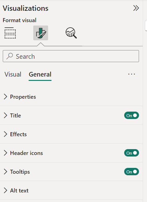
Power BI lets you customize your reports and dashboards to fit your brand and message.
You can:
You can access your reports and dashboards on the go via the Power BI mobile apps for iOS, Android, and Windows. This allows you to view and interact with data from any device. The responsive design automatically adjusts visuals to fit your screen size.
You can set alerts to receive notifications when key metrics reach specific thresholds to stay informed even when you’re away from your desk. With offline access, you can also view previously loaded reports without an internet connection. These features make it easy to stay connected to your data, no matter where you are.
We’ve covered most of the benefits of Power BI in previous sections and chapter, so now we’re going to look at three final benefits of Power BI that have not been stressed enough.
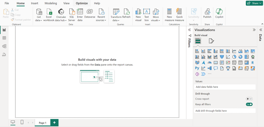
You do not need to be a data expert with x years of experience to use Power BI to create insightful reports and dashboards. Power BI has an intuitive click-drag-and-drop functionality that can get you started with minimal need for coding. Power BI makes it as simple as ABC to connect to your data sources, create visuals, and generate reports in no time.
Power BI is a lot less expensive than other business intelligence and analytics solutions. At the same time Power BI offers a lot of ways to customise your visualisations which is one area where other BI tools struggle. This is particularly beneficial to small and medium-sized businesses because it allows them to access powerful analytics tools without breaking the bank. With Power BI’s free tier and affordable premium options (pricing will be discussed in more detail in a later chapter), businesses can get the insights they need to make data-driven decisions without the high upfront licensing costs.
Power BI is regularly updated with new features that help businesses stay competitive by offering new ways to visualize data, integrate with other tools, and enhance performance. This is one of the reasons why Power BI has been named an analytics and BI leader by Gartner Magic Quadrant for the past 7 years. Using Power BI for your analytics gives you more confidence because you’re sure you’re always working with the most up-to-date tools and capabilities in terms of visualizations, data security, and optimization.
Power BI is built on a set of key components that define how you create, share, and consume insights across your organization.
These components work together to provide flexibility for different roles and technical abilities.
In this chapter, we’re going to look at the four components that make Power BI a complete solution.
You can install Power BI Desktop by clicking here.
This tool is free to install and mostly used by data analysts, business intelligence professionals, or anyone responsible for building and designing reports from scratch. It’s where all the heavy lifting happens—where data modelling, calculations (using DAX), and report building—take place. Once your reports are ready, they can be published to the Power BI Service for wider access across teams or to be embedded in dashboards.
Power BI Service, unlike Power BI Desktop, is a cloud-based platform that you can access via your web browser. This way the your stakeholders don’t have to download heavy files to view the reports. Instead they go to the Power BI website and interact with their reports.
Power BI service brings a lot of benefits that aren’t available in the desktop version.
For one, Power BI Service is now part of a larger data platform called Microsoft Fabric. This means that once you publish your reports online, the underlying datasets can be accessed by other Microsoft tools like Azure Synapse and Data Factory. This eliminates the need to apply data processing steps multiple times in different analytics tools.
Fabric helps you handle data engineering, integration, and business intelligence in a single platform. This becomes very beneficial as your data size and complexity grows—your Power BI reports and dashboards will seamlessly work with other data tools. It simplifies your workflow by giving you one environment for all your data needs.
It is the only place where you can create dashboards (a single-page visualization that contains the most important metrics and trends you want to track). You can either create dashboards from scratch or pin key visuals from various reports to it.
Developers can also use the Power BI Service interface to set up automatic data refresh (scheduled refresh). Another use of Power BI Service for developers is to set up row-level security which allow developers to only show a portion of the dataset to certain users. This way when a US sales manager opens the dashboard, they will only see the US sales, etc.
Finally, developers can set up alerts to business users from Power BI service. For example if the value of a certain KPI drops below the set threshold, the management will be notified.
Power BI Mobile is simply a more limited version of Power BI Service in the form of a mobile application. With it, you can access your reports and dashboards on the go, using your smartphone or tablet.
Power BI mobile app is very useful for report users who are always on the go. This is very common in industries such as transportation and logistics.
Power BI Report Server is an alternative report-sharing platform for businesses that store data on-premises i.e. for compliance or security reasons.
Power BI Report Server combines the capabilities of Power BI with a secure server environment that lets you publish, manage, and deliver reports internally without relying on the cloud unlike with Power BI Service.
Your sensitive data stays within your organization and you’ll have complete privacy and control. You can create reports in Power BI Desktop and then publish them to the report Server for easy access by your team.
This is useful if your organization requires strict data governance but still wants to take advantage of Power BI reporting conveniences.
People often use the words ‘report’ and ‘dashboard’ interchangeably when referring to something that looks like this:

Is this a Power BI Dashboard or Report?
But they are actually quite different.
In this chapter, we’re going to get to the bottom of what sets them apart.
Power BI reports are designed by data analysts in Power BI Desktop.
The process of designing a Power BI report is to:
Here are some of the benefits of Power BI reports.
Reports help your business or teams analyse data more deeply to uncover trends, root causes, and insights to drive continuous improvement. They serve as customizable portals for technical and non-technical users alike to analyse business data.
A dashboard in Power BI is a single page, often personalized, view which combines multiple reports together. Power BI allows the users to select different graphs from different reports to a single dashboard. It is also possible to select an entire page of a Power BI report and insert it into your Power BI dashboard.
The process of building a Power BI dashboard is:
As you can see, there are no options to load additional data sources, create new formulas or edit your graphs in a dashboard. On the other hand, here are some of the benefits you can get out of a Power BI dashboard.
While dashboards and reports serve different end purposes, Power BI offers a unified experience for building and interacting with both. Below are some of their core similarities:
With Power BI, reusable data models feed consistent metrics into both dashboards and reports. Authors can build and interact with visuals across both using similar core experiences. Any Power BI user can leverage published dashboards and reports to analyse data.
Despite being similar in many ways, Power BI dashboards and reports serve very different purposes reflected in key differentiation points:
| Feature | Dashboards | Reports |
| Purpose & Audience | Dashboards are designed for executives and managers who only need to see a couple of key insights | Reports are built for analysts and frontline users to analyze data deeper and be able to explain it in detail. |
| Page Length & Layout | Dashboards condense key insights onto a single screen for easy viewing. | Reports allow for detailed analysis across multiple pages, often containing extensive data. |
| Visual Editing | Dashboards show the visuals as they are on the report with no way to edit them. | Reports allow users to apply all the formatting options to the graphs. |
| Interactivity | Dashboards offer limited filters and drill-downs. | Reports allow deep customization with slicers, drill-throughs, and conditional formatting. |
| Data Analysis | Dashboards display summarized insights from reports for easy interpretation. | Reports enable hands-on data analysis, often driving dashboard insights and improvements. |
As you can see, dashboards offer wide but shallow analysis while reports provide narrow but extremely deep data analysis. Reports empower business teams to uncover hidden insights to actually improve organizational KPIs showcased in dashboards over time.
Together, they provide organizational visibility at all levels to drive better decision-making.
There are many ways to create a dashboard. For example, you can create a dashboard from a report, from scratch, from a semantic model, or by duplicating an existing dashboard. In this section, you create a quick and easy dashboard that pins visualizations from an existing report.
Start by designing your reports in Power BI Desktop or Service. Make sure the visuals you want to include in your dashboard are well-crafted and convey the insights you wish to showcase.

If you built your reports in Power BI Desktop, when your reports are ready, publish them to the Power BI Service by selecting the Publish button and choosing your workspace in the Power BI Service.
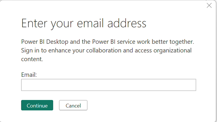
Log in to the Power BI Service using your Microsoft account. Navigate to the workspace where you published your reports. Here, you will see all the reports available to you.
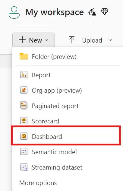
To create a new dashboard, go to the workspace and select Dashboards from the left-hand menu. Click on + Create, then choose Dashboard. Give your dashboard a name that reflects its content or purpose and click Create.
Now, you’ll need to pin visuals from your reports to your new dashboard. Open one of the reports you published in Power BI Service. Hover over the visual you want to pin and click the pin icon that appears.
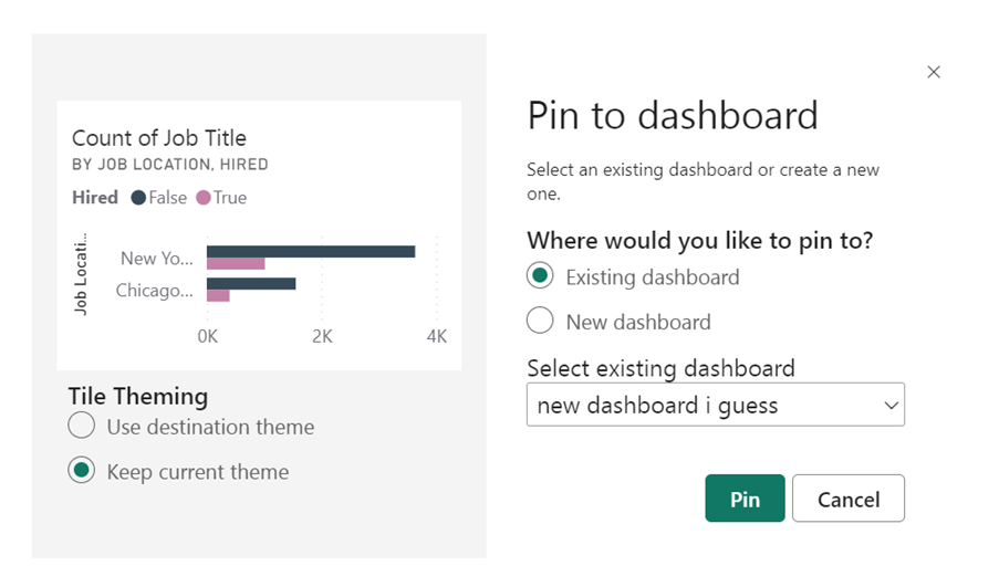
You’ll be prompted to choose which dashboard to pin the visual to—select the dashboard you just created or create a new one directly from this window. Repeat this process for all the visuals you want to include in your dashboard.
Once you’ve pinned all the visuals you are interested in, go back to your dashboard. You can now rearrange the visuals by dragging and dropping them to your desired positions. You can also resize each visual to create a layout that best suits your data presentation needs.
You can customize your dashboard by adding titles, text boxes, and images. You can also set alerts on specific visuals to notify you when data changes significantly. Once your dashboard is set up, you can share it with your team or stakeholders so that everyone who needs to access the insights will be able to at any time.
Now that you understand what Power BI dashboards are and how to create them, let’s look at some best practices that can set your dashboards up for success
Dashboards should focus on the vital few metrics most important for fast and accurate decisions. Too much complexity slows down information absorption. Use reports for deeper analysis.
Lead with the most critical company, departmental or individual metrics the audience cares about rather than burying them. Make powering organizational goals the dashboard’s purpose.
Avoid density and clutter. Use basic charts and graphs over complex visuals. Format charts, minimize gridlines, legends, and labels that impede quick analysis. Use white space appropriately.
Make anomalies, underperformance, or changes easy to spot with simple colour coding, metrics against targets, sparklines showing trends, etc. Alert users to change with indicators.
Provide line of sight – linking data insights on dashboards directly to actions users should consider taking within daily workflows. Provide next-step recommendations.
On the other hand, best practices for reports in Power BI focus on enabling interactive analysis for business teams to uncover granular insights. Reports don’t randomly dump data but reveal powerful insights through deliberate designs.
Create reports to answer pressing business issues. Explore causes of problems and sources of opportunities rather than generic reporting which dilutes meaning.
Organize report pages and visualizations in sequences that follow users’ analytical thought processes vs. disconnected charts that leave users lost.
Use grids and shared axes so different charts reflect common groupings and base measures allowing users compare related metrics apples-to-apples.
Empower report consumers to apply filters, alternate visual types, add metrics etc. to support ad-hoc analysis. Different users can customize views for their context.
Help users grasp how filtering certain chart values will change all related data views in reports through synced and high-lighted slicers for each section.
In general, focus on enabling self-service analytics through deliberate report design so business teams uncover granular insights themselves vs. the BI team predetermining analysis.
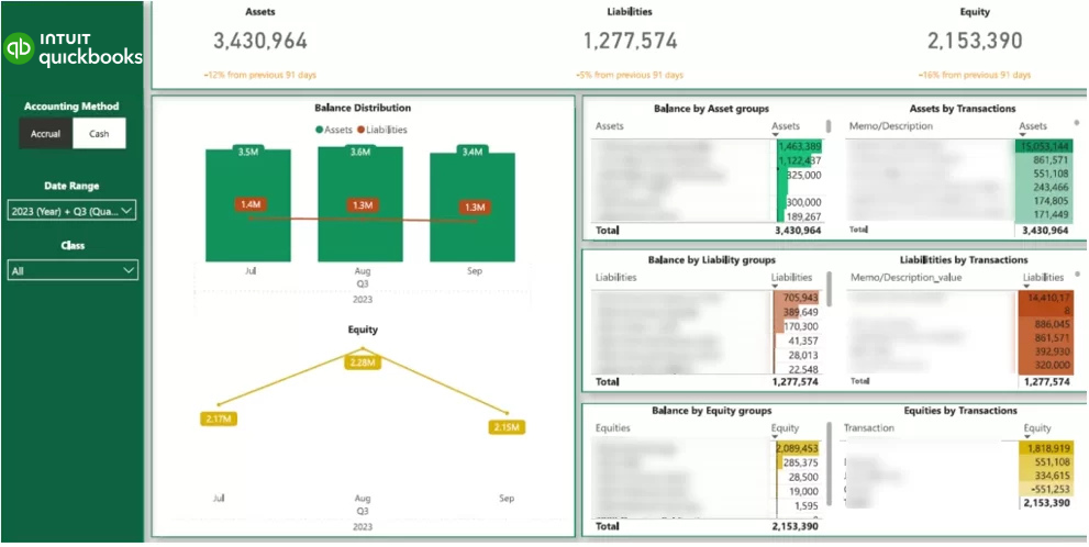
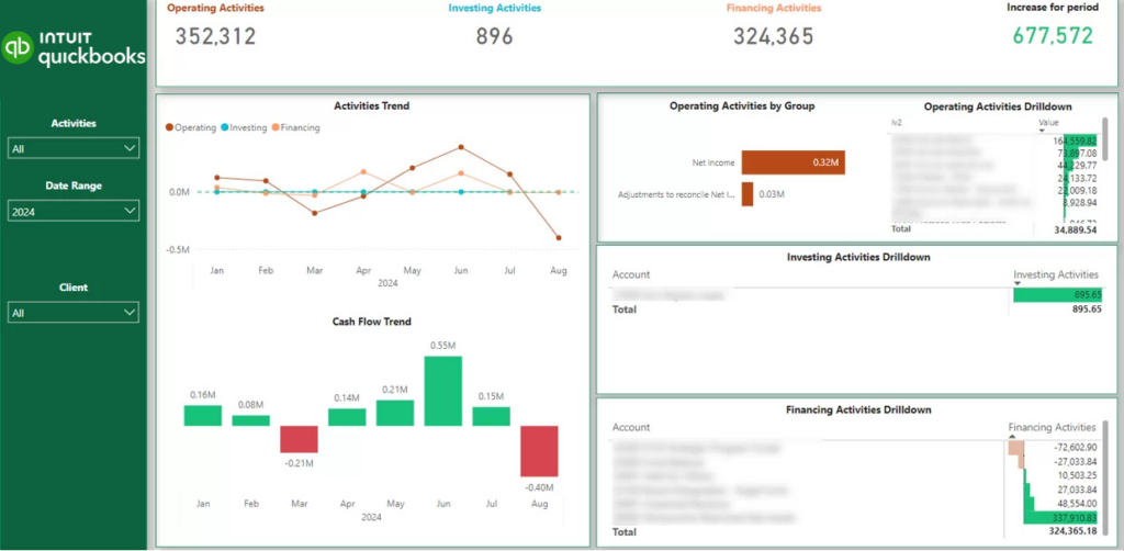
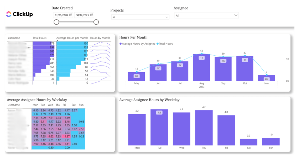
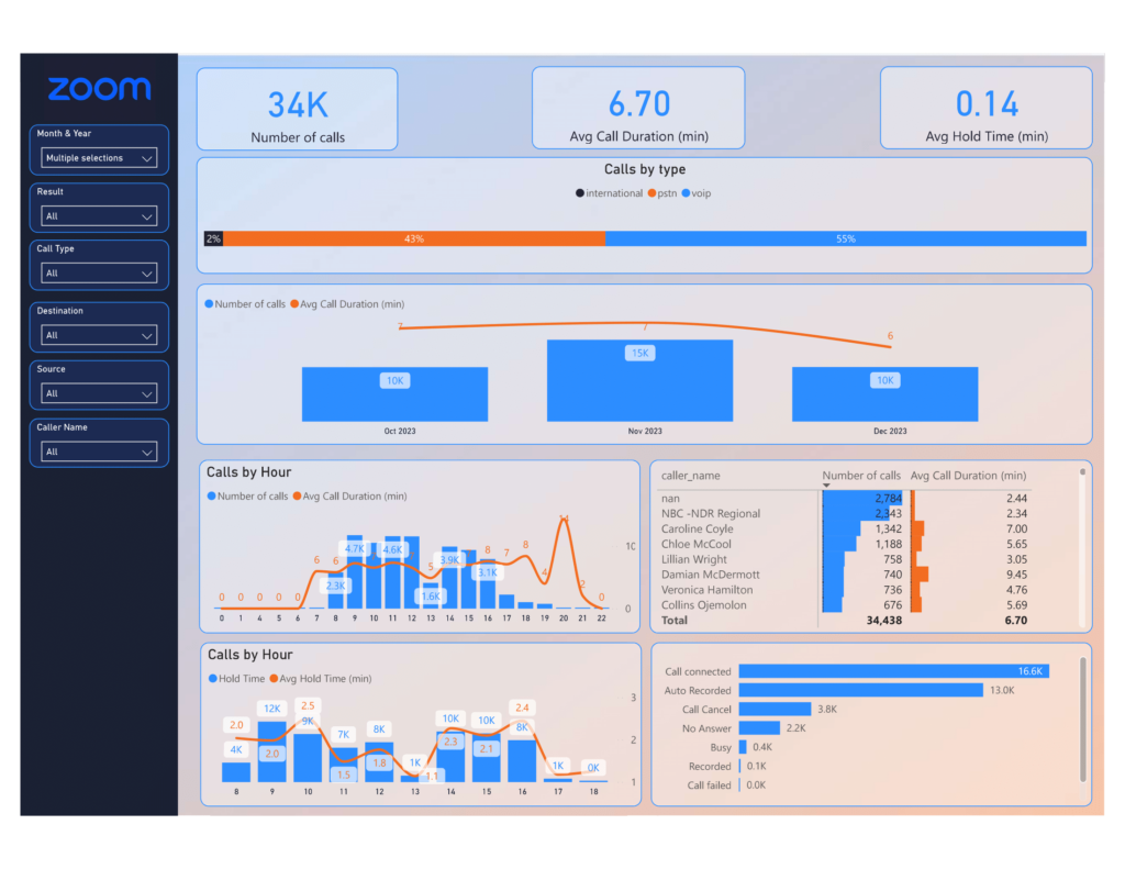
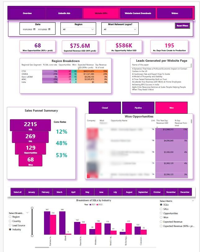
SEE MORE OF OUR DASHBOARDS HERE
The term ‘connector’ generally means a thing that links two or more things together.
So, a Power BI connector is simply what links data sources to the Power BI platform.
In this chapter, you’re going to learn about power BI connectors.
Power BI connectors enable the platform to connect to all the different data sources where you have your data stored.
If your sales numbers are in Excel, customer details are stored in Salesforce, and website analytics are in Google Analytics, connectors help you to pull all that information easily into Power BI.
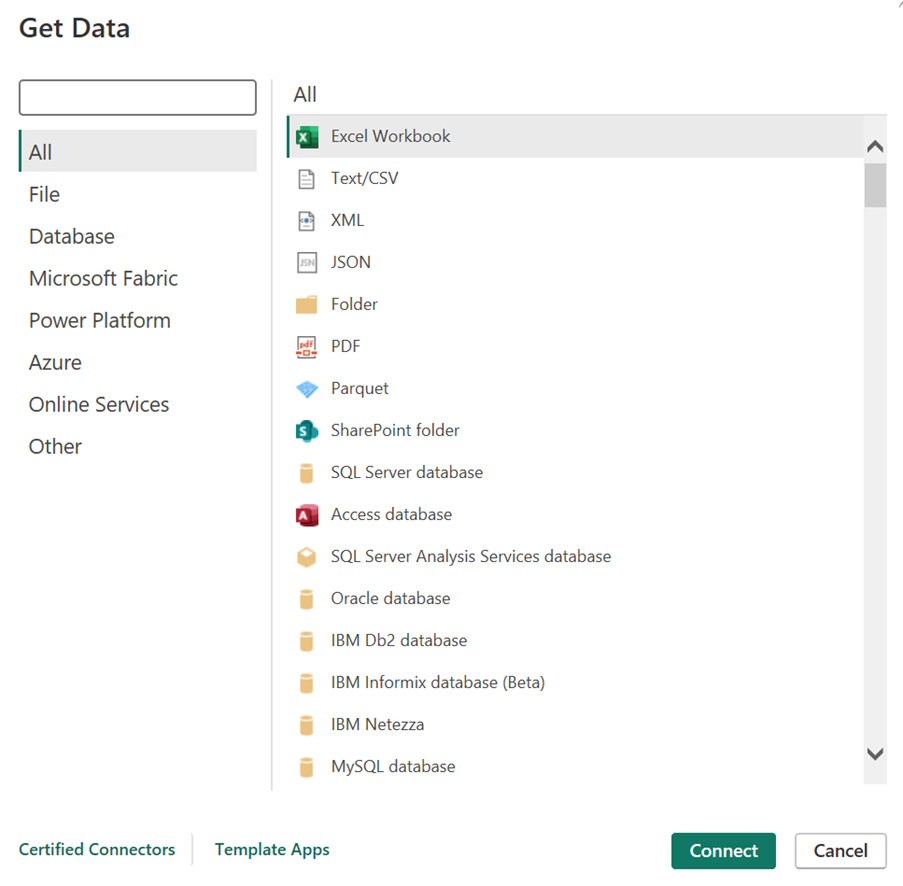
These are readily available and make connecting to common data sources simple. For example, if you have your data stored in a flat file like CSV format, you can easily select the CSV connector in Power BI to give Power BI access to the data. Built-in connectors are easy to use even for non-technical people.
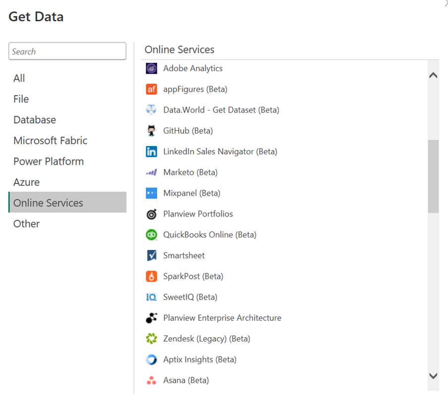
Third-party connectors are pre-built tools developed by companies outside of Microsoft. These connectors make it easier for you to link Power BI with popular platforms like Salesforce, Google Analytics, or QuickBooks.
Instead of building your own connection from scratch, you can simply use a third-party connector to pull data from these platforms into Power BI for analysis.
If your business generates data from software that doesn’t have a built-in or existing third-party connector, you can create a custom connector.
Custom connectors are useful for connecting Power BI to proprietary databases or specialized applications. You may either build a custom connector from scratch (this requires advanced technical skills) or hire a professional to create it for you.

Vidi Corp specializes in creating custom connectors that help automate data integration with Power BI.
If you have your data stored in a location that doesn’t connect easily with Power BI or want to visualize data generated from an uncommon source such as social media platforms or niche applications, we can help you out.
We’ve built several custom Power BI connectors that are very optimized and customizable. Let’s have a quick rundown:
This connector automates syncing financial data from QuickBooks, the popular accounting software for managing invoices, payroll, and expenses, into Power BI for real-time reporting.
The connector pulls task data, workload, work hours, and project timelines from ClickUp project management platform into Power BI for visualization and analysis.
The connector automates the extraction of Facebook ad performance metrics and data into Power BI for detailed analysis which saves you cost and allows for more customization.
Vidi’s Zoho Books connector allows you to automatically connect and consolidate financial data from multiple organizations, store it in your preferred database or data warehouse, and customize the data as needed.
The connector makes it possible to combine data from multiple Xero companies together in a single dataset and supports Direct Query connection in Power BI for dynamic reporting.
Vidi’s custom Salesforce connector solves major issues involved with the native/ built-in salesforce connector in Power BI. Vidi’s salesforce connector allows you to overcome the 2000 rows limitation imposed by the native connector and supports Direct Query connectivity for real time analytics.
The connector brings in data that allows you analyse all your zoom calls, web meetings as well as the webinar registrants & participants in Power BI.
Vidi’s Jira connector helps you overcome major limitations posed by other third-party connectors, such as high subscription costs, lack of source code access, and regional unavailability. Vidi’s solution addresses these issues with its custom, flexible connector that allows you to extract custom fields from Jira, with full source code access, and is available globally. Plus, it’s all for a one-time fee.
VIDI’s Shopify connector to Power BI enables you to centralize and manage your Shopify data effortlessly, saving time and resources. With it, you can do away with data silos by combining all your Shopify accounts and organizations under one roof.
The LinkedIn Ads connector allows users to extract data from LinkedIn Ads Campaign Manager into Power BI. It supports multiple LinkedIn Ads accounts and extracts essential data from the LinkedIn Ads API, with options for customization to you’re your specific needs.
Businesses of all sizes love Power BI because of how easy it makes collaboration and sharing of reports.
In this chapter, you’re going to see how to collaborate on and share reports on Power BI.
You can share reports created using Power BI Desktop with your team and other stakeholders by simply publishing that report to Power BI Service which is a cloud environment.
Publishing your reports to the Power BI Service is a straightforward process:
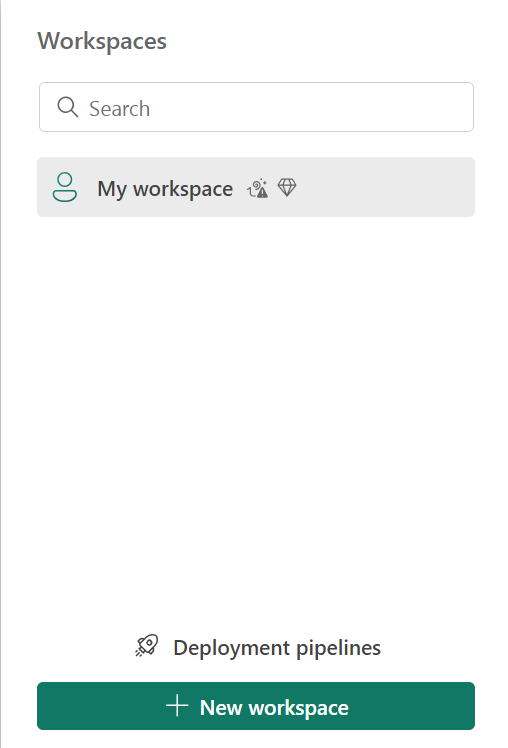
Workspaces in Power BI help you organize your reports, dashboards, and datasets. Follow the steps below to create and manage your first workspace:


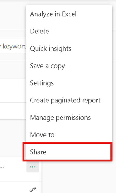
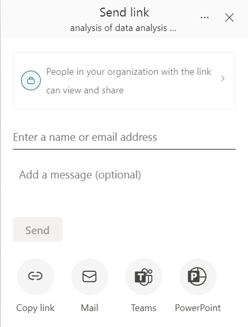
P.S. You can also copy the link to share with others or publish to the web for wider access (publishing to the web makes your report public).
Row-level security (RLS) allows you to restrict data access for specific users based on their roles. Follow the steps below to set up RLS.

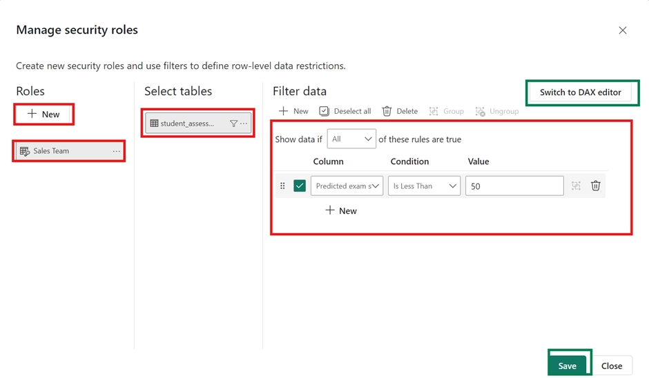
Not all row-level security filters supported in Power BI can be defined using the default editor. In some cases, you may need to define roles using the DAX editor.
You can’t assign users to a role within Power BI Desktop. You assign them in the Power BI service.
At advanced level, you can enable dynamic security within Power BI Desktop by making use of the username() or userprincipalname() DAX functions and having the proper relationships configured.
For this guide, we’ll focus on assigning users to role in Power BI Service
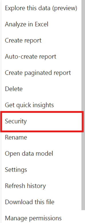
P.S.It’s a good practice to test the RLS settings. In Power BI Desktop, you can use the “View as Role” option to see how the data appears for different users.
If you’ve decided to use Power BI for your business intelligence needs then you have to understand the different licensing and pricing options available.
Power BI has several plans to suit businesses of different sizes, structures, and needs.
In this chapter, we’ll break down the pricing and licensing options, so you can choose the best one for your business and make the most of Power BI.
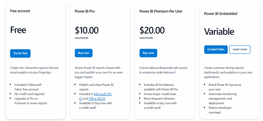
With the free account, you can use Power BI to connect to your data and create reports for your personal use. However, you won’t be able to share your reports with colleagues or collaborate on them. It’s a good starting point if you’re doing solo analysis or just exploring the platform.
If your organization has Pro or Premium Per User (PPU) licenses, you’ll still be able to view and interact with content in shared workspaces, even with a free account, as long as the workspaces are hosted in Premium capacity.
The Pro license is ideal for users who need to collaborate and share insights. It’s a per-user plan that allows you to create, share, and collaborate on reports and dashboards with your team. You’ll also be able to publish content to other people’s workspaces, making it a great choice if you’re part of a team or need to distribute reports across the organization.
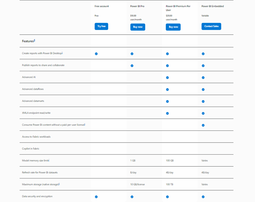
The Premium Per User plan is designed for more advanced needs. It includes all the benefits of the Pro license but adds powerful features like advanced AI tools, larger data models (up to 100 GB per model), and up to 48 data refreshes per day. You’ll also have access to advanced dataflows and datasets, making it perfect for organizations that deal with complex data or need enhanced performance and capabilities. Additionally, you can share your reports with people who don’t have Pro or PPU licenses, as long as they’re part of a Premium workspace.
With Power BI Embedded, you can integrate Power BI reports directly into your applications. This plan is ideal if you’re looking to provide BI functionality to your customers through your app or website. It includes many of the same features as the Premium plan but gives you the flexibility to customize your setup based on your app’s requirements.
The table below shows how different licenses vary in terms of their features:
Performance optimization in Power BI involves improving the load speed of the visuals and the refresh time of the reports.
There are various techniques and best practices you can adopt to enhance the loading time, responsiveness, and overall user experience of your Power BI reports.
In this chapter, we’ll be tackling all of them.
This involves designing an efficient and optimized data model by reducing unnecessary relationships, removing redundant tables or columns, and optimizing data types and cardinality. A well-designed data model can significantly improve report performance. Let’s see in more details how to optimize your data model:
Data models should be simple and well-organised.
Reduce the number of tables and relationships between the tables to improve performance.
Star Schema is recommended for the data model over any other schema.
Cardinality and cross-filter directions are important aspects of any data model.
Many to Many cardinality and Bi-directional filters should be avoided for better performance.
Choose appropriate data types for columns to reduce memory consumption and improve performance.
Usually, Power BI auto detects the correct data types but it should be checked and changed accordingly for every relevant column to improve the performance.
Consider changing the data type from Date/Time to Date. When the data type is set to Date/Time, Power BI will automatically produce a small calendar table in the background including Month, Quarter and Year. When you change the data type to Date, the background table will not be produced.
Remove or hide unnecessary columns from the data set. It will lead to lower memory consumption and will improve the performance of the report.
The column can be removed from Power Query before loading the data to the data view or can be hidden by right-clicking on it.
Power BI queries data from the underlying data sources to populate the visualisations in the report. Optimising the queries can involve reducing unnecessary columns, filtering data at the source, and using query folding to push data transformation steps back to the data source. This optimisation step ensures that your data refresh happens faster.
This is also another important method to optimize your report. You can disable loading the table if you are not planning to use it as a dimension or a fact table. This is commonly done for tables that are used for merge or append functions.
Assume you have 3 tables loaded to Power BI and have appended these tables into a single table. If you load all the tables into the model, it creates redundancy, which increases the model’s size and makes it less efficient. So, instead, you should disable the load of these tables and load only the final appended table to the data view.
How to enable or disable a load:
Designing an efficient and user-friendly report layout is crucial for optimising user experience. This involves organising visuals, using appropriate visuals for the data, minimising the use of custom visuals, and optimising colours, fonts, and other design elements. Some best practices:
Minimise the number of visuals and elements on a report page to improve rendering and interaction performance.
Avoid using too many slicers on a page as each slicer can impact performance.
Use appropriate visual types, reduce unnecessary formatting, and avoid complex visual interactions to improve rendering performance. Try to avoid using custom visuals as they take much longer to load than Power BI native visuals.
Regularly monitoring the performance of your Power BI reports and conducting performance testing can help identify bottlenecks and areas for improvement.

Utilize Power BI’s Performance Analyzer tool to identify and troubleshoot performance bottlenecks.
Keep track of query execution times and identify slow-running queries to optimise them.
Analyse usage metrics and identify reports or visuals that are causing performance issues.
Schedule data refresh during off-peak hours and optimise queries used in data refresh operations.
This involves optimising the infrastructure and settings to ensure the best performance and user experience.
Configure and optimise the Power BI Gateway for efficient data transfer between on-premises and cloud-based data sources.
If after all the optimisations above your report still loads slowly you can consider buying additional computing resources as part of the Power BI Premium by Capacity license.
So far, you’ve learnt a lot about Power BI, its benefits, core components and capabilities.
Now, you’re going to see real-world examples of how Power BI has transformed businesses and operations in recent times.
P.S. The case studies featured in this chapter are projects completed by Vidi Corp, a top Power BI consultancy firm.
If you’re pondering how Power BI could improve your own business operations, feel free to reach out for custom solutions that meet your unique needs.
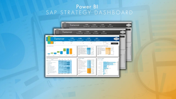
A public manufacturing company needed help migrating a set of 8 manual excel reports into Power BI as part of the company-wide shift away from using spreadsheets for reporting.
The turnover page highlighted the YoY growth for the company’s product portfolio. The top 8 and bottom 8 products by YoY growth were identified and sent to the management for a more detailed discussion. The YoY growth by supplier enabled more insights to manage supplier relationships and the insights on YoY growth by region analysis supported regional growth strategy.
You can read more about this case here
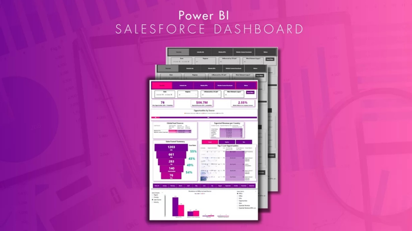
A global company with 400k+ employees needed help automating reporting from Salesforce, Webeo and LinkedIn Ads. It used to take them 6 hours of manual work per report refresh and they wanted to refresh this report on a daily basis.
Vidi Corp built a Power BI dashboard using data from Salesforce, LinkedIn Ads, and Webeo that had the following outcomes:
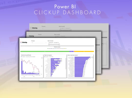
Businesses that use ClickUp for project management and task tracking need a dashboard that shows a clear view of the team’s workload and project progress.
The dashboard allows you to more efficiently:
This streamlines project management further and leads to an increased rate of project completion.
You can read more about this case here
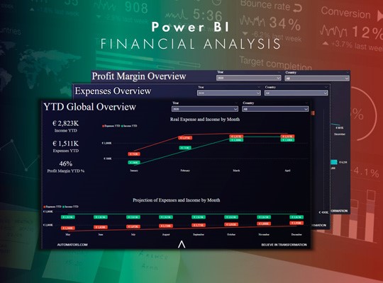
One of the Automators partners needed a report that would analyse financial health of the business. The goal was to use this report for presentation to other partners, review financial results and trends.
Vidi Corp delivered an easy-to-digest dashboard by connecting to the company’s data stored in MySQL and Sharepoint lists. They achieved a better understanding of financial sustainability which helped the partners track performance metrics, predict trends, and make informed decisions for future investments.
You can read more about this case here
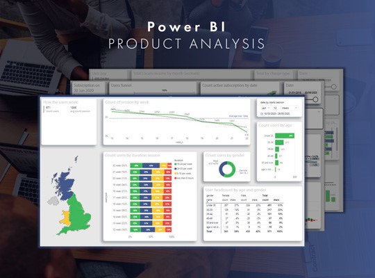
The CEO of a SaaS company in the UK targeting GPs wanted to answer several questions about the user-base of their app.
The dashboard Vidi Corp delivered answered the following questions using real time data on the company’s customers:
– Distribution of users by age and gender
– How many hours GPs work per week
– How much do GPs charge per hour
– How many sessions on average GPs have per month
– How many active subscriptions the app has
– What is average conversion rate from free trial to paid subscription
You can read more about this case here
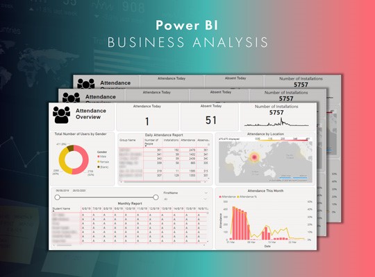
A SaaS company that deals with educational institutions like schools and universities needed a Power BI report that they could embed to their SaaS application and show to their clients the analysis for attendance of the students.
A Power BI embedded report that shows a detailed analysis of student attendance and absence, with information about the number of app installations by gender and location and insights on both group and individual levels that show attendance patterns. There’s also an option for data export to Excel.
You can read more about this case here

Power BI is easy to use, but gaining the highest ROI on any Power BI investment is not as straightforward.
That’s why it’s good practice to contact eligible Power BI consultants before and while embarking on your BI journey.
Without the right guidance, you could end up using Power BI all wrong – in the most unoptimized, inefficient, and time-consuming way possible.
This can slow down your decision-making process or even lead to missed insights and wasted resources. Consultancy helps avoid these pitfalls and that’s why you should consider hiring one.
In this chapter, we’ll walk you through how to choose the right Power BI consultancy for your business.
To understand the role of a Power BI consultant, you need to be familiar with the entire data analytics process. Once you understand the process, it becomes easier to identify which tasks are aimed at each stage of the process.
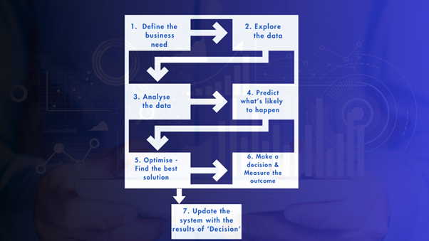
This stage is for a Power BI consultant to understand business problems that need to be solved. During this step all the expectations and goals from customers are set and discussed. In order to get clear objections, a document with all business questions will be created including business questions that need to be answered, formulas to answer these questions and a suggested data visualization method for every question.
The next step is gathering relevant data from different data sources such as CRMs, ERPs or external databases. Data collection can be done either manually or automatically via Power BI connectors.
This stage is one of the most important and challenging parts of the data analytics process. It is crucial to clean the collected data in order to ensure that analysis will be unbiased. During the Data cleaning stage all inaccuracies, duplicates and irrelevance are identified.
After the data is cleaned, consultants design data models that organize different datasets to perform efficient analysis. During this phase, the connections between data points are established. The most widely used tools for data calculations are SQL and Excel.
This is the key step to visualize complex data in an easier and user-friendly format using graphs, charts, tables etc. Power BI developers create intuitive and visually appealing dashboards that present data in a way that is easy for non-technical users to get insights from.
After data is visualized, consultants help customers to analyse trends and patterns that will be used in the decision-making process. This is the process of interpretation of the data visualisation inside of a dashboard. This includes identifying trends, comparing performance across different time periods or analysing customer behaviour patterns.
The final step is to deploy the insights derived from data analysis. Customers then implement strategies based on data findings. For instance, optimizing marketing campaigns, improving product offerings, or adjusting operational processes.
In big organizations, different steps of the data analytics process would be performed by different team members with different specializations. A business analyst would work on identifying business questions and the necessary data to answer them. A data engineer would work on automating the data extraction, cleaning, and pre-processing. A data analyst would work on the data modelling and visualisation. Finally, the senior management would analyse what the data visualisation is saying and act based on the insights.
But in SMBs, a single Power BI consultant often handles all of these tasks and provides a full-service solution. The key tasks that a Power BI consultant performs are:
KPIs are performance indicators that show how effectively a company achieves its long-term objectives. A power BI consultant helps businesses to define clear KPIs. For instance, KPIs can include sales growth, customer retention rate, employee turnover etc.
A Power BI consultant would help the client to identify KPIs, the data to calculate those KPIs and also the most effective way to visualise them. This case study is a good example of how a Power BI consultant would help with this process.
2. Connecting to data
Power BI offers a range of ready-made connectors that make it easy to pull in data from different data sources. But in some cases, Power BI consultants may need to develop custom Power Bi connectors that automatically extracts data from databases API.
Examples of data sources that require custom connectors include ClickUp, Jira, QuickBooks etc. Automatic data integration is crucial for a smooth analysis process as it reduces the maintenance workload. Here are examples of custom Power BI connectors for different data sources
3. Data cleaning and modelling using Power Query
Power Query is a data extraction, transformation and loading (ETL) tool inside of Power BI that is used to automate data processing. Power BI consultants use this tool to clean, filter data and bring it to a convenient format to work with. During this stage, a consultant ensures the quality and speed of Power BI reports through only loading the necessary data.
4. Dashboard creation in Power BI
Once the data is ready, the next step is to develop a dashboard that will provide real-time insights, allowing businesses to monitor its performance. Power BI consultants use different bars and charts to ensure that a report is developed in a clear and visually appealing way. Consultants then design every part of a dashboard such as filter menu, navigation menu, a line of cards and a block of data visualisations to accurately reflect data trends and patterns. You can learn more about the process for creating these charts here.
5. Interpreting the results
Power BI consultants also help in interpreting the results. Consultants usually schedule a call with the client to discuss results and all the limitations of the dashboard. Sometimes additional analysis is required after such meetings. All parts of the completed analysis are critically evaluated.
6. Maintenance and continuous improvement of the report
Power BI consultants provide ongoing maintenance and support, ensuring the dashboards are updated as new data sources are added, business needs or data format change. It is vital that the report will answer business questions over time, not just once.
When hiring a Power BI consultant, you may typically look for one of these 3 things:
If you know what dashboard you need to produce and what data you need to use as a client, there is nothing wrong with hiring for cost-effectiveness. In this scenario, you would have a good understanding of your problem, and you would know how to solve it, all you are missing is the technical know-how.
There are a few ways to test the technical know-how:
As a client you know what your problem is but you can’t scope a project based on it. As a result the project scope is open-ended and you need a consultant to step it and help you define it.
Now that you have a better understanding of the different types of consulting needs, let’s dive into the key factors to consider when evaluating potential Power BI consultants.
Regardless of the type of project, it’s essential to ensure that the consultant you choose has the necessary technical skills and certifications in Power BI. Look for:
If you’re looking for a consultant with specific expertise, such as working with particular data sources or creating visually appealing dashboards, be sure to thoroughly vet their experience in these areas. Look for:
For more complex, open-ended projects, you’ll want a consultant who can think creatively and strategically to help you define the right KPIs and develop a custom solution. Look for:
Now that you have a better understanding of the different types of Power BI consulting needs and the key factors to consider, let’s walk through the process of selecting the right consultant for your specific project.
Start by clearly defining the type of consulting you require. Is it a cost-effective solution, specialized expertise, or an intelligent, custom-tailored approach? Understanding your specific needs will help you narrow down the pool of potential consultants and ensure you find the best fit.
Once you’ve identified your consulting needs, begin researching and evaluating potential Power BI consultants. Review their technical certifications, years of experience, portfolio of past projects, and any relevant specialized expertise. For more complex projects, pay close attention to their problem-solving abilities and strategic thinking skills.
After shortlisting a few promising candidates, schedule interviews or consultations to assess their fit and compatibility with your project. Pay attention to their communication style, responsiveness, and ability to understand your specific challenges. A good consultant should be able to quickly grasp the problem and provide valuable insights.
Before making your final decision, be sure to check references and read reviews from the consultant’s previous clients. This will give you a better understanding of their reliability, professionalism, and the quality of their work.
Considering all the factors you’ve evaluated, make your selection of the Power BI consultant who best fits your needs. Remember, the right consultant can make a significant impact on the success of your Power BI project, so take the time to find the perfect match.
In this chapter, you’re going to learn about some more important Power BI features that you’ll surely encounter if you plan on using Power BI for advanced data analytics and reporting.

Power BI’s bookmark feature allows you to save the current state of your report pages, including the changes you made to filters, slicers, and visuals on that page.
Think of bookmarks as snapshots of your report at a specific moment, which you can quickly navigate back to i.e. during presentations or when sharing insights with your team.
For instance, suppose you’re analysing sales performance across different regions. You might create a bookmark that shows the report filtered to display only the data for the North region. Later, when you want to switch back to the overall view, you simply click on the bookmark. This makes it easy to guide your audience through the data without having to redo filters or navigate manually.
Drillthrough is another captivating feature that lets you explore data in greater detail by navigating from one report page to another. It’s a great way to provide more context or insights about specific data points without cluttering your main report page.
Let’s use the sales performance report as an example again. By right-clicking on a specific region’s sales figure, you can access a drillthrough page (which you’ll have previously created and indicated as a drillthrough page) for that region. This page might include more detailed analytics, such as customer demographics, sales trends, and feedback related to that area.
Drilldown is similar to drillthrough but focuses on hierarchical data. It allows you to navigate from higher-level data to more granular data points. This feature is useful if your business deals with hierarchical structures, like sales data categorized by year, quarter, month, and day.
Imagine you’re looking at annual sales figures presented in a bar chart. If you want to understand how those figures break down by quarter, you can click on the annual bar, and Power BI will expand it to show the quarterly data. This way, you can easily transition from a summary view to detailed insights.
DAX is the formula language in Power BI that allows you to create custom calculations and aggregations for your data. You can use DAX to build complex measures that enhance your data analysis capabilities. It’s a lot like Excel formulas, just designed specifically for data modelling in Power BI.
You might use DAX in situations where you might want to calculate aggregate values like Year-to-Date (YTD) sales, percentage growth, profit margins, or customer retention rates.
The great thing about using DAX for these calculations is that they are dynamic. This means that as new data comes in or as you apply filters to your reports, DAX automatically updates the calculated values to reflect the most current information
Power Query, before recently, was only available in the Power BI Desktop. It’s one of the most popular and important features of power BI. It allows you to connect, combine, and transform data from various sources.
The Power Query editor uses a formula language called M, which lets you clean and shape your data before it gets loaded into your reports.
You can perform operations like removing unnecessary columns, changing data types, merging tables, and so on with Power Query and M.
Microsoft Power BI, although the most widely-used, is not the only business intelligence solution out there.
There are several others like Tableau, Looker Studio (formerly called Google Data Studio), QlikView, and Salesforce.
In this chapter, we’re going to juxtapose all these solutions so you can see which one best fits your business needs.
| Power BI | Tableau | Salesforce (Einstein Analytics) | Looker Studio | QlikView | |
| Pricing | Affordable, starting at $10/user/month (Pro) | High, starting at $70/user/month | Integrated with Salesforce pricing (high cost) | Free for Looker Studio; Looker (enterprise) starts at $30/user/month | Mid-range, customizable pricing models |
| Business Needs | Great for SMBs and enterprise; strong Microsoft integration | Well-suited for enterprises, especially for complex visualizations | Ideal for businesses using Salesforce CRM | Best for businesses on a budget with moderate needs | Suitable for large enterprises needing real-time data analysis |
| User Interface | User-friendly, Excel-like, drag-and-drop | Intuitive but steep learning curve for advanced use | Seamless integration within Salesforce UI | Clean UI but requires some technical knowledge | Older UI but highly customizable |
| Collaboration | Integrates well with Microsoft Teams, SharePoint | Good sharing and collaboration options | Best collaboration within Salesforce ecosystem | Good collaboration within Google ecosystem | Strong collaboration tools within enterprise environments |
| Cloud Integration | Fully integrated with Azure, OneDrive, SharePoint | Cloud-first, with support for on-premise options | Cloud-based, tightly integrated with Salesforce Cloud | Cloud-based with deep Google Cloud integration | Supports both cloud and on-premise solutions |
| AI & Advanced Analytics | AI features like Q&A, AI Insights | Features like Explain Data, Ask Data for AI | AI-driven analytics powered by Einstein AI | Basic AI capabilities (Looker Studio lacks robust AI) | Real-time AI analytics and predictive modeling available |
| Customization | Supports DAX, Power Query, and extensive customization | High customization through Tableau Prep, APIs | Customizable within Salesforce but limited outside | Custom dashboards, deep integration with coding | Highly customizable but requires technical expertise |
| Mobile Access | Full mobile support; apps for all devices | Robust mobile app, full interactivity | Integrated with Salesforce mobile apps | Mobile-friendly reports and Google apps integration | Mobile app available, responsive design |
| Learning Curve | Easy for Excel users, moderate for advanced features | Steep learning curve for non-technical users | Easy for Salesforce users, harder for others | Easy for beginners, but advanced features require coding skills | Moderate, interface can feel outdated |
| Data Source Connectivity | Hundreds of connectors (Excel, SQL, Azure, etc.) | Strong with Big Data, Hadoop, cloud storage options | Tied to Salesforce but supports external sources | Connects well with Google services and other databases | Extensive data connectors, strong real-time integration |
| Community & Support | Large user community, robust online resources | Strong community and third-party support | Excellent support for Salesforce users | Limited community for Looker Studio, strong Google support for enterprise version | Large community, support tends to favor enterprise users |
| Embedded Analytics | Strong embedding options, with Power BI Embedded | Available with extra configuration | Fully supports embedded analytics for Salesforce apps | Limited in Looker Studio, available in Looker (enterprise) | Supports embedded analytics for enterprise apps |
| Data Preparation | Power Query simplifies data preparation | Tableau Prep offers powerful data transformation tools | Limited data prep, mainly designed for CRM insights | Basic data preparation in Looker Studio, more advanced in enterprise | Strong data transformation tools, real-time preparation |
| On-Premise Deployment | Available through Power BI Report Server | Available, but focus is cloud-first | Not available, fully cloud-based | Not available, fully cloud-based | Available, strong support for on-premise environments |
As you finish up this Ultimate guide to Power BI, you can see this is more than just a tool; it’s a key to transforming your business intelligence and becoming a data-driven organization.
The beauty of Power BI is it’s always evolving. Microsoft is constantly adding features and developments that make it easier for you to get insights from your data.
In the coming years, the demand for business intelligence tools like Power BI will skyrocket.
According to recent studies, the global business intelligence market is expected to grow by 30% by 2026. This growth is because of the increasing reliance on data analytics to guide business strategy.
By investing in Power BI now, you’re putting yourself and your organization ahead of the curve.
Remember the more you use these insights the better you’ll be equipped to navigate the complexities of today’s business world.