Want to make your ugly Power BI dashboards a bit less ugly? This Power BI UI Design blog post is for you! I am joking, I am sure, they are not ugly but beautiful in their own way. Let’s talk about how to put some makeup on them to make them even more beautiful!
We can’t make them more beautiful without first understanding some Power BI UI design principles. Before we start building our beautiful dashboard, let’s first discuss them!
Our Power BI consultancy has created 1000+ dashboards for 600+ international clients. This article covers some Power BI UI design principles that we use for every project.
The first thing you need to understand about Power BI UI design is how the users of your dashboards read them.
Your report viewers will read the dashboards in a z-like fashion, the same way as you would read a book. You first finish line 1, reading from left to right and then you switch your eyes to line 2. Therefore, there has to be some logical connection between line 1 and line 2. This logical connection is usually built by drilling down as you move from top left to bottom right.
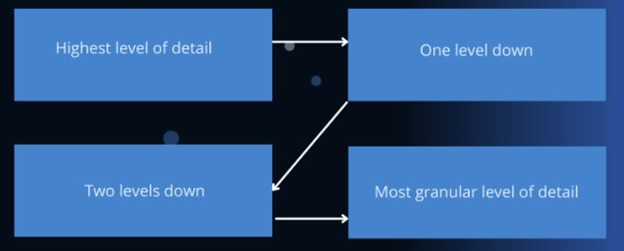
Secondly, every dashboard is easier to read when you divide it into sections. Some common dashboard sections are:
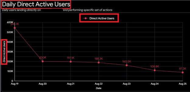
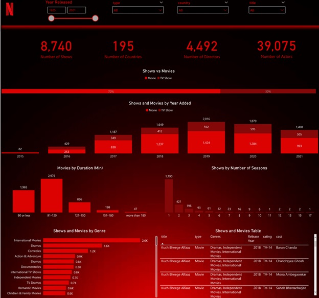
Consider the Power BI UI design below which has all of the above sections
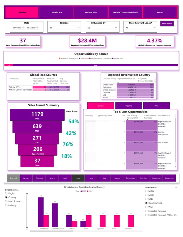
I highly encourage you to plan in advance for where you place these sections on your canvas. Planning for how exactly you drill down further into your data with every visual is also really important to make your dashboards intuitive.
You can read more about this dashboard and how it was designed here.
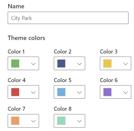
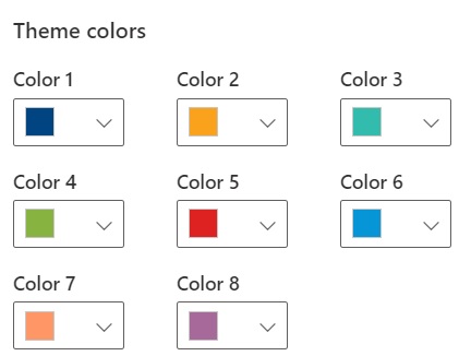
Thirdly, it is important to select a good color scheme for your Power BI UI Design. A good color scheme would contain a color that you can use to communicate negative insights like red or orange, a neutral color like blue and a color to communicate positive insights like green.
An example of a really good default color scheme in Power BI would be City Park
Below is a custom scheme that I am using for one of my clients. This is aligned with their brand colors but also has all the elements of a good color scheme:
Using colors strategically in your Power BI UI design is really important for making them easier to interpret. For example if one of the metrics in your report is revenue, color it in green everywhere in your report. This would teach your users to associate the color with the metric. As a result it would take them less time to read and understand your reports.
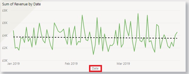
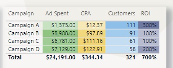
For example consider the dashboard below:

Notice how the sum of revenue is colored in green everywhere in the dashboard. This makes users remember that green means revenue. Therefore, the dashboard becomes a lot easier to interpret.
Note that if you want to build the dashboard above, I have a video on my youtube channel where I walk you through building it.
Fourthly, it is important that you know how to choose the right data visualization. Choosing the right data visualisation is a massive part of Power BI UI design and s big topic on its own. I wrote a blog post about it earlier which I highly encourage you to read!
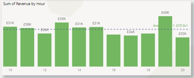
Fifthly, it is important to remove clutter as much as possible from your visualisation. Clutter includes:

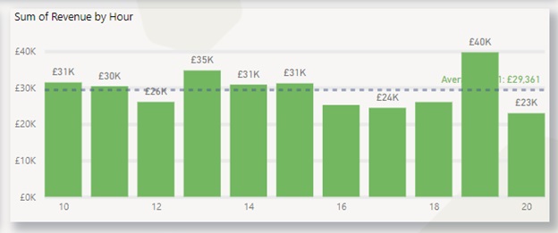
Now compare the chart below where I removed gridlines and Y-axis. No information was lost but the chart already became a lot cleaner.
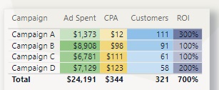
The bottom line is that you need to be as minimalistic as possible when you communicate insights to your dashboard users.
Imagine yourself walking in your dashboard user’s shoes. If you ask someone to explain to you how your business is performing, you don’t want to hear them rumbling for 30 minutes. Trying to pick 5 important sentences from a 30-minute speech is overwhelming. This is why it is always better to provide clarity to insight through your Power BI UI Design.
You want to hear a structured answer where an analyst explains the key insights to you in as few words as possible. This makes it far easier for you to understand and retain the key information.
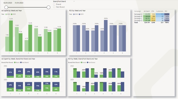
Placing your visuals in consistent places across your canvas is really important too. Consider the case study for the financial analysis on our website. The position of cards, filters and bar charts is consistent across different pages. As a result, the dashboard users know exactly where to direct their sight to find a specific insight.

Finally, let’s talk about the blank space because it can be an asset as well as a liability for your Power BI UI Design. Some blank space is good because it makes your dashboard look less cluttered.
Consider the dashboard below, leaving blank space between the visuals allows me to use the shadow effect and makes the dashboard look very clean.
However, leaving too much blank space on the dashboard makes the data storytelling looks disorganized.
Consider this example that I found online. There is a lot of blank space on bottom right which could in theory be used to make the visuals larger and therefore easier to read. This space could also be used for additional analysis.
Now that you know the theory of efficient Power BI UI design, let’s use them together to build a good-looking dashboard from scratch! Follow this video tutorial with me to make this piece of beauty below!
Download the source Power BI file from here and let’s get started!
![]()
![]()
![]()