Designing a dashboard involves creating something concrete—a product that can be deployed in the real world. However, if there isn’t a distinct problem the dashboard would address, or if the expense of its development outweighs the potential value it would bring, pursuing the project could be futile. Many organisations make a number of critical mistakes that render their dashboards ineffective.
In this blog post, we ‘ll discuss 5 common dashboard mistakes to avoid when delivering valuable insights to ensure you build dashboards that are useful.
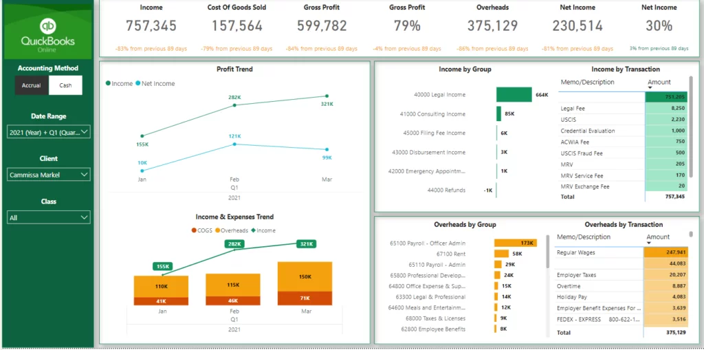
CHECK OUT SAMPLES OF OUR DASHBOARDS HERE
A data dashboard is basically an interactive instrument enabling the tracking, analysis, and presentation of KPIs and metrics. Modern dashboards facilitate the integration of real-time data from various domains, offering AI-driven assistance in data preparation, chart generation, and analysis. Consequently, data dashboards transform raw organizational data into actionable insights that enhance specific processes, departments, or the overall business performance.
The most common massive mistake in dashboard design is to use bad data. Bad data is the scourge of any decision-making, and unreliable data will lead to ineffective strategies and solutions that are based on the wrong information. To diminish this risk, insist on the best processes for data validation, audit your data-sources and compare results with regularity, and insist on data quality through robust processes for data-validity.
Good dashboard design is more than just presenting data. It should have a simple layout, clear visual hierarchy and strong usability. Poorly designed dashboards can end up being a hot mess if not designed well in accordance with best practises. Incorporate principles of visual design, such as whitespace utilization, colour consistency, and font hierarchy, to create visually appealing and easy-to-navigate dashboards or ask your clients what they think and iterate on the design until it meets the desired outcomes.
Failure to engage the critical aspect of alignment and to set clear goals for the dashboard is a common pitfall in the dashboard development lifecycle. If you do not understand the stakeholders, their requirements and objectives, the dashboard will not address their needs and provide the necessary insights and value.
At the early stages of your project, conduct a number of stakeholder interviews and requirements gathering sessions to identify their KPIs and goals. Document the requirements and use them as a design framework to guide you through the entire dashboard development lifecycle.
Choosing the appropriate visualizations is crucial for effectively communicating insights and telling your data story. Using inappropriate or overly complex visualizations can confuse users and obscure key insights.
Before selecting visualizations, consider the nature of the data and the message you want to convey. Utilize common chart types, such as bar charts, line graphs, and pie charts, to effectively represent different types of data. Experiment with various visualization options and prioritize clarity and simplicity to enhance comprehension and interpretation of the data.
While it may be tempting to include a plethora of KPIs and visualizations on the dashboard, overcrowding can overwhelm users and dilute the impact of key insights.
Focus on identifying a concise set of high-impact KPIs that directly align with business objectives and prioritize them on the dashboard. Limit the number of visualizations to those that are essential for conveying meaningful insights and avoid unnecessary clutter.
By maintaining simplicity and clarity, you can ensure that users can quickly grasp the most important information and make informed decisions.
Avoiding these dashboard traps is crucial to optimise your data visualisation practice and support business success. Make sure your dashboards can keep your clients and stakeholders happy by ensuring data accuracy, following best practices of dashboard design, meeting your clients’ needs, selecting the right visualisations, and keeping it simple.
CONTACT US TO PREPARE A DETAILED DASHBOARD FOR YOUR BUSINESS
![]()
![]()
![]()