In my experience Power BI financial dashboards are becoming increasingly more popular. It is no surprise because of the data transformation capabilities of Power BI and it’s ability to handle big data. Power BI really opens a lot of opportunities for financial analysis and we will explore some of them in this article. But first let’s discuss the context for which these Power BI financial dashboards were created.

I used to work as a financial analyst in Autodesk for 3+ years where I created a tonne of Power BI financial dashboards. My dashboards used to go to financial directors and VPs of Finance. They were mainly used for financial forecasting, tracking sales performance vs targets and sometimes for managing sales people. My biggest achievement in Autodesk was creating one Power BI financial dashboard that went to the CEO and CFO of Autodesk.
In 2021 I transitioned to running my Power BI consultancy where my team and I created many financial Power BI dashboards. I had a privilege of delivering financial analysis to companies like Google, Teleperformance and Heineken. You will see some of the dashboards that we created below.
When I joined Autodesk, they were in the middle of a big push to move their financial dashboards from Excel to Power BI. The financial department wanted to achieve multiple benefits by using Power BI:
The financial KPIs that you would visualize on your dashboard would be different depending on your audience. Based on my experience, these are some useful financial KPIs that are commonly analyzed:
Power BI is often the tool of choice for financial reporting and for a good reason!
Firstly, Power BI evolved from Excel which offers the finance and accounting departments room all the important functionalities that they are used to. Power BI essentially becomes a natural next step from crude financial Excel reports.
Secondly, Power BI has superior data visualisation capabilities which allows financial analysts to improve the user interface. We have seen many cases when the companies switched away from Excel tables to build Power BI financial dashboards. Many noticed that the visual presentation of data in Power BI makes it easier to discover actionable insights and leads to more data-driven decisions.
Finally, Power BI has integration with many financial and accounting systems like QuickBooks, Xero, Anaplan and many others! Those integrations enable companies to automate the financial date extraction and save valuable working hours.
Let’s now look at most common examples of Power BI financial dashboards!
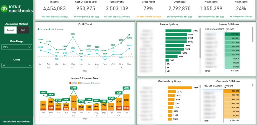
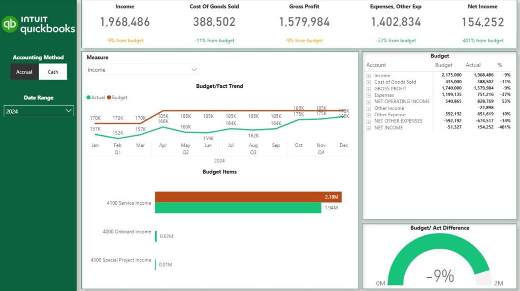
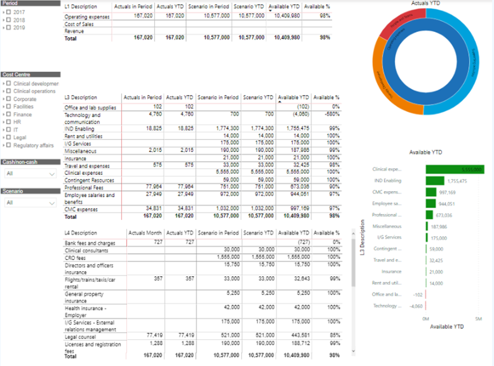
Power BI profit & loss (P&L) dashboard visualizes the main business profitability metrics including revenue, cost of goods sold, gross profit, overheads and net income. A good Power BI P&L dashboard is interactive, enables users to apply filters and drill down into data.
For example the dashboard above enables the user to switch between accrual and cash accounting methods, filter by date and drill down to specific transactions making up the value of each account.
Analysis that you typically have on the P&L dashboard is:
There are several benefits for creating your P&L dashboards in Power BI:
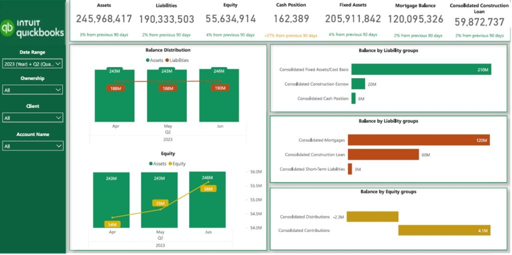
Power BI balance sheet dashboard visualizes assets, liabilities and equity metrics helping to identify the risks in the asset and liabilities mix. It is especially important in industries like real estate or construction where large mortgages are very common and asset value is just as important as revenue.
Common KPIs on a balance sheet dashboard include:
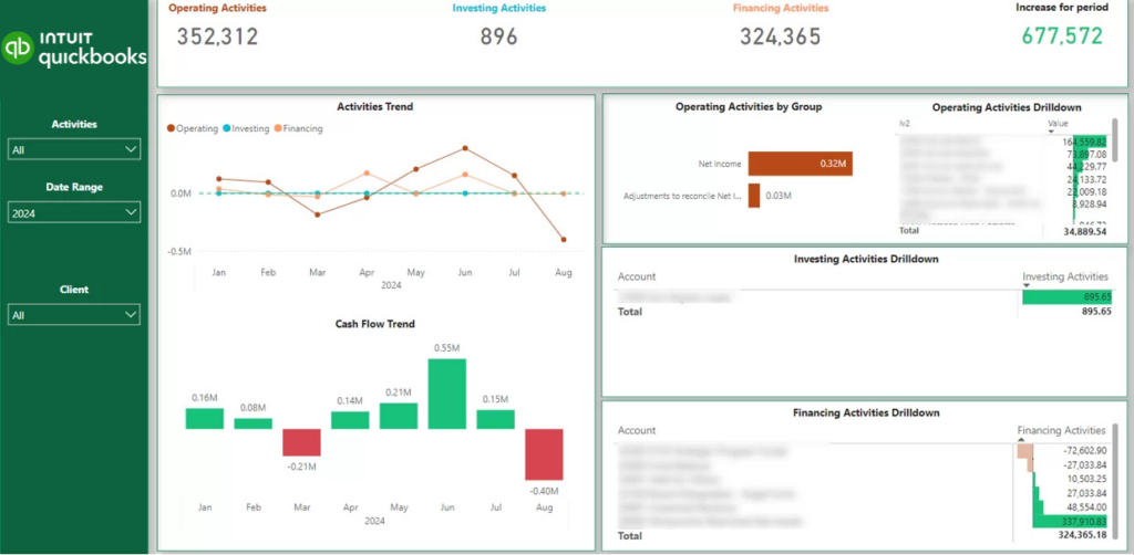
The next thing companies usually worry about after their P&L is their cash flow. It is well known that may companies go out of business because the lack of cash, not lack of profit.
Creating a Power BI financial dashboard enables companies like Will Dispute Lawyers NSW to keep better track of their cash reserves and ensure that they have enough cash to keep going. Consider the example below.
This Power BI financial dashboard shows that the company has enough cash in the bank for the next 4 months. It therefore emphasises the need to collect open invoices to ensure that the company can continue operating.
This brings us to our next topic!
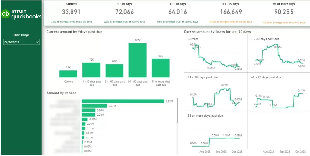
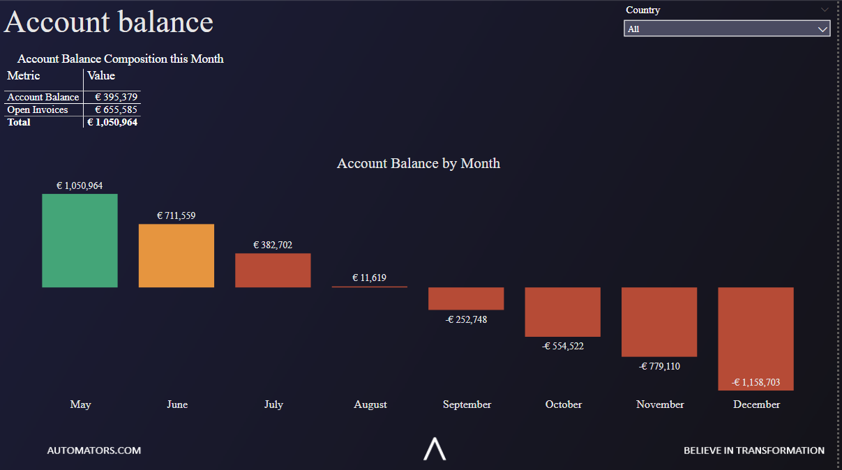
The process of collecting open invoices can be better managed with an Power BI financial dashboard. Consider the example above!
The horizontal bar chart shows how much each client owes you. The vertical bar chart shows how many days the invoices have been outstanding for and the amount of those invoices.
A credit control specialist can press on the “61-90 days past due” column and see the amount of money outstanding by client. They can then contact every client and chase them for collecting the invoices.
A Power BI budget vs actual dashboard usually compares the actual sales and expenses data with the targets that are set once a year or a quarter. Budget numbers are basically targets so they are usually updated once a year whereas forecast numbers can be updated every week.
The specific type of budget would largerly affect what the dashboard would look like. Financial departments can create budgets for every level of their P&L or balance sheet statement if they want to. Less granular budgets can be for sales of specific product or product group.
Common Power BI budget vs actual visualizations are:
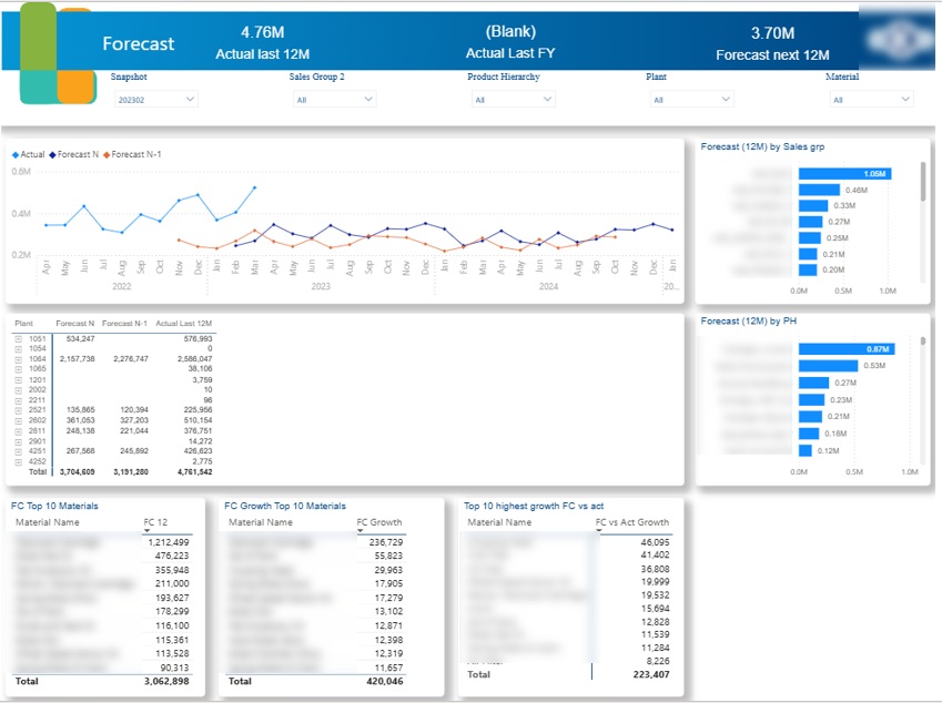
Power BI sales forecast dashoards usually visualize the forecast data and compare it with the actual data. The main purpose of the sales forecasting dashboard is to help CFOs with financial forecasting and plan how to structure finances for the future.
A common approach to sales forecasting is calculating a weighted pipeline where each stage in the sales pipeline would be assigned a percentage probability score for closing the deal. You would then multiply the revenue from deals sitting in each pipeline stage with their respective percentage probability score.
There are 2 approaches for creating Power BI forecasting dashboards:
For example,when we worked on the sales forecasting dashboard you see above, our client did all the forecasting in Excel. They forecasted the sales of the selected range of products in every country to help with demand planning. They also compared their current forecast with the previous version (Forecast N-1) to measure the forecast accuracy.
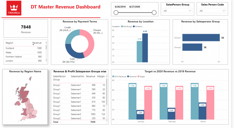
Sales analysis was the main topic of my Power BI financial dashboards when I was working in Autodesk. I used this experience to create the dashboard you see above for the financial director of Tikkurila (data is randomised).
Power BI sales financial dashboards are commonly built on top of ERPs like Dynamics Nav, Netsuite, etc. These dashboards allow Financial Directors to identify areas of business growth and slowdown. These insights ultimately drive the weekly forecasting decisions that are important for sales management and expense planning.
During my time in Autodesk, Financial Directors also collaborated with VPs of Sales by relying on insights from these Power BI financial dashboards. For example if sales slowed down, Financial Directors advised taking measures such as giving discounts or processing the deals in the pipeline faster.
These Power BI financial dashboards are very common for operational expenses management. We used to have a dedicated person for OPEX management in our team at Autodesk. This person had their own Power BI financial dashboard pulling the procurement data from SAP Hana.
OPEX Power BI financial dashboards usually compare actual spending to budget and analyse the amount of money that is still available to spend.
This way when a request for reimbursement comes in, the OPEX manager will be able to view whether the department who requested it still have any budget left.
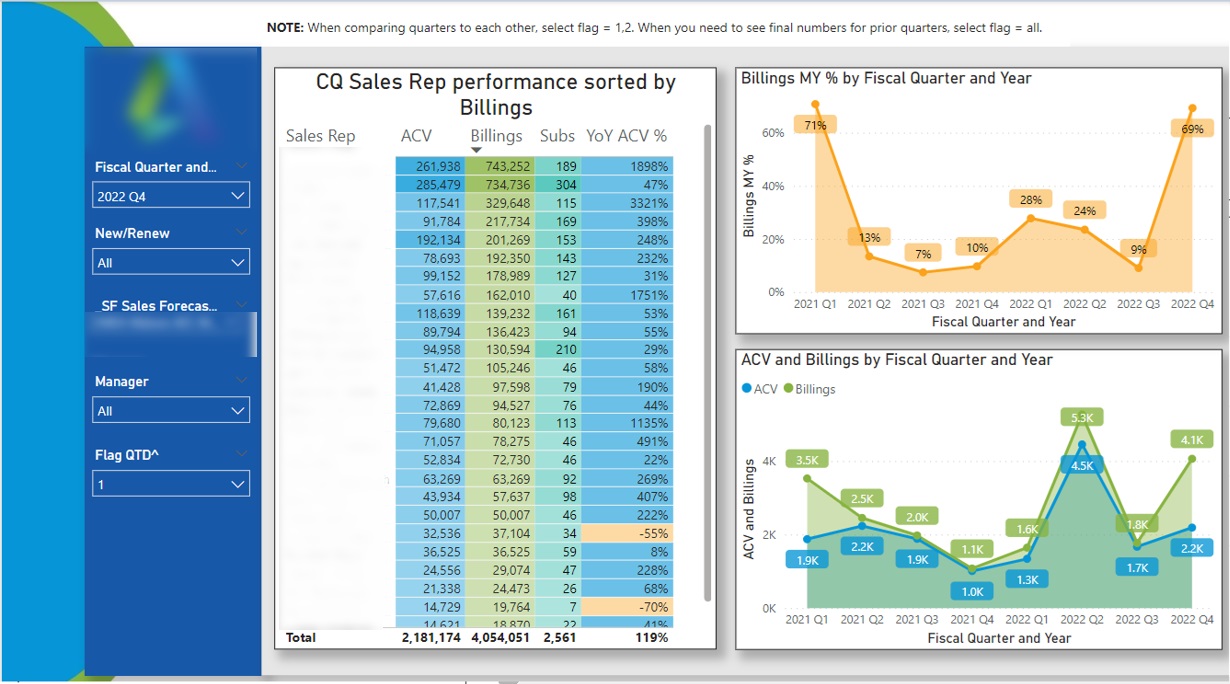
When I worked in Autodesk every sales team had a dedicated Finance Business Partner. Their job was to support the sales managers and directors with financial insights. Above is an example of a Power BI financial dashboard that could be used by Finance Business Partners.
Finance Business partners would open this dashboard and apply the manager filter. They would then see the performance of every sales person under that manager.
Once they click on the salesperson name in the table, they would see the quarterly trends for their performance.
Such Power BI financial dashboards help finance business partners to spot top performers and encourage them to share knowledge with others. Equally, the salespeople with slowing performance might need help such as adding extra leads to their pipeline or extra training.
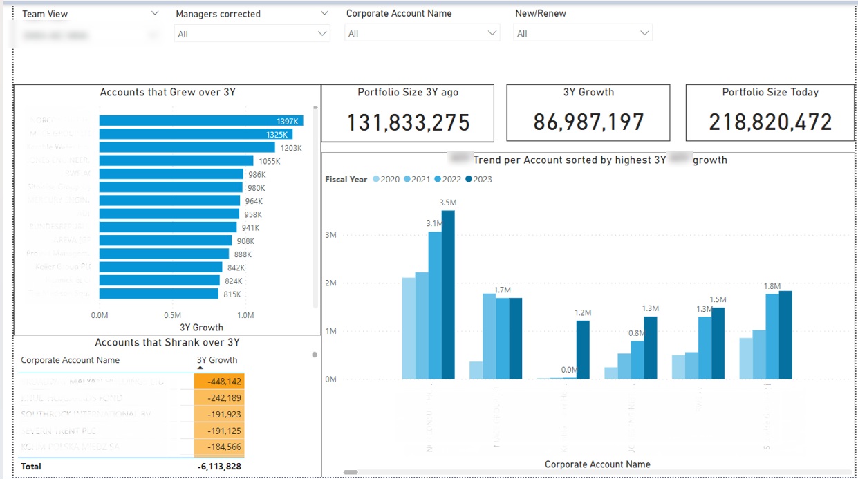
It is the goal of every sales organisation to grow the business from every client over time. A Power BI financial dashboard can really help to identify priorities in the customer growth. Finance Business Partners would be using this dashboard to support their sales team with insights.
Above is a Power BI financial dashboard that I created to measure the total growth of client portfolio of every sales manager. This dashboard helped them to quickly identify the accounts that grew and accounts that shrank over the last 3 years.
A few actionable insights followed from this dashboards:
Using this Power BI financial dashboard can help to identify the specific targets for account management efforts which directly leads to more sales and revenue. I have personally seen very steep increases in revenue once companies became more proactive with their account management.
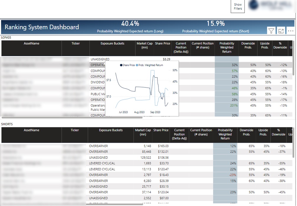
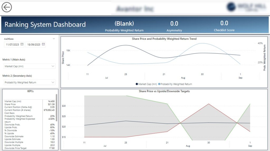
I had a pleasure to work with some hedge funds and build their Power BI financial dashboards. They are now using these dashboards on a daily basis to analyse the performance of their investment portfolio including longs (stock they are buying) and shorts (stock they are selling)
As you can see, they have a view of all their trading positions in a single place and they can view the trends for their price when they hover to a line in the table.
They hedge fund managers also can select an open position and drill-through to another page which shows them detailed performance metrics for their trade as you can see below.
You can automate finance reporting with Power BI in 3 steps:
As you can see Power BI can be used for creating a wide range of financial dashboards. Building financial Power BI dashboards helps businesses to automate their reporting, improve user experience and avoid sharing large spreadsheets.
Vidi Corp can support finance departments in multiple ways:
![]()
![]()
![]()